
Before I started doing these reviews, I had trouble identifying the different series of film, particularly with the economic series offered in ISO 200. If we talk about cheap color negative films in that range from the two bigger manufacturers, Fuji and Kodak, we will notice that there are two lines:
- “Premium” : Kodak Gold 200, Fujicolor Superia 200.
- “Budget” : Kodak Colorplus 200, Fujicolor C200
Agfa only has one option the Agfacolor vista 200, allegedly to be manufactured with a cheap Fujifilm emulsion. Rollei has the CR200 but is a reversal film (positive). Lomography has the Lomography X-Pro 200, but I think is more an artistic or special film, more than a normal one. Also to mention the Cine series, with the Kodak Vision 3, 250D and 250T or Fujifilm with the Eterna 250D.
So, before starting the review of the Kodak Gold 200, I think it was quite important to place it in its correspondent line, that is the best way to value the relation quality/price.

| Name | Kodak Gold 200 |
| ISO | 200 |
| Developer | C-41 |
| Available formats | 35mm |
| Exposures | 24, 36 |
| DX Coding | Yes |
| Availability | ★★★☆☆
I have troubles to find it in Asia, but plenty on-line and other markets. |

The first cool thing about this film is that you can still find these 3-rolls pack with 24 exposures each that will make you feel like a dad in the 90’s ready for a Disneyland trip, forget about those boring bulk-pro packagings. Load the old school design roll, and good to go!
![[FILM] USA christmas DEC2016 - Nikon FM (s) - Kodak Gold 200 -038](https://carlosgrphoto.com/wp-content/uploads/2017/03/film-usa-christmas-dec2016-nikon-fm-s-kodak-gold-200-038.jpg?w=880)
I’m a little bit biased with this film, in particular, I love the way it renders the colors. Maybe it reminds me of childhood memories, or is just the feeling of “this is how film should look”. But as I said, this is a totally subjective point of view. I will try to write this review as unbiased as possible. I have been really lucky, I have been able to review this film shooting daily scenes in Taiwan, but also during a winter trip to Des Moines (Iowa). For the winter colors, it looked great! carmine toned browns, and soft yellow all over, I love it!
In these two pictures, we can appreciate that reds are quite off, they don’t pop up like other films do. The Superia line from Fujifilm has brighter reds, or even in Kodak, Ektar, for example, has more punchy and saturated colors, at a different starting price though. Depending on the use for this film, that can be an advantage or a disadvantage, for daily life pictures, with plenty of skin tones and trees or street scenes, I personally like the carmine red tones, a little bit off, fading with the brown palette. However, the temple picture could use more intensity, if reds and greens were more contrasty the photo will be much more attractive, easy to fix in post-processing, however, for these reviews, the photos are exactly as they come out from the scanner.
![[FILM] USA TAIWAN christmas finals JAN2017 Nikon FM(s) Kodak Gold 200 -003](https://carlosgrphoto.com/wp-content/uploads/2017/03/film-usa-taiwan-christmas-finals-jan2017-nikon-fms-kodak-gold-200-003.jpg?w=880)
![[FILM] TAIWAN US portraits makiko test Nikon FM(S) Kodak Gold 200 011](https://carlosgrphoto.com/wp-content/uploads/2017/03/film-taiwan-us-portraits-makiko-test-nikon-fms-kodak-gold-200-011.jpg?w=880)
Greens, behave exactly in the same way as reds, muted tones, closer to “grass green” than to “lime green”. It also fades a little bit with the brown, but again, do not think this is a disadvantage, the way colors interact with each other creates its own interesting color palette.
![[FILM] TAIWAN US portraits makiko test Nikon FM(S) Kodak Gold 200 013](https://carlosgrphoto.com/wp-content/uploads/2017/03/film-taiwan-us-portraits-makiko-test-nikon-fms-kodak-gold-200-013.jpg?w=880)
Blues are really neutral, and very true to color. Both the top picture of the temple (淡水天元宮 in North Taipei, really worth the visit!) and the bottom picture of a sunset in Des Moines really captured the image showing the blue tones as real as I remember.
![[FILM] USA TAIWAN christmas finals JAN2017 Nikon FM(s) Kodak Gold 200 -012](https://carlosgrphoto.com/wp-content/uploads/2017/03/film-usa-taiwan-christmas-finals-jan2017-nikon-fms-kodak-gold-200-012.jpg?w=880)
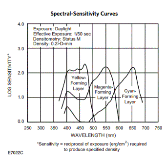
Yellows are vibrant in pictures taken with natural light. If any complaint about the yellow tones, I found out that all the photos taken between 10 am to 5 pm, with harsh light, the frames would have a subtle yellow tint. I did a little bit more of research and find out that yellow is the most sensitive layer, this review is not a scientific test, and maybe is just a choice of style, but this might explain why under harsh light (midday sun or snow) we obtain that yellow cast.
![[FILM] TAIWAN US portraits makiko test Nikon FM(S) Kodak Gold 200 006](https://carlosgrphoto.com/wp-content/uploads/2017/03/film-taiwan-us-portraits-makiko-test-nikon-fms-kodak-gold-200-006.jpg?w=880)
![[FILM] USA TAIWAN christmas finals JAN2017 Nikon FM(s) Kodak Gold 200 -015](https://carlosgrphoto.com/wp-content/uploads/2017/03/film-usa-taiwan-christmas-finals-jan2017-nikon-fms-kodak-gold-200-015.jpg?w=880)
Finally, I tested this film in some portraits, with some friends with a lighter skin tone (Makiko) and darker skin tone (Caroline) under natural light and direct flash, to see how this film reacts to different situations. You can click to enlarge this gallery.
 Kodak Gold 200 003")
 Kodak Gold 200 004")
 Kodak Gold 200 018")
 Kodak Gold 200 019")
The colors with natural light, shows a little bit of the mentioned yellow cast, especially in Makiko’s portrait, the fact that is underexposed with a pink background definitely do not benefit the skin tone. In another situation, this film would be more advantageous for a portrait. With the direct flash, it perfectly balanced the yellow cast and made amazing, contrasty pictures for such a cheap film.
Grain is very subtle, especially in the portraits. Correct for an ISO 200 film of its range. This crop of Makiko’s portrait shows no grain at all, I was really impressed by that! The dog’s fur is also quite clear of grain.
![[FILM] TAIWAN US portraits makiko test Nikon FM(S) Kodak Gold 200 003](https://carlosgrphoto.com/wp-content/uploads/2017/03/film-taiwan-us-portraits-makiko-test-nikon-fms-kodak-gold-200-003.jpg?w=402&h=254)
![[FILM] TAIWAN US portraits makiko test Nikon FM(S) Kodak Gold 200 003-2](https://carlosgrphoto.com/wp-content/uploads/2017/03/film-taiwan-us-portraits-makiko-test-nikon-fms-kodak-gold-200-003-2.jpg?w=408&h=258)
![[FILM] TAIWAN US portraits makiko test Nikon FM(S) Kodak Gold 200 010](https://carlosgrphoto.com/wp-content/uploads/2017/03/film-taiwan-us-portraits-makiko-test-nikon-fms-kodak-gold-200-010.jpg?w=880)
![[FILM] USA christmas DEC2016 - Nikon FM (s) - Kodak Gold 200 -017](https://carlosgrphoto.com/wp-content/uploads/2017/03/film-usa-christmas-dec2016-nikon-fm-s-kodak-gold-200-017.jpg?w=880)
Color chart and measurement of the colors.
![[FILM] TAIWAN US portraits makiko test Nikon FM(S) Kodak Gold 200 017](https://carlosgrphoto.com/wp-content/uploads/2017/03/film-taiwan-us-portraits-makiko-test-nikon-fms-kodak-gold-200-017.jpg?w=880)
RED Average Colour R:188.0 G:141.0 B:78.0
YELLOW Average Colour R:201.0 G:200.0 B:56.0
BLUE Average Colour R:56.0 G:128.0 B:170.0
GREEN Average Colour R:125.0 G:184.0 B:73.0
You can take also a look on this article on How do I measure the colors?
![[FILM] USA TAIWAN christmas finals JAN2017 Nikon FM(s) Kodak Gold 200 -024](https://carlosgrphoto.com/wp-content/uploads/2017/03/film-usa-taiwan-christmas-finals-jan2017-nikon-fms-kodak-gold-200-024.jpg?w=880)
As a rule of thumb, I tend to like more warm colors than cold ones, that’s why I quite like this film: cheap and with a beautiful palette of colors. After testing a few different kind of rolls, I could firmly say that this is one of my favorites, my favorite in the ISO 200 range. Pictures don’t pop up like other films, but it creates a really vintage atmosphere, with the tones a little bit washed off and a light yellow cast. I can understand that many people will not like it, but I love it!
If any drawback, this film is not easy to find in the Asian market, There is plenty of the cheaper version, the Kodak Colorplus 200, but is not exactly the same emulsion of film. Very similar whatsoever. Nevertheless, soon I will also prepare a comparison in between its direct rival in price and technical conditions (Fujicolor Superia 200) and with its cheaper brother (Kodak Colorplus 200)
YES ⇑
- For daily use, load it in any kind of camera and expect great results, harsh light, flash, it will resolve pretty well for its price
- Looking for a vintage feeling without falling into any forced “lomo” effect.
- If you like to play with negatives in post-processing, being so neutral, with a little bit of tweak it can create great images.
NO ⇓
- If you can’t stand light yellow cast in your photos. Or you are looking for a colder feeling.
- Landscape photography, I would go for other color that would pop more the colors individually.
- If you need a fast film you will obtain similar results with the Ultramax 400 for the same price (or even cheaper!), but with a higher ISO number.
Check out the gallery for more shots taken with this film!
![[FILM] TAIWAN US portraits makiko test Nikon FM(S) Kodak Gold 200 006](https://i0.wp.com/carlosgrphoto.com/wp-content/uploads/2017/03/film-taiwan-us-portraits-makiko-test-nikon-fms-kodak-gold-200-006.jpg?w=581&h=372&ssl=1 "[FILM] TAIWAN US portraits makiko test Nikon FM(S) Kodak Gold 200 006")
![[FILM] USA christmas DEC2016 - Nikon FM (s) - Kodak Gold 200 -026](https://i0.wp.com/carlosgrphoto.com/wp-content/uploads/2017/03/film-usa-christmas-dec2016-nikon-fm-s-kodak-gold-200-026.jpg?w=291&h=184&ssl=1 "[FILM] USA christmas DEC2016 - Nikon FM (s) - Kodak Gold 200 -026")
![[FILM] USA TAIWAN christmas finals JAN2017 Nikon FM(s) Kodak Gold 200 -002](https://i0.wp.com/carlosgrphoto.com/wp-content/uploads/2017/03/film-usa-taiwan-christmas-finals-jan2017-nikon-fms-kodak-gold-200-002.jpg?w=291&h=184&ssl=1 "[FILM] USA TAIWAN christmas finals JAN2017 Nikon FM(s) Kodak Gold 200 -002")
![[FILM] USA TAIWAN christmas finals JAN2017 Nikon FM(s) Kodak Gold 200 -019](https://i0.wp.com/carlosgrphoto.com/wp-content/uploads/2017/03/film-usa-taiwan-christmas-finals-jan2017-nikon-fms-kodak-gold-200-019.jpg?w=266&h=168&ssl=1 "[FILM] USA TAIWAN christmas finals JAN2017 Nikon FM(s) Kodak Gold 200 -019")
![[FILM] USA TAIWAN christmas finals JAN2017 Nikon FM(s) Kodak Gold 200 -022](https://i0.wp.com/carlosgrphoto.com/wp-content/uploads/2017/03/film-usa-taiwan-christmas-finals-jan2017-nikon-fms-kodak-gold-200-022.jpg?w=266&h=173&ssl=1 "[FILM] USA TAIWAN christmas finals JAN2017 Nikon FM(s) Kodak Gold 200 -022")
![[FILM] USA christmas DEC2016 - Nikon FM (s) - Kodak Gold 200 -041](https://i0.wp.com/carlosgrphoto.com/wp-content/uploads/2017/03/film-usa-christmas-dec2016-nikon-fm-s-kodak-gold-200-041.jpg?w=266&h=176&ssl=1 "[FILM] USA christmas DEC2016 - Nikon FM (s) - Kodak Gold 200 -041")
![[FILM] TAIWAN US portraits makiko test Nikon FM(S) Kodak Gold 200 012](https://i0.wp.com/carlosgrphoto.com/wp-content/uploads/2017/03/film-taiwan-us-portraits-makiko-test-nikon-fms-kodak-gold-200-012.jpg?w=330&h=525&ssl=1 "[FILM] TAIWAN US portraits makiko test Nikon FM(S) Kodak Gold 200 012")
![[FILM] USA christmas DEC2016 - Nikon FM (s) - Kodak Gold 200 -039](https://i0.wp.com/carlosgrphoto.com/wp-content/uploads/2017/03/film-usa-christmas-dec2016-nikon-fm-s-kodak-gold-200-039.jpg?w=272&h=171&ssl=1 "[FILM] USA christmas DEC2016 - Nikon FM (s) - Kodak Gold 200 -039")
![[FILM] USA TAIWAN christmas finals JAN2017 Nikon FM(s) Kodak Gold 200 -014](https://i0.wp.com/carlosgrphoto.com/wp-content/uploads/2017/03/film-usa-taiwan-christmas-finals-jan2017-nikon-fms-kodak-gold-200-014.jpg?w=272&h=174&ssl=1 "[FILM] USA TAIWAN christmas finals JAN2017 Nikon FM(s) Kodak Gold 200 -014")
![[FILM] USA christmas DEC2016 - Nikon FM (s) - Kodak Gold 200 -038](https://i0.wp.com/carlosgrphoto.com/wp-content/uploads/2017/03/film-usa-christmas-dec2016-nikon-fm-s-kodak-gold-200-038.jpg?w=272&h=172&ssl=1 "[FILM] USA christmas DEC2016 - Nikon FM (s) - Kodak Gold 200 -038")
![[FILM] USA christmas DEC2016 - Nikon FM (s) - Kodak Gold 200 -025](https://i0.wp.com/carlosgrphoto.com/wp-content/uploads/2017/03/film-usa-christmas-dec2016-nikon-fm-s-kodak-gold-200-025.jpg?w=449&h=284&ssl=1 "[FILM] USA christmas DEC2016 - Nikon FM (s) - Kodak Gold 200 -025")
![[FILM] USA christmas DEC2016 - Nikon FM (s) - Kodak Gold 200 -021](https://i0.wp.com/carlosgrphoto.com/wp-content/uploads/2017/03/film-usa-christmas-dec2016-nikon-fm-s-kodak-gold-200-021.jpg?w=423&h=284&ssl=1 "[FILM] USA christmas DEC2016 - Nikon FM (s) - Kodak Gold 200 -021")
![[FILM] USA TAIWAN christmas finals JAN2017 Nikon FM(s) Kodak Gold 200 -026](https://i0.wp.com/carlosgrphoto.com/wp-content/uploads/2017/03/film-usa-taiwan-christmas-finals-jan2017-nikon-fms-kodak-gold-200-026.jpg?w=295&h=182&ssl=1 "[FILM] USA TAIWAN christmas finals JAN2017 Nikon FM(s) Kodak Gold 200 -026")
![[FILM] USA TAIWAN christmas finals JAN2017 Nikon FM(s) Kodak Gold 200 -007](https://i0.wp.com/carlosgrphoto.com/wp-content/uploads/2017/03/film-usa-taiwan-christmas-finals-jan2017-nikon-fms-kodak-gold-200-007.jpg?w=295&h=185&ssl=1 "[FILM] USA TAIWAN christmas finals JAN2017 Nikon FM(s) Kodak Gold 200 -007")
 Kodak Gold 200 004")
 Kodak Gold 200 019")
![[FILM] TAIWAN US portraits makiko test Nikon FM(S) Kodak Gold 200 007](https://i0.wp.com/carlosgrphoto.com/wp-content/uploads/2017/03/film-taiwan-us-portraits-makiko-test-nikon-fms-kodak-gold-200-007.jpg?w=284&h=182&ssl=1 "[FILM] TAIWAN US portraits makiko test Nikon FM(S) Kodak Gold 200 007")
![[FILM] USA christmas DEC2016 - Nikon FM (s) - Kodak Gold 200 -023](https://i0.wp.com/carlosgrphoto.com/wp-content/uploads/2017/03/film-usa-christmas-dec2016-nikon-fm-s-kodak-gold-200-023.jpg?w=284&h=183&ssl=1 "[FILM] USA christmas DEC2016 - Nikon FM (s) - Kodak Gold 200 -023")
![[FILM] USA TAIWAN christmas finals JAN2017 Nikon FM(s) Kodak Gold 200 -023](https://i0.wp.com/carlosgrphoto.com/wp-content/uploads/2017/03/film-usa-taiwan-christmas-finals-jan2017-nikon-fms-kodak-gold-200-023.jpg?w=440&h=274&ssl=1 "[FILM] USA TAIWAN christmas finals JAN2017 Nikon FM(s) Kodak Gold 200 -023")
![[FILM] USA christmas DEC2016 - Nikon FM (s) - Kodak Gold 200 -024](https://i0.wp.com/carlosgrphoto.com/wp-content/uploads/2017/03/film-usa-christmas-dec2016-nikon-fm-s-kodak-gold-200-024.jpg?w=432&h=274&ssl=1 "[FILM] USA christmas DEC2016 - Nikon FM (s) - Kodak Gold 200 -024")
![[FILM] USA christmas DEC2016 - Nikon FM (s) - Kodak Gold 200 -036](https://i0.wp.com/carlosgrphoto.com/wp-content/uploads/2017/03/film-usa-christmas-dec2016-nikon-fm-s-kodak-gold-200-036.jpg?w=439&h=276&ssl=1 "[FILM] USA christmas DEC2016 - Nikon FM (s) - Kodak Gold 200 -036")
![[FILM] TAIWAN US portraits makiko test Nikon FM(S) Kodak Gold 200 009](https://i0.wp.com/carlosgrphoto.com/wp-content/uploads/2017/03/film-taiwan-us-portraits-makiko-test-nikon-fms-kodak-gold-200-009.jpg?w=433&h=276&ssl=1 "[FILM] TAIWAN US portraits makiko test Nikon FM(S) Kodak Gold 200 009")
![[FILM] TAIWAN US portraits makiko test Nikon FM(S) Kodak Gold 200 011](https://i0.wp.com/carlosgrphoto.com/wp-content/uploads/2017/03/film-taiwan-us-portraits-makiko-test-nikon-fms-kodak-gold-200-011.jpg?w=435&h=693&ssl=1 "[FILM] TAIWAN US portraits makiko test Nikon FM(S) Kodak Gold 200 011")
![[FILM] TAIWAN US portraits makiko test Nikon FM(S) Kodak Gold 200 014](https://i0.wp.com/carlosgrphoto.com/wp-content/uploads/2017/03/film-taiwan-us-portraits-makiko-test-nikon-fms-kodak-gold-200-014.jpg?w=437&h=693&ssl=1 "[FILM] TAIWAN US portraits makiko test Nikon FM(S) Kodak Gold 200 014")
![[FILM] USA TAIWAN christmas finals JAN2017 Nikon FM(s) Kodak Gold 200 -021](https://i0.wp.com/carlosgrphoto.com/wp-content/uploads/2017/03/film-usa-taiwan-christmas-finals-jan2017-nikon-fms-kodak-gold-200-021.jpg?w=587&h=371&ssl=1 "[FILM] USA TAIWAN christmas finals JAN2017 Nikon FM(s) Kodak Gold 200 -021")
![[FILM] USA TAIWAN christmas finals JAN2017 Nikon FM(s) Kodak Gold 200 -003](https://i0.wp.com/carlosgrphoto.com/wp-content/uploads/2017/03/film-usa-taiwan-christmas-finals-jan2017-nikon-fms-kodak-gold-200-003.jpg?w=285&h=184&ssl=1 "[FILM] USA TAIWAN christmas finals JAN2017 Nikon FM(s) Kodak Gold 200 -003")
![[FILM] USA christmas DEC2016 - Nikon FM (s) - Kodak Gold 200 -033](https://i0.wp.com/carlosgrphoto.com/wp-content/uploads/2017/03/film-usa-christmas-dec2016-nikon-fm-s-kodak-gold-200-033.jpg?w=285&h=183&ssl=1 "[FILM] USA christmas DEC2016 - Nikon FM (s) - Kodak Gold 200 -033")
![[FILM] TAIWAN US portraits makiko test Nikon FM(S) Kodak Gold 200 010](https://i0.wp.com/carlosgrphoto.com/wp-content/uploads/2017/03/film-taiwan-us-portraits-makiko-test-nikon-fms-kodak-gold-200-010.jpg?w=286&h=184&ssl=1 "[FILM] TAIWAN US portraits makiko test Nikon FM(S) Kodak Gold 200 010")
![[FILM] USA christmas DEC2016 - Nikon FM (s) - Kodak Gold 200 -034](https://i0.wp.com/carlosgrphoto.com/wp-content/uploads/2017/03/film-usa-christmas-dec2016-nikon-fm-s-kodak-gold-200-034.jpg?w=286&h=180&ssl=1 "[FILM] USA christmas DEC2016 - Nikon FM (s) - Kodak Gold 200 -034")
![[FILM] USA christmas DEC2016 - Nikon FM (s) - Kodak Gold 200 -020](https://i0.wp.com/carlosgrphoto.com/wp-content/uploads/2017/03/film-usa-christmas-dec2016-nikon-fm-s-kodak-gold-200-020.jpg?w=586&h=368&ssl=1 "[FILM] USA christmas DEC2016 - Nikon FM (s) - Kodak Gold 200 -020")
 Kodak Gold 200 003")
![[FILM] TAIWAN US portraits makiko test Nikon FM(S) Kodak Gold 200 013](https://i0.wp.com/carlosgrphoto.com/wp-content/uploads/2017/03/film-taiwan-us-portraits-makiko-test-nikon-fms-kodak-gold-200-013.jpg?w=436&h=275&ssl=1 "[FILM] TAIWAN US portraits makiko test Nikon FM(S) Kodak Gold 200 013")
![[FILM] USA christmas DEC2016 - Nikon FM (s) - Kodak Gold 200 -037](https://i0.wp.com/carlosgrphoto.com/wp-content/uploads/2017/03/film-usa-christmas-dec2016-nikon-fm-s-kodak-gold-200-037.jpg?w=536&h=336&ssl=1 "[FILM] USA christmas DEC2016 - Nikon FM (s) - Kodak Gold 200 -037")

![[FILM] USA christmas DEC2016 - Nikon FM (s) - Kodak Gold 200 -017](https://i0.wp.com/carlosgrphoto.com/wp-content/uploads/2017/03/film-usa-christmas-dec2016-nikon-fm-s-kodak-gold-200-017.jpg?w=271&h=420&ssl=1 "[FILM] USA christmas DEC2016 - Nikon FM (s) - Kodak Gold 200 -017")
![[FILM] USA christmas DEC2016 - Nikon FM (s) - Kodak Gold 200 -019](https://i0.wp.com/carlosgrphoto.com/wp-content/uploads/2017/03/film-usa-christmas-dec2016-nikon-fm-s-kodak-gold-200-019.jpg?w=331&h=208&ssl=1 "[FILM] USA christmas DEC2016 - Nikon FM (s) - Kodak Gold 200 -019")
 Kodak Gold 200 018")
![[FILM] USA christmas DEC2016 - Nikon FM (s) - Kodak Gold 200 -027](https://i0.wp.com/carlosgrphoto.com/wp-content/uploads/2017/03/film-usa-christmas-dec2016-nikon-fm-s-kodak-gold-200-027.jpg?w=266&h=420&ssl=1 "[FILM] USA christmas DEC2016 - Nikon FM (s) - Kodak Gold 200 -027")

Yellow forming layer refers to the blue sensitive layer, as proven by nm values, which describe wavelengths corresponding to blue light. When developed the layer appears blue because of its negative nature.
Your color chart here is bluish so it is not white correct!