Fujicolor C200 is a daylight balanced, ISO 200 film offered by Fujifilm, currently is one of the few films remaining in the Fujifilm consumer series after the discontinuation of Superia 200. Along with Fujicolor C200 the other option is the Fujicolor X-TRA 400, a similar film in the ISO400 range.

When searching for more information about this film, many people wonder if this film is a re-packed Superia 200 others affirm that is Agfa Vista Plus 200. I can confirm that is not any of those, it looks similar to the Agfa, but it is quite different from the Superia 200. I believe the Fujicolor C200 is a different and low-cost Fujifilm emulsion that is cheaply produced, in order to reduce costs and keep a consumer film in the market. The main difference probably is the lack of the famous 4th layer included in Superia 200. Although C200 is introduced as the cheapest option available, I was quite pleased with the results, much more than with the Superia 200. Without getting too technical, here is how the structure of both films looks side by side.

| Name | Fujifilm Fujicolor C200 |
| ISO | 200 |
| Developer | C-41, CN-16 |
| Available formats | 35mm |
| Exposures | 24, 36 |
| DX coding | Yes |
| Availability | ★★★★★ |

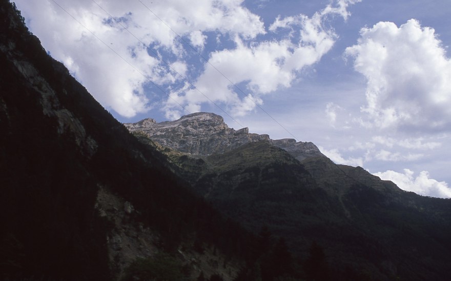
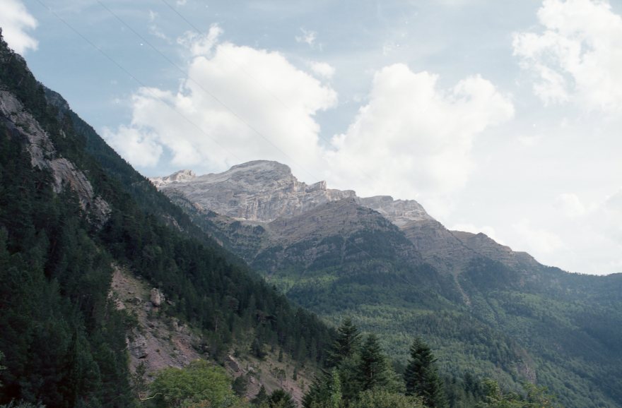
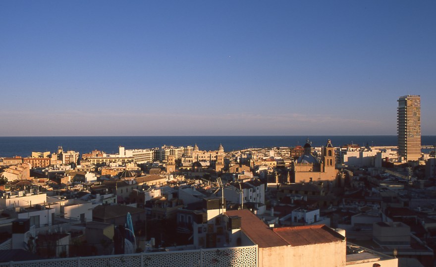
The advantage of reviewing a cheap film is that I don’t need to break the piggy bank to buy it, I was able to buy several rolls to try them in different lights and situations. With this film, I used my -now defunct- Nikon F100 with the 24-120mm f3.5-5.6D when hiking and camping in Taiwan. A F90x / 50mm f1.8D for the beach trips, along with the Nikon FM2 with a 28mm and a 50mm f1.8 Ais for my daily life shots, trips to the US and a trip in the French Pyrenees.
![[FILM] TAIWAN camping KTV MAR2017 Nikon F100 Fujicolor C200007](https://carlosgrphoto.com/wp-content/uploads/2018/08/film-taiwan-camping-ktv-mar2017-nikon-f100-fujicolor-c200007.jpg?w=880)

The Fujicolor C200 is a really balanced film, rendering a quite balanced palette. As with many Fujifilm films, greens are one of its strongest points. Not so vivid as the Superia line, and it always rendered slightly warm green tones. Not as warm as Kodak Colorplus 200, but warmer than I remember them in the real scene.


Shooting at box speed gives you very natural and pleasant blue tones, really wide tonality and surprisingly this film is quite forgiving in the highlights considering its price.


Reds are more muted than other Fujifilm films, films like Superia 200, or the Industrial 100 are much more vivid and intense. Definitely I prefer this muted red tones, a little bit more “red firebrick” than bright red.


Same as blue tones, yellow tones are natural, balanced and true to color.
![[FILM] TAIWAN tamsui summer JUL2017 Nikon F100 (Problem) Fujicolor C200 -007](https://carlosgrphoto.com/wp-content/uploads/2018/08/film-taiwan-tamsui-summer-jul2017-nikon-f100-problem-fujicolor-c200-007.jpg?w=880)
In addition, I tested this film in some portraits, with some friends withd ifferent skin tones under natural light and direct flash, to see how this film reacts to different situations. You can click to enlarge this gallery.


Is not a film designed for portraits, but still does a really good job. Natural skin tones, slightly more warm or magenta than they were in real life, but it can be easily solved in post (none of these pictures was edited). In my opinion, is MUCH better than the discontinued Superia 200, and better than Superia 400 shot at box speed (overexposing will solve the magenta skin tone). It wouldn’t be my top choice for a portrait session, but it definitely has the potential to be an excellent balanced walk-around film.
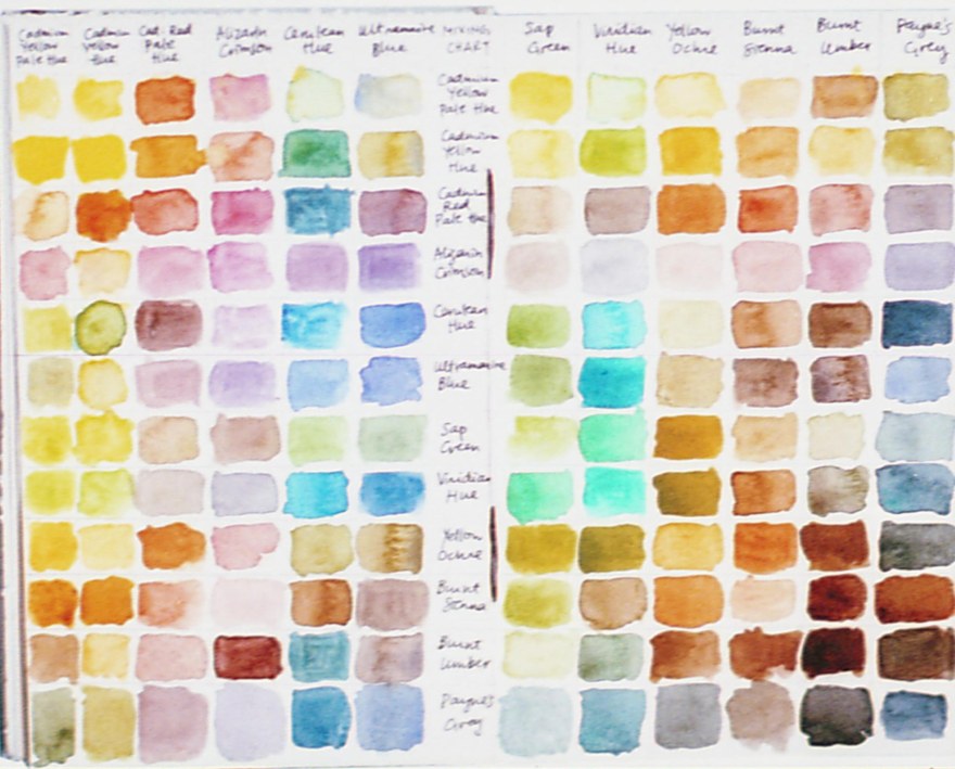
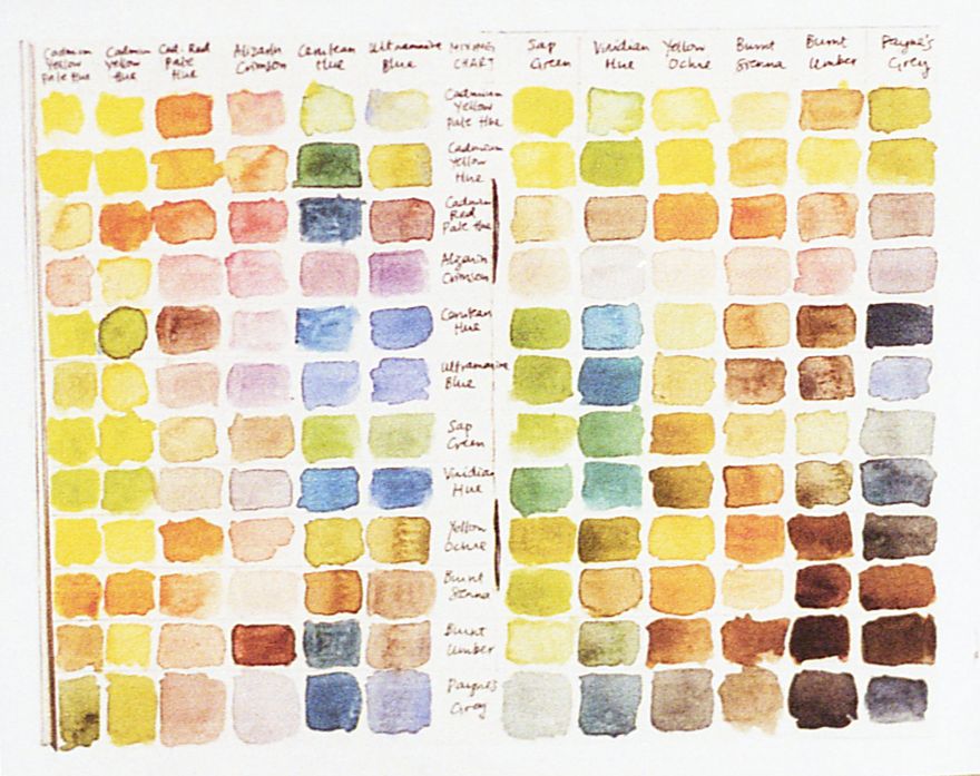
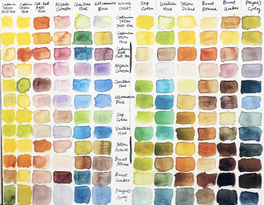
Color chart and measurement of the colors.
![[FILM] TAIWAN tamsui summer JUL2017 Nikon F100 (Problem) Fujicolor C200 -014](https://carlosgrphoto.com/wp-content/uploads/2018/08/film-taiwan-tamsui-summer-jul2017-nikon-f100-problem-fujicolor-c200-014.jpg?w=880)
YELLOW Average Colour R:240.0 G:210.0 B:56.0
RED Average Colour R:210.0 G:110.0 B:60.0
BLUE Average Colour R:68.0 G:121.0 B:158.0
GREEN Average Colour R:158.0 G:195.0 B:76.0
See also: How do I measure the colors?
![[FILM] TAIWAN camping KTV MAR2017 Nikon F100 Fujicolor C200014](https://carlosgrphoto.com/wp-content/uploads/2018/08/film-taiwan-camping-ktv-mar2017-nikon-f100-fujicolor-c200014.jpg?w=880)
![[FILM] TAIWAN camping KTV MAR2017 Nikon F100 Fujicolor C200017](https://carlosgrphoto.com/wp-content/uploads/2018/08/film-taiwan-camping-ktv-mar2017-nikon-f100-fujicolor-c200017.jpg?w=880)
Overexposing the C200 one stop (Shot at 100 ISO)
There is a small yellow cast over the picture, in the green tones it gets more accented than in other tones, blues are more pastel than at box speed.


Underexposing C200 one stop (shot at 400 ISO)
Blues become strong and more vibrant. However, greens become muddier and they start to fade in the shadows. Shadows become slightly greenish, really typical feeling of other Fujifilm films. I’m not a fan of this green shadows, but I saw people doing a great job doing low-key portraits and work with this technique and they look amazing. I’d rather go for a similarly-priced 400 ISO if you really need the extra speed.


Fujicolor C200 is a film that I really like. It is widely available, it is cheap, you can buy 24 and 36 exposures and the latitude is amazing, you can easily underexpose without worrying too much on burning the highlights. Grain is quite controlled for such a cheap film. With a good scanner and a few minutes of editing you can get amazing results with it. It wouldn’t be my top choice in the range of cheap films, I’d rather shoot Superia X-TRA 400 at ISO200, or Kodak Colorplus at 200 as well. But, you can’t go wrong with this film, for almost any situation.
YES
- Daily use, load it in your camera and ready to go. It will respond correctly to any situation.
- Experiment with it, overexpose, underexpose, all the results came out great from every camera I used it.
- Widely available, cheap and good, what else do you need?
NO
- If you are looking for a sharp, clean image. I felt that it can be quite muddy sometimes.
- I wouldn’t overexpose it too much, better go for the Superia X-TRA 400 for almost the same price.
Check out the gallery for more shots taken with this film!


![[FILM] TAIWAN tamsui summer JUL2017 Nikon F100 (Problem) Fujicolor C200 -016](https://i0.wp.com/carlosgrphoto.com/wp-content/uploads/2018/08/film-taiwan-tamsui-summer-jul2017-nikon-f100-problem-fujicolor-c200-016.jpg?w=286&h=180&ssl=1 "[FILM] TAIWAN tamsui summer JUL2017 Nikon F100 (Problem) Fujicolor C200 -016")
![[FILM] TAIWAN tamsui summer JUL2017 Nikon F100 (Problem) Fujicolor C200 -015](https://i0.wp.com/carlosgrphoto.com/wp-content/uploads/2018/08/film-taiwan-tamsui-summer-jul2017-nikon-f100-problem-fujicolor-c200-015.jpg?w=586&h=369&ssl=1 "[FILM] TAIWAN tamsui summer JUL2017 Nikon F100 (Problem) Fujicolor C200 -015")
![[FILM] TAIWAN tamsui summer JUL2017 Nikon F100 (Problem) Fujicolor C200 -014](https://i0.wp.com/carlosgrphoto.com/wp-content/uploads/2018/08/film-taiwan-tamsui-summer-jul2017-nikon-f100-problem-fujicolor-c200-014.jpg?w=393&h=300&ssl=1 "[FILM] TAIWAN tamsui summer JUL2017 Nikon F100 (Problem) Fujicolor C200 -014")
![[FILM] TAIWAN tamsui summer JUL2017 Nikon F100 (Problem) Fujicolor C200 -007](https://i0.wp.com/carlosgrphoto.com/wp-content/uploads/2018/08/film-taiwan-tamsui-summer-jul2017-nikon-f100-problem-fujicolor-c200-007.jpg?w=479&h=300&ssl=1 "[FILM] TAIWAN tamsui summer JUL2017 Nikon F100 (Problem) Fujicolor C200 -007")
![[FILM] TAIWAN tamsui summer JUL2017 Nikon F100 (Problem) Fujicolor C200 -006](https://i0.wp.com/carlosgrphoto.com/wp-content/uploads/2018/08/film-taiwan-tamsui-summer-jul2017-nikon-f100-problem-fujicolor-c200-006.jpg?w=434&h=696&ssl=1 "[FILM] TAIWAN tamsui summer JUL2017 Nikon F100 (Problem) Fujicolor C200 -006")
![[FILM] TAIWAN tamsui summer JUL2017 Nikon F100 (Problem) Fujicolor C200 -004](https://i0.wp.com/carlosgrphoto.com/wp-content/uploads/2018/08/film-taiwan-tamsui-summer-jul2017-nikon-f100-problem-fujicolor-c200-004.jpg?w=438&h=696&ssl=1 "[FILM] TAIWAN tamsui summer JUL2017 Nikon F100 (Problem) Fujicolor C200 -004")
![[FILM] TAIWAN tamsui summer JUL2017 Nikon F100 (Problem) Fujicolor C200 -003](https://i0.wp.com/carlosgrphoto.com/wp-content/uploads/2018/08/film-taiwan-tamsui-summer-jul2017-nikon-f100-problem-fujicolor-c200-003.jpg?w=584&h=368&ssl=1 "[FILM] TAIWAN tamsui summer JUL2017 Nikon F100 (Problem) Fujicolor C200 -003")
![[FILM] TAIWAN tamsui summer JUL2017 Nikon F100 (Problem) Fujicolor C200 -002](https://i0.wp.com/carlosgrphoto.com/wp-content/uploads/2018/08/film-taiwan-tamsui-summer-jul2017-nikon-f100-problem-fujicolor-c200-002.jpg?w=288&h=182&ssl=1 "[FILM] TAIWAN tamsui summer JUL2017 Nikon F100 (Problem) Fujicolor C200 -002")
![[FILM] TAIWAN tamsui summer JUL2017 Nikon F100 (Problem) Fujicolor C200 -001](https://i0.wp.com/carlosgrphoto.com/wp-content/uploads/2018/08/film-taiwan-tamsui-summer-jul2017-nikon-f100-problem-fujicolor-c200-001.jpg?w=288&h=182&ssl=1 "[FILM] TAIWAN tamsui summer JUL2017 Nikon F100 (Problem) Fujicolor C200 -001")
![[FILM] TAIWAN camping KTV MAR2017 Nikon F100 Fujicolor C200036](https://i0.wp.com/carlosgrphoto.com/wp-content/uploads/2018/08/film-taiwan-camping-ktv-mar2017-nikon-f100-fujicolor-c200036.jpg?w=487&h=303&ssl=1 "[FILM] TAIWAN camping KTV MAR2017 Nikon F100 Fujicolor C200036")
![[FILM] TAIWAN camping KTV MAR2017 Nikon F100 Fujicolor C200035](https://i0.wp.com/carlosgrphoto.com/wp-content/uploads/2018/08/film-taiwan-camping-ktv-mar2017-nikon-f100-fujicolor-c200035.jpg?w=487&h=304&ssl=1 "[FILM] TAIWAN camping KTV MAR2017 Nikon F100 Fujicolor C200035")
![[FILM] TAIWAN camping KTV MAR2017 Nikon F100 Fujicolor C200032](https://i0.wp.com/carlosgrphoto.com/wp-content/uploads/2018/08/film-taiwan-camping-ktv-mar2017-nikon-f100-fujicolor-c200032.jpg?w=385&h=611&ssl=1 "[FILM] TAIWAN camping KTV MAR2017 Nikon F100 Fujicolor C200032")
![[FILM] TAIWAN camping KTV MAR2017 Nikon F100 Fujicolor C200024](https://i0.wp.com/carlosgrphoto.com/wp-content/uploads/2018/08/film-taiwan-camping-ktv-mar2017-nikon-f100-fujicolor-c200024.jpg?w=155&h=249&ssl=1 "[FILM] TAIWAN camping KTV MAR2017 Nikon F100 Fujicolor C200024")
![[FILM] TAIWAN camping KTV MAR2017 Nikon F100 Fujicolor C200023](https://i0.wp.com/carlosgrphoto.com/wp-content/uploads/2018/08/film-taiwan-camping-ktv-mar2017-nikon-f100-fujicolor-c200023.jpg?w=397&h=249&ssl=1 "[FILM] TAIWAN camping KTV MAR2017 Nikon F100 Fujicolor C200023")
![[FILM] TAIWAN camping KTV MAR2017 Nikon F100 Fujicolor C200022](https://i0.wp.com/carlosgrphoto.com/wp-content/uploads/2018/08/film-taiwan-camping-ktv-mar2017-nikon-f100-fujicolor-c200022.jpg?w=156&h=249&ssl=1 "[FILM] TAIWAN camping KTV MAR2017 Nikon F100 Fujicolor C200022")
![[FILM] TAIWAN camping KTV MAR2017 Nikon F100 Fujicolor C200021](https://i0.wp.com/carlosgrphoto.com/wp-content/uploads/2018/08/film-taiwan-camping-ktv-mar2017-nikon-f100-fujicolor-c200021.jpg?w=156&h=249&ssl=1 "[FILM] TAIWAN camping KTV MAR2017 Nikon F100 Fujicolor C200021")
![[FILM] TAIWAN camping KTV MAR2017 Nikon F100 Fujicolor C200020](https://i0.wp.com/carlosgrphoto.com/wp-content/uploads/2018/08/film-taiwan-camping-ktv-mar2017-nikon-f100-fujicolor-c200020.jpg?w=442&h=278&ssl=1 "[FILM] TAIWAN camping KTV MAR2017 Nikon F100 Fujicolor C200020")
![[FILM] TAIWAN camping KTV MAR2017 Nikon F100 Fujicolor C200019](https://i0.wp.com/carlosgrphoto.com/wp-content/uploads/2018/08/film-taiwan-camping-ktv-mar2017-nikon-f100-fujicolor-c200019.jpg?w=430&h=278&ssl=1 "[FILM] TAIWAN camping KTV MAR2017 Nikon F100 Fujicolor C200019")
![[FILM] TAIWAN camping KTV MAR2017 Nikon F100 Fujicolor C200017](https://i0.wp.com/carlosgrphoto.com/wp-content/uploads/2018/08/film-taiwan-camping-ktv-mar2017-nikon-f100-fujicolor-c200017.jpg?w=583&h=368&ssl=1 "[FILM] TAIWAN camping KTV MAR2017 Nikon F100 Fujicolor C200017")
![[FILM] TAIWAN camping KTV MAR2017 Nikon F100 Fujicolor C200016](https://i0.wp.com/carlosgrphoto.com/wp-content/uploads/2018/08/film-taiwan-camping-ktv-mar2017-nikon-f100-fujicolor-c200016.jpg?w=289&h=182&ssl=1 "[FILM] TAIWAN camping KTV MAR2017 Nikon F100 Fujicolor C200016")
![[FILM] TAIWAN camping KTV MAR2017 Nikon F100 Fujicolor C200015](https://i0.wp.com/carlosgrphoto.com/wp-content/uploads/2018/08/film-taiwan-camping-ktv-mar2017-nikon-f100-fujicolor-c200015.jpg?w=289&h=182&ssl=1 "[FILM] TAIWAN camping KTV MAR2017 Nikon F100 Fujicolor C200015")
![[FILM] TAIWAN camping KTV MAR2017 Nikon F100 Fujicolor C200014](https://i0.wp.com/carlosgrphoto.com/wp-content/uploads/2018/08/film-taiwan-camping-ktv-mar2017-nikon-f100-fujicolor-c200014.jpg?w=618&h=391&ssl=1 "[FILM] TAIWAN camping KTV MAR2017 Nikon F100 Fujicolor C200014")
![[FILM] TAIWAN camping KTV MAR2017 Nikon F100 Fujicolor C200013](https://i0.wp.com/carlosgrphoto.com/wp-content/uploads/2018/08/film-taiwan-camping-ktv-mar2017-nikon-f100-fujicolor-c200013.jpg?w=254&h=391&ssl=1 "[FILM] TAIWAN camping KTV MAR2017 Nikon F100 Fujicolor C200013")
![[FILM] TAIWAN camping KTV MAR2017 Nikon F100 Fujicolor C200011](https://i0.wp.com/carlosgrphoto.com/wp-content/uploads/2018/08/film-taiwan-camping-ktv-mar2017-nikon-f100-fujicolor-c200011.jpg?w=246&h=393&ssl=1 "[FILM] TAIWAN camping KTV MAR2017 Nikon F100 Fujicolor C200011")
![[FILM] TAIWAN camping KTV MAR2017 Nikon F100 Fujicolor C200010](https://i0.wp.com/carlosgrphoto.com/wp-content/uploads/2018/08/film-taiwan-camping-ktv-mar2017-nikon-f100-fujicolor-c200010.jpg?w=626&h=393&ssl=1 "[FILM] TAIWAN camping KTV MAR2017 Nikon F100 Fujicolor C200010")
![[FILM] TAIWAN camping KTV MAR2017 Nikon F100 Fujicolor C200008](https://i0.wp.com/carlosgrphoto.com/wp-content/uploads/2018/08/film-taiwan-camping-ktv-mar2017-nikon-f100-fujicolor-c200008.jpg?w=249&h=399&ssl=1 "[FILM] TAIWAN camping KTV MAR2017 Nikon F100 Fujicolor C200008")
![[FILM] TAIWAN camping KTV MAR2017 Nikon F100 Fujicolor C200007](https://i0.wp.com/carlosgrphoto.com/wp-content/uploads/2018/08/film-taiwan-camping-ktv-mar2017-nikon-f100-fujicolor-c200007.jpg?w=623&h=399&ssl=1 "[FILM] TAIWAN camping KTV MAR2017 Nikon F100 Fujicolor C200007")
![[FILM] TAIWAN camping KTV MAR2017 Nikon F100 Fujicolor C200006](https://i0.wp.com/carlosgrphoto.com/wp-content/uploads/2018/08/film-taiwan-camping-ktv-mar2017-nikon-f100-fujicolor-c200006.jpg?w=440&h=681&ssl=1 "[FILM] TAIWAN camping KTV MAR2017 Nikon F100 Fujicolor C200006")
![[FILM] TAIWAN camping KTV MAR2017 Nikon F100 Fujicolor C200005](https://i0.wp.com/carlosgrphoto.com/wp-content/uploads/2018/08/film-taiwan-camping-ktv-mar2017-nikon-f100-fujicolor-c200005.jpg?w=432&h=681&ssl=1 "[FILM] TAIWAN camping KTV MAR2017 Nikon F100 Fujicolor C200005")
![[FILM] TAIWAN camping KTV MAR2017 Nikon F100 Fujicolor C200004](https://i0.wp.com/carlosgrphoto.com/wp-content/uploads/2018/08/film-taiwan-camping-ktv-mar2017-nikon-f100-fujicolor-c200004.jpg?w=876&h=554&ssl=1 "[FILM] TAIWAN camping KTV MAR2017 Nikon F100 Fujicolor C200004")


![[Film] SPAIN TAIWAN - boat sanxia - AUG2016 -Nikon FM S - Fujifilm XTRA 400 -026](https://carlosgrphoto.com/wp-content/uploads/2018/07/film-spain-taiwan-boat-sanxia-aug2016-nikon-fm-s-fujifilm-xtra-400-026.jpg?w=880)

![[FILM] TAIWAN yuanshan street MAR2017 Nikon F4 Fujicolor X-TRA 400017](https://carlosgrphoto.com/wp-content/uploads/2018/07/film-taiwan-yuanshan-street-mar2017-nikon-f4-fujicolor-x-tra-400017.jpg?w=880)
![[FILM] IRELAND TAIWAN maria ireland taipei NIKON FM(S) Fujifilm XTRA400-004](https://carlosgrphoto.com/wp-content/uploads/2018/07/film-ireland-taiwan-maria-ireland-taipei-nikon-fms-fujifilm-xtra400-004.jpg?w=880)
![[FILM] TAIWAN yuanshan street MAR2017 Nikon F4 Fujicolor X-TRA 400015](https://carlosgrphoto.com/wp-content/uploads/2018/07/film-taiwan-yuanshan-street-mar2017-nikon-f4-fujicolor-x-tra-400015.jpg?w=880)
![[FILM] TAIWAN yuanshan street MAR2017 Nikon F4 Fujicolor X-TRA 400012](https://carlosgrphoto.com/wp-content/uploads/2018/07/film-taiwan-yuanshan-street-mar2017-nikon-f4-fujicolor-x-tra-400012.jpg?w=880)

![[Film] SPAIN TAIWAN - boat sanxia - AUG2016 -Nikon FM S - Fujifilm XTRA 400 -002](https://carlosgrphoto.com/wp-content/uploads/2018/07/film-spain-taiwan-boat-sanxia-aug2016-nikon-fm-s-fujifilm-xtra-400-002.jpg?w=880)
![[FILM] TAIWAN yuanshan street MAR2017 Nikon F4 Fujicolor X-TRA 400021](https://carlosgrphoto.com/wp-content/uploads/2018/07/film-taiwan-yuanshan-street-mar2017-nikon-f4-fujicolor-x-tra-400021.jpg?w=880)


![[FILM] TAIWAN Jorge Taipei center DEC2015 Nikon F3 Fujifilm X-TRA 400025](https://carlosgrphoto.com/wp-content/uploads/2018/07/film-taiwan-jorge-taipei-center-dec2015-nikon-f3-fujifilm-x-tra-400025.jpg?w=880)
![[FILM] TAIWAN Jorge Taipei center DEC2015 Nikon F3 Fujifilm X-TRA 400026](https://i0.wp.com/carlosgrphoto.com/wp-content/uploads/2018/07/film-taiwan-jorge-taipei-center-dec2015-nikon-f3-fujifilm-x-tra-400026.jpg?w=476&h=755&ssl=1 "[FILM] TAIWAN Jorge Taipei center DEC2015 Nikon F3 Fujifilm X-TRA 400026")
![[Film] SPAIN TAIWAN - boat sanxia - AUG2016 -Nikon FM S - Fujifilm XTRA 400 -008](https://i0.wp.com/carlosgrphoto.com/wp-content/uploads/2018/07/film-spain-taiwan-boat-sanxia-aug2016-nikon-fm-s-fujifilm-xtra-400-008.jpg?w=396&h=247&ssl=1 "[Film] SPAIN TAIWAN - boat sanxia - AUG2016 -Nikon FM S - Fujifilm XTRA 400 -008")
![[Film] SPAIN TAIWAN - boat sanxia - AUG2016 -Nikon FM S - Fujifilm XTRA 400 -007](https://i0.wp.com/carlosgrphoto.com/wp-content/uploads/2018/07/film-spain-taiwan-boat-sanxia-aug2016-nikon-fm-s-fujifilm-xtra-400-007.jpg?w=396&h=252&ssl=1 "[Film] SPAIN TAIWAN - boat sanxia - AUG2016 -Nikon FM S - Fujifilm XTRA 400 -007")


![[FILM] TAIWAN Jorge Taipei center DEC2015 Nikon F3 Fujifilm X-TRA 400006](https://carlosgrphoto.com/wp-content/uploads/2018/07/film-taiwan-jorge-taipei-center-dec2015-nikon-f3-fujifilm-x-tra-400006.jpg?w=880)


![[FILM] TAIWAN yuanshan street MAR2017 Nikon F4 Fujicolor X-TRA 400035](https://i0.wp.com/carlosgrphoto.com/wp-content/uploads/2018/07/film-taiwan-yuanshan-street-mar2017-nikon-f4-fujicolor-x-tra-400035.jpg?w=290&h=181&ssl=1 "[FILM] TAIWAN yuanshan street MAR2017 Nikon F4 Fujicolor X-TRA 400035")
![[FILM] TAIWAN yuanshan street MAR2017 Nikon F4 Fujicolor X-TRA 400032](https://i0.wp.com/carlosgrphoto.com/wp-content/uploads/2018/07/film-taiwan-yuanshan-street-mar2017-nikon-f4-fujicolor-x-tra-400032.jpg?w=290&h=181&ssl=1 "[FILM] TAIWAN yuanshan street MAR2017 Nikon F4 Fujicolor X-TRA 400032")
![[FILM] TAIWAN yuanshan street MAR2017 Nikon F4 Fujicolor X-TRA 400030](https://i0.wp.com/carlosgrphoto.com/wp-content/uploads/2018/07/film-taiwan-yuanshan-street-mar2017-nikon-f4-fujicolor-x-tra-400030.jpg?w=582&h=366&ssl=1 "[FILM] TAIWAN yuanshan street MAR2017 Nikon F4 Fujicolor X-TRA 400030")
![[FILM] TAIWAN yuanshan street MAR2017 Nikon F4 Fujicolor X-TRA 400029](https://i0.wp.com/carlosgrphoto.com/wp-content/uploads/2018/07/film-taiwan-yuanshan-street-mar2017-nikon-f4-fujicolor-x-tra-400029.jpg?w=436&h=273&ssl=1 "[FILM] TAIWAN yuanshan street MAR2017 Nikon F4 Fujicolor X-TRA 400029")
![[FILM] TAIWAN yuanshan street MAR2017 Nikon F4 Fujicolor X-TRA 400028](https://i0.wp.com/carlosgrphoto.com/wp-content/uploads/2018/07/film-taiwan-yuanshan-street-mar2017-nikon-f4-fujicolor-x-tra-400028.jpg?w=436&h=273&ssl=1 "[FILM] TAIWAN yuanshan street MAR2017 Nikon F4 Fujicolor X-TRA 400028")
![[FILM] TAIWAN yuanshan street MAR2017 Nikon F4 Fujicolor X-TRA 400027](https://i0.wp.com/carlosgrphoto.com/wp-content/uploads/2018/07/film-taiwan-yuanshan-street-mar2017-nikon-f4-fujicolor-x-tra-400027.jpg?w=475&h=756&ssl=1 "[FILM] TAIWAN yuanshan street MAR2017 Nikon F4 Fujicolor X-TRA 400027")

![[FILM] TAIWAN yuanshan street MAR2017 Nikon F4 Fujicolor X-TRA 400024](https://i0.wp.com/carlosgrphoto.com/wp-content/uploads/2018/07/film-taiwan-yuanshan-street-mar2017-nikon-f4-fujicolor-x-tra-400024.jpg?w=397&h=251&ssl=1 "[FILM] TAIWAN yuanshan street MAR2017 Nikon F4 Fujicolor X-TRA 400024")
![[FILM] TAIWAN yuanshan street MAR2017 Nikon F4 Fujicolor X-TRA 400023](https://i0.wp.com/carlosgrphoto.com/wp-content/uploads/2018/07/film-taiwan-yuanshan-street-mar2017-nikon-f4-fujicolor-x-tra-400023.jpg?w=397&h=247&ssl=1 "[FILM] TAIWAN yuanshan street MAR2017 Nikon F4 Fujicolor X-TRA 400023")
![[FILM] TAIWAN yuanshan street MAR2017 Nikon F4 Fujicolor X-TRA 400021](https://i0.wp.com/carlosgrphoto.com/wp-content/uploads/2018/07/film-taiwan-yuanshan-street-mar2017-nikon-f4-fujicolor-x-tra-400021.jpg?w=290&h=181&ssl=1 "[FILM] TAIWAN yuanshan street MAR2017 Nikon F4 Fujicolor X-TRA 400021")
![[FILM] TAIWAN yuanshan street MAR2017 Nikon F4 Fujicolor X-TRA 400020](https://i0.wp.com/carlosgrphoto.com/wp-content/uploads/2018/07/film-taiwan-yuanshan-street-mar2017-nikon-f4-fujicolor-x-tra-400020.jpg?w=288&h=181&ssl=1 "[FILM] TAIWAN yuanshan street MAR2017 Nikon F4 Fujicolor X-TRA 400020")
![[FILM] TAIWAN yuanshan street MAR2017 Nikon F4 Fujicolor X-TRA 400019](https://i0.wp.com/carlosgrphoto.com/wp-content/uploads/2018/07/film-taiwan-yuanshan-street-mar2017-nikon-f4-fujicolor-x-tra-400019.jpg?w=290&h=181&ssl=1 "[FILM] TAIWAN yuanshan street MAR2017 Nikon F4 Fujicolor X-TRA 400019")
![[FILM] TAIWAN yuanshan street MAR2017 Nikon F4 Fujicolor X-TRA 400018](https://i0.wp.com/carlosgrphoto.com/wp-content/uploads/2018/07/film-taiwan-yuanshan-street-mar2017-nikon-f4-fujicolor-x-tra-400018.jpg?w=582&h=368&ssl=1 "[FILM] TAIWAN yuanshan street MAR2017 Nikon F4 Fujicolor X-TRA 400018")
![[FILM] TAIWAN yuanshan street MAR2017 Nikon F4 Fujicolor X-TRA 400017](https://i0.wp.com/carlosgrphoto.com/wp-content/uploads/2018/07/film-taiwan-yuanshan-street-mar2017-nikon-f4-fujicolor-x-tra-400017.jpg?w=290&h=182&ssl=1 "[FILM] TAIWAN yuanshan street MAR2017 Nikon F4 Fujicolor X-TRA 400017")
![[FILM] TAIWAN yuanshan street MAR2017 Nikon F4 Fujicolor X-TRA 400016](https://i0.wp.com/carlosgrphoto.com/wp-content/uploads/2018/07/film-taiwan-yuanshan-street-mar2017-nikon-f4-fujicolor-x-tra-400016.jpg?w=290&h=182&ssl=1 "[FILM] TAIWAN yuanshan street MAR2017 Nikon F4 Fujicolor X-TRA 400016")
![[FILM] TAIWAN yuanshan street MAR2017 Nikon F4 Fujicolor X-TRA 400015](https://i0.wp.com/carlosgrphoto.com/wp-content/uploads/2018/07/film-taiwan-yuanshan-street-mar2017-nikon-f4-fujicolor-x-tra-400015.jpg?w=309&h=195&ssl=1 "[FILM] TAIWAN yuanshan street MAR2017 Nikon F4 Fujicolor X-TRA 400015")
![[FILM] TAIWAN yuanshan street MAR2017 Nikon F4 Fujicolor X-TRA 400012](https://i0.wp.com/carlosgrphoto.com/wp-content/uploads/2018/07/film-taiwan-yuanshan-street-mar2017-nikon-f4-fujicolor-x-tra-400012.jpg?w=309&h=196&ssl=1 "[FILM] TAIWAN yuanshan street MAR2017 Nikon F4 Fujicolor X-TRA 400012")
![[FILM] TAIWAN yuanshan street MAR2017 Nikon F4 Fujicolor X-TRA 400011](https://i0.wp.com/carlosgrphoto.com/wp-content/uploads/2018/07/film-taiwan-yuanshan-street-mar2017-nikon-f4-fujicolor-x-tra-400011.jpg?w=251&h=395&ssl=1 "[FILM] TAIWAN yuanshan street MAR2017 Nikon F4 Fujicolor X-TRA 400011")
![[FILM] TAIWAN yuanshan street MAR2017 Nikon F4 Fujicolor X-TRA 400010](https://i0.wp.com/carlosgrphoto.com/wp-content/uploads/2018/07/film-taiwan-yuanshan-street-mar2017-nikon-f4-fujicolor-x-tra-400010.jpg?w=308&h=196&ssl=1 "[FILM] TAIWAN yuanshan street MAR2017 Nikon F4 Fujicolor X-TRA 400010")
![[FILM] TAIWAN yuanshan street MAR2017 Nikon F4 Fujicolor X-TRA 400009](https://i0.wp.com/carlosgrphoto.com/wp-content/uploads/2018/07/film-taiwan-yuanshan-street-mar2017-nikon-f4-fujicolor-x-tra-400009.jpg?w=308&h=195&ssl=1 "[FILM] TAIWAN yuanshan street MAR2017 Nikon F4 Fujicolor X-TRA 400009")
![[FILM] TAIWAN yuanshan street MAR2017 Nikon F4 Fujicolor X-TRA 400007](https://i0.wp.com/carlosgrphoto.com/wp-content/uploads/2018/07/film-taiwan-yuanshan-street-mar2017-nikon-f4-fujicolor-x-tra-400007.jpg?w=253&h=392&ssl=1 "[FILM] TAIWAN yuanshan street MAR2017 Nikon F4 Fujicolor X-TRA 400007")
![[FILM] TAIWAN yuanshan street MAR2017 Nikon F4 Fujicolor X-TRA 400006](https://i0.wp.com/carlosgrphoto.com/wp-content/uploads/2018/07/film-taiwan-yuanshan-street-mar2017-nikon-f4-fujicolor-x-tra-400006.jpg?w=619&h=392&ssl=1 "[FILM] TAIWAN yuanshan street MAR2017 Nikon F4 Fujicolor X-TRA 400006")
![[FILM] TAIWAN yuanshan street MAR2017 Nikon F4 Fujicolor X-TRA 400002](https://i0.wp.com/carlosgrphoto.com/wp-content/uploads/2018/07/film-taiwan-yuanshan-street-mar2017-nikon-f4-fujicolor-x-tra-400002.jpg?w=481&h=758&ssl=1 "[FILM] TAIWAN yuanshan street MAR2017 Nikon F4 Fujicolor X-TRA 400002")
![[FILM] TAIWAN yuanshan street MAR2017 Nikon F4 Fujicolor X-TRA 400001](https://i0.wp.com/carlosgrphoto.com/wp-content/uploads/2018/07/film-taiwan-yuanshan-street-mar2017-nikon-f4-fujicolor-x-tra-400001.jpg?w=391&h=253&ssl=1 "[FILM] TAIWAN yuanshan street MAR2017 Nikon F4 Fujicolor X-TRA 400001")
![[FILM] TAIWAN Jorge Taipei center DEC2015 Nikon F3 Fujifilm X-TRA 400034](https://i0.wp.com/carlosgrphoto.com/wp-content/uploads/2018/07/film-taiwan-jorge-taipei-center-dec2015-nikon-f3-fujifilm-x-tra-400034.jpg?w=391&h=247&ssl=1 "[FILM] TAIWAN Jorge Taipei center DEC2015 Nikon F3 Fujifilm X-TRA 400034")
![[FILM] TAIWAN Jorge Taipei center DEC2015 Nikon F3 Fujifilm X-TRA 400030](https://i0.wp.com/carlosgrphoto.com/wp-content/uploads/2018/07/film-taiwan-jorge-taipei-center-dec2015-nikon-f3-fujifilm-x-tra-400030.jpg?w=391&h=250&ssl=1 "[FILM] TAIWAN Jorge Taipei center DEC2015 Nikon F3 Fujifilm X-TRA 400030")
![[FILM] TAIWAN Jorge Taipei center DEC2015 Nikon F3 Fujifilm X-TRA 400028](https://i0.wp.com/carlosgrphoto.com/wp-content/uploads/2018/07/film-taiwan-jorge-taipei-center-dec2015-nikon-f3-fujifilm-x-tra-400028.jpg?w=485&h=306&ssl=1 "[FILM] TAIWAN Jorge Taipei center DEC2015 Nikon F3 Fujifilm X-TRA 400028")
![[FILM] TAIWAN Jorge Taipei center DEC2015 Nikon F3 Fujifilm X-TRA 400027](https://i0.wp.com/carlosgrphoto.com/wp-content/uploads/2018/07/film-taiwan-jorge-taipei-center-dec2015-nikon-f3-fujifilm-x-tra-400027.jpg?w=485&h=305&ssl=1 "[FILM] TAIWAN Jorge Taipei center DEC2015 Nikon F3 Fujifilm X-TRA 400027")
![[FILM] TAIWAN Jorge Taipei center DEC2015 Nikon F3 Fujifilm X-TRA 400026](https://i0.wp.com/carlosgrphoto.com/wp-content/uploads/2018/07/film-taiwan-jorge-taipei-center-dec2015-nikon-f3-fujifilm-x-tra-400026.jpg?w=387&h=615&ssl=1 "[FILM] TAIWAN Jorge Taipei center DEC2015 Nikon F3 Fujifilm X-TRA 400026")
![[FILM] TAIWAN -Beach Drinking - APR2016 - Konica Z-UP70 - Fujifilm XTRA 400 -029](https://i0.wp.com/carlosgrphoto.com/wp-content/uploads/2018/07/film-taiwan-beach-drinking-apr2016-konica-z-up70-fujifilm-xtra-400-029.jpg?w=585&h=370&ssl=1 "[FILM] TAIWAN -Beach Drinking - APR2016 - Konica Z-UP70 - Fujifilm XTRA 400 -029")
![[FILM] TAIWAN -Beach Drinking - APR2016 - Konica Z-UP70 - Fujifilm XTRA 400 -035](https://i0.wp.com/carlosgrphoto.com/wp-content/uploads/2018/07/film-taiwan-beach-drinking-apr2016-konica-z-up70-fujifilm-xtra-400-035.jpg?w=287&h=182&ssl=1 "[FILM] TAIWAN -Beach Drinking - APR2016 - Konica Z-UP70 - Fujifilm XTRA 400 -035")
![[FILM] TAIWAN Jorge Taipei center DEC2015 Nikon F3 Fujifilm X-TRA 400001](https://i0.wp.com/carlosgrphoto.com/wp-content/uploads/2018/07/film-taiwan-jorge-taipei-center-dec2015-nikon-f3-fujifilm-x-tra-400001.jpg?w=287&h=184&ssl=1 "[FILM] TAIWAN Jorge Taipei center DEC2015 Nikon F3 Fujifilm X-TRA 400001")
![[FILM] TAIWAN Jorge Taipei center DEC2015 Nikon F3 Fujifilm X-TRA 400002](https://i0.wp.com/carlosgrphoto.com/wp-content/uploads/2018/07/film-taiwan-jorge-taipei-center-dec2015-nikon-f3-fujifilm-x-tra-400002.jpg?w=445&h=288&ssl=1 "[FILM] TAIWAN Jorge Taipei center DEC2015 Nikon F3 Fujifilm X-TRA 400002")
![[FILM] TAIWAN Jorge Taipei center DEC2015 Nikon F3 Fujifilm X-TRA 400006](https://i0.wp.com/carlosgrphoto.com/wp-content/uploads/2018/07/film-taiwan-jorge-taipei-center-dec2015-nikon-f3-fujifilm-x-tra-400006.jpg?w=427&h=288&ssl=1 "[FILM] TAIWAN Jorge Taipei center DEC2015 Nikon F3 Fujifilm X-TRA 400006")
![[FILM] TAIWAN Jorge Taipei center DEC2015 Nikon F3 Fujifilm X-TRA 400004](https://i0.wp.com/carlosgrphoto.com/wp-content/uploads/2018/07/film-taiwan-jorge-taipei-center-dec2015-nikon-f3-fujifilm-x-tra-400004.jpg?w=432&h=279&ssl=1 "[FILM] TAIWAN Jorge Taipei center DEC2015 Nikon F3 Fujifilm X-TRA 400004")
![[FILM] TAIWAN Jorge Taipei center DEC2015 Nikon F3 Fujifilm X-TRA 400013](https://i0.wp.com/carlosgrphoto.com/wp-content/uploads/2018/07/film-taiwan-jorge-taipei-center-dec2015-nikon-f3-fujifilm-x-tra-400013.jpg?w=440&h=279&ssl=1 "[FILM] TAIWAN Jorge Taipei center DEC2015 Nikon F3 Fujifilm X-TRA 400013")
![[FILM] TAIWAN Jorge Taipei center DEC2015 Nikon F3 Fujifilm X-TRA 400016](https://i0.wp.com/carlosgrphoto.com/wp-content/uploads/2018/07/film-taiwan-jorge-taipei-center-dec2015-nikon-f3-fujifilm-x-tra-400016.jpg?w=288&h=183&ssl=1 "[FILM] TAIWAN Jorge Taipei center DEC2015 Nikon F3 Fujifilm X-TRA 400016")
![[FILM] TAIWAN Jorge Taipei center DEC2015 Nikon F3 Fujifilm X-TRA 400021](https://i0.wp.com/carlosgrphoto.com/wp-content/uploads/2018/07/film-taiwan-jorge-taipei-center-dec2015-nikon-f3-fujifilm-x-tra-400021.jpg?w=288&h=182&ssl=1 "[FILM] TAIWAN Jorge Taipei center DEC2015 Nikon F3 Fujifilm X-TRA 400021")
![[FILM] TAIWAN Jorge Taipei center DEC2015 Nikon F3 Fujifilm X-TRA 400022](https://i0.wp.com/carlosgrphoto.com/wp-content/uploads/2018/07/film-taiwan-jorge-taipei-center-dec2015-nikon-f3-fujifilm-x-tra-400022.jpg?w=584&h=369&ssl=1 "[FILM] TAIWAN Jorge Taipei center DEC2015 Nikon F3 Fujifilm X-TRA 400022")
![[FILM] TAIWAN Jorge Taipei center DEC2015 Nikon F3 Fujifilm X-TRA 400023](https://i0.wp.com/carlosgrphoto.com/wp-content/uploads/2018/07/film-taiwan-jorge-taipei-center-dec2015-nikon-f3-fujifilm-x-tra-400023.jpg?w=583&h=369&ssl=1 "[FILM] TAIWAN Jorge Taipei center DEC2015 Nikon F3 Fujifilm X-TRA 400023")
![[FILM] TAIWAN Jorge Taipei center DEC2015 Nikon F3 Fujifilm X-TRA 400025](https://i0.wp.com/carlosgrphoto.com/wp-content/uploads/2018/07/film-taiwan-jorge-taipei-center-dec2015-nikon-f3-fujifilm-x-tra-400025.jpg?w=289&h=182&ssl=1 "[FILM] TAIWAN Jorge Taipei center DEC2015 Nikon F3 Fujifilm X-TRA 400025")
![[FILM] TAIWAN -Beach Drinking - APR2016 - Konica Z-UP70 - Fujifilm XTRA 400 -025](https://i0.wp.com/carlosgrphoto.com/wp-content/uploads/2018/07/film-taiwan-beach-drinking-apr2016-konica-z-up70-fujifilm-xtra-400-025.jpg?w=289&h=183&ssl=1 "[FILM] TAIWAN -Beach Drinking - APR2016 - Konica Z-UP70 - Fujifilm XTRA 400 -025")

![[FILM] TAIWAN -Beach Drinking - APR2016 - Konica Z-UP70 - Fujifilm XTRA 400 -012](https://i0.wp.com/carlosgrphoto.com/wp-content/uploads/2018/07/film-taiwan-beach-drinking-apr2016-konica-z-up70-fujifilm-xtra-400-012.jpg?w=435&h=278&ssl=1 "[FILM] TAIWAN -Beach Drinking - APR2016 - Konica Z-UP70 - Fujifilm XTRA 400 -012")
![[FILM] TAIWAN -Beach Drinking - APR2016 - Konica Z-UP70 - Fujifilm XTRA 400 -008](https://i0.wp.com/carlosgrphoto.com/wp-content/uploads/2018/07/film-taiwan-beach-drinking-apr2016-konica-z-up70-fujifilm-xtra-400-008.jpg?w=435&h=276&ssl=1 "[FILM] TAIWAN -Beach Drinking - APR2016 - Konica Z-UP70 - Fujifilm XTRA 400 -008")
![[Film] SPAIN TAIWAN - boat sanxia - AUG2016 -Nikon FM S - Fujifilm XTRA 400 -035](https://i0.wp.com/carlosgrphoto.com/wp-content/uploads/2018/07/film-spain-taiwan-boat-sanxia-aug2016-nikon-fm-s-fujifilm-xtra-400-035.jpg?w=437&h=276&ssl=1 "[Film] SPAIN TAIWAN - boat sanxia - AUG2016 -Nikon FM S - Fujifilm XTRA 400 -035")
![[Film] SPAIN TAIWAN - boat sanxia - AUG2016 -Nikon FM S - Fujifilm XTRA 400 -034](https://i0.wp.com/carlosgrphoto.com/wp-content/uploads/2018/07/film-spain-taiwan-boat-sanxia-aug2016-nikon-fm-s-fujifilm-xtra-400-034.jpg?w=287&h=184&ssl=1 "[Film] SPAIN TAIWAN - boat sanxia - AUG2016 -Nikon FM S - Fujifilm XTRA 400 -034")
![[Film] SPAIN TAIWAN - boat sanxia - AUG2016 -Nikon FM S - Fujifilm XTRA 400 -033](https://i0.wp.com/carlosgrphoto.com/wp-content/uploads/2018/07/film-spain-taiwan-boat-sanxia-aug2016-nikon-fm-s-fujifilm-xtra-400-033.jpg?w=287&h=182&ssl=1 "[Film] SPAIN TAIWAN - boat sanxia - AUG2016 -Nikon FM S - Fujifilm XTRA 400 -033")
![[Film] SPAIN TAIWAN - boat sanxia - AUG2016 -Nikon FM S - Fujifilm XTRA 400 -032](https://i0.wp.com/carlosgrphoto.com/wp-content/uploads/2018/07/film-spain-taiwan-boat-sanxia-aug2016-nikon-fm-s-fujifilm-xtra-400-032.jpg?w=585&h=370&ssl=1 "[Film] SPAIN TAIWAN - boat sanxia - AUG2016 -Nikon FM S - Fujifilm XTRA 400 -032")
![[Film] SPAIN TAIWAN - boat sanxia - AUG2016 -Nikon FM S - Fujifilm XTRA 400 -031](https://i0.wp.com/carlosgrphoto.com/wp-content/uploads/2018/07/film-spain-taiwan-boat-sanxia-aug2016-nikon-fm-s-fujifilm-xtra-400-031.jpg?w=583&h=365&ssl=1 "[Film] SPAIN TAIWAN - boat sanxia - AUG2016 -Nikon FM S - Fujifilm XTRA 400 -031")
![[Film] SPAIN TAIWAN - boat sanxia - AUG2016 -Nikon FM S - Fujifilm XTRA 400 -029](https://i0.wp.com/carlosgrphoto.com/wp-content/uploads/2018/07/film-spain-taiwan-boat-sanxia-aug2016-nikon-fm-s-fujifilm-xtra-400-029.jpg?w=289&h=181&ssl=1 "[Film] SPAIN TAIWAN - boat sanxia - AUG2016 -Nikon FM S - Fujifilm XTRA 400 -029")
![[Film] SPAIN TAIWAN - boat sanxia - AUG2016 -Nikon FM S - Fujifilm XTRA 400 -030](https://i0.wp.com/carlosgrphoto.com/wp-content/uploads/2018/07/film-spain-taiwan-boat-sanxia-aug2016-nikon-fm-s-fujifilm-xtra-400-030.jpg?w=289&h=180&ssl=1 "[Film] SPAIN TAIWAN - boat sanxia - AUG2016 -Nikon FM S - Fujifilm XTRA 400 -030")
![[Film] SPAIN TAIWAN - boat sanxia - AUG2016 -Nikon FM S - Fujifilm XTRA 400 -002](https://i0.wp.com/carlosgrphoto.com/wp-content/uploads/2018/07/film-spain-taiwan-boat-sanxia-aug2016-nikon-fm-s-fujifilm-xtra-400-002.jpg?w=437&h=277&ssl=1 "[Film] SPAIN TAIWAN - boat sanxia - AUG2016 -Nikon FM S - Fujifilm XTRA 400 -002")

![[Film] SPAIN TAIWAN - boat sanxia - AUG2016 -Nikon FM S - Fujifilm XTRA 400 -007](https://i0.wp.com/carlosgrphoto.com/wp-content/uploads/2018/07/film-spain-taiwan-boat-sanxia-aug2016-nikon-fm-s-fujifilm-xtra-400-007.jpg?w=432&h=275&ssl=1 "[Film] SPAIN TAIWAN - boat sanxia - AUG2016 -Nikon FM S - Fujifilm XTRA 400 -007")
![[Film] SPAIN TAIWAN - boat sanxia - AUG2016 -Nikon FM S - Fujifilm XTRA 400 -008](https://i0.wp.com/carlosgrphoto.com/wp-content/uploads/2018/07/film-spain-taiwan-boat-sanxia-aug2016-nikon-fm-s-fujifilm-xtra-400-008.jpg?w=440&h=275&ssl=1 "[Film] SPAIN TAIWAN - boat sanxia - AUG2016 -Nikon FM S - Fujifilm XTRA 400 -008")
![[Film] SPAIN TAIWAN - boat sanxia - AUG2016 -Nikon FM S - Fujifilm XTRA 400 -009](https://i0.wp.com/carlosgrphoto.com/wp-content/uploads/2018/07/film-spain-taiwan-boat-sanxia-aug2016-nikon-fm-s-fujifilm-xtra-400-009.jpg?w=311&h=195&ssl=1 "[Film] SPAIN TAIWAN - boat sanxia - AUG2016 -Nikon FM S - Fujifilm XTRA 400 -009")
![[Film] SPAIN TAIWAN - boat sanxia - AUG2016 -Nikon FM S - Fujifilm XTRA 400 -010](https://i0.wp.com/carlosgrphoto.com/wp-content/uploads/2018/07/film-spain-taiwan-boat-sanxia-aug2016-nikon-fm-s-fujifilm-xtra-400-010.jpg?w=311&h=194&ssl=1 "[Film] SPAIN TAIWAN - boat sanxia - AUG2016 -Nikon FM S - Fujifilm XTRA 400 -010")
![[Film] SPAIN TAIWAN - boat sanxia - AUG2016 -Nikon FM S - Fujifilm XTRA 400 -011](https://i0.wp.com/carlosgrphoto.com/wp-content/uploads/2018/07/film-spain-taiwan-boat-sanxia-aug2016-nikon-fm-s-fujifilm-xtra-400-011.jpg?w=246&h=393&ssl=1 "[Film] SPAIN TAIWAN - boat sanxia - AUG2016 -Nikon FM S - Fujifilm XTRA 400 -011")
![[Film] SPAIN TAIWAN - boat sanxia - AUG2016 -Nikon FM S - Fujifilm XTRA 400 -012](https://i0.wp.com/carlosgrphoto.com/wp-content/uploads/2018/07/film-spain-taiwan-boat-sanxia-aug2016-nikon-fm-s-fujifilm-xtra-400-012.jpg?w=311&h=195&ssl=1 "[Film] SPAIN TAIWAN - boat sanxia - AUG2016 -Nikon FM S - Fujifilm XTRA 400 -012")
![[Film] SPAIN TAIWAN - boat sanxia - AUG2016 -Nikon FM S - Fujifilm XTRA 400 -013](https://i0.wp.com/carlosgrphoto.com/wp-content/uploads/2018/07/film-spain-taiwan-boat-sanxia-aug2016-nikon-fm-s-fujifilm-xtra-400-013.jpg?w=311&h=194&ssl=1 "[Film] SPAIN TAIWAN - boat sanxia - AUG2016 -Nikon FM S - Fujifilm XTRA 400 -013")
![[Film] SPAIN TAIWAN - boat sanxia - AUG2016 -Nikon FM S - Fujifilm XTRA 400 -024](https://i0.wp.com/carlosgrphoto.com/wp-content/uploads/2018/07/film-spain-taiwan-boat-sanxia-aug2016-nikon-fm-s-fujifilm-xtra-400-024.jpg?w=583&h=377&ssl=1 "[Film] SPAIN TAIWAN - boat sanxia - AUG2016 -Nikon FM S - Fujifilm XTRA 400 -024")
![[Film] SPAIN TAIWAN - boat sanxia - AUG2016 -Nikon FM S - Fujifilm XTRA 400 -026](https://i0.wp.com/carlosgrphoto.com/wp-content/uploads/2018/07/film-spain-taiwan-boat-sanxia-aug2016-nikon-fm-s-fujifilm-xtra-400-026.jpg?w=289&h=186&ssl=1 "[Film] SPAIN TAIWAN - boat sanxia - AUG2016 -Nikon FM S - Fujifilm XTRA 400 -026")
![[Film] SPAIN TAIWAN - boat sanxia - AUG2016 -Nikon FM S - Fujifilm XTRA 400 -028](https://i0.wp.com/carlosgrphoto.com/wp-content/uploads/2018/07/film-spain-taiwan-boat-sanxia-aug2016-nikon-fm-s-fujifilm-xtra-400-028.jpg?w=289&h=187&ssl=1 "[Film] SPAIN TAIWAN - boat sanxia - AUG2016 -Nikon FM S - Fujifilm XTRA 400 -028")
![[FILM] IRELAND TAIWAN maria ireland taipei NIKON FM(S) Fujifilm XTRA400-032](https://i0.wp.com/carlosgrphoto.com/wp-content/uploads/2018/07/film-ireland-taiwan-maria-ireland-taipei-nikon-fms-fujifilm-xtra400-032.jpg?w=272&h=170&ssl=1 "[FILM] IRELAND TAIWAN maria ireland taipei NIKON FM(S) Fujifilm XTRA400-032")
![[FILM] IRELAND TAIWAN maria ireland taipei NIKON FM(S) Fujifilm XTRA400-031](https://i0.wp.com/carlosgrphoto.com/wp-content/uploads/2018/07/film-ireland-taiwan-maria-ireland-taipei-nikon-fms-fujifilm-xtra400-031.jpg?w=272&h=171&ssl=1 "[FILM] IRELAND TAIWAN maria ireland taipei NIKON FM(S) Fujifilm XTRA400-031")
![[FILM] IRELAND TAIWAN maria ireland taipei NIKON FM(S) Fujifilm XTRA400-029](https://i0.wp.com/carlosgrphoto.com/wp-content/uploads/2018/07/film-ireland-taiwan-maria-ireland-taipei-nikon-fms-fujifilm-xtra400-029.jpg?w=272&h=171&ssl=1 "[FILM] IRELAND TAIWAN maria ireland taipei NIKON FM(S) Fujifilm XTRA400-029")
![[FILM] IRELAND TAIWAN maria ireland taipei NIKON FM(S) Fujifilm XTRA400-028](https://i0.wp.com/carlosgrphoto.com/wp-content/uploads/2018/07/film-ireland-taiwan-maria-ireland-taipei-nikon-fms-fujifilm-xtra400-028.jpg?w=326&h=520&ssl=1 "[FILM] IRELAND TAIWAN maria ireland taipei NIKON FM(S) Fujifilm XTRA400-028")
![[FILM] IRELAND TAIWAN maria ireland taipei NIKON FM(S) Fujifilm XTRA400-027](https://i0.wp.com/carlosgrphoto.com/wp-content/uploads/2018/07/film-ireland-taiwan-maria-ireland-taipei-nikon-fms-fujifilm-xtra400-027.jpg?w=270&h=172&ssl=1 "[FILM] IRELAND TAIWAN maria ireland taipei NIKON FM(S) Fujifilm XTRA400-027")
![[FILM] IRELAND TAIWAN maria ireland taipei NIKON FM(S) Fujifilm XTRA400-023](https://i0.wp.com/carlosgrphoto.com/wp-content/uploads/2018/07/film-ireland-taiwan-maria-ireland-taipei-nikon-fms-fujifilm-xtra400-023.jpg?w=270&h=170&ssl=1 "[FILM] IRELAND TAIWAN maria ireland taipei NIKON FM(S) Fujifilm XTRA400-023")
![[FILM] IRELAND TAIWAN maria ireland taipei NIKON FM(S) Fujifilm XTRA400-022](https://i0.wp.com/carlosgrphoto.com/wp-content/uploads/2018/07/film-ireland-taiwan-maria-ireland-taipei-nikon-fms-fujifilm-xtra400-022.jpg?w=270&h=170&ssl=1 "[FILM] IRELAND TAIWAN maria ireland taipei NIKON FM(S) Fujifilm XTRA400-022")
![[FILM] IRELAND TAIWAN maria ireland taipei NIKON FM(S) Fujifilm XTRA400-021](https://i0.wp.com/carlosgrphoto.com/wp-content/uploads/2018/07/film-ireland-taiwan-maria-ireland-taipei-nikon-fms-fujifilm-xtra400-021.jpg?w=287&h=181&ssl=1 "[FILM] IRELAND TAIWAN maria ireland taipei NIKON FM(S) Fujifilm XTRA400-021")
![[FILM] IRELAND TAIWAN maria ireland taipei NIKON FM(S) Fujifilm XTRA400-019](https://i0.wp.com/carlosgrphoto.com/wp-content/uploads/2018/07/film-ireland-taiwan-maria-ireland-taipei-nikon-fms-fujifilm-xtra400-019.jpg?w=287&h=183&ssl=1 "[FILM] IRELAND TAIWAN maria ireland taipei NIKON FM(S) Fujifilm XTRA400-019")
![[FILM] IRELAND TAIWAN maria ireland taipei NIKON FM(S) Fujifilm XTRA400-017](https://i0.wp.com/carlosgrphoto.com/wp-content/uploads/2018/07/film-ireland-taiwan-maria-ireland-taipei-nikon-fms-fujifilm-xtra400-017.jpg?w=585&h=368&ssl=1 "[FILM] IRELAND TAIWAN maria ireland taipei NIKON FM(S) Fujifilm XTRA400-017")
![[FILM] IRELAND TAIWAN maria ireland taipei NIKON FM(S) Fujifilm XTRA400-016](https://i0.wp.com/carlosgrphoto.com/wp-content/uploads/2018/07/film-ireland-taiwan-maria-ireland-taipei-nikon-fms-fujifilm-xtra400-016.jpg?w=437&h=274&ssl=1 "[FILM] IRELAND TAIWAN maria ireland taipei NIKON FM(S) Fujifilm XTRA400-016")
![[FILM] IRELAND TAIWAN maria ireland taipei NIKON FM(S) Fujifilm XTRA400-015](https://i0.wp.com/carlosgrphoto.com/wp-content/uploads/2018/07/film-ireland-taiwan-maria-ireland-taipei-nikon-fms-fujifilm-xtra400-015.jpg?w=435&h=274&ssl=1 "[FILM] IRELAND TAIWAN maria ireland taipei NIKON FM(S) Fujifilm XTRA400-015")
![[FILM] IRELAND TAIWAN maria ireland taipei NIKON FM(S) Fujifilm XTRA400-014](https://i0.wp.com/carlosgrphoto.com/wp-content/uploads/2018/07/film-ireland-taiwan-maria-ireland-taipei-nikon-fms-fujifilm-xtra400-014.jpg?w=266&h=421&ssl=1 "[FILM] IRELAND TAIWAN maria ireland taipei NIKON FM(S) Fujifilm XTRA400-014")
![[FILM] IRELAND TAIWAN maria ireland taipei NIKON FM(S) Fujifilm XTRA400-013](https://i0.wp.com/carlosgrphoto.com/wp-content/uploads/2018/07/film-ireland-taiwan-maria-ireland-taipei-nikon-fms-fujifilm-xtra400-013.jpg?w=329&h=206&ssl=1 "[FILM] IRELAND TAIWAN maria ireland taipei NIKON FM(S) Fujifilm XTRA400-013")
![[FILM] IRELAND TAIWAN maria ireland taipei NIKON FM(S) Fujifilm XTRA400-012](https://i0.wp.com/carlosgrphoto.com/wp-content/uploads/2018/07/film-ireland-taiwan-maria-ireland-taipei-nikon-fms-fujifilm-xtra400-012.jpg?w=329&h=211&ssl=1 "[FILM] IRELAND TAIWAN maria ireland taipei NIKON FM(S) Fujifilm XTRA400-012")
![[FILM] IRELAND TAIWAN maria ireland taipei NIKON FM(S) Fujifilm XTRA400-011](https://i0.wp.com/carlosgrphoto.com/wp-content/uploads/2018/07/film-ireland-taiwan-maria-ireland-taipei-nikon-fms-fujifilm-xtra400-011.jpg?w=273&h=421&ssl=1 "[FILM] IRELAND TAIWAN maria ireland taipei NIKON FM(S) Fujifilm XTRA400-011")
![[FILM] IRELAND TAIWAN maria ireland taipei NIKON FM(S) Fujifilm XTRA400-009](https://i0.wp.com/carlosgrphoto.com/wp-content/uploads/2018/07/film-ireland-taiwan-maria-ireland-taipei-nikon-fms-fujifilm-xtra400-009.jpg?w=584&h=368&ssl=1 "[FILM] IRELAND TAIWAN maria ireland taipei NIKON FM(S) Fujifilm XTRA400-009")
![[FILM] IRELAND TAIWAN maria ireland taipei NIKON FM(S) Fujifilm XTRA400-007](https://i0.wp.com/carlosgrphoto.com/wp-content/uploads/2018/07/film-ireland-taiwan-maria-ireland-taipei-nikon-fms-fujifilm-xtra400-007.jpg?w=288&h=182&ssl=1 "[FILM] IRELAND TAIWAN maria ireland taipei NIKON FM(S) Fujifilm XTRA400-007")
![[FILM] IRELAND TAIWAN maria ireland taipei NIKON FM(S) Fujifilm XTRA400-006](https://i0.wp.com/carlosgrphoto.com/wp-content/uploads/2018/07/film-ireland-taiwan-maria-ireland-taipei-nikon-fms-fujifilm-xtra400-006.jpg?w=288&h=182&ssl=1 "[FILM] IRELAND TAIWAN maria ireland taipei NIKON FM(S) Fujifilm XTRA400-006")
![[FILM] IRELAND TAIWAN maria ireland taipei NIKON FM(S) Fujifilm XTRA400-004](https://i0.wp.com/carlosgrphoto.com/wp-content/uploads/2018/07/film-ireland-taiwan-maria-ireland-taipei-nikon-fms-fujifilm-xtra400-004.jpg?w=216&h=136&ssl=1 "[FILM] IRELAND TAIWAN maria ireland taipei NIKON FM(S) Fujifilm XTRA400-004")
![[FILM] IRELAND TAIWAN maria ireland taipei NIKON FM(S) Fujifilm XTRA400-003](https://i0.wp.com/carlosgrphoto.com/wp-content/uploads/2018/07/film-ireland-taiwan-maria-ireland-taipei-nikon-fms-fujifilm-xtra400-003.jpg?w=216&h=136&ssl=1 "[FILM] IRELAND TAIWAN maria ireland taipei NIKON FM(S) Fujifilm XTRA400-003")
![[FILM] IRELAND TAIWAN maria ireland taipei NIKON FM(S) Fujifilm XTRA400-002](https://i0.wp.com/carlosgrphoto.com/wp-content/uploads/2018/07/film-ireland-taiwan-maria-ireland-taipei-nikon-fms-fujifilm-xtra400-002.jpg?w=216&h=136&ssl=1 "[FILM] IRELAND TAIWAN maria ireland taipei NIKON FM(S) Fujifilm XTRA400-002")
![[FILM] IRELAND TAIWAN maria ireland taipei NIKON FM(S) Fujifilm XTRA400-001](https://i0.wp.com/carlosgrphoto.com/wp-content/uploads/2018/07/film-ireland-taiwan-maria-ireland-taipei-nikon-fms-fujifilm-xtra400-001.jpg?w=216&h=136&ssl=1 "[FILM] IRELAND TAIWAN maria ireland taipei NIKON FM(S) Fujifilm XTRA400-001")


-002")
-001")

-026")
-010")
-013")


-035")
-033")
-031")
-030")
-029")
-028")
-027")
-026")
-025")
-024")
-023")
-022")
-021")
-019")
-018")
-017")
-016")
-015")
-014")
-013")
-012")
-011")
-009")
-008")
-010")
-007")
-006")
-004")
-003")
-005")
-002")
-001")


![[FILM] SPAIN daily life - OCT 2013 - Nikon F3 - Kodak ColorPlus 200 -014](https://carlosgrphoto.com/wp-content/uploads/2017/11/film-spain-daily-life-oct-2013-nikon-f3-kodak-colorplus-200-014.jpg?w=880)
![[FILM] SPAIN daily life - OCT 2013 - Nikon F3 - Kodak ColorPlus 200 -011](https://carlosgrphoto.com/wp-content/uploads/2017/11/film-spain-daily-life-oct-2013-nikon-f3-kodak-colorplus-200-011.jpg?w=880)


![[FILM] TAIWAN friends visiting MAY2017 Nikon F100 Kodak Colorplus 200014](https://carlosgrphoto.com/wp-content/uploads/2017/11/film-taiwan-friends-visiting-may2017-nikon-f100-kodak-colorplus-200014.jpg?w=880)
![[FILM] TAIWAN friends visiting MAY2017 Nikon F100 Kodak Colorplus 200005](https://carlosgrphoto.com/wp-content/uploads/2017/11/film-taiwan-friends-visiting-may2017-nikon-f100-kodak-colorplus-200005.jpg?w=880)

![[FILM] TAIWAN friends visiting MAY2017 Nikon F100 Kodak Colorplus 200003](https://carlosgrphoto.com/wp-content/uploads/2017/11/film-taiwan-friends-visiting-may2017-nikon-f100-kodak-colorplus-200003.jpg?w=880)


![[FILM] TAIWAN friends visiting MAY2017 Nikon F100 Kodak Colorplus 200004](https://i0.wp.com/carlosgrphoto.com/wp-content/uploads/2017/11/film-taiwan-friends-visiting-may2017-nikon-f100-kodak-colorplus-200004.jpg?w=258&h=401&ssl=1 "[FILM] TAIWAN friends visiting MAY2017 Nikon F100 Kodak Colorplus 200004")

![[FILM] TAIWAN friends visiting MAY2017 Nikon F100 Kodak Colorplus 200012](https://i0.wp.com/carlosgrphoto.com/wp-content/uploads/2017/11/film-taiwan-friends-visiting-may2017-nikon-f100-kodak-colorplus-200012.jpg?w=247&h=391&ssl=1 "[FILM] TAIWAN friends visiting MAY2017 Nikon F100 Kodak Colorplus 200012")
![[FILM] TAIWAN friends visiting MAY2017 Nikon F100 Kodak Colorplus 200002](https://i0.wp.com/carlosgrphoto.com/wp-content/uploads/2017/11/film-taiwan-friends-visiting-may2017-nikon-f100-kodak-colorplus-200002.jpg?w=876&h=1359&ssl=1 "[FILM] TAIWAN friends visiting MAY2017 Nikon F100 Kodak Colorplus 200002")


![[FILM] TAIWAN friends visiting MAY2017 Nikon F100 Kodak Colorplus 200014](https://i0.wp.com/carlosgrphoto.com/wp-content/uploads/2017/11/film-taiwan-friends-visiting-may2017-nikon-f100-kodak-colorplus-200014.jpg?w=622&h=389&ssl=1 "[FILM] TAIWAN friends visiting MAY2017 Nikon F100 Kodak Colorplus 200014")
![[FILM] TAIWAN friends visiting MAY2017 Nikon F100 Kodak Colorplus 200013](https://i0.wp.com/carlosgrphoto.com/wp-content/uploads/2017/11/film-taiwan-friends-visiting-may2017-nikon-f100-kodak-colorplus-200013.jpg?w=266&h=425&ssl=1 "[FILM] TAIWAN friends visiting MAY2017 Nikon F100 Kodak Colorplus 200013")
![[FILM] TAIWAN friends visiting MAY2017 Nikon F100 Kodak Colorplus 200010](https://i0.wp.com/carlosgrphoto.com/wp-content/uploads/2017/11/film-taiwan-friends-visiting-may2017-nikon-f100-kodak-colorplus-200010.jpg?w=333&h=210&ssl=1 "[FILM] TAIWAN friends visiting MAY2017 Nikon F100 Kodak Colorplus 200010")
![[FILM] TAIWAN friends visiting MAY2017 Nikon F100 Kodak Colorplus 200011](https://i0.wp.com/carlosgrphoto.com/wp-content/uploads/2017/11/film-taiwan-friends-visiting-may2017-nikon-f100-kodak-colorplus-200011.jpg?w=333&h=211&ssl=1 "[FILM] TAIWAN friends visiting MAY2017 Nikon F100 Kodak Colorplus 200011")
![[FILM] TAIWAN friends visiting MAY2017 Nikon F100 Kodak Colorplus 200012](https://i0.wp.com/carlosgrphoto.com/wp-content/uploads/2017/11/film-taiwan-friends-visiting-may2017-nikon-f100-kodak-colorplus-200012.jpg?w=269&h=425&ssl=1 "[FILM] TAIWAN friends visiting MAY2017 Nikon F100 Kodak Colorplus 200012")
![[FILM] TAIWAN friends visiting MAY2017 Nikon F100 Kodak Colorplus 200009](https://i0.wp.com/carlosgrphoto.com/wp-content/uploads/2017/11/film-taiwan-friends-visiting-may2017-nikon-f100-kodak-colorplus-200009.jpg?w=534&h=650&ssl=1 "[FILM] TAIWAN friends visiting MAY2017 Nikon F100 Kodak Colorplus 200009")

![[FILM] TAIWAN friends visiting MAY2017 Nikon F100 Kodak Colorplus 200015](https://i0.wp.com/carlosgrphoto.com/wp-content/uploads/2017/11/film-taiwan-friends-visiting-may2017-nikon-f100-kodak-colorplus-200015.jpg?w=338&h=214&ssl=1 "[FILM] TAIWAN friends visiting MAY2017 Nikon F100 Kodak Colorplus 200015")
![[FILM] TAIWAN friends visiting MAY2017 Nikon F100 Kodak Colorplus 200008](https://i0.wp.com/carlosgrphoto.com/wp-content/uploads/2017/11/film-taiwan-friends-visiting-may2017-nikon-f100-kodak-colorplus-200008.jpg?w=338&h=213&ssl=1 "[FILM] TAIWAN friends visiting MAY2017 Nikon F100 Kodak Colorplus 200008")
![[FILM] TAIWAN friends visiting MAY2017 Nikon F100 Kodak Colorplus 200007](https://i0.wp.com/carlosgrphoto.com/wp-content/uploads/2017/11/film-taiwan-friends-visiting-may2017-nikon-f100-kodak-colorplus-200007.jpg?w=616&h=390&ssl=1 "[FILM] TAIWAN friends visiting MAY2017 Nikon F100 Kodak Colorplus 200007")
![[FILM] TAIWAN friends visiting MAY2017 Nikon F100 Kodak Colorplus 200006](https://i0.wp.com/carlosgrphoto.com/wp-content/uploads/2017/11/film-taiwan-friends-visiting-may2017-nikon-f100-kodak-colorplus-200006.jpg?w=256&h=390&ssl=1 "[FILM] TAIWAN friends visiting MAY2017 Nikon F100 Kodak Colorplus 200006")
![[FILM] TAIWAN friends visiting MAY2017 Nikon F100 Kodak Colorplus 200005](https://i0.wp.com/carlosgrphoto.com/wp-content/uploads/2017/11/film-taiwan-friends-visiting-may2017-nikon-f100-kodak-colorplus-200005.jpg?w=159&h=248&ssl=1 "[FILM] TAIWAN friends visiting MAY2017 Nikon F100 Kodak Colorplus 200005")
![[FILM] TAIWAN friends visiting MAY2017 Nikon F100 Kodak Colorplus 200004](https://i0.wp.com/carlosgrphoto.com/wp-content/uploads/2017/11/film-taiwan-friends-visiting-may2017-nikon-f100-kodak-colorplus-200004.jpg?w=160&h=248&ssl=1 "[FILM] TAIWAN friends visiting MAY2017 Nikon F100 Kodak Colorplus 200004")
![[FILM] TAIWAN friends visiting MAY2017 Nikon F100 Kodak Colorplus 200003](https://i0.wp.com/carlosgrphoto.com/wp-content/uploads/2017/11/film-taiwan-friends-visiting-may2017-nikon-f100-kodak-colorplus-200003.jpg?w=385&h=248&ssl=1 "[FILM] TAIWAN friends visiting MAY2017 Nikon F100 Kodak Colorplus 200003")
![[FILM] TAIWAN friends visiting MAY2017 Nikon F100 Kodak Colorplus 200002](https://i0.wp.com/carlosgrphoto.com/wp-content/uploads/2017/11/film-taiwan-friends-visiting-may2017-nikon-f100-kodak-colorplus-200002.jpg?w=160&h=248&ssl=1 "[FILM] TAIWAN friends visiting MAY2017 Nikon F100 Kodak Colorplus 200002")
![[FILM] SPAIN daily life - OCT 2013 - Nikon F3 - Kodak ColorPlus 200 -009](https://i0.wp.com/carlosgrphoto.com/wp-content/uploads/2017/11/film-spain-daily-life-oct-2013-nikon-f3-kodak-colorplus-200-009.jpg?w=593&h=371&ssl=1 "[FILM] SPAIN daily life - OCT 2013 - Nikon F3 - Kodak ColorPlus 200 -009")
![[FILM] SPAIN daily life - OCT 2013 - Nikon F3 - Kodak ColorPlus 200 -011](https://i0.wp.com/carlosgrphoto.com/wp-content/uploads/2017/11/film-spain-daily-life-oct-2013-nikon-f3-kodak-colorplus-200-011.jpg?w=279&h=184&ssl=1 "[FILM] SPAIN daily life - OCT 2013 - Nikon F3 - Kodak ColorPlus 200 -011")
![[FILM] SPAIN daily life - OCT 2013 - Nikon F3 - Kodak ColorPlus 200 -013](https://i0.wp.com/carlosgrphoto.com/wp-content/uploads/2017/11/film-spain-daily-life-oct-2013-nikon-f3-kodak-colorplus-200-013.jpg?w=279&h=183&ssl=1 "[FILM] SPAIN daily life - OCT 2013 - Nikon F3 - Kodak ColorPlus 200 -013")
![[FILM] SPAIN daily life - OCT 2013 - Nikon F3 - Kodak ColorPlus 200 -012](https://i0.wp.com/carlosgrphoto.com/wp-content/uploads/2017/11/film-spain-daily-life-oct-2013-nikon-f3-kodak-colorplus-200-012.jpg?w=287&h=187&ssl=1 "[FILM] SPAIN daily life - OCT 2013 - Nikon F3 - Kodak ColorPlus 200 -012")
![[FILM] SPAIN daily life - OCT 2013 - Nikon F3 - Kodak ColorPlus 200 -014](https://i0.wp.com/carlosgrphoto.com/wp-content/uploads/2017/11/film-spain-daily-life-oct-2013-nikon-f3-kodak-colorplus-200-014.jpg?w=287&h=186&ssl=1 "[FILM] SPAIN daily life - OCT 2013 - Nikon F3 - Kodak ColorPlus 200 -014")
![[FILM] SPAIN daily life - OCT 2013 - Nikon F3 - Kodak ColorPlus 200 -016](https://i0.wp.com/carlosgrphoto.com/wp-content/uploads/2017/11/film-spain-daily-life-oct-2013-nikon-f3-kodak-colorplus-200-016.jpg?w=585&h=377&ssl=1 "[FILM] SPAIN daily life - OCT 2013 - Nikon F3 - Kodak ColorPlus 200 -016")
![[FILM] SPAIN daily life - OCT 2013 - Nikon F3 - Kodak ColorPlus 200 -018](https://i0.wp.com/carlosgrphoto.com/wp-content/uploads/2017/11/film-spain-daily-life-oct-2013-nikon-f3-kodak-colorplus-200-018.jpg?w=218&h=135&ssl=1 "[FILM] SPAIN daily life - OCT 2013 - Nikon F3 - Kodak ColorPlus 200 -018")
![[FILM] TAIWAN friends visiting MAY2017 Nikon F100 Kodak Colorplus 200001](https://i0.wp.com/carlosgrphoto.com/wp-content/uploads/2017/11/film-taiwan-friends-visiting-may2017-nikon-f100-kodak-colorplus-200001.jpg?w=212&h=135&ssl=1 "[FILM] TAIWAN friends visiting MAY2017 Nikon F100 Kodak Colorplus 200001")
![[FILM] SPAIN daily life - OCT 2013 - Nikon F3 - Kodak ColorPlus 200 -003](https://i0.wp.com/carlosgrphoto.com/wp-content/uploads/2017/11/film-spain-daily-life-oct-2013-nikon-f3-kodak-colorplus-200-003.jpg?w=213&h=135&ssl=1 "[FILM] SPAIN daily life - OCT 2013 - Nikon F3 - Kodak ColorPlus 200 -003")
![[FILM] SPAIN daily life - OCT 2013 - Nikon F3 - Kodak ColorPlus 200 -006](https://i0.wp.com/carlosgrphoto.com/wp-content/uploads/2017/11/film-spain-daily-life-oct-2013-nikon-f3-kodak-colorplus-200-006.jpg?w=221&h=135&ssl=1 "[FILM] SPAIN daily life - OCT 2013 - Nikon F3 - Kodak ColorPlus 200 -006")


![[FILM] SPAIN holidays summer AUG2016 Nikon FM(s) Fujicolor Superia 200028](https://carlosgrphoto.com/wp-content/uploads/2017/10/film-spain-holidays-summer-aug2016-nikon-fms-fujicolor-superia-200028.jpg?w=880)

![[FILM] SPAIN holidays summer AUG2016 Nikon FM(s) Fujicolor Superia 200023](https://carlosgrphoto.com/wp-content/uploads/2017/10/film-spain-holidays-summer-aug2016-nikon-fms-fujicolor-superia-200023.jpg?w=880)
![[FILM] SPAIN holidays summer AUG2016 Nikon FM(s) Fujicolor Superia 200027](https://carlosgrphoto.com/wp-content/uploads/2017/10/film-spain-holidays-summer-aug2016-nikon-fms-fujicolor-superia-200027.jpg?w=880)


![[FILM] SPAIN summer vacation with my parents - AUG2016 - Nikon FM (S) - Fujifilm Superia 200 -033](https://i0.wp.com/carlosgrphoto.com/wp-content/uploads/2017/10/film-spain-summer-vacation-with-my-parents-aug2016-nikon-fm-s-fujifilm-superia-200-033.jpg?w=395&h=248&ssl=1 "[FILM] SPAIN summer vacation with my parents - AUG2016 - Nikon FM (S) - Fujifilm Superia 200 -033")
![[FILM] SPAIN holidays summer AUG2016 Nikon FM(s) Fujicolor Superia 200019](https://i0.wp.com/carlosgrphoto.com/wp-content/uploads/2017/10/film-spain-holidays-summer-aug2016-nikon-fms-fujicolor-superia-200019.jpg?w=477&h=756&ssl=1 "[FILM] SPAIN holidays summer AUG2016 Nikon FM(s) Fujicolor Superia 200019")

 Fujicolor Superia 200014")
 Fujicolor Superia 200008")
 Fujicolor Superia 200034")
![[FILM] TAIWAN camping KTV MAR2017 Nikon F100 Fujicolor C200016](https://carlosgrphoto.com/wp-content/uploads/2017/10/film-taiwan-camping-ktv-mar2017-nikon-f100-fujicolor-c200016.jpg?w=880)

![[FILM] SPAIN summer vacation with my parents - AUG2016 - Nikon FM (S) - Fujifilm Superia 200 -018](https://carlosgrphoto.com/wp-content/uploads/2017/10/film-spain-summer-vacation-with-my-parents-aug2016-nikon-fm-s-fujifilm-superia-200-018.jpg?w=880)


![[FILM] SPAIN summer vacation with my parents - AUG2016 - Nikon FM (S) - Fujifilm Superia 200 -033](https://i0.wp.com/carlosgrphoto.com/wp-content/uploads/2017/10/film-spain-summer-vacation-with-my-parents-aug2016-nikon-fm-s-fujifilm-superia-200-033.jpg?w=288&h=181&ssl=1 "[FILM] SPAIN summer vacation with my parents - AUG2016 - Nikon FM (S) - Fujifilm Superia 200 -033")
![[FILM] SPAIN summer vacation with my parents - AUG2016 - Nikon FM (S) - Fujifilm Superia 200 -032](https://i0.wp.com/carlosgrphoto.com/wp-content/uploads/2017/10/film-spain-summer-vacation-with-my-parents-aug2016-nikon-fm-s-fujifilm-superia-200-032.jpg?w=288&h=180&ssl=1 "[FILM] SPAIN summer vacation with my parents - AUG2016 - Nikon FM (S) - Fujifilm Superia 200 -032")
![[FILM] SPAIN summer vacation with my parents - AUG2016 - Nikon FM (S) - Fujifilm Superia 200 -030](https://i0.wp.com/carlosgrphoto.com/wp-content/uploads/2017/10/film-spain-summer-vacation-with-my-parents-aug2016-nikon-fm-s-fujifilm-superia-200-030.jpg?w=395&h=247&ssl=1 "[FILM] SPAIN summer vacation with my parents - AUG2016 - Nikon FM (S) - Fujifilm Superia 200 -030")
![[FILM] SPAIN summer vacation with my parents - AUG2016 - Nikon FM (S) - Fujifilm Superia 200 -028](https://i0.wp.com/carlosgrphoto.com/wp-content/uploads/2017/10/film-spain-summer-vacation-with-my-parents-aug2016-nikon-fm-s-fujifilm-superia-200-028.jpg?w=157&h=247&ssl=1 "[FILM] SPAIN summer vacation with my parents - AUG2016 - Nikon FM (S) - Fujifilm Superia 200 -028")
![[FILM] SPAIN summer vacation with my parents - AUG2016 - Nikon FM (S) - Fujifilm Superia 200 -027](https://i0.wp.com/carlosgrphoto.com/wp-content/uploads/2017/10/film-spain-summer-vacation-with-my-parents-aug2016-nikon-fm-s-fujifilm-superia-200-027.jpg?w=156&h=247&ssl=1 "[FILM] SPAIN summer vacation with my parents - AUG2016 - Nikon FM (S) - Fujifilm Superia 200 -027")
![[FILM] SPAIN summer vacation with my parents - AUG2016 - Nikon FM (S) - Fujifilm Superia 200 -026](https://i0.wp.com/carlosgrphoto.com/wp-content/uploads/2017/10/film-spain-summer-vacation-with-my-parents-aug2016-nikon-fm-s-fujifilm-superia-200-026.jpg?w=156&h=247&ssl=1 "[FILM] SPAIN summer vacation with my parents - AUG2016 - Nikon FM (S) - Fujifilm Superia 200 -026")
![[FILM] SPAIN summer vacation with my parents - AUG2016 - Nikon FM (S) - Fujifilm Superia 200 -018](https://i0.wp.com/carlosgrphoto.com/wp-content/uploads/2017/10/film-spain-summer-vacation-with-my-parents-aug2016-nikon-fm-s-fujifilm-superia-200-018.jpg?w=616&h=399&ssl=1 "[FILM] SPAIN summer vacation with my parents - AUG2016 - Nikon FM (S) - Fujifilm Superia 200 -018")
![[FILM] SPAIN summer vacation with my parents - AUG2016 - Nikon FM (S) - Fujifilm Superia 200 -013](https://i0.wp.com/carlosgrphoto.com/wp-content/uploads/2017/10/film-spain-summer-vacation-with-my-parents-aug2016-nikon-fm-s-fujifilm-superia-200-013.jpg?w=256&h=399&ssl=1 "[FILM] SPAIN summer vacation with my parents - AUG2016 - Nikon FM (S) - Fujifilm Superia 200 -013")
![[FILM] SPAIN summer vacation with my parents - AUG2016 - Nikon FM (S) - Fujifilm Superia 200 -011](https://i0.wp.com/carlosgrphoto.com/wp-content/uploads/2017/10/film-spain-summer-vacation-with-my-parents-aug2016-nikon-fm-s-fujifilm-superia-200-011.jpg?w=311&h=194&ssl=1 "[FILM] SPAIN summer vacation with my parents - AUG2016 - Nikon FM (S) - Fujifilm Superia 200 -011")
![[FILM] SPAIN summer vacation with my parents - AUG2016 - Nikon FM (S) - Fujifilm Superia 200 -009](https://i0.wp.com/carlosgrphoto.com/wp-content/uploads/2017/10/film-spain-summer-vacation-with-my-parents-aug2016-nikon-fm-s-fujifilm-superia-200-009.jpg?w=311&h=195&ssl=1 "[FILM] SPAIN summer vacation with my parents - AUG2016 - Nikon FM (S) - Fujifilm Superia 200 -009")
![[FILM] SPAIN summer vacation with my parents - AUG2016 - Nikon FM (S) - Fujifilm Superia 200 -005](https://i0.wp.com/carlosgrphoto.com/wp-content/uploads/2017/10/film-spain-summer-vacation-with-my-parents-aug2016-nikon-fm-s-fujifilm-superia-200-005.jpg?w=250&h=393&ssl=1 "[FILM] SPAIN summer vacation with my parents - AUG2016 - Nikon FM (S) - Fujifilm Superia 200 -005")
![[FILM] SPAIN summer vacation with my parents - AUG2016 - Nikon FM (S) - Fujifilm Superia 200 -003](https://i0.wp.com/carlosgrphoto.com/wp-content/uploads/2017/10/film-spain-summer-vacation-with-my-parents-aug2016-nikon-fm-s-fujifilm-superia-200-003.jpg?w=307&h=194&ssl=1 "[FILM] SPAIN summer vacation with my parents - AUG2016 - Nikon FM (S) - Fujifilm Superia 200 -003")
![[FILM] SPAIN summer vacation with my parents - AUG2016 - Nikon FM (S) - Fujifilm Superia 200 -002](https://i0.wp.com/carlosgrphoto.com/wp-content/uploads/2017/10/film-spain-summer-vacation-with-my-parents-aug2016-nikon-fm-s-fujifilm-superia-200-002.jpg?w=307&h=195&ssl=1 "[FILM] SPAIN summer vacation with my parents - AUG2016 - Nikon FM (S) - Fujifilm Superia 200 -002")
![[FILM] Spain summer - AUG2016 - Nikon FM Fuji Superia 200 -067](https://i0.wp.com/carlosgrphoto.com/wp-content/uploads/2017/10/film-spain-summer-aug2016-nikon-fm-fuji-superia-200-067.jpg?w=576&h=375&ssl=1 "[FILM] Spain summer - AUG2016 - Nikon FM Fuji Superia 200 -067")
![[FILM] Spain summer - AUG2016 - Nikon FM Fuji Superia 200 -066](https://i0.wp.com/carlosgrphoto.com/wp-content/uploads/2017/10/film-spain-summer-aug2016-nikon-fm-fuji-superia-200-066.jpg?w=296&h=186&ssl=1 "[FILM] Spain summer - AUG2016 - Nikon FM Fuji Superia 200 -066")
![[FILM] Spain summer - AUG2016 - Nikon FM Fuji Superia 200 -063](https://i0.wp.com/carlosgrphoto.com/wp-content/uploads/2017/10/film-spain-summer-aug2016-nikon-fm-fuji-superia-200-063.jpg?w=296&h=185&ssl=1 "[FILM] Spain summer - AUG2016 - Nikon FM Fuji Superia 200 -063")
![[FILM] Spain summer - AUG2016 - Nikon FM Fuji Superia 200 -052](https://i0.wp.com/carlosgrphoto.com/wp-content/uploads/2017/10/film-spain-summer-aug2016-nikon-fm-fuji-superia-200-052.jpg?w=298&h=190&ssl=1 "[FILM] Spain summer - AUG2016 - Nikon FM Fuji Superia 200 -052")
![[FILM] Spain summer - AUG2016 - Nikon FM Fuji Superia 200 -049](https://i0.wp.com/carlosgrphoto.com/wp-content/uploads/2017/10/film-spain-summer-aug2016-nikon-fm-fuji-superia-200-049.jpg?w=298&h=181&ssl=1 "[FILM] Spain summer - AUG2016 - Nikon FM Fuji Superia 200 -049")
![[FILM] Spain summer - AUG2016 - Nikon FM Fuji Superia 200 -042](https://i0.wp.com/carlosgrphoto.com/wp-content/uploads/2017/10/film-spain-summer-aug2016-nikon-fm-fuji-superia-200-042.jpg?w=574&h=375&ssl=1 "[FILM] Spain summer - AUG2016 - Nikon FM Fuji Superia 200 -042")
![[FILM] Spain summer - AUG2016 - Nikon FM Fuji Superia 200 -040](https://i0.wp.com/carlosgrphoto.com/wp-content/uploads/2017/10/film-spain-summer-aug2016-nikon-fm-fuji-superia-200-040.jpg?w=623&h=395&ssl=1 "[FILM] Spain summer - AUG2016 - Nikon FM Fuji Superia 200 -040")
![[FILM] Spain summer - AUG2016 - Nikon FM Fuji Superia 200 -039](https://i0.wp.com/carlosgrphoto.com/wp-content/uploads/2017/10/film-spain-summer-aug2016-nikon-fm-fuji-superia-200-039.jpg?w=249&h=395&ssl=1 "[FILM] Spain summer - AUG2016 - Nikon FM Fuji Superia 200 -039")
![[FILM] Spain summer - AUG2016 - Nikon FM Fuji Superia 200 -037](https://i0.wp.com/carlosgrphoto.com/wp-content/uploads/2017/10/film-spain-summer-aug2016-nikon-fm-fuji-superia-200-037.jpg?w=436&h=279&ssl=1 "[FILM] Spain summer - AUG2016 - Nikon FM Fuji Superia 200 -037")
![[FILM] Spain summer - AUG2016 - Nikon FM Fuji Superia 200 -036](https://i0.wp.com/carlosgrphoto.com/wp-content/uploads/2017/10/film-spain-summer-aug2016-nikon-fm-fuji-superia-200-036.jpg?w=436&h=279&ssl=1 "[FILM] Spain summer - AUG2016 - Nikon FM Fuji Superia 200 -036")
 Fujicolor Superia 200034")
![[FILM] SPAIN holidays summer AUG2016 Nikon FM(s) Fujicolor Superia 200028](https://i0.wp.com/carlosgrphoto.com/wp-content/uploads/2017/10/film-spain-holidays-summer-aug2016-nikon-fms-fujicolor-superia-200028.jpg?w=385&h=242&ssl=1 "[FILM] SPAIN holidays summer AUG2016 Nikon FM(s) Fujicolor Superia 200028")
![[FILM] SPAIN holidays summer AUG2016 Nikon FM(s) Fujicolor Superia 200027](https://i0.wp.com/carlosgrphoto.com/wp-content/uploads/2017/10/film-spain-holidays-summer-aug2016-nikon-fms-fujicolor-superia-200027.jpg?w=385&h=241&ssl=1 "[FILM] SPAIN holidays summer AUG2016 Nikon FM(s) Fujicolor Superia 200027")
![[FILM] SPAIN holidays summer AUG2016 Nikon FM(s) Fujicolor Superia 200024](https://i0.wp.com/carlosgrphoto.com/wp-content/uploads/2017/10/film-spain-holidays-summer-aug2016-nikon-fms-fujicolor-superia-200024.jpg?w=487&h=737&ssl=1 "[FILM] SPAIN holidays summer AUG2016 Nikon FM(s) Fujicolor Superia 200024")
![[FILM] SPAIN holidays summer AUG2016 Nikon FM(s) Fujicolor Superia 200023](https://i0.wp.com/carlosgrphoto.com/wp-content/uploads/2017/10/film-spain-holidays-summer-aug2016-nikon-fms-fujicolor-superia-200023.jpg?w=584&h=366&ssl=1 "[FILM] SPAIN holidays summer AUG2016 Nikon FM(s) Fujicolor Superia 200023")
![[FILM] SPAIN holidays summer AUG2016 Nikon FM(s) Fujicolor Superia 200022](https://i0.wp.com/carlosgrphoto.com/wp-content/uploads/2017/10/film-spain-holidays-summer-aug2016-nikon-fms-fujicolor-superia-200022.jpg?w=288&h=181&ssl=1 "[FILM] SPAIN holidays summer AUG2016 Nikon FM(s) Fujicolor Superia 200022")
![[FILM] SPAIN holidays summer AUG2016 Nikon FM(s) Fujicolor Superia 200020](https://i0.wp.com/carlosgrphoto.com/wp-content/uploads/2017/10/film-spain-holidays-summer-aug2016-nikon-fms-fujicolor-superia-200020.jpg?w=288&h=181&ssl=1 "[FILM] SPAIN holidays summer AUG2016 Nikon FM(s) Fujicolor Superia 200020")
![[FILM] SPAIN holidays summer AUG2016 Nikon FM(s) Fujicolor Superia 200019](https://i0.wp.com/carlosgrphoto.com/wp-content/uploads/2017/10/film-spain-holidays-summer-aug2016-nikon-fms-fujicolor-superia-200019.jpg?w=265&h=421&ssl=1 "[FILM] SPAIN holidays summer AUG2016 Nikon FM(s) Fujicolor Superia 200019")
 Fujicolor Superia 200014")
 Fujicolor Superia 200008")
![[FILM] SPAIN holidays summer AUG2016 Nikon FM(s) Fujicolor Superia 200001](https://i0.wp.com/carlosgrphoto.com/wp-content/uploads/2017/10/film-spain-holidays-summer-aug2016-nikon-fms-fujicolor-superia-200001.jpg?w=270&h=421&ssl=1 "[FILM] SPAIN holidays summer AUG2016 Nikon FM(s) Fujicolor Superia 200001")


![[FILM] TAIWAN Camping jingshan MAR2017 Nikon F100 Lomography 400023](https://carlosgrphoto.com/wp-content/uploads/2017/10/film-taiwan-camping-jingshan-mar2017-nikon-f100-lomography-400023.jpg?w=880)

![[FILM] TAIWAN Camping jingshan MAR2017 Nikon F100 Lomography 400026](https://carlosgrphoto.com/wp-content/uploads/2017/10/film-taiwan-camping-jingshan-mar2017-nikon-f100-lomography-400026.jpg?w=880)
![[FILM] TAIWAN hualien friends visiting MAY2017 Nikon F100 Lomography 400023](https://carlosgrphoto.com/wp-content/uploads/2017/10/film-taiwan-hualien-friends-visiting-may2017-nikon-f100-lomography-400023.jpg?w=880)
![[FILM] TAIWAN hualien friends visiting MAY2017 Nikon F100 Lomography 400003](https://carlosgrphoto.com/wp-content/uploads/2017/10/film-taiwan-hualien-friends-visiting-may2017-nikon-f100-lomography-400003.jpg?w=880)
![[FILM] TAIWAN hualien friends visiting MAY2017 Nikon F100 Lomography 400031](https://carlosgrphoto.com/wp-content/uploads/2017/10/film-taiwan-hualien-friends-visiting-may2017-nikon-f100-lomography-400031.jpg?w=880)
![[FILM] TAIWAN hualien friends visiting MAY2017 Nikon F100 Lomography 400004.jpg](https://carlosgrphoto.com/wp-content/uploads/2017/10/film-taiwan-hualien-friends-visiting-may2017-nikon-f100-lomography-4000041.jpg?w=880)
![[FILM] TAIWAN hualien friends visiting MAY2017 Nikon F100 Lomography 400010](https://carlosgrphoto.com/wp-content/uploads/2017/10/film-taiwan-hualien-friends-visiting-may2017-nikon-f100-lomography-400010.jpg?w=880)
![[FILM] TAIWAN Camping jingshan MAR2017 Nikon F100 Lomography 400014](https://carlosgrphoto.com/wp-content/uploads/2017/10/film-taiwan-camping-jingshan-mar2017-nikon-f100-lomography-400014.jpg?w=880)


![[FILM] TAIWAN hualien friends visiting MAY2017 Nikon F100 Lomography 400029](https://i0.wp.com/carlosgrphoto.com/wp-content/uploads/2017/10/film-taiwan-hualien-friends-visiting-may2017-nikon-f100-lomography-400029.jpg?w=285&h=180&ssl=1 "[FILM] TAIWAN hualien friends visiting MAY2017 Nikon F100 Lomography 400029")
![[FILM] TAIWAN Camping jingshan MAR2017 Nikon F100 Lomography 400006](https://i0.wp.com/carlosgrphoto.com/wp-content/uploads/2017/10/film-taiwan-camping-jingshan-mar2017-nikon-f100-lomography-400006.jpg?w=285&h=183&ssl=1 "[FILM] TAIWAN Camping jingshan MAR2017 Nikon F100 Lomography 400006")

![[FILM] TAIWAN hualien friends visiting MAY2017 Nikon F100 Lomography 400018](https://carlosgrphoto.com/wp-content/uploads/2017/10/film-taiwan-hualien-friends-visiting-may2017-nikon-f100-lomography-400018.jpg?w=880)
![[FILM] TAIWAN hualien friends visiting MAY2017 Nikon F100 Lomography 400004](https://i0.wp.com/carlosgrphoto.com/wp-content/uploads/2017/10/film-taiwan-hualien-friends-visiting-may2017-nikon-f100-lomography-4000041.jpg?w=582&h=367&ssl=1 "[FILM] TAIWAN hualien friends visiting MAY2017 Nikon F100 Lomography 400004")


![[FILM] TAIWAN hualien friends visiting MAY2017 Nikon F100 Lomography 400035](https://i0.wp.com/carlosgrphoto.com/wp-content/uploads/2017/10/film-taiwan-hualien-friends-visiting-may2017-nikon-f100-lomography-400035.jpg?w=157&h=248&ssl=1 "[FILM] TAIWAN hualien friends visiting MAY2017 Nikon F100 Lomography 400035")


![[FILM] TAIWAN hualien friends visiting MAY2017 Nikon F100 Lomography 400031](https://i0.wp.com/carlosgrphoto.com/wp-content/uploads/2017/10/film-taiwan-hualien-friends-visiting-may2017-nikon-f100-lomography-400031.jpg?w=158&h=248&ssl=1 "[FILM] TAIWAN hualien friends visiting MAY2017 Nikon F100 Lomography 400031")
![[FILM] TAIWAN hualien friends visiting MAY2017 Nikon F100 Lomography 400021](https://i0.wp.com/carlosgrphoto.com/wp-content/uploads/2017/10/film-taiwan-hualien-friends-visiting-may2017-nikon-f100-lomography-400021.jpg?w=587&h=368&ssl=1 "[FILM] TAIWAN hualien friends visiting MAY2017 Nikon F100 Lomography 400021")
![[FILM] TAIWAN hualien friends visiting MAY2017 Nikon F100 Lomography 400020](https://i0.wp.com/carlosgrphoto.com/wp-content/uploads/2017/10/film-taiwan-hualien-friends-visiting-may2017-nikon-f100-lomography-400020.jpg?w=285&h=178&ssl=1 "[FILM] TAIWAN hualien friends visiting MAY2017 Nikon F100 Lomography 400020")
![[FILM] TAIWAN hualien friends visiting MAY2017 Nikon F100 Lomography 400019](https://i0.wp.com/carlosgrphoto.com/wp-content/uploads/2017/10/film-taiwan-hualien-friends-visiting-may2017-nikon-f100-lomography-400019.jpg?w=285&h=186&ssl=1 "[FILM] TAIWAN hualien friends visiting MAY2017 Nikon F100 Lomography 400019")
![[FILM] TAIWAN hualien friends visiting MAY2017 Nikon F100 Lomography 400018](https://i0.wp.com/carlosgrphoto.com/wp-content/uploads/2017/10/film-taiwan-hualien-friends-visiting-may2017-nikon-f100-lomography-400018.jpg?w=393&h=257&ssl=1 "[FILM] TAIWAN hualien friends visiting MAY2017 Nikon F100 Lomography 400018")
![[FILM] TAIWAN hualien friends visiting MAY2017 Nikon F100 Lomography 400010](https://i0.wp.com/carlosgrphoto.com/wp-content/uploads/2017/10/film-taiwan-hualien-friends-visiting-may2017-nikon-f100-lomography-400010.jpg?w=393&h=248&ssl=1 "[FILM] TAIWAN hualien friends visiting MAY2017 Nikon F100 Lomography 400010")
![[FILM] TAIWAN hualien friends visiting MAY2017 Nikon F100 Lomography 400012](https://i0.wp.com/carlosgrphoto.com/wp-content/uploads/2017/10/film-taiwan-hualien-friends-visiting-may2017-nikon-f100-lomography-400012.jpg?w=393&h=247&ssl=1 "[FILM] TAIWAN hualien friends visiting MAY2017 Nikon F100 Lomography 400012")
![[FILM] TAIWAN hualien friends visiting MAY2017 Nikon F100 Lomography 400011](https://i0.wp.com/carlosgrphoto.com/wp-content/uploads/2017/10/film-taiwan-hualien-friends-visiting-may2017-nikon-f100-lomography-400011.jpg?w=479&h=760&ssl=1 "[FILM] TAIWAN hualien friends visiting MAY2017 Nikon F100 Lomography 400011")
![[FILM] TAIWAN hualien friends visiting MAY2017 Nikon F100 Lomography 400007](https://i0.wp.com/carlosgrphoto.com/wp-content/uploads/2017/10/film-taiwan-hualien-friends-visiting-may2017-nikon-f100-lomography-400007.jpg?w=308&h=198&ssl=1 "[FILM] TAIWAN hualien friends visiting MAY2017 Nikon F100 Lomography 400007")
![[FILM] TAIWAN hualien friends visiting MAY2017 Nikon F100 Lomography 400005](https://i0.wp.com/carlosgrphoto.com/wp-content/uploads/2017/10/film-taiwan-hualien-friends-visiting-may2017-nikon-f100-lomography-400005.jpg?w=308&h=194&ssl=1 "[FILM] TAIWAN hualien friends visiting MAY2017 Nikon F100 Lomography 400005")
![[FILM] TAIWAN hualien friends visiting MAY2017 Nikon F100 Lomography 400003](https://i0.wp.com/carlosgrphoto.com/wp-content/uploads/2017/10/film-taiwan-hualien-friends-visiting-may2017-nikon-f100-lomography-400003.jpg?w=249&h=396&ssl=1 "[FILM] TAIWAN hualien friends visiting MAY2017 Nikon F100 Lomography 400003")
![[FILM] TAIWAN hualien friends visiting MAY2017 Nikon F100 Lomography 400002](https://i0.wp.com/carlosgrphoto.com/wp-content/uploads/2017/10/film-taiwan-hualien-friends-visiting-may2017-nikon-f100-lomography-400002.jpg?w=311&h=196&ssl=1 "[FILM] TAIWAN hualien friends visiting MAY2017 Nikon F100 Lomography 400002")
![[FILM] TAIWAN hualien friends visiting MAY2017 Nikon F100 Lomography 400001](https://i0.wp.com/carlosgrphoto.com/wp-content/uploads/2017/10/film-taiwan-hualien-friends-visiting-may2017-nikon-f100-lomography-400001.jpg?w=311&h=196&ssl=1 "[FILM] TAIWAN hualien friends visiting MAY2017 Nikon F100 Lomography 400001")
![[FILM] TAIWAN Camping jingshan MAR2017 Nikon F100 Lomography 400035](https://i0.wp.com/carlosgrphoto.com/wp-content/uploads/2017/10/film-taiwan-camping-jingshan-mar2017-nikon-f100-lomography-400035.jpg?w=285&h=186&ssl=1 "[FILM] TAIWAN Camping jingshan MAR2017 Nikon F100 Lomography 400035")
![[FILM] TAIWAN Camping jingshan MAR2017 Nikon F100 Lomography 400032](https://i0.wp.com/carlosgrphoto.com/wp-content/uploads/2017/10/film-taiwan-camping-jingshan-mar2017-nikon-f100-lomography-400032.jpg?w=285&h=180&ssl=1 "[FILM] TAIWAN Camping jingshan MAR2017 Nikon F100 Lomography 400032")
![[FILM] TAIWAN Camping jingshan MAR2017 Nikon F100 Lomography 400030](https://i0.wp.com/carlosgrphoto.com/wp-content/uploads/2017/10/film-taiwan-camping-jingshan-mar2017-nikon-f100-lomography-400030.jpg?w=587&h=370&ssl=1 "[FILM] TAIWAN Camping jingshan MAR2017 Nikon F100 Lomography 400030")
![[FILM] TAIWAN Camping jingshan MAR2017 Nikon F100 Lomography 400034](https://i0.wp.com/carlosgrphoto.com/wp-content/uploads/2017/10/film-taiwan-camping-jingshan-mar2017-nikon-f100-lomography-400034.jpg?w=585&h=368&ssl=1 "[FILM] TAIWAN Camping jingshan MAR2017 Nikon F100 Lomography 400034")
![[FILM] TAIWAN Camping jingshan MAR2017 Nikon F100 Lomography 400028](https://i0.wp.com/carlosgrphoto.com/wp-content/uploads/2017/10/film-taiwan-camping-jingshan-mar2017-nikon-f100-lomography-400028.jpg?w=287&h=183&ssl=1 "[FILM] TAIWAN Camping jingshan MAR2017 Nikon F100 Lomography 400028")
![[FILM] TAIWAN Camping jingshan MAR2017 Nikon F100 Lomography 400027](https://i0.wp.com/carlosgrphoto.com/wp-content/uploads/2017/10/film-taiwan-camping-jingshan-mar2017-nikon-f100-lomography-400027.jpg?w=287&h=181&ssl=1 "[FILM] TAIWAN Camping jingshan MAR2017 Nikon F100 Lomography 400027")
![[FILM] TAIWAN Camping jingshan MAR2017 Nikon F100 Lomography 400026](https://i0.wp.com/carlosgrphoto.com/wp-content/uploads/2017/10/film-taiwan-camping-jingshan-mar2017-nikon-f100-lomography-400026.jpg?w=289&h=183&ssl=1 "[FILM] TAIWAN Camping jingshan MAR2017 Nikon F100 Lomography 400026")
![[FILM] TAIWAN Camping jingshan MAR2017 Nikon F100 Lomography 400025](https://i0.wp.com/carlosgrphoto.com/wp-content/uploads/2017/10/film-taiwan-camping-jingshan-mar2017-nikon-f100-lomography-400025.jpg?w=290&h=183&ssl=1 "[FILM] TAIWAN Camping jingshan MAR2017 Nikon F100 Lomography 400025")
![[FILM] TAIWAN Camping jingshan MAR2017 Nikon F100 Lomography 400024](https://i0.wp.com/carlosgrphoto.com/wp-content/uploads/2017/10/film-taiwan-camping-jingshan-mar2017-nikon-f100-lomography-400024.jpg?w=289&h=183&ssl=1 "[FILM] TAIWAN Camping jingshan MAR2017 Nikon F100 Lomography 400024")
![[FILM] TAIWAN Camping jingshan MAR2017 Nikon F100 Lomography 400021](https://i0.wp.com/carlosgrphoto.com/wp-content/uploads/2017/10/film-taiwan-camping-jingshan-mar2017-nikon-f100-lomography-400021.jpg?w=427&h=281&ssl=1 "[FILM] TAIWAN Camping jingshan MAR2017 Nikon F100 Lomography 400021")
![[FILM] TAIWAN Camping jingshan MAR2017 Nikon F100 Lomography 400020](https://i0.wp.com/carlosgrphoto.com/wp-content/uploads/2017/10/film-taiwan-camping-jingshan-mar2017-nikon-f100-lomography-400020.jpg?w=445&h=281&ssl=1 "[FILM] TAIWAN Camping jingshan MAR2017 Nikon F100 Lomography 400020")
![[FILM] TAIWAN Camping jingshan MAR2017 Nikon F100 Lomography 400017](https://i0.wp.com/carlosgrphoto.com/wp-content/uploads/2017/10/film-taiwan-camping-jingshan-mar2017-nikon-f100-lomography-400017.jpg?w=476&h=755&ssl=1 "[FILM] TAIWAN Camping jingshan MAR2017 Nikon F100 Lomography 400017")
![[FILM] TAIWAN Camping jingshan MAR2017 Nikon F100 Lomography 400016](https://i0.wp.com/carlosgrphoto.com/wp-content/uploads/2017/10/film-taiwan-camping-jingshan-mar2017-nikon-f100-lomography-400016.jpg?w=396&h=250&ssl=1 "[FILM] TAIWAN Camping jingshan MAR2017 Nikon F100 Lomography 400016")
![[FILM] TAIWAN Camping jingshan MAR2017 Nikon F100 Lomography 400015](https://i0.wp.com/carlosgrphoto.com/wp-content/uploads/2017/10/film-taiwan-camping-jingshan-mar2017-nikon-f100-lomography-400015.jpg?w=396&h=248&ssl=1 "[FILM] TAIWAN Camping jingshan MAR2017 Nikon F100 Lomography 400015")
![[FILM] TAIWAN Camping jingshan MAR2017 Nikon F100 Lomography 400014](https://i0.wp.com/carlosgrphoto.com/wp-content/uploads/2017/10/film-taiwan-camping-jingshan-mar2017-nikon-f100-lomography-400014.jpg?w=396&h=249&ssl=1 "[FILM] TAIWAN Camping jingshan MAR2017 Nikon F100 Lomography 400014")
![[FILM] TAIWAN Camping jingshan MAR2017 Nikon F100 Lomography 400006](https://i0.wp.com/carlosgrphoto.com/wp-content/uploads/2017/10/film-taiwan-camping-jingshan-mar2017-nikon-f100-lomography-400006.jpg?w=876&h=563&ssl=1 "[FILM] TAIWAN Camping jingshan MAR2017 Nikon F100 Lomography 400006")


![[FILM] TAIWAN tamkang tamsui JUN2017 Olympus OM-30 Kodak Vision3 50D018](https://carlosgrphoto.com/wp-content/uploads/2017/07/film-taiwan-tamkang-tamsui-jun2017-olympus-om-30-kodak-vision3-50d018.jpg?w=880)
![[FILM] TAIWAN tamkang tamsui JUN2017 Olympus OM-30 Kodak Vision3 50D031](https://carlosgrphoto.com/wp-content/uploads/2017/07/film-taiwan-tamkang-tamsui-jun2017-olympus-om-30-kodak-vision3-50d031.jpg?w=880)
![[FILM] TAIWAN tamkang tamsui JUN2017 Olympus OM-30 Kodak Vision3 50D030](https://carlosgrphoto.com/wp-content/uploads/2017/07/film-taiwan-tamkang-tamsui-jun2017-olympus-om-30-kodak-vision3-50d030.jpg?w=880)
![[FILM] TAIWAN tamkang tamsui JUN2017 Olympus OM-30 Kodak Vision3 50D003](https://carlosgrphoto.com/wp-content/uploads/2017/07/film-taiwan-tamkang-tamsui-jun2017-olympus-om-30-kodak-vision3-50d003.jpg?w=880)
![[FILM] TAIWAN tamkang tamsui JUN2017 Olympus OM-30 Kodak Vision3 50D012](https://carlosgrphoto.com/wp-content/uploads/2017/07/film-taiwan-tamkang-tamsui-jun2017-olympus-om-30-kodak-vision3-50d012.jpg?w=880)
![[FILM] TAIWAN tamkang tamsui JUN2017 Olympus OM-30 Kodak Vision3 50D011](https://carlosgrphoto.com/wp-content/uploads/2017/07/film-taiwan-tamkang-tamsui-jun2017-olympus-om-30-kodak-vision3-50d011.jpg?w=880)
![[FILM] TAIWAN tamkang tamsui JUN2017 Olympus OM-30 Kodak Vision3 50D007](https://carlosgrphoto.com/wp-content/uploads/2017/07/film-taiwan-tamkang-tamsui-jun2017-olympus-om-30-kodak-vision3-50d007.jpg?w=880)
![[FILM] TAIWAN tamkang tamsui JUN2017 Olympus OM-30 Kodak Vision3 50D008](https://carlosgrphoto.com/wp-content/uploads/2017/07/film-taiwan-tamkang-tamsui-jun2017-olympus-om-30-kodak-vision3-50d008.jpg?w=880)
![[FILM] TAIWAN tamkang tamsui JUN2017 Olympus OM-30 Kodak Vision3 50D005](https://carlosgrphoto.com/wp-content/uploads/2017/07/film-taiwan-tamkang-tamsui-jun2017-olympus-om-30-kodak-vision3-50d005.jpg?w=880)
![[FILM] TAIWAN tamkang tamsui JUN2017 Olympus OM-30 Kodak Vision3 50D002](https://carlosgrphoto.com/wp-content/uploads/2017/07/film-taiwan-tamkang-tamsui-jun2017-olympus-om-30-kodak-vision3-50d002.jpg?w=880)
![[FILM] TAIWAN tamkang tamsui JUN2017 Olympus OM-30 Kodak Vision3 50D023](https://i0.wp.com/carlosgrphoto.com/wp-content/uploads/2017/07/film-taiwan-tamkang-tamsui-jun2017-olympus-om-30-kodak-vision3-50d023.jpg?w=436&h=436&crop=1&ssl=1 "[FILM] TAIWAN tamkang tamsui JUN2017 Olympus OM-30 Kodak Vision3 50D023")
![[FILM] TAIWAN tamkang tamsui JUN2017 Olympus OM-30 Kodak Vision3 50D021](https://i0.wp.com/carlosgrphoto.com/wp-content/uploads/2017/07/film-taiwan-tamkang-tamsui-jun2017-olympus-om-30-kodak-vision3-50d021.jpg?w=436&h=436&crop=1&ssl=1 "[FILM] TAIWAN tamkang tamsui JUN2017 Olympus OM-30 Kodak Vision3 50D021")


![[FILM] TAIWAN tamkang tamsui JUN2017 Olympus OM-30 Kodak Vision3 50D014](https://carlosgrphoto.com/wp-content/uploads/2017/07/film-taiwan-tamkang-tamsui-jun2017-olympus-om-30-kodak-vision3-50d014.jpg?w=880)
![[FILM] TAIWAN tamkang tamsui JUN2017 Olympus OM-30 Kodak Vision3 50D026](https://i0.wp.com/carlosgrphoto.com/wp-content/uploads/2017/07/film-taiwan-tamkang-tamsui-jun2017-olympus-om-30-kodak-vision3-50d026.jpg?w=393&h=249&ssl=1 "[FILM] TAIWAN tamkang tamsui JUN2017 Olympus OM-30 Kodak Vision3 50D026")
![[FILM] TAIWAN tamkang tamsui JUN2017 Olympus OM-30 Kodak Vision3 50D036](https://i0.wp.com/carlosgrphoto.com/wp-content/uploads/2017/07/film-taiwan-tamkang-tamsui-jun2017-olympus-om-30-kodak-vision3-50d036.jpg?w=393&h=246&ssl=1 "[FILM] TAIWAN tamkang tamsui JUN2017 Olympus OM-30 Kodak Vision3 50D036")
![[FILM] TAIWAN tamkang tamsui JUN2017 Olympus OM-30 Kodak Vision3 50D010](https://i0.wp.com/carlosgrphoto.com/wp-content/uploads/2017/07/film-taiwan-tamkang-tamsui-jun2017-olympus-om-30-kodak-vision3-50d010.jpg?w=393&h=249&ssl=1 "[FILM] TAIWAN tamkang tamsui JUN2017 Olympus OM-30 Kodak Vision3 50D010")
![[FILM] TAIWAN tamkang tamsui JUN2017 Olympus OM-30 Kodak Vision3 50D004](https://i0.wp.com/carlosgrphoto.com/wp-content/uploads/2017/07/film-taiwan-tamkang-tamsui-jun2017-olympus-om-30-kodak-vision3-50d004.jpg?w=479&h=752&ssl=1 "[FILM] TAIWAN tamkang tamsui JUN2017 Olympus OM-30 Kodak Vision3 50D004")


![[FILM] TAIWAN tamkang tamsui JUN2017 Olympus OM-30 Kodak Vision3 50D038](https://i0.wp.com/carlosgrphoto.com/wp-content/uploads/2017/07/film-taiwan-tamkang-tamsui-jun2017-olympus-om-30-kodak-vision3-50d038.jpg?w=623&h=393&ssl=1 "[FILM] TAIWAN tamkang tamsui JUN2017 Olympus OM-30 Kodak Vision3 50D038")
![[FILM] TAIWAN tamkang tamsui JUN2017 Olympus OM-30 Kodak Vision3 50D036](https://i0.wp.com/carlosgrphoto.com/wp-content/uploads/2017/07/film-taiwan-tamkang-tamsui-jun2017-olympus-om-30-kodak-vision3-50d036.jpg?w=585&h=367&ssl=1 "[FILM] TAIWAN tamkang tamsui JUN2017 Olympus OM-30 Kodak Vision3 50D036")
![[FILM] TAIWAN tamkang tamsui JUN2017 Olympus OM-30 Kodak Vision3 50D035](https://i0.wp.com/carlosgrphoto.com/wp-content/uploads/2017/07/film-taiwan-tamkang-tamsui-jun2017-olympus-om-30-kodak-vision3-50d035.jpg?w=287&h=182&ssl=1 "[FILM] TAIWAN tamkang tamsui JUN2017 Olympus OM-30 Kodak Vision3 50D035")
![[FILM] TAIWAN tamkang tamsui JUN2017 Olympus OM-30 Kodak Vision3 50D034](https://i0.wp.com/carlosgrphoto.com/wp-content/uploads/2017/07/film-taiwan-tamkang-tamsui-jun2017-olympus-om-30-kodak-vision3-50d034.jpg?w=287&h=181&ssl=1 "[FILM] TAIWAN tamkang tamsui JUN2017 Olympus OM-30 Kodak Vision3 50D034")
![[FILM] TAIWAN tamkang tamsui JUN2017 Olympus OM-30 Kodak Vision3 50D033](https://i0.wp.com/carlosgrphoto.com/wp-content/uploads/2017/07/film-taiwan-tamkang-tamsui-jun2017-olympus-om-30-kodak-vision3-50d033.jpg?w=440&h=278&ssl=1 "[FILM] TAIWAN tamkang tamsui JUN2017 Olympus OM-30 Kodak Vision3 50D033")
![[FILM] TAIWAN tamkang tamsui JUN2017 Olympus OM-30 Kodak Vision3 50D031](https://i0.wp.com/carlosgrphoto.com/wp-content/uploads/2017/07/film-taiwan-tamkang-tamsui-jun2017-olympus-om-30-kodak-vision3-50d031.jpg?w=432&h=278&ssl=1 "[FILM] TAIWAN tamkang tamsui JUN2017 Olympus OM-30 Kodak Vision3 50D031")
![[FILM] TAIWAN tamkang tamsui JUN2017 Olympus OM-30 Kodak Vision3 50D030](https://i0.wp.com/carlosgrphoto.com/wp-content/uploads/2017/07/film-taiwan-tamkang-tamsui-jun2017-olympus-om-30-kodak-vision3-50d030.jpg?w=432&h=279&ssl=1 "[FILM] TAIWAN tamkang tamsui JUN2017 Olympus OM-30 Kodak Vision3 50D030")
![[FILM] TAIWAN tamkang tamsui JUN2017 Olympus OM-30 Kodak Vision3 50D029](https://i0.wp.com/carlosgrphoto.com/wp-content/uploads/2017/07/film-taiwan-tamkang-tamsui-jun2017-olympus-om-30-kodak-vision3-50d029.jpg?w=440&h=279&ssl=1 "[FILM] TAIWAN tamkang tamsui JUN2017 Olympus OM-30 Kodak Vision3 50D029")
![[FILM] TAIWAN tamkang tamsui JUN2017 Olympus OM-30 Kodak Vision3 50D028](https://i0.wp.com/carlosgrphoto.com/wp-content/uploads/2017/07/film-taiwan-tamkang-tamsui-jun2017-olympus-om-30-kodak-vision3-50d028.jpg?w=288&h=182&ssl=1 "[FILM] TAIWAN tamkang tamsui JUN2017 Olympus OM-30 Kodak Vision3 50D028")
![[FILM] TAIWAN tamkang tamsui JUN2017 Olympus OM-30 Kodak Vision3 50D027](https://i0.wp.com/carlosgrphoto.com/wp-content/uploads/2017/07/film-taiwan-tamkang-tamsui-jun2017-olympus-om-30-kodak-vision3-50d027.jpg?w=288&h=182&ssl=1 "[FILM] TAIWAN tamkang tamsui JUN2017 Olympus OM-30 Kodak Vision3 50D027")
![[FILM] TAIWAN tamkang tamsui JUN2017 Olympus OM-30 Kodak Vision3 50D023](https://i0.wp.com/carlosgrphoto.com/wp-content/uploads/2017/07/film-taiwan-tamkang-tamsui-jun2017-olympus-om-30-kodak-vision3-50d023.jpg?w=584&h=368&ssl=1 "[FILM] TAIWAN tamkang tamsui JUN2017 Olympus OM-30 Kodak Vision3 50D023")
![[FILM] TAIWAN tamkang tamsui JUN2017 Olympus OM-30 Kodak Vision3 50D021](https://i0.wp.com/carlosgrphoto.com/wp-content/uploads/2017/07/film-taiwan-tamkang-tamsui-jun2017-olympus-om-30-kodak-vision3-50d021.jpg?w=624&h=391&ssl=1 "[FILM] TAIWAN tamkang tamsui JUN2017 Olympus OM-30 Kodak Vision3 50D021")
![[FILM] TAIWAN tamkang tamsui JUN2017 Olympus OM-30 Kodak Vision3 50D025](https://i0.wp.com/carlosgrphoto.com/wp-content/uploads/2017/07/film-taiwan-tamkang-tamsui-jun2017-olympus-om-30-kodak-vision3-50d025.jpg?w=248&h=391&ssl=1 "[FILM] TAIWAN tamkang tamsui JUN2017 Olympus OM-30 Kodak Vision3 50D025")
![[FILM] TAIWAN tamkang tamsui JUN2017 Olympus OM-30 Kodak Vision3 50D026](https://i0.wp.com/carlosgrphoto.com/wp-content/uploads/2017/07/film-taiwan-tamkang-tamsui-jun2017-olympus-om-30-kodak-vision3-50d026.jpg?w=615&h=389&ssl=1 "[FILM] TAIWAN tamkang tamsui JUN2017 Olympus OM-30 Kodak Vision3 50D026")
![[FILM] TAIWAN tamkang tamsui JUN2017 Olympus OM-30 Kodak Vision3 50D018](https://i0.wp.com/carlosgrphoto.com/wp-content/uploads/2017/07/film-taiwan-tamkang-tamsui-jun2017-olympus-om-30-kodak-vision3-50d018.jpg?w=257&h=389&ssl=1 "[FILM] TAIWAN tamkang tamsui JUN2017 Olympus OM-30 Kodak Vision3 50D018")
![[FILM] TAIWAN tamkang tamsui JUN2017 Olympus OM-30 Kodak Vision3 50D017](https://i0.wp.com/carlosgrphoto.com/wp-content/uploads/2017/07/film-taiwan-tamkang-tamsui-jun2017-olympus-om-30-kodak-vision3-50d017.jpg?w=601&h=389&ssl=1 "[FILM] TAIWAN tamkang tamsui JUN2017 Olympus OM-30 Kodak Vision3 50D017")
![[FILM] TAIWAN tamkang tamsui JUN2017 Olympus OM-30 Kodak Vision3 50D016](https://i0.wp.com/carlosgrphoto.com/wp-content/uploads/2017/07/film-taiwan-tamkang-tamsui-jun2017-olympus-om-30-kodak-vision3-50d016.jpg?w=271&h=175&ssl=1 "[FILM] TAIWAN tamkang tamsui JUN2017 Olympus OM-30 Kodak Vision3 50D016")
![[FILM] TAIWAN tamkang tamsui JUN2017 Olympus OM-30 Kodak Vision3 50D014](https://i0.wp.com/carlosgrphoto.com/wp-content/uploads/2017/07/film-taiwan-tamkang-tamsui-jun2017-olympus-om-30-kodak-vision3-50d014.jpg?w=271&h=210&ssl=1 "[FILM] TAIWAN tamkang tamsui JUN2017 Olympus OM-30 Kodak Vision3 50D014")
![[FILM] TAIWAN tamkang tamsui JUN2017 Olympus OM-30 Kodak Vision3 50D012](https://i0.wp.com/carlosgrphoto.com/wp-content/uploads/2017/07/film-taiwan-tamkang-tamsui-jun2017-olympus-om-30-kodak-vision3-50d012.jpg?w=286&h=185&ssl=1 "[FILM] TAIWAN tamkang tamsui JUN2017 Olympus OM-30 Kodak Vision3 50D012")
![[FILM] TAIWAN tamkang tamsui JUN2017 Olympus OM-30 Kodak Vision3 50D011](https://i0.wp.com/carlosgrphoto.com/wp-content/uploads/2017/07/film-taiwan-tamkang-tamsui-jun2017-olympus-om-30-kodak-vision3-50d011.jpg?w=286&h=181&ssl=1 "[FILM] TAIWAN tamkang tamsui JUN2017 Olympus OM-30 Kodak Vision3 50D011")
![[FILM] TAIWAN tamkang tamsui JUN2017 Olympus OM-30 Kodak Vision3 50D010](https://i0.wp.com/carlosgrphoto.com/wp-content/uploads/2017/07/film-taiwan-tamkang-tamsui-jun2017-olympus-om-30-kodak-vision3-50d010.jpg?w=586&h=370&ssl=1 "[FILM] TAIWAN tamkang tamsui JUN2017 Olympus OM-30 Kodak Vision3 50D010")
![[FILM] TAIWAN tamkang tamsui JUN2017 Olympus OM-30 Kodak Vision3 50D009](https://i0.wp.com/carlosgrphoto.com/wp-content/uploads/2017/07/film-taiwan-tamkang-tamsui-jun2017-olympus-om-30-kodak-vision3-50d009.jpg?w=290&h=183&ssl=1 "[FILM] TAIWAN tamkang tamsui JUN2017 Olympus OM-30 Kodak Vision3 50D009")
![[FILM] TAIWAN tamkang tamsui JUN2017 Olympus OM-30 Kodak Vision3 50D008](https://i0.wp.com/carlosgrphoto.com/wp-content/uploads/2017/07/film-taiwan-tamkang-tamsui-jun2017-olympus-om-30-kodak-vision3-50d008.jpg?w=289&h=183&ssl=1 "[FILM] TAIWAN tamkang tamsui JUN2017 Olympus OM-30 Kodak Vision3 50D008")
![[FILM] TAIWAN tamkang tamsui JUN2017 Olympus OM-30 Kodak Vision3 50D007](https://i0.wp.com/carlosgrphoto.com/wp-content/uploads/2017/07/film-taiwan-tamkang-tamsui-jun2017-olympus-om-30-kodak-vision3-50d007.jpg?w=289&h=183&ssl=1 "[FILM] TAIWAN tamkang tamsui JUN2017 Olympus OM-30 Kodak Vision3 50D007")
![[FILM] TAIWAN tamkang tamsui JUN2017 Olympus OM-30 Kodak Vision3 50D006](https://i0.wp.com/carlosgrphoto.com/wp-content/uploads/2017/07/film-taiwan-tamkang-tamsui-jun2017-olympus-om-30-kodak-vision3-50d006.jpg?w=436&h=277&ssl=1 "[FILM] TAIWAN tamkang tamsui JUN2017 Olympus OM-30 Kodak Vision3 50D006")
![[FILM] TAIWAN tamkang tamsui JUN2017 Olympus OM-30 Kodak Vision3 50D005](https://i0.wp.com/carlosgrphoto.com/wp-content/uploads/2017/07/film-taiwan-tamkang-tamsui-jun2017-olympus-om-30-kodak-vision3-50d005.jpg?w=436&h=277&ssl=1 "[FILM] TAIWAN tamkang tamsui JUN2017 Olympus OM-30 Kodak Vision3 50D005")
![[FILM] TAIWAN tamkang tamsui JUN2017 Olympus OM-30 Kodak Vision3 50D004](https://i0.wp.com/carlosgrphoto.com/wp-content/uploads/2017/07/film-taiwan-tamkang-tamsui-jun2017-olympus-om-30-kodak-vision3-50d004.jpg?w=482&h=756&ssl=1 "[FILM] TAIWAN tamkang tamsui JUN2017 Olympus OM-30 Kodak Vision3 50D004")
![[FILM] TAIWAN tamkang tamsui JUN2017 Olympus OM-30 Kodak Vision3 50D003](https://i0.wp.com/carlosgrphoto.com/wp-content/uploads/2017/07/film-taiwan-tamkang-tamsui-jun2017-olympus-om-30-kodak-vision3-50d003.jpg?w=390&h=248&ssl=1 "[FILM] TAIWAN tamkang tamsui JUN2017 Olympus OM-30 Kodak Vision3 50D003")
![[FILM] TAIWAN tamkang tamsui JUN2017 Olympus OM-30 Kodak Vision3 50D002](https://i0.wp.com/carlosgrphoto.com/wp-content/uploads/2017/07/film-taiwan-tamkang-tamsui-jun2017-olympus-om-30-kodak-vision3-50d002.jpg?w=390&h=249&ssl=1 "[FILM] TAIWAN tamkang tamsui JUN2017 Olympus OM-30 Kodak Vision3 50D002")
![[FILM] TAIWAN tamkang tamsui JUN2017 Olympus OM-30 Kodak Vision3 50D001](https://i0.wp.com/carlosgrphoto.com/wp-content/uploads/2017/07/film-taiwan-tamkang-tamsui-jun2017-olympus-om-30-kodak-vision3-50d001.jpg?w=390&h=251&ssl=1 "[FILM] TAIWAN tamkang tamsui JUN2017 Olympus OM-30 Kodak Vision3 50D001")
