*Note to the reader: Generally, I will only review films that are not expired and still in production. However, during the time that I was shooting this film, prior to the review, Fujifilm announced that the Superia 200 (among other lines from Fujifilm) would be discontinued. Leaving only the Fujicolor C200 and Superia X-TRA 400.
Many people wonder why Fujifilm is discontinuing so many films recently, I think the explanation is quite simple, two equal products “35mm film”, to the same target “nonprofessional film user”, at a similar price range in the same market. It is called Cannibalization “In marketing strategy, cannibalization refers to a reduction in sales volume, sales revenue, or market share of one product as a result of the introduction of a new product by the same producer.“
![]()
After introducing the Fujicolor C200, the Superia 200 sales were reduced for a very similar product. Maintaining two lines of production, distribution, and marketing is not cheap. I think Fujifilm decided to go for the product that will bring them more revenue. The Fujicolor C200. For what I know, C200 is cheaper to produce than the Superia line.
Most target customers will not even realize that Superia 200 has been discontinued because it is a perfect substitute “A Perfect Substitute is a good that functions just the same as the good it is being compared to. An example would be Coke or Pepsi, BP petroleum or Exxon petroleum etc… “
Sad but understandable, with fresh stock remaining in the market, let’s see how the Superia 200 behaves.
Fujifilm has two different consumer films in ISO 200. The Fujicolor C200, the budget-friendly option and Superia 200, the “Premium” consumer option. The Superia 200 rivals directly in price and range with the Kodak Gold 200, while the C200 competes with the Kodak Colorplus 200. The professional option in this ISO range of color negative would be the Fujicolor Pro 160NS (also recently discontinued).
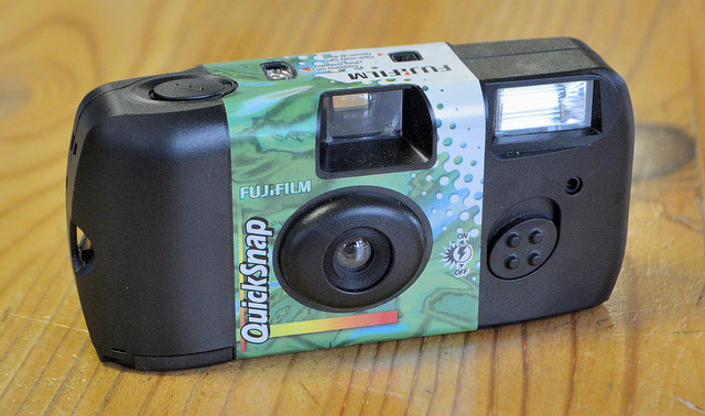
The Superia 200 is a daylight balanced film, sold in single rolls of 24-36 exposures or packs of 3 rolls. Originally Superia 200 was also offered in “110” cartridges. Although all these “110” films are already expired, eventually we can see some popping up on eBay.
| Name | Fujicolor Superia 200 |
| ISO | 200 |
| Developer | C-41, CN-16 |
| Available formats | 35mm |
| Exposures | 24-36 |
| DX coding | Yes |
| Availability | ★★★★☆
Widely available but discontinued since 2017. |

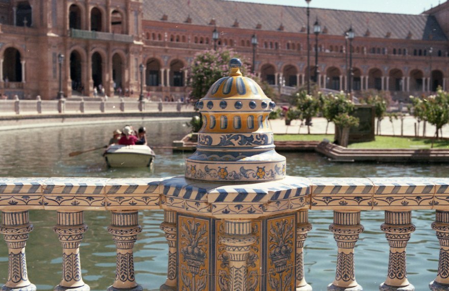
I bought 5-6 rolls of Superia 200 and shot it in the span of 15 months. I shot most of them with my trusty Nikon FM and the -now defunct- 50mm f1.4 Ai-s that I dropped while reviewing this film in Spain. Even with different cameras and lenses, it gave consistent results with vivid colors. Saturated colors, resulting in saturated skin colors, with a slight blueish-green tone in the shadows.

![[FILM] SPAIN holidays summer AUG2016 Nikon FM(s) Fujicolor Superia 200028](https://carlosgrphoto.com/wp-content/uploads/2017/10/film-spain-holidays-summer-aug2016-nikon-fms-fujicolor-superia-200028.jpg?w=880)
Reds and greens are very intense, it makes red tones and especially brown tones like the clay tiles or the facade in the picture turn into a darker crimson tone. It definitely gives an interesting tonality to warm colors, however, it also gives a pinkish tone to skin tones that I don’t find pleasant. In almost every picture, except in those too overexposed, people in it look like if they just finished a 5K run, pink cheeks, and red shadows.

![[FILM] SPAIN holidays summer AUG2016 Nikon FM(s) Fujicolor Superia 200023](https://carlosgrphoto.com/wp-content/uploads/2017/10/film-spain-holidays-summer-aug2016-nikon-fms-fujicolor-superia-200023.jpg?w=880)
![[FILM] SPAIN holidays summer AUG2016 Nikon FM(s) Fujicolor Superia 200027](https://carlosgrphoto.com/wp-content/uploads/2017/10/film-spain-holidays-summer-aug2016-nikon-fms-fujicolor-superia-200027.jpg?w=880)
Blues are also very intense. Pictures with a blue sky or water will definitely benefit from it, tones look very deep and that helps to create really cool images. Again, in this clay tile floor, we can see the “pink” feeling that I mentioned before.

Yellows look really neutral. In this case the, cathedral was under tungsten light, and it really represents the real color. Not too bright, really appropriate and correct hues.


![[FILM] SPAIN summer vacation with my parents - AUG2016 - Nikon FM (S) - Fujifilm Superia 200 -033](https://i0.wp.com/carlosgrphoto.com/wp-content/uploads/2017/10/film-spain-summer-vacation-with-my-parents-aug2016-nikon-fm-s-fujifilm-superia-200-033.jpg?w=395&h=248&ssl=1 "[FILM] SPAIN summer vacation with my parents - AUG2016 - Nikon FM (S) - Fujifilm Superia 200 -033")
![[FILM] SPAIN holidays summer AUG2016 Nikon FM(s) Fujicolor Superia 200019](https://i0.wp.com/carlosgrphoto.com/wp-content/uploads/2017/10/film-spain-holidays-summer-aug2016-nikon-fms-fujicolor-superia-200019.jpg?w=477&h=756&ssl=1 "[FILM] SPAIN holidays summer AUG2016 Nikon FM(s) Fujicolor Superia 200019")

Ultimately, I used this film for some portraits, some under natural light, others with a direct flash. On subjects with different types of skin tone.
 Fujicolor Superia 200014")
 Fujicolor Superia 200008")
 Fujicolor Superia 200034")
Like I mentioned before, in different lights it gives pinkish tones that generally are quite unpleasant. Only when the film was overexposed the red tone disappears, but at that point, we were starting to lose detail in the subject’s features. With flash is slightly better, I think this film really pairs with cheap compact cameras, with that tiny flash included.
Compared to Fujicolor C200
![[FILM] TAIWAN camping KTV MAR2017 Nikon F100 Fujicolor C200016](https://carlosgrphoto.com/wp-content/uploads/2017/10/film-taiwan-camping-ktv-mar2017-nikon-f100-fujicolor-c200016.jpg?w=880)
Fujicolor C200 renders much better skin tones hand down, with or without flash the tones are much more pleasant (always in my opinion) than Superia 200.
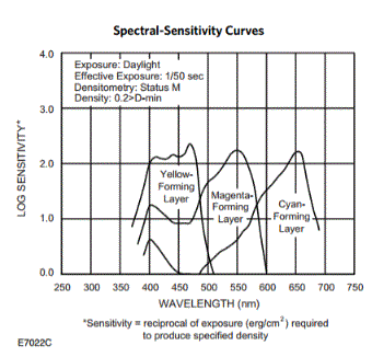
Color chart and measurement of the colors.
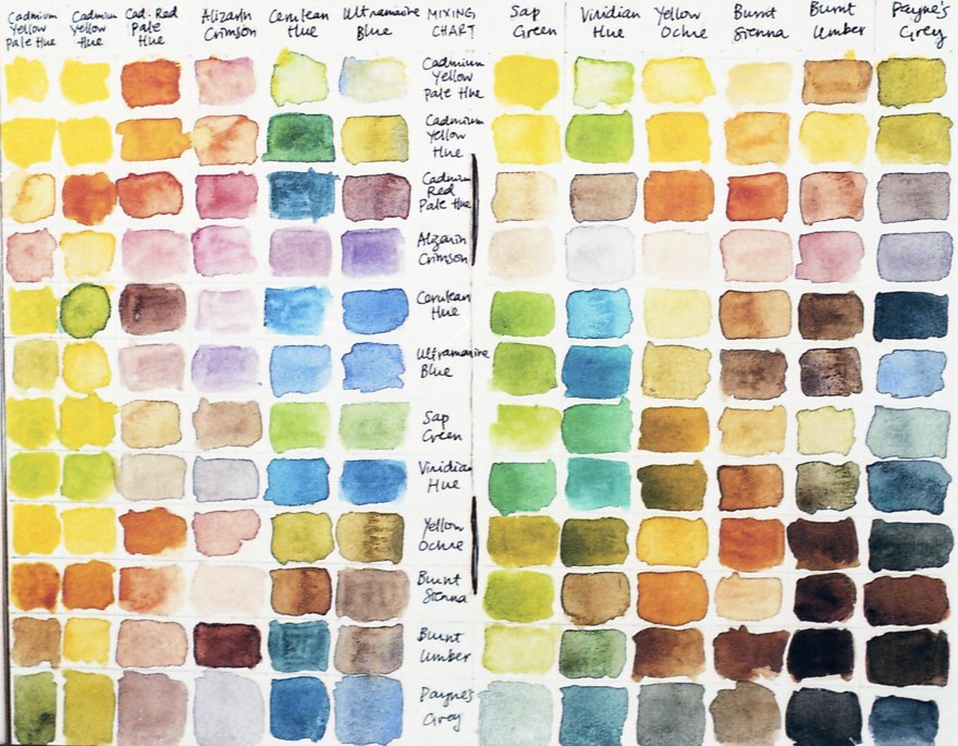
RED Average Colour R:219.0 G:127.0 B:88.0
GREEN Average Colour R:170.0 G:201.0 B:92.0
YELLOW Average Colour R:248.0 G:225.0 B:85.0
BLUE Average Colour R:68.0 G:120.0 B:166.0
You can take also a look at this article on How do I measure the colors?

Summing up, Superia is a well balanced film. Vivid colors, very intense reds. It really reminds me to the Fujicolor Industrial 100. It pairs very well with compact cameras, you can use the bright colors and a high depth of field as a part of your composition. It pairs greatly with an electronic flash.
The Superia 200 would never be my first choice in almost any situation. I can’t stand the pink skin tones and green shadows. Is not the cheapest, is not a high ISO film, and currently discontinued, will just make prices go higher. I would definitely go for Kodak Gold 200 in that price range. If you really like the Fujifilm color palette, I would opt for C200 instead. Fujicolor C200 is cheaper, more available and better reproduction of colors. I believe, that was part of Fujifilm’s decission to choose C200 to stay over the Superia 200.
![[FILM] SPAIN summer vacation with my parents - AUG2016 - Nikon FM (S) - Fujifilm Superia 200 -018](https://carlosgrphoto.com/wp-content/uploads/2017/10/film-spain-summer-vacation-with-my-parents-aug2016-nikon-fm-s-fujifilm-superia-200-018.jpg?w=880)
Like I always mention, this reviews are completely subjective, based on my own taste and impressions. I’ve seen several great photos with Superia 200 online, but definitely is not my piece of cake. It’s a pity that Superia 200 is discontinued, but I will definitely not miss it.
YES ⇑
- For daily use, daylight balanced, medium ISO, really average priced.
- If you want a cheap film with saturated colors.
- If you like the characteristic Fujifilm color palette.
NO ⇓
- I wouldn’t use for portraits, it will give pink skin tones and, do not dare to underexposed, it will turn bright red.
- Pushing it to 400. Superia 400 stills in production and will cost you less than this one.
- If you plan a long term project. Go for a film that stills in production, otherwise the consistency of your job will be compromised.
Check out the gallery for more shots taken with this film!


![[FILM] SPAIN summer vacation with my parents - AUG2016 - Nikon FM (S) - Fujifilm Superia 200 -033](https://i0.wp.com/carlosgrphoto.com/wp-content/uploads/2017/10/film-spain-summer-vacation-with-my-parents-aug2016-nikon-fm-s-fujifilm-superia-200-033.jpg?w=288&h=181&ssl=1 "[FILM] SPAIN summer vacation with my parents - AUG2016 - Nikon FM (S) - Fujifilm Superia 200 -033")
![[FILM] SPAIN summer vacation with my parents - AUG2016 - Nikon FM (S) - Fujifilm Superia 200 -032](https://i0.wp.com/carlosgrphoto.com/wp-content/uploads/2017/10/film-spain-summer-vacation-with-my-parents-aug2016-nikon-fm-s-fujifilm-superia-200-032.jpg?w=288&h=180&ssl=1 "[FILM] SPAIN summer vacation with my parents - AUG2016 - Nikon FM (S) - Fujifilm Superia 200 -032")
![[FILM] SPAIN summer vacation with my parents - AUG2016 - Nikon FM (S) - Fujifilm Superia 200 -030](https://i0.wp.com/carlosgrphoto.com/wp-content/uploads/2017/10/film-spain-summer-vacation-with-my-parents-aug2016-nikon-fm-s-fujifilm-superia-200-030.jpg?w=395&h=247&ssl=1 "[FILM] SPAIN summer vacation with my parents - AUG2016 - Nikon FM (S) - Fujifilm Superia 200 -030")
![[FILM] SPAIN summer vacation with my parents - AUG2016 - Nikon FM (S) - Fujifilm Superia 200 -028](https://i0.wp.com/carlosgrphoto.com/wp-content/uploads/2017/10/film-spain-summer-vacation-with-my-parents-aug2016-nikon-fm-s-fujifilm-superia-200-028.jpg?w=157&h=247&ssl=1 "[FILM] SPAIN summer vacation with my parents - AUG2016 - Nikon FM (S) - Fujifilm Superia 200 -028")
![[FILM] SPAIN summer vacation with my parents - AUG2016 - Nikon FM (S) - Fujifilm Superia 200 -027](https://i0.wp.com/carlosgrphoto.com/wp-content/uploads/2017/10/film-spain-summer-vacation-with-my-parents-aug2016-nikon-fm-s-fujifilm-superia-200-027.jpg?w=156&h=247&ssl=1 "[FILM] SPAIN summer vacation with my parents - AUG2016 - Nikon FM (S) - Fujifilm Superia 200 -027")
![[FILM] SPAIN summer vacation with my parents - AUG2016 - Nikon FM (S) - Fujifilm Superia 200 -026](https://i0.wp.com/carlosgrphoto.com/wp-content/uploads/2017/10/film-spain-summer-vacation-with-my-parents-aug2016-nikon-fm-s-fujifilm-superia-200-026.jpg?w=156&h=247&ssl=1 "[FILM] SPAIN summer vacation with my parents - AUG2016 - Nikon FM (S) - Fujifilm Superia 200 -026")
![[FILM] SPAIN summer vacation with my parents - AUG2016 - Nikon FM (S) - Fujifilm Superia 200 -018](https://i0.wp.com/carlosgrphoto.com/wp-content/uploads/2017/10/film-spain-summer-vacation-with-my-parents-aug2016-nikon-fm-s-fujifilm-superia-200-018.jpg?w=616&h=399&ssl=1 "[FILM] SPAIN summer vacation with my parents - AUG2016 - Nikon FM (S) - Fujifilm Superia 200 -018")
![[FILM] SPAIN summer vacation with my parents - AUG2016 - Nikon FM (S) - Fujifilm Superia 200 -013](https://i0.wp.com/carlosgrphoto.com/wp-content/uploads/2017/10/film-spain-summer-vacation-with-my-parents-aug2016-nikon-fm-s-fujifilm-superia-200-013.jpg?w=256&h=399&ssl=1 "[FILM] SPAIN summer vacation with my parents - AUG2016 - Nikon FM (S) - Fujifilm Superia 200 -013")
![[FILM] SPAIN summer vacation with my parents - AUG2016 - Nikon FM (S) - Fujifilm Superia 200 -011](https://i0.wp.com/carlosgrphoto.com/wp-content/uploads/2017/10/film-spain-summer-vacation-with-my-parents-aug2016-nikon-fm-s-fujifilm-superia-200-011.jpg?w=311&h=194&ssl=1 "[FILM] SPAIN summer vacation with my parents - AUG2016 - Nikon FM (S) - Fujifilm Superia 200 -011")
![[FILM] SPAIN summer vacation with my parents - AUG2016 - Nikon FM (S) - Fujifilm Superia 200 -009](https://i0.wp.com/carlosgrphoto.com/wp-content/uploads/2017/10/film-spain-summer-vacation-with-my-parents-aug2016-nikon-fm-s-fujifilm-superia-200-009.jpg?w=311&h=195&ssl=1 "[FILM] SPAIN summer vacation with my parents - AUG2016 - Nikon FM (S) - Fujifilm Superia 200 -009")
![[FILM] SPAIN summer vacation with my parents - AUG2016 - Nikon FM (S) - Fujifilm Superia 200 -005](https://i0.wp.com/carlosgrphoto.com/wp-content/uploads/2017/10/film-spain-summer-vacation-with-my-parents-aug2016-nikon-fm-s-fujifilm-superia-200-005.jpg?w=250&h=393&ssl=1 "[FILM] SPAIN summer vacation with my parents - AUG2016 - Nikon FM (S) - Fujifilm Superia 200 -005")
![[FILM] SPAIN summer vacation with my parents - AUG2016 - Nikon FM (S) - Fujifilm Superia 200 -003](https://i0.wp.com/carlosgrphoto.com/wp-content/uploads/2017/10/film-spain-summer-vacation-with-my-parents-aug2016-nikon-fm-s-fujifilm-superia-200-003.jpg?w=307&h=194&ssl=1 "[FILM] SPAIN summer vacation with my parents - AUG2016 - Nikon FM (S) - Fujifilm Superia 200 -003")
![[FILM] SPAIN summer vacation with my parents - AUG2016 - Nikon FM (S) - Fujifilm Superia 200 -002](https://i0.wp.com/carlosgrphoto.com/wp-content/uploads/2017/10/film-spain-summer-vacation-with-my-parents-aug2016-nikon-fm-s-fujifilm-superia-200-002.jpg?w=307&h=195&ssl=1 "[FILM] SPAIN summer vacation with my parents - AUG2016 - Nikon FM (S) - Fujifilm Superia 200 -002")
![[FILM] Spain summer - AUG2016 - Nikon FM Fuji Superia 200 -067](https://i0.wp.com/carlosgrphoto.com/wp-content/uploads/2017/10/film-spain-summer-aug2016-nikon-fm-fuji-superia-200-067.jpg?w=576&h=375&ssl=1 "[FILM] Spain summer - AUG2016 - Nikon FM Fuji Superia 200 -067")
![[FILM] Spain summer - AUG2016 - Nikon FM Fuji Superia 200 -066](https://i0.wp.com/carlosgrphoto.com/wp-content/uploads/2017/10/film-spain-summer-aug2016-nikon-fm-fuji-superia-200-066.jpg?w=296&h=186&ssl=1 "[FILM] Spain summer - AUG2016 - Nikon FM Fuji Superia 200 -066")
![[FILM] Spain summer - AUG2016 - Nikon FM Fuji Superia 200 -063](https://i0.wp.com/carlosgrphoto.com/wp-content/uploads/2017/10/film-spain-summer-aug2016-nikon-fm-fuji-superia-200-063.jpg?w=296&h=185&ssl=1 "[FILM] Spain summer - AUG2016 - Nikon FM Fuji Superia 200 -063")
![[FILM] Spain summer - AUG2016 - Nikon FM Fuji Superia 200 -052](https://i0.wp.com/carlosgrphoto.com/wp-content/uploads/2017/10/film-spain-summer-aug2016-nikon-fm-fuji-superia-200-052.jpg?w=298&h=190&ssl=1 "[FILM] Spain summer - AUG2016 - Nikon FM Fuji Superia 200 -052")
![[FILM] Spain summer - AUG2016 - Nikon FM Fuji Superia 200 -049](https://i0.wp.com/carlosgrphoto.com/wp-content/uploads/2017/10/film-spain-summer-aug2016-nikon-fm-fuji-superia-200-049.jpg?w=298&h=181&ssl=1 "[FILM] Spain summer - AUG2016 - Nikon FM Fuji Superia 200 -049")
![[FILM] Spain summer - AUG2016 - Nikon FM Fuji Superia 200 -042](https://i0.wp.com/carlosgrphoto.com/wp-content/uploads/2017/10/film-spain-summer-aug2016-nikon-fm-fuji-superia-200-042.jpg?w=574&h=375&ssl=1 "[FILM] Spain summer - AUG2016 - Nikon FM Fuji Superia 200 -042")
![[FILM] Spain summer - AUG2016 - Nikon FM Fuji Superia 200 -040](https://i0.wp.com/carlosgrphoto.com/wp-content/uploads/2017/10/film-spain-summer-aug2016-nikon-fm-fuji-superia-200-040.jpg?w=623&h=395&ssl=1 "[FILM] Spain summer - AUG2016 - Nikon FM Fuji Superia 200 -040")
![[FILM] Spain summer - AUG2016 - Nikon FM Fuji Superia 200 -039](https://i0.wp.com/carlosgrphoto.com/wp-content/uploads/2017/10/film-spain-summer-aug2016-nikon-fm-fuji-superia-200-039.jpg?w=249&h=395&ssl=1 "[FILM] Spain summer - AUG2016 - Nikon FM Fuji Superia 200 -039")
![[FILM] Spain summer - AUG2016 - Nikon FM Fuji Superia 200 -037](https://i0.wp.com/carlosgrphoto.com/wp-content/uploads/2017/10/film-spain-summer-aug2016-nikon-fm-fuji-superia-200-037.jpg?w=436&h=279&ssl=1 "[FILM] Spain summer - AUG2016 - Nikon FM Fuji Superia 200 -037")
![[FILM] Spain summer - AUG2016 - Nikon FM Fuji Superia 200 -036](https://i0.wp.com/carlosgrphoto.com/wp-content/uploads/2017/10/film-spain-summer-aug2016-nikon-fm-fuji-superia-200-036.jpg?w=436&h=279&ssl=1 "[FILM] Spain summer - AUG2016 - Nikon FM Fuji Superia 200 -036")
 Fujicolor Superia 200034")
![[FILM] SPAIN holidays summer AUG2016 Nikon FM(s) Fujicolor Superia 200028](https://i0.wp.com/carlosgrphoto.com/wp-content/uploads/2017/10/film-spain-holidays-summer-aug2016-nikon-fms-fujicolor-superia-200028.jpg?w=385&h=242&ssl=1 "[FILM] SPAIN holidays summer AUG2016 Nikon FM(s) Fujicolor Superia 200028")
![[FILM] SPAIN holidays summer AUG2016 Nikon FM(s) Fujicolor Superia 200027](https://i0.wp.com/carlosgrphoto.com/wp-content/uploads/2017/10/film-spain-holidays-summer-aug2016-nikon-fms-fujicolor-superia-200027.jpg?w=385&h=241&ssl=1 "[FILM] SPAIN holidays summer AUG2016 Nikon FM(s) Fujicolor Superia 200027")
![[FILM] SPAIN holidays summer AUG2016 Nikon FM(s) Fujicolor Superia 200024](https://i0.wp.com/carlosgrphoto.com/wp-content/uploads/2017/10/film-spain-holidays-summer-aug2016-nikon-fms-fujicolor-superia-200024.jpg?w=487&h=737&ssl=1 "[FILM] SPAIN holidays summer AUG2016 Nikon FM(s) Fujicolor Superia 200024")
![[FILM] SPAIN holidays summer AUG2016 Nikon FM(s) Fujicolor Superia 200023](https://i0.wp.com/carlosgrphoto.com/wp-content/uploads/2017/10/film-spain-holidays-summer-aug2016-nikon-fms-fujicolor-superia-200023.jpg?w=584&h=366&ssl=1 "[FILM] SPAIN holidays summer AUG2016 Nikon FM(s) Fujicolor Superia 200023")
![[FILM] SPAIN holidays summer AUG2016 Nikon FM(s) Fujicolor Superia 200022](https://i0.wp.com/carlosgrphoto.com/wp-content/uploads/2017/10/film-spain-holidays-summer-aug2016-nikon-fms-fujicolor-superia-200022.jpg?w=288&h=181&ssl=1 "[FILM] SPAIN holidays summer AUG2016 Nikon FM(s) Fujicolor Superia 200022")
![[FILM] SPAIN holidays summer AUG2016 Nikon FM(s) Fujicolor Superia 200020](https://i0.wp.com/carlosgrphoto.com/wp-content/uploads/2017/10/film-spain-holidays-summer-aug2016-nikon-fms-fujicolor-superia-200020.jpg?w=288&h=181&ssl=1 "[FILM] SPAIN holidays summer AUG2016 Nikon FM(s) Fujicolor Superia 200020")
![[FILM] SPAIN holidays summer AUG2016 Nikon FM(s) Fujicolor Superia 200019](https://i0.wp.com/carlosgrphoto.com/wp-content/uploads/2017/10/film-spain-holidays-summer-aug2016-nikon-fms-fujicolor-superia-200019.jpg?w=265&h=421&ssl=1 "[FILM] SPAIN holidays summer AUG2016 Nikon FM(s) Fujicolor Superia 200019")
 Fujicolor Superia 200014")
 Fujicolor Superia 200008")
![[FILM] SPAIN holidays summer AUG2016 Nikon FM(s) Fujicolor Superia 200001](https://i0.wp.com/carlosgrphoto.com/wp-content/uploads/2017/10/film-spain-holidays-summer-aug2016-nikon-fms-fujicolor-superia-200001.jpg?w=270&h=421&ssl=1 "[FILM] SPAIN holidays summer AUG2016 Nikon FM(s) Fujicolor Superia 200001")


![[FILM] TAIWAN tamkang tamsui JUN2017 Olympus OM-30 Kodak Vision3 50D018](https://carlosgrphoto.com/wp-content/uploads/2017/07/film-taiwan-tamkang-tamsui-jun2017-olympus-om-30-kodak-vision3-50d018.jpg?w=880)
![[FILM] TAIWAN tamkang tamsui JUN2017 Olympus OM-30 Kodak Vision3 50D031](https://carlosgrphoto.com/wp-content/uploads/2017/07/film-taiwan-tamkang-tamsui-jun2017-olympus-om-30-kodak-vision3-50d031.jpg?w=880)
![[FILM] TAIWAN tamkang tamsui JUN2017 Olympus OM-30 Kodak Vision3 50D030](https://carlosgrphoto.com/wp-content/uploads/2017/07/film-taiwan-tamkang-tamsui-jun2017-olympus-om-30-kodak-vision3-50d030.jpg?w=880)
![[FILM] TAIWAN tamkang tamsui JUN2017 Olympus OM-30 Kodak Vision3 50D003](https://carlosgrphoto.com/wp-content/uploads/2017/07/film-taiwan-tamkang-tamsui-jun2017-olympus-om-30-kodak-vision3-50d003.jpg?w=880)
![[FILM] TAIWAN tamkang tamsui JUN2017 Olympus OM-30 Kodak Vision3 50D012](https://carlosgrphoto.com/wp-content/uploads/2017/07/film-taiwan-tamkang-tamsui-jun2017-olympus-om-30-kodak-vision3-50d012.jpg?w=880)
![[FILM] TAIWAN tamkang tamsui JUN2017 Olympus OM-30 Kodak Vision3 50D011](https://carlosgrphoto.com/wp-content/uploads/2017/07/film-taiwan-tamkang-tamsui-jun2017-olympus-om-30-kodak-vision3-50d011.jpg?w=880)
![[FILM] TAIWAN tamkang tamsui JUN2017 Olympus OM-30 Kodak Vision3 50D007](https://carlosgrphoto.com/wp-content/uploads/2017/07/film-taiwan-tamkang-tamsui-jun2017-olympus-om-30-kodak-vision3-50d007.jpg?w=880)
![[FILM] TAIWAN tamkang tamsui JUN2017 Olympus OM-30 Kodak Vision3 50D008](https://carlosgrphoto.com/wp-content/uploads/2017/07/film-taiwan-tamkang-tamsui-jun2017-olympus-om-30-kodak-vision3-50d008.jpg?w=880)
![[FILM] TAIWAN tamkang tamsui JUN2017 Olympus OM-30 Kodak Vision3 50D005](https://carlosgrphoto.com/wp-content/uploads/2017/07/film-taiwan-tamkang-tamsui-jun2017-olympus-om-30-kodak-vision3-50d005.jpg?w=880)
![[FILM] TAIWAN tamkang tamsui JUN2017 Olympus OM-30 Kodak Vision3 50D002](https://carlosgrphoto.com/wp-content/uploads/2017/07/film-taiwan-tamkang-tamsui-jun2017-olympus-om-30-kodak-vision3-50d002.jpg?w=880)
![[FILM] TAIWAN tamkang tamsui JUN2017 Olympus OM-30 Kodak Vision3 50D023](https://i0.wp.com/carlosgrphoto.com/wp-content/uploads/2017/07/film-taiwan-tamkang-tamsui-jun2017-olympus-om-30-kodak-vision3-50d023.jpg?w=436&h=436&crop=1&ssl=1 "[FILM] TAIWAN tamkang tamsui JUN2017 Olympus OM-30 Kodak Vision3 50D023")
![[FILM] TAIWAN tamkang tamsui JUN2017 Olympus OM-30 Kodak Vision3 50D021](https://i0.wp.com/carlosgrphoto.com/wp-content/uploads/2017/07/film-taiwan-tamkang-tamsui-jun2017-olympus-om-30-kodak-vision3-50d021.jpg?w=436&h=436&crop=1&ssl=1 "[FILM] TAIWAN tamkang tamsui JUN2017 Olympus OM-30 Kodak Vision3 50D021")


![[FILM] TAIWAN tamkang tamsui JUN2017 Olympus OM-30 Kodak Vision3 50D014](https://carlosgrphoto.com/wp-content/uploads/2017/07/film-taiwan-tamkang-tamsui-jun2017-olympus-om-30-kodak-vision3-50d014.jpg?w=880)
![[FILM] TAIWAN tamkang tamsui JUN2017 Olympus OM-30 Kodak Vision3 50D026](https://i0.wp.com/carlosgrphoto.com/wp-content/uploads/2017/07/film-taiwan-tamkang-tamsui-jun2017-olympus-om-30-kodak-vision3-50d026.jpg?w=393&h=249&ssl=1 "[FILM] TAIWAN tamkang tamsui JUN2017 Olympus OM-30 Kodak Vision3 50D026")
![[FILM] TAIWAN tamkang tamsui JUN2017 Olympus OM-30 Kodak Vision3 50D036](https://i0.wp.com/carlosgrphoto.com/wp-content/uploads/2017/07/film-taiwan-tamkang-tamsui-jun2017-olympus-om-30-kodak-vision3-50d036.jpg?w=393&h=246&ssl=1 "[FILM] TAIWAN tamkang tamsui JUN2017 Olympus OM-30 Kodak Vision3 50D036")
![[FILM] TAIWAN tamkang tamsui JUN2017 Olympus OM-30 Kodak Vision3 50D010](https://i0.wp.com/carlosgrphoto.com/wp-content/uploads/2017/07/film-taiwan-tamkang-tamsui-jun2017-olympus-om-30-kodak-vision3-50d010.jpg?w=393&h=249&ssl=1 "[FILM] TAIWAN tamkang tamsui JUN2017 Olympus OM-30 Kodak Vision3 50D010")
![[FILM] TAIWAN tamkang tamsui JUN2017 Olympus OM-30 Kodak Vision3 50D004](https://i0.wp.com/carlosgrphoto.com/wp-content/uploads/2017/07/film-taiwan-tamkang-tamsui-jun2017-olympus-om-30-kodak-vision3-50d004.jpg?w=479&h=752&ssl=1 "[FILM] TAIWAN tamkang tamsui JUN2017 Olympus OM-30 Kodak Vision3 50D004")


![[FILM] TAIWAN tamkang tamsui JUN2017 Olympus OM-30 Kodak Vision3 50D038](https://i0.wp.com/carlosgrphoto.com/wp-content/uploads/2017/07/film-taiwan-tamkang-tamsui-jun2017-olympus-om-30-kodak-vision3-50d038.jpg?w=623&h=393&ssl=1 "[FILM] TAIWAN tamkang tamsui JUN2017 Olympus OM-30 Kodak Vision3 50D038")
![[FILM] TAIWAN tamkang tamsui JUN2017 Olympus OM-30 Kodak Vision3 50D036](https://i0.wp.com/carlosgrphoto.com/wp-content/uploads/2017/07/film-taiwan-tamkang-tamsui-jun2017-olympus-om-30-kodak-vision3-50d036.jpg?w=585&h=367&ssl=1 "[FILM] TAIWAN tamkang tamsui JUN2017 Olympus OM-30 Kodak Vision3 50D036")
![[FILM] TAIWAN tamkang tamsui JUN2017 Olympus OM-30 Kodak Vision3 50D035](https://i0.wp.com/carlosgrphoto.com/wp-content/uploads/2017/07/film-taiwan-tamkang-tamsui-jun2017-olympus-om-30-kodak-vision3-50d035.jpg?w=287&h=182&ssl=1 "[FILM] TAIWAN tamkang tamsui JUN2017 Olympus OM-30 Kodak Vision3 50D035")
![[FILM] TAIWAN tamkang tamsui JUN2017 Olympus OM-30 Kodak Vision3 50D034](https://i0.wp.com/carlosgrphoto.com/wp-content/uploads/2017/07/film-taiwan-tamkang-tamsui-jun2017-olympus-om-30-kodak-vision3-50d034.jpg?w=287&h=181&ssl=1 "[FILM] TAIWAN tamkang tamsui JUN2017 Olympus OM-30 Kodak Vision3 50D034")
![[FILM] TAIWAN tamkang tamsui JUN2017 Olympus OM-30 Kodak Vision3 50D033](https://i0.wp.com/carlosgrphoto.com/wp-content/uploads/2017/07/film-taiwan-tamkang-tamsui-jun2017-olympus-om-30-kodak-vision3-50d033.jpg?w=440&h=278&ssl=1 "[FILM] TAIWAN tamkang tamsui JUN2017 Olympus OM-30 Kodak Vision3 50D033")
![[FILM] TAIWAN tamkang tamsui JUN2017 Olympus OM-30 Kodak Vision3 50D031](https://i0.wp.com/carlosgrphoto.com/wp-content/uploads/2017/07/film-taiwan-tamkang-tamsui-jun2017-olympus-om-30-kodak-vision3-50d031.jpg?w=432&h=278&ssl=1 "[FILM] TAIWAN tamkang tamsui JUN2017 Olympus OM-30 Kodak Vision3 50D031")
![[FILM] TAIWAN tamkang tamsui JUN2017 Olympus OM-30 Kodak Vision3 50D030](https://i0.wp.com/carlosgrphoto.com/wp-content/uploads/2017/07/film-taiwan-tamkang-tamsui-jun2017-olympus-om-30-kodak-vision3-50d030.jpg?w=432&h=279&ssl=1 "[FILM] TAIWAN tamkang tamsui JUN2017 Olympus OM-30 Kodak Vision3 50D030")
![[FILM] TAIWAN tamkang tamsui JUN2017 Olympus OM-30 Kodak Vision3 50D029](https://i0.wp.com/carlosgrphoto.com/wp-content/uploads/2017/07/film-taiwan-tamkang-tamsui-jun2017-olympus-om-30-kodak-vision3-50d029.jpg?w=440&h=279&ssl=1 "[FILM] TAIWAN tamkang tamsui JUN2017 Olympus OM-30 Kodak Vision3 50D029")
![[FILM] TAIWAN tamkang tamsui JUN2017 Olympus OM-30 Kodak Vision3 50D028](https://i0.wp.com/carlosgrphoto.com/wp-content/uploads/2017/07/film-taiwan-tamkang-tamsui-jun2017-olympus-om-30-kodak-vision3-50d028.jpg?w=288&h=182&ssl=1 "[FILM] TAIWAN tamkang tamsui JUN2017 Olympus OM-30 Kodak Vision3 50D028")
![[FILM] TAIWAN tamkang tamsui JUN2017 Olympus OM-30 Kodak Vision3 50D027](https://i0.wp.com/carlosgrphoto.com/wp-content/uploads/2017/07/film-taiwan-tamkang-tamsui-jun2017-olympus-om-30-kodak-vision3-50d027.jpg?w=288&h=182&ssl=1 "[FILM] TAIWAN tamkang tamsui JUN2017 Olympus OM-30 Kodak Vision3 50D027")
![[FILM] TAIWAN tamkang tamsui JUN2017 Olympus OM-30 Kodak Vision3 50D023](https://i0.wp.com/carlosgrphoto.com/wp-content/uploads/2017/07/film-taiwan-tamkang-tamsui-jun2017-olympus-om-30-kodak-vision3-50d023.jpg?w=584&h=368&ssl=1 "[FILM] TAIWAN tamkang tamsui JUN2017 Olympus OM-30 Kodak Vision3 50D023")
![[FILM] TAIWAN tamkang tamsui JUN2017 Olympus OM-30 Kodak Vision3 50D021](https://i0.wp.com/carlosgrphoto.com/wp-content/uploads/2017/07/film-taiwan-tamkang-tamsui-jun2017-olympus-om-30-kodak-vision3-50d021.jpg?w=624&h=391&ssl=1 "[FILM] TAIWAN tamkang tamsui JUN2017 Olympus OM-30 Kodak Vision3 50D021")
![[FILM] TAIWAN tamkang tamsui JUN2017 Olympus OM-30 Kodak Vision3 50D025](https://i0.wp.com/carlosgrphoto.com/wp-content/uploads/2017/07/film-taiwan-tamkang-tamsui-jun2017-olympus-om-30-kodak-vision3-50d025.jpg?w=248&h=391&ssl=1 "[FILM] TAIWAN tamkang tamsui JUN2017 Olympus OM-30 Kodak Vision3 50D025")
![[FILM] TAIWAN tamkang tamsui JUN2017 Olympus OM-30 Kodak Vision3 50D026](https://i0.wp.com/carlosgrphoto.com/wp-content/uploads/2017/07/film-taiwan-tamkang-tamsui-jun2017-olympus-om-30-kodak-vision3-50d026.jpg?w=615&h=389&ssl=1 "[FILM] TAIWAN tamkang tamsui JUN2017 Olympus OM-30 Kodak Vision3 50D026")
![[FILM] TAIWAN tamkang tamsui JUN2017 Olympus OM-30 Kodak Vision3 50D018](https://i0.wp.com/carlosgrphoto.com/wp-content/uploads/2017/07/film-taiwan-tamkang-tamsui-jun2017-olympus-om-30-kodak-vision3-50d018.jpg?w=257&h=389&ssl=1 "[FILM] TAIWAN tamkang tamsui JUN2017 Olympus OM-30 Kodak Vision3 50D018")
![[FILM] TAIWAN tamkang tamsui JUN2017 Olympus OM-30 Kodak Vision3 50D017](https://i0.wp.com/carlosgrphoto.com/wp-content/uploads/2017/07/film-taiwan-tamkang-tamsui-jun2017-olympus-om-30-kodak-vision3-50d017.jpg?w=601&h=389&ssl=1 "[FILM] TAIWAN tamkang tamsui JUN2017 Olympus OM-30 Kodak Vision3 50D017")
![[FILM] TAIWAN tamkang tamsui JUN2017 Olympus OM-30 Kodak Vision3 50D016](https://i0.wp.com/carlosgrphoto.com/wp-content/uploads/2017/07/film-taiwan-tamkang-tamsui-jun2017-olympus-om-30-kodak-vision3-50d016.jpg?w=271&h=175&ssl=1 "[FILM] TAIWAN tamkang tamsui JUN2017 Olympus OM-30 Kodak Vision3 50D016")
![[FILM] TAIWAN tamkang tamsui JUN2017 Olympus OM-30 Kodak Vision3 50D014](https://i0.wp.com/carlosgrphoto.com/wp-content/uploads/2017/07/film-taiwan-tamkang-tamsui-jun2017-olympus-om-30-kodak-vision3-50d014.jpg?w=271&h=210&ssl=1 "[FILM] TAIWAN tamkang tamsui JUN2017 Olympus OM-30 Kodak Vision3 50D014")
![[FILM] TAIWAN tamkang tamsui JUN2017 Olympus OM-30 Kodak Vision3 50D012](https://i0.wp.com/carlosgrphoto.com/wp-content/uploads/2017/07/film-taiwan-tamkang-tamsui-jun2017-olympus-om-30-kodak-vision3-50d012.jpg?w=286&h=185&ssl=1 "[FILM] TAIWAN tamkang tamsui JUN2017 Olympus OM-30 Kodak Vision3 50D012")
![[FILM] TAIWAN tamkang tamsui JUN2017 Olympus OM-30 Kodak Vision3 50D011](https://i0.wp.com/carlosgrphoto.com/wp-content/uploads/2017/07/film-taiwan-tamkang-tamsui-jun2017-olympus-om-30-kodak-vision3-50d011.jpg?w=286&h=181&ssl=1 "[FILM] TAIWAN tamkang tamsui JUN2017 Olympus OM-30 Kodak Vision3 50D011")
![[FILM] TAIWAN tamkang tamsui JUN2017 Olympus OM-30 Kodak Vision3 50D010](https://i0.wp.com/carlosgrphoto.com/wp-content/uploads/2017/07/film-taiwan-tamkang-tamsui-jun2017-olympus-om-30-kodak-vision3-50d010.jpg?w=586&h=370&ssl=1 "[FILM] TAIWAN tamkang tamsui JUN2017 Olympus OM-30 Kodak Vision3 50D010")
![[FILM] TAIWAN tamkang tamsui JUN2017 Olympus OM-30 Kodak Vision3 50D009](https://i0.wp.com/carlosgrphoto.com/wp-content/uploads/2017/07/film-taiwan-tamkang-tamsui-jun2017-olympus-om-30-kodak-vision3-50d009.jpg?w=290&h=183&ssl=1 "[FILM] TAIWAN tamkang tamsui JUN2017 Olympus OM-30 Kodak Vision3 50D009")
![[FILM] TAIWAN tamkang tamsui JUN2017 Olympus OM-30 Kodak Vision3 50D008](https://i0.wp.com/carlosgrphoto.com/wp-content/uploads/2017/07/film-taiwan-tamkang-tamsui-jun2017-olympus-om-30-kodak-vision3-50d008.jpg?w=289&h=183&ssl=1 "[FILM] TAIWAN tamkang tamsui JUN2017 Olympus OM-30 Kodak Vision3 50D008")
![[FILM] TAIWAN tamkang tamsui JUN2017 Olympus OM-30 Kodak Vision3 50D007](https://i0.wp.com/carlosgrphoto.com/wp-content/uploads/2017/07/film-taiwan-tamkang-tamsui-jun2017-olympus-om-30-kodak-vision3-50d007.jpg?w=289&h=183&ssl=1 "[FILM] TAIWAN tamkang tamsui JUN2017 Olympus OM-30 Kodak Vision3 50D007")
![[FILM] TAIWAN tamkang tamsui JUN2017 Olympus OM-30 Kodak Vision3 50D006](https://i0.wp.com/carlosgrphoto.com/wp-content/uploads/2017/07/film-taiwan-tamkang-tamsui-jun2017-olympus-om-30-kodak-vision3-50d006.jpg?w=436&h=277&ssl=1 "[FILM] TAIWAN tamkang tamsui JUN2017 Olympus OM-30 Kodak Vision3 50D006")
![[FILM] TAIWAN tamkang tamsui JUN2017 Olympus OM-30 Kodak Vision3 50D005](https://i0.wp.com/carlosgrphoto.com/wp-content/uploads/2017/07/film-taiwan-tamkang-tamsui-jun2017-olympus-om-30-kodak-vision3-50d005.jpg?w=436&h=277&ssl=1 "[FILM] TAIWAN tamkang tamsui JUN2017 Olympus OM-30 Kodak Vision3 50D005")
![[FILM] TAIWAN tamkang tamsui JUN2017 Olympus OM-30 Kodak Vision3 50D004](https://i0.wp.com/carlosgrphoto.com/wp-content/uploads/2017/07/film-taiwan-tamkang-tamsui-jun2017-olympus-om-30-kodak-vision3-50d004.jpg?w=482&h=756&ssl=1 "[FILM] TAIWAN tamkang tamsui JUN2017 Olympus OM-30 Kodak Vision3 50D004")
![[FILM] TAIWAN tamkang tamsui JUN2017 Olympus OM-30 Kodak Vision3 50D003](https://i0.wp.com/carlosgrphoto.com/wp-content/uploads/2017/07/film-taiwan-tamkang-tamsui-jun2017-olympus-om-30-kodak-vision3-50d003.jpg?w=390&h=248&ssl=1 "[FILM] TAIWAN tamkang tamsui JUN2017 Olympus OM-30 Kodak Vision3 50D003")
![[FILM] TAIWAN tamkang tamsui JUN2017 Olympus OM-30 Kodak Vision3 50D002](https://i0.wp.com/carlosgrphoto.com/wp-content/uploads/2017/07/film-taiwan-tamkang-tamsui-jun2017-olympus-om-30-kodak-vision3-50d002.jpg?w=390&h=249&ssl=1 "[FILM] TAIWAN tamkang tamsui JUN2017 Olympus OM-30 Kodak Vision3 50D002")
![[FILM] TAIWAN tamkang tamsui JUN2017 Olympus OM-30 Kodak Vision3 50D001](https://i0.wp.com/carlosgrphoto.com/wp-content/uploads/2017/07/film-taiwan-tamkang-tamsui-jun2017-olympus-om-30-kodak-vision3-50d001.jpg?w=390&h=251&ssl=1 "[FILM] TAIWAN tamkang tamsui JUN2017 Olympus OM-30 Kodak Vision3 50D001")


![[FILM] TAIWAN friends sakura APR2017 Nikon F100 Fujicolor ProviaF 100029-2](https://carlosgrphoto.com/wp-content/uploads/2017/05/film-taiwan-friends-sakura-apr2017-nikon-f100-fujicolor-proviaf-100029-2.jpg?w=880)
![[FILM] TAIWAN friends sakura APR2017 Nikon F100 Fujicolor ProviaF 100005](https://carlosgrphoto.com/wp-content/uploads/2017/05/film-taiwan-friends-sakura-apr2017-nikon-f100-fujicolor-proviaf-100005.jpg?w=880)
![[FILM] TAIWAN friends sakura APR2017 Nikon F100 Fujicolor ProviaF 100025](https://carlosgrphoto.com/wp-content/uploads/2017/05/film-taiwan-friends-sakura-apr2017-nikon-f100-fujicolor-proviaf-100025.jpg?w=880)
![[FILM] TAIWAN friends sakura APR2017 Nikon F100 Fujicolor ProviaF 100022](https://carlosgrphoto.com/wp-content/uploads/2017/05/film-taiwan-friends-sakura-apr2017-nikon-f100-fujicolor-proviaf-100022.jpg?w=880)
![[FILM] TAIWAN friends sakura APR2017 Nikon F100 Fujicolor ProviaF 100013](https://carlosgrphoto.com/wp-content/uploads/2017/05/film-taiwan-friends-sakura-apr2017-nikon-f100-fujicolor-proviaf-100013.jpg?w=880)

![[FILM] TAIWAN friends sakura APR2017 Nikon F100 Fujicolor ProviaF 100006](https://carlosgrphoto.com/wp-content/uploads/2017/05/film-taiwan-friends-sakura-apr2017-nikon-f100-fujicolor-proviaf-100006.jpg?w=880)


![[FILM] TAIWAN friends sakura APR2017 Nikon F100 Fujicolor ProviaF 100017](https://carlosgrphoto.com/wp-content/uploads/2017/05/film-taiwan-friends-sakura-apr2017-nikon-f100-fujicolor-proviaf-100017.jpg?w=880)
![[FILM] TAIWAN friends sakura APR2017 Nikon F100 Fujicolor ProviaF 100015](https://i0.wp.com/carlosgrphoto.com/wp-content/uploads/2017/05/film-taiwan-friends-sakura-apr2017-nikon-f100-fujicolor-proviaf-100015.jpg?w=490&h=303&ssl=1 "[FILM] TAIWAN friends sakura APR2017 Nikon F100 Fujicolor ProviaF 100015")
![[FILM] TAIWAN friends sakura APR2017 Nikon F100 Fujicolor ProviaF 100027](https://i0.wp.com/carlosgrphoto.com/wp-content/uploads/2017/05/film-taiwan-friends-sakura-apr2017-nikon-f100-fujicolor-proviaf-100027.jpg?w=490&h=320&ssl=1 "[FILM] TAIWAN friends sakura APR2017 Nikon F100 Fujicolor ProviaF 100027")
![[FILM] TAIWAN friends sakura APR2017 Nikon F100 Fujicolor ProviaF 100023](https://i0.wp.com/carlosgrphoto.com/wp-content/uploads/2017/05/film-taiwan-friends-sakura-apr2017-nikon-f100-fujicolor-proviaf-100023.jpg?w=382&h=627&ssl=1 "[FILM] TAIWAN friends sakura APR2017 Nikon F100 Fujicolor ProviaF 100023")
![[FILM] TAIWAN friends sakura APR2017 Nikon F100 Fujicolor ProviaF 100027](https://i0.wp.com/carlosgrphoto.com/wp-content/uploads/2017/05/film-taiwan-friends-sakura-apr2017-nikon-f100-fujicolor-proviaf-100027.jpg?w=621&h=406&ssl=1 "[FILM] TAIWAN friends sakura APR2017 Nikon F100 Fujicolor ProviaF 100027")
![[FILM] TAIWAN friends sakura APR2017 Nikon F100 Fujicolor ProviaF 100026](https://i0.wp.com/carlosgrphoto.com/wp-content/uploads/2017/05/film-taiwan-friends-sakura-apr2017-nikon-f100-fujicolor-proviaf-100026.jpg?w=251&h=406&ssl=1 "[FILM] TAIWAN friends sakura APR2017 Nikon F100 Fujicolor ProviaF 100026")
![[FILM] TAIWAN friends sakura APR2017 Nikon F100 Fujicolor ProviaF 100025](https://i0.wp.com/carlosgrphoto.com/wp-content/uploads/2017/05/film-taiwan-friends-sakura-apr2017-nikon-f100-fujicolor-proviaf-100025.jpg?w=633&h=389&ssl=1 "[FILM] TAIWAN friends sakura APR2017 Nikon F100 Fujicolor ProviaF 100025")
![[FILM] TAIWAN friends sakura APR2017 Nikon F100 Fujicolor ProviaF 100024](https://i0.wp.com/carlosgrphoto.com/wp-content/uploads/2017/05/film-taiwan-friends-sakura-apr2017-nikon-f100-fujicolor-proviaf-100024.jpg?w=239&h=389&ssl=1 "[FILM] TAIWAN friends sakura APR2017 Nikon F100 Fujicolor ProviaF 100024")
![[FILM] TAIWAN friends sakura APR2017 Nikon F100 Fujicolor ProviaF 100023](https://i0.wp.com/carlosgrphoto.com/wp-content/uploads/2017/05/film-taiwan-friends-sakura-apr2017-nikon-f100-fujicolor-proviaf-100023.jpg?w=239&h=392&ssl=1 "[FILM] TAIWAN friends sakura APR2017 Nikon F100 Fujicolor ProviaF 100023")
![[FILM] TAIWAN friends sakura APR2017 Nikon F100 Fujicolor ProviaF 100022](https://i0.wp.com/carlosgrphoto.com/wp-content/uploads/2017/05/film-taiwan-friends-sakura-apr2017-nikon-f100-fujicolor-proviaf-100022.jpg?w=633&h=392&ssl=1 "[FILM] TAIWAN friends sakura APR2017 Nikon F100 Fujicolor ProviaF 100022")
![[FILM] TAIWAN friends sakura APR2017 Nikon F100 Fujicolor ProviaF 100021](https://i0.wp.com/carlosgrphoto.com/wp-content/uploads/2017/05/film-taiwan-friends-sakura-apr2017-nikon-f100-fujicolor-proviaf-100021.jpg?w=468&h=756&ssl=1 "[FILM] TAIWAN friends sakura APR2017 Nikon F100 Fujicolor ProviaF 100021")
![[FILM] TAIWAN friends sakura APR2017 Nikon F100 Fujicolor ProviaF 100020](https://i0.wp.com/carlosgrphoto.com/wp-content/uploads/2017/05/film-taiwan-friends-sakura-apr2017-nikon-f100-fujicolor-proviaf-100020.jpg?w=404&h=251&ssl=1 "[FILM] TAIWAN friends sakura APR2017 Nikon F100 Fujicolor ProviaF 100020")


![[FILM] TAIWAN friends sakura APR2017 Nikon F100 Fujicolor ProviaF 100017](https://i0.wp.com/carlosgrphoto.com/wp-content/uploads/2017/05/film-taiwan-friends-sakura-apr2017-nikon-f100-fujicolor-proviaf-100017.jpg?w=330&h=255&ssl=1 "[FILM] TAIWAN friends sakura APR2017 Nikon F100 Fujicolor ProviaF 100017")
![[FILM] TAIWAN friends sakura APR2017 Nikon F100 Fujicolor ProviaF 100015](https://i0.wp.com/carlosgrphoto.com/wp-content/uploads/2017/05/film-taiwan-friends-sakura-apr2017-nikon-f100-fujicolor-proviaf-100015.jpg?w=330&h=204&ssl=1 "[FILM] TAIWAN friends sakura APR2017 Nikon F100 Fujicolor ProviaF 100015")
![[FILM] TAIWAN friends sakura APR2017 Nikon F100 Fujicolor ProviaF 100014](https://i0.wp.com/carlosgrphoto.com/wp-content/uploads/2017/05/film-taiwan-friends-sakura-apr2017-nikon-f100-fujicolor-proviaf-100014.jpg?w=330&h=207&ssl=1 "[FILM] TAIWAN friends sakura APR2017 Nikon F100 Fujicolor ProviaF 100014")
![[FILM] TAIWAN friends sakura APR2017 Nikon F100 Fujicolor ProviaF 100013](https://i0.wp.com/carlosgrphoto.com/wp-content/uploads/2017/05/film-taiwan-friends-sakura-apr2017-nikon-f100-fujicolor-proviaf-100013.jpg?w=542&h=674&ssl=1 "[FILM] TAIWAN friends sakura APR2017 Nikon F100 Fujicolor ProviaF 100013")
![[FILM] TAIWAN friends sakura APR2017 Nikon F100 Fujicolor ProviaF 100012](https://i0.wp.com/carlosgrphoto.com/wp-content/uploads/2017/05/film-taiwan-friends-sakura-apr2017-nikon-f100-fujicolor-proviaf-100012.jpg?w=583&h=364&ssl=1 "[FILM] TAIWAN friends sakura APR2017 Nikon F100 Fujicolor ProviaF 100012")
![[FILM] TAIWAN friends sakura APR2017 Nikon F100 Fujicolor ProviaF 100011](https://i0.wp.com/carlosgrphoto.com/wp-content/uploads/2017/05/film-taiwan-friends-sakura-apr2017-nikon-f100-fujicolor-proviaf-100011.jpg?w=289&h=179&ssl=1 "[FILM] TAIWAN friends sakura APR2017 Nikon F100 Fujicolor ProviaF 100011")
![[FILM] TAIWAN friends sakura APR2017 Nikon F100 Fujicolor ProviaF 100010](https://i0.wp.com/carlosgrphoto.com/wp-content/uploads/2017/05/film-taiwan-friends-sakura-apr2017-nikon-f100-fujicolor-proviaf-100010.jpg?w=289&h=181&ssl=1 "[FILM] TAIWAN friends sakura APR2017 Nikon F100 Fujicolor ProviaF 100010")
![[FILM] TAIWAN friends sakura APR2017 Nikon F100 Fujicolor ProviaF 100009](https://i0.wp.com/carlosgrphoto.com/wp-content/uploads/2017/05/film-taiwan-friends-sakura-apr2017-nikon-f100-fujicolor-proviaf-100009.jpg?w=630&h=393&ssl=1 "[FILM] TAIWAN friends sakura APR2017 Nikon F100 Fujicolor ProviaF 100009")

![[FILM] TAIWAN friends sakura APR2017 Nikon F100 Fujicolor ProviaF 100007](https://i0.wp.com/carlosgrphoto.com/wp-content/uploads/2017/05/film-taiwan-friends-sakura-apr2017-nikon-f100-fujicolor-proviaf-100007.jpg?w=629&h=391&ssl=1 "[FILM] TAIWAN friends sakura APR2017 Nikon F100 Fujicolor ProviaF 100007")
![[FILM] TAIWAN friends sakura APR2017 Nikon F100 Fujicolor ProviaF 100006](https://i0.wp.com/carlosgrphoto.com/wp-content/uploads/2017/05/film-taiwan-friends-sakura-apr2017-nikon-f100-fujicolor-proviaf-100006.jpg?w=243&h=391&ssl=1 "[FILM] TAIWAN friends sakura APR2017 Nikon F100 Fujicolor ProviaF 100006")
![[FILM] TAIWAN friends sakura APR2017 Nikon F100 Fujicolor ProviaF 100005](https://i0.wp.com/carlosgrphoto.com/wp-content/uploads/2017/05/film-taiwan-friends-sakura-apr2017-nikon-f100-fujicolor-proviaf-100005.jpg?w=489&h=306&ssl=1 "[FILM] TAIWAN friends sakura APR2017 Nikon F100 Fujicolor ProviaF 100005")
![[FILM] TAIWAN friends sakura APR2017 Nikon F100 Fujicolor ProviaF 100004](https://i0.wp.com/carlosgrphoto.com/wp-content/uploads/2017/05/film-taiwan-friends-sakura-apr2017-nikon-f100-fujicolor-proviaf-100004.jpg?w=489&h=303&ssl=1 "[FILM] TAIWAN friends sakura APR2017 Nikon F100 Fujicolor ProviaF 100004")


![[FILM] TAIWAN Beach Taipei APR2017 Nikon FM(B) Adox Color Implosion 100 @200034](https://carlosgrphoto.com/wp-content/uploads/2017/05/film-taiwan-beach-taipei-apr2017-nikon-fmb-adox-color-implosion-100-200034.jpg?w=880)
![[FILM] TAIWAN Beach Taipei APR2017 Nikon FM(B) Adox Color Implosion 100 @200020](https://carlosgrphoto.com/wp-content/uploads/2017/05/film-taiwan-beach-taipei-apr2017-nikon-fmb-adox-color-implosion-100-200020.jpg?w=880)

![[FILM] TAIWAN Beach Taipei APR2017 Nikon FM(B) Adox Color Implosion 100 @200016](https://carlosgrphoto.com/wp-content/uploads/2017/05/film-taiwan-beach-taipei-apr2017-nikon-fmb-adox-color-implosion-100-200016.jpg?w=880)
![[FILM] TAIWAN Beach Taipei APR2017 Nikon FM(B) Adox Color Implosion 100 @200031](https://carlosgrphoto.com/wp-content/uploads/2017/05/film-taiwan-beach-taipei-apr2017-nikon-fmb-adox-color-implosion-100-200031.jpg?w=880)
![[FILM] TAIWAN Beach Taipei APR2017 Nikon FM(B) Adox Color Implosion 100 @200011](https://carlosgrphoto.com/wp-content/uploads/2017/05/film-taiwan-beach-taipei-apr2017-nikon-fmb-adox-color-implosion-100-200011.jpg?w=880)
![[FILM] TAIWAN Beach Taipei APR2017 Nikon FM(B) Adox Color Implosion 100 @200024](https://carlosgrphoto.com/wp-content/uploads/2017/05/film-taiwan-beach-taipei-apr2017-nikon-fmb-adox-color-implosion-100-200024.jpg?w=880)
![[FILM] TAIWAN Beach Taipei APR2017 Nikon FM(B) Adox Color Implosion 100 @200025](https://carlosgrphoto.com/wp-content/uploads/2017/05/film-taiwan-beach-taipei-apr2017-nikon-fmb-adox-color-implosion-100-200025.jpg?w=880)
 Adox Color Implosion 100 @200015")
 Adox Color Implosion 100 @200014")
 Adox Color Implosion 100 @200012")
 Adox Color Implosion 100 @200001")
![[FILM] TAIWAN Beach Taipei APR2017 Nikon FM(B) Adox Color Implosion 100 @200010](https://carlosgrphoto.com/wp-content/uploads/2017/05/film-taiwan-beach-taipei-apr2017-nikon-fmb-adox-color-implosion-100-200010.jpg?w=880)
![[FILM] TAIWAN Beach Taipei APR2017 Nikon FM(B) Adox Color Implosion 100 @200030](https://carlosgrphoto.com/wp-content/uploads/2017/05/film-taiwan-beach-taipei-apr2017-nikon-fmb-adox-color-implosion-100-200030.jpg?w=880)
![[FILM] TAIWAN Beach Taipei APR2017 Nikon FM(B) Adox Color Implosion 100 @200029](https://carlosgrphoto.com/wp-content/uploads/2017/05/film-taiwan-beach-taipei-apr2017-nikon-fmb-adox-color-implosion-100-200029.jpg?w=880)
![[FILM] TAIWAN Beach Taipei APR2017 Nikon FM(B) Adox Color Implosion 100 @200028](https://carlosgrphoto.com/wp-content/uploads/2017/05/film-taiwan-beach-taipei-apr2017-nikon-fmb-adox-color-implosion-100-200028.jpg?w=880)
![[FILM] TAIWAN Beach Taipei APR2017 Nikon FM(B) Adox Color Implosion 100 @200030](https://i0.wp.com/carlosgrphoto.com/wp-content/uploads/2017/05/film-taiwan-beach-taipei-apr2017-nikon-fmb-adox-color-implosion-100-200030.jpg?w=289&h=289&crop=1&ssl=1 "[FILM] TAIWAN Beach Taipei APR2017 Nikon FM(B) Adox Color Implosion 100 @200030")
![[FILM] TAIWAN Beach Taipei APR2017 Nikon FM(B) Adox Color Implosion 100 @200029](https://i0.wp.com/carlosgrphoto.com/wp-content/uploads/2017/05/film-taiwan-beach-taipei-apr2017-nikon-fmb-adox-color-implosion-100-200029.jpg?w=289&h=289&crop=1&ssl=1 "[FILM] TAIWAN Beach Taipei APR2017 Nikon FM(B) Adox Color Implosion 100 @200029")
![[FILM] TAIWAN Beach Taipei APR2017 Nikon FM(B) Adox Color Implosion 100 @200028](https://i0.wp.com/carlosgrphoto.com/wp-content/uploads/2017/05/film-taiwan-beach-taipei-apr2017-nikon-fmb-adox-color-implosion-100-200028.jpg?w=289&h=289&crop=1&ssl=1 "[FILM] TAIWAN Beach Taipei APR2017 Nikon FM(B) Adox Color Implosion 100 @200028")
![[FILM] TAIWAN Beach Taipei APR2017 Nikon FM(B) Adox Color Implosion 100 @200002](https://carlosgrphoto.com/wp-content/uploads/2017/05/film-taiwan-beach-taipei-apr2017-nikon-fmb-adox-color-implosion-100-200002.jpg?w=880)
![[FILM] TAIWAN Beach Taipei APR2017 Nikon FM(B) Adox Color Implosion 100 @200006](https://i0.wp.com/carlosgrphoto.com/wp-content/uploads/2017/05/film-taiwan-beach-taipei-apr2017-nikon-fmb-adox-color-implosion-100-200006.jpg?w=449&h=674&ssl=1 "[FILM] TAIWAN Beach Taipei APR2017 Nikon FM(B) Adox Color Implosion 100 @200006")
![[FILM] TAIWAN Beach Taipei APR2017 Nikon FM(B) Adox Color Implosion 100 @200021](https://i0.wp.com/carlosgrphoto.com/wp-content/uploads/2017/05/film-taiwan-beach-taipei-apr2017-nikon-fmb-adox-color-implosion-100-200021.jpg?w=423&h=674&ssl=1 "[FILM] TAIWAN Beach Taipei APR2017 Nikon FM(B) Adox Color Implosion 100 @200021")
![[FILM] TAIWAN Beach Taipei APR2017 Nikon FM(B) Adox Color Implosion 100 @200004](https://i0.wp.com/carlosgrphoto.com/wp-content/uploads/2017/05/film-taiwan-beach-taipei-apr2017-nikon-fmb-adox-color-implosion-100-200004.jpg?w=876&h=562&ssl=1 "[FILM] TAIWAN Beach Taipei APR2017 Nikon FM(B) Adox Color Implosion 100 @200004")
![[FILM] TAIWAN Beach Taipei APR2017 Nikon FM(B) Adox Color Implosion 100 @200035](https://i0.wp.com/carlosgrphoto.com/wp-content/uploads/2017/05/film-taiwan-beach-taipei-apr2017-nikon-fmb-adox-color-implosion-100-200035.jpg?w=439&h=700&ssl=1 "[FILM] TAIWAN Beach Taipei APR2017 Nikon FM(B) Adox Color Implosion 100 @200035")
![[FILM] TAIWAN Beach Taipei APR2017 Nikon FM(B) Adox Color Implosion 100 @200034](https://i0.wp.com/carlosgrphoto.com/wp-content/uploads/2017/05/film-taiwan-beach-taipei-apr2017-nikon-fmb-adox-color-implosion-100-200034.jpg?w=433&h=700&ssl=1 "[FILM] TAIWAN Beach Taipei APR2017 Nikon FM(B) Adox Color Implosion 100 @200034")
![[FILM] TAIWAN Beach Taipei APR2017 Nikon FM(B) Adox Color Implosion 100 @200033](https://i0.wp.com/carlosgrphoto.com/wp-content/uploads/2017/05/film-taiwan-beach-taipei-apr2017-nikon-fmb-adox-color-implosion-100-200033.jpg?w=312&h=193&ssl=1 "[FILM] TAIWAN Beach Taipei APR2017 Nikon FM(B) Adox Color Implosion 100 @200033")
![[FILM] TAIWAN Beach Taipei APR2017 Nikon FM(B) Adox Color Implosion 100 @200032](https://i0.wp.com/carlosgrphoto.com/wp-content/uploads/2017/05/film-taiwan-beach-taipei-apr2017-nikon-fmb-adox-color-implosion-100-200032.jpg?w=312&h=194&ssl=1 "[FILM] TAIWAN Beach Taipei APR2017 Nikon FM(B) Adox Color Implosion 100 @200032")
![[FILM] TAIWAN Beach Taipei APR2017 Nikon FM(B) Adox Color Implosion 100 @200031](https://i0.wp.com/carlosgrphoto.com/wp-content/uploads/2017/05/film-taiwan-beach-taipei-apr2017-nikon-fmb-adox-color-implosion-100-200031.jpg?w=251&h=391&ssl=1 "[FILM] TAIWAN Beach Taipei APR2017 Nikon FM(B) Adox Color Implosion 100 @200031")
![[FILM] TAIWAN Beach Taipei APR2017 Nikon FM(B) Adox Color Implosion 100 @200030](https://i0.wp.com/carlosgrphoto.com/wp-content/uploads/2017/05/film-taiwan-beach-taipei-apr2017-nikon-fmb-adox-color-implosion-100-200030.jpg?w=305&h=194&ssl=1 "[FILM] TAIWAN Beach Taipei APR2017 Nikon FM(B) Adox Color Implosion 100 @200030")
![[FILM] TAIWAN Beach Taipei APR2017 Nikon FM(B) Adox Color Implosion 100 @200029](https://i0.wp.com/carlosgrphoto.com/wp-content/uploads/2017/05/film-taiwan-beach-taipei-apr2017-nikon-fmb-adox-color-implosion-100-200029.jpg?w=305&h=193&ssl=1 "[FILM] TAIWAN Beach Taipei APR2017 Nikon FM(B) Adox Color Implosion 100 @200029")
![[FILM] TAIWAN Beach Taipei APR2017 Nikon FM(B) Adox Color Implosion 100 @200028](https://i0.wp.com/carlosgrphoto.com/wp-content/uploads/2017/05/film-taiwan-beach-taipei-apr2017-nikon-fmb-adox-color-implosion-100-200028.jpg?w=623&h=396&ssl=1 "[FILM] TAIWAN Beach Taipei APR2017 Nikon FM(B) Adox Color Implosion 100 @200028")
![[FILM] TAIWAN Beach Taipei APR2017 Nikon FM(B) Adox Color Implosion 100 @200023](https://i0.wp.com/carlosgrphoto.com/wp-content/uploads/2017/05/film-taiwan-beach-taipei-apr2017-nikon-fmb-adox-color-implosion-100-200023.jpg?w=249&h=396&ssl=1 "[FILM] TAIWAN Beach Taipei APR2017 Nikon FM(B) Adox Color Implosion 100 @200023")
![[FILM] TAIWAN Beach Taipei APR2017 Nikon FM(B) Adox Color Implosion 100 @200024](https://i0.wp.com/carlosgrphoto.com/wp-content/uploads/2017/05/film-taiwan-beach-taipei-apr2017-nikon-fmb-adox-color-implosion-100-200024.jpg?w=395&h=248&ssl=1 "[FILM] TAIWAN Beach Taipei APR2017 Nikon FM(B) Adox Color Implosion 100 @200024")
![[FILM] TAIWAN Beach Taipei APR2017 Nikon FM(B) Adox Color Implosion 100 @200025](https://i0.wp.com/carlosgrphoto.com/wp-content/uploads/2017/05/film-taiwan-beach-taipei-apr2017-nikon-fmb-adox-color-implosion-100-200025.jpg?w=395&h=251&ssl=1 "[FILM] TAIWAN Beach Taipei APR2017 Nikon FM(B) Adox Color Implosion 100 @200025")
![[FILM] TAIWAN Beach Taipei APR2017 Nikon FM(B) Adox Color Implosion 100 @200027](https://i0.wp.com/carlosgrphoto.com/wp-content/uploads/2017/05/film-taiwan-beach-taipei-apr2017-nikon-fmb-adox-color-implosion-100-200027.jpg?w=395&h=252&ssl=1 "[FILM] TAIWAN Beach Taipei APR2017 Nikon FM(B) Adox Color Implosion 100 @200027")
![[FILM] TAIWAN Beach Taipei APR2017 Nikon FM(B) Adox Color Implosion 100 @200021](https://i0.wp.com/carlosgrphoto.com/wp-content/uploads/2017/05/film-taiwan-beach-taipei-apr2017-nikon-fmb-adox-color-implosion-100-200021.jpg?w=477&h=759&ssl=1 "[FILM] TAIWAN Beach Taipei APR2017 Nikon FM(B) Adox Color Implosion 100 @200021")
![[FILM] TAIWAN Beach Taipei APR2017 Nikon FM(B) Adox Color Implosion 100 @200020](https://i0.wp.com/carlosgrphoto.com/wp-content/uploads/2017/05/film-taiwan-beach-taipei-apr2017-nikon-fmb-adox-color-implosion-100-200020.jpg?w=433&h=684&ssl=1 "[FILM] TAIWAN Beach Taipei APR2017 Nikon FM(B) Adox Color Implosion 100 @200020")
![[FILM] TAIWAN Beach Taipei APR2017 Nikon FM(B) Adox Color Implosion 100 @200016](https://i0.wp.com/carlosgrphoto.com/wp-content/uploads/2017/05/film-taiwan-beach-taipei-apr2017-nikon-fmb-adox-color-implosion-100-200016.jpg?w=439&h=684&ssl=1 "[FILM] TAIWAN Beach Taipei APR2017 Nikon FM(B) Adox Color Implosion 100 @200016")
 Adox Color Implosion 100 @200015")
 Adox Color Implosion 100 @200014")
 Adox Color Implosion 100 @200012")
![[FILM] TAIWAN Beach Taipei APR2017 Nikon FM(B) Adox Color Implosion 100 @200011](https://i0.wp.com/carlosgrphoto.com/wp-content/uploads/2017/05/film-taiwan-beach-taipei-apr2017-nikon-fmb-adox-color-implosion-100-200011.jpg?w=623&h=394&ssl=1 "[FILM] TAIWAN Beach Taipei APR2017 Nikon FM(B) Adox Color Implosion 100 @200011")
![[FILM] TAIWAN Beach Taipei APR2017 Nikon FM(B) Adox Color Implosion 100 @200010](https://i0.wp.com/carlosgrphoto.com/wp-content/uploads/2017/05/film-taiwan-beach-taipei-apr2017-nikon-fmb-adox-color-implosion-100-200010.jpg?w=249&h=394&ssl=1 "[FILM] TAIWAN Beach Taipei APR2017 Nikon FM(B) Adox Color Implosion 100 @200010")
![[FILM] TAIWAN Beach Taipei APR2017 Nikon FM(B) Adox Color Implosion 100 @200009](https://i0.wp.com/carlosgrphoto.com/wp-content/uploads/2017/05/film-taiwan-beach-taipei-apr2017-nikon-fmb-adox-color-implosion-100-200009.jpg?w=471&h=299&ssl=1 "[FILM] TAIWAN Beach Taipei APR2017 Nikon FM(B) Adox Color Implosion 100 @200009")
![[FILM] TAIWAN Beach Taipei APR2017 Nikon FM(B) Adox Color Implosion 100 @200008](https://i0.wp.com/carlosgrphoto.com/wp-content/uploads/2017/05/film-taiwan-beach-taipei-apr2017-nikon-fmb-adox-color-implosion-100-200008.jpg?w=471&h=299&ssl=1 "[FILM] TAIWAN Beach Taipei APR2017 Nikon FM(B) Adox Color Implosion 100 @200008")
![[FILM] TAIWAN Beach Taipei APR2017 Nikon FM(B) Adox Color Implosion 100 @200006](https://i0.wp.com/carlosgrphoto.com/wp-content/uploads/2017/05/film-taiwan-beach-taipei-apr2017-nikon-fmb-adox-color-implosion-100-200006.jpg?w=401&h=602&ssl=1 "[FILM] TAIWAN Beach Taipei APR2017 Nikon FM(B) Adox Color Implosion 100 @200006")
![[FILM] TAIWAN Beach Taipei APR2017 Nikon FM(B) Adox Color Implosion 100 @200005](https://i0.wp.com/carlosgrphoto.com/wp-content/uploads/2017/05/film-taiwan-beach-taipei-apr2017-nikon-fmb-adox-color-implosion-100-200005.jpg?w=435&h=280&ssl=1 "[FILM] TAIWAN Beach Taipei APR2017 Nikon FM(B) Adox Color Implosion 100 @200005")
![[FILM] TAIWAN Beach Taipei APR2017 Nikon FM(B) Adox Color Implosion 100 @200004](https://i0.wp.com/carlosgrphoto.com/wp-content/uploads/2017/05/film-taiwan-beach-taipei-apr2017-nikon-fmb-adox-color-implosion-100-200004.jpg?w=437&h=280&ssl=1 "[FILM] TAIWAN Beach Taipei APR2017 Nikon FM(B) Adox Color Implosion 100 @200004")
![[FILM] TAIWAN Beach Taipei APR2017 Nikon FM(B) Adox Color Implosion 100 @200003](https://i0.wp.com/carlosgrphoto.com/wp-content/uploads/2017/05/film-taiwan-beach-taipei-apr2017-nikon-fmb-adox-color-implosion-100-200003.jpg?w=603&h=387&ssl=1 "[FILM] TAIWAN Beach Taipei APR2017 Nikon FM(B) Adox Color Implosion 100 @200003")
![[FILM] TAIWAN Beach Taipei APR2017 Nikon FM(B) Adox Color Implosion 100 @200002](https://i0.wp.com/carlosgrphoto.com/wp-content/uploads/2017/05/film-taiwan-beach-taipei-apr2017-nikon-fmb-adox-color-implosion-100-200002.jpg?w=269&h=211&ssl=1 "[FILM] TAIWAN Beach Taipei APR2017 Nikon FM(B) Adox Color Implosion 100 @200002")
 Adox Color Implosion 100 @200001")


![[FILM] US TAIWAN makiko iowa Nikon FM(B) Fujifilm Superia 800-020](https://carlosgrphoto.com/wp-content/uploads/2017/04/film-us-taiwan-makiko-iowa-nikon-fmb-fujifilm-superia-800-020.jpg?w=880)
![[FILM] US TAIWAN makiko iowa Nikon FM(B) Fujifilm Superia 800-023](https://carlosgrphoto.com/wp-content/uploads/2017/04/film-us-taiwan-makiko-iowa-nikon-fmb-fujifilm-superia-800-023.jpg?w=880)
![[FILM] US TAIWAN makiko iowa Nikon FM(B) Fujifilm Superia 800-022](https://carlosgrphoto.com/wp-content/uploads/2017/04/film-us-taiwan-makiko-iowa-nikon-fmb-fujifilm-superia-800-022.jpg?w=880)
![[FILM] US TAIWAN makiko iowa Nikon FM(B) Fujifilm Superia 800-014](https://carlosgrphoto.com/wp-content/uploads/2017/04/film-us-taiwan-makiko-iowa-nikon-fmb-fujifilm-superia-800-014.jpg?w=880)
![[FILM] US TAIWAN makiko iowa Nikon FM(B) Fujifilm Superia 800-015](https://carlosgrphoto.com/wp-content/uploads/2017/04/film-us-taiwan-makiko-iowa-nikon-fmb-fujifilm-superia-800-015.jpg?w=880)
![[FILM] US TAIWAN makiko iowa Nikon FM(B) Fujifilm Superia 800-010](https://carlosgrphoto.com/wp-content/uploads/2017/04/film-us-taiwan-makiko-iowa-nikon-fmb-fujifilm-superia-800-010.jpg?w=880)
![[FILM] US TAIWAN makiko iowa Nikon FM(B) Fujifilm Superia 800-021](https://carlosgrphoto.com/wp-content/uploads/2017/04/film-us-taiwan-makiko-iowa-nikon-fmb-fujifilm-superia-800-021.jpg?w=880)
 Fujifilm Superia 800-020")
 Fujifilm Superia 800-019")
 Fujifilm Superia 800-007")
 Fujifilm Superia 800-006")
![[FILM] TAIWAN US portraits makiko test Nikon FM(S) Kodak Gold 200 003-2](https://carlosgrphoto.com/wp-content/uploads/2017/03/film-taiwan-us-portraits-makiko-test-nikon-fms-kodak-gold-200-003-2.jpg?w=880)
![[FILM] US TAIWAN makiko iowa Nikon FM(B) Fujifilm Superia 800-007-2](https://carlosgrphoto.com/wp-content/uploads/2017/04/film-us-taiwan-makiko-iowa-nikon-fmb-fujifilm-superia-800-007-2.jpg?w=880)
![[FILM] US TAIWAN makiko iowa Nikon FM(B) Fujifilm Superia 800-018](https://carlosgrphoto.com/wp-content/uploads/2017/04/film-us-taiwan-makiko-iowa-nikon-fmb-fujifilm-superia-800-018.jpg?w=880)
![[FILM] US TAIWAN makiko iowa Nikon FM(B) Fujifilm Superia 800-009](https://carlosgrphoto.com/wp-content/uploads/2017/04/film-us-taiwan-makiko-iowa-nikon-fmb-fujifilm-superia-800-009.jpg?w=880)
![[FILM] US TAIWAN makiko iowa Nikon FM(B) Fujifilm Superia 800-001](https://carlosgrphoto.com/wp-content/uploads/2017/04/film-us-taiwan-makiko-iowa-nikon-fmb-fujifilm-superia-800-001.jpg?w=880)

![[FILM] US TAIWAN makiko iowa Nikon FM(B) Fujifilm Superia 800-024](https://i0.wp.com/carlosgrphoto.com/wp-content/uploads/2017/04/film-us-taiwan-makiko-iowa-nikon-fmb-fujifilm-superia-800-024.jpg?w=617&h=390&ssl=1 "[FILM] US TAIWAN makiko iowa Nikon FM(B) Fujifilm Superia 800-024")
![[FILM] US TAIWAN makiko iowa Nikon FM(B) Fujifilm Superia 800-023](https://i0.wp.com/carlosgrphoto.com/wp-content/uploads/2017/04/film-us-taiwan-makiko-iowa-nikon-fmb-fujifilm-superia-800-023.jpg?w=255&h=390&ssl=1 "[FILM] US TAIWAN makiko iowa Nikon FM(B) Fujifilm Superia 800-023")
![[FILM] US TAIWAN makiko iowa Nikon FM(B) Fujifilm Superia 800-022](https://i0.wp.com/carlosgrphoto.com/wp-content/uploads/2017/04/film-us-taiwan-makiko-iowa-nikon-fmb-fujifilm-superia-800-022.jpg?w=583&h=366&ssl=1 "[FILM] US TAIWAN makiko iowa Nikon FM(B) Fujifilm Superia 800-022")
![[FILM] US TAIWAN makiko iowa Nikon FM(B) Fujifilm Superia 800-021](https://i0.wp.com/carlosgrphoto.com/wp-content/uploads/2017/04/film-us-taiwan-makiko-iowa-nikon-fmb-fujifilm-superia-800-021.jpg?w=289&h=182&ssl=1 "[FILM] US TAIWAN makiko iowa Nikon FM(B) Fujifilm Superia 800-021")
 Fujifilm Superia 800-020")
 Fujifilm Superia 800-019")
![[FILM] US TAIWAN makiko iowa Nikon FM(B) Fujifilm Superia 800-025](https://i0.wp.com/carlosgrphoto.com/wp-content/uploads/2017/04/film-us-taiwan-makiko-iowa-nikon-fmb-fujifilm-superia-800-025.jpg?w=329&h=210&ssl=1 "[FILM] US TAIWAN makiko iowa Nikon FM(B) Fujifilm Superia 800-025")
![[FILM] US TAIWAN makiko iowa Nikon FM(B) Fujifilm Superia 800-018](https://i0.wp.com/carlosgrphoto.com/wp-content/uploads/2017/04/film-us-taiwan-makiko-iowa-nikon-fmb-fujifilm-superia-800-018.jpg?w=543&h=419&ssl=1 "[FILM] US TAIWAN makiko iowa Nikon FM(B) Fujifilm Superia 800-018")
![[FILM] US TAIWAN makiko iowa Nikon FM(B) Fujifilm Superia 800-016](https://i0.wp.com/carlosgrphoto.com/wp-content/uploads/2017/04/film-us-taiwan-makiko-iowa-nikon-fmb-fujifilm-superia-800-016.jpg?w=438&h=273&ssl=1 "[FILM] US TAIWAN makiko iowa Nikon FM(B) Fujifilm Superia 800-016")
![[FILM] US TAIWAN makiko iowa Nikon FM(B) Fujifilm Superia 800-015](https://i0.wp.com/carlosgrphoto.com/wp-content/uploads/2017/04/film-us-taiwan-makiko-iowa-nikon-fmb-fujifilm-superia-800-015.jpg?w=434&h=273&ssl=1 "[FILM] US TAIWAN makiko iowa Nikon FM(B) Fujifilm Superia 800-015")
![[FILM] US TAIWAN makiko iowa Nikon FM(B) Fujifilm Superia 800-014](https://i0.wp.com/carlosgrphoto.com/wp-content/uploads/2017/04/film-us-taiwan-makiko-iowa-nikon-fmb-fujifilm-superia-800-014.jpg?w=392&h=250&ssl=1 "[FILM] US TAIWAN makiko iowa Nikon FM(B) Fujifilm Superia 800-014")
![[FILM] US TAIWAN makiko iowa Nikon FM(B) Fujifilm Superia 800-013](https://i0.wp.com/carlosgrphoto.com/wp-content/uploads/2017/04/film-us-taiwan-makiko-iowa-nikon-fmb-fujifilm-superia-800-013.jpg?w=392&h=251&ssl=1 "[FILM] US TAIWAN makiko iowa Nikon FM(B) Fujifilm Superia 800-013")
![[FILM] US TAIWAN makiko iowa Nikon FM(B) Fujifilm Superia 800-012](https://i0.wp.com/carlosgrphoto.com/wp-content/uploads/2017/04/film-us-taiwan-makiko-iowa-nikon-fmb-fujifilm-superia-800-012.jpg?w=392&h=254&ssl=1 "[FILM] US TAIWAN makiko iowa Nikon FM(B) Fujifilm Superia 800-012")
 Fujifilm Superia 800-007")
 Fujifilm Superia 800-006")
![[FILM] US TAIWAN makiko iowa Nikon FM(B) Fujifilm Superia 800-010](https://i0.wp.com/carlosgrphoto.com/wp-content/uploads/2017/04/film-us-taiwan-makiko-iowa-nikon-fmb-fujifilm-superia-800-010.jpg?w=293&h=183&ssl=1 "[FILM] US TAIWAN makiko iowa Nikon FM(B) Fujifilm Superia 800-010")
![[FILM] US TAIWAN makiko iowa Nikon FM(B) Fujifilm Superia 800-009](https://i0.wp.com/carlosgrphoto.com/wp-content/uploads/2017/04/film-us-taiwan-makiko-iowa-nikon-fmb-fujifilm-superia-800-009.jpg?w=293&h=184&ssl=1 "[FILM] US TAIWAN makiko iowa Nikon FM(B) Fujifilm Superia 800-009")
![[FILM] US TAIWAN makiko iowa Nikon FM(B) Fujifilm Superia 800-004](https://i0.wp.com/carlosgrphoto.com/wp-content/uploads/2017/04/film-us-taiwan-makiko-iowa-nikon-fmb-fujifilm-superia-800-004.jpg?w=484&h=308&ssl=1 "[FILM] US TAIWAN makiko iowa Nikon FM(B) Fujifilm Superia 800-004")
![[FILM] US TAIWAN makiko iowa Nikon FM(B) Fujifilm Superia 800-003](https://i0.wp.com/carlosgrphoto.com/wp-content/uploads/2017/04/film-us-taiwan-makiko-iowa-nikon-fmb-fujifilm-superia-800-003.jpg?w=484&h=305&ssl=1 "[FILM] US TAIWAN makiko iowa Nikon FM(B) Fujifilm Superia 800-003")
![[FILM] US TAIWAN makiko iowa Nikon FM(B) Fujifilm Superia 800-002](https://i0.wp.com/carlosgrphoto.com/wp-content/uploads/2017/04/film-us-taiwan-makiko-iowa-nikon-fmb-fujifilm-superia-800-002.jpg?w=388&h=617&ssl=1 "[FILM] US TAIWAN makiko iowa Nikon FM(B) Fujifilm Superia 800-002")
![[FILM] US TAIWAN makiko iowa Nikon FM(B) Fujifilm Superia 800-005](https://i0.wp.com/carlosgrphoto.com/wp-content/uploads/2017/04/film-us-taiwan-makiko-iowa-nikon-fmb-fujifilm-superia-800-005.jpg?w=224&h=141&ssl=1 "[FILM] US TAIWAN makiko iowa Nikon FM(B) Fujifilm Superia 800-005")
![[FILM] US TAIWAN makiko iowa Nikon FM(B) Fujifilm Superia 800-001](https://i0.wp.com/carlosgrphoto.com/wp-content/uploads/2017/04/film-us-taiwan-makiko-iowa-nikon-fmb-fujifilm-superia-800-001.jpg?w=224&h=141&ssl=1 "[FILM] US TAIWAN makiko iowa Nikon FM(B) Fujifilm Superia 800-001")

![[FILM] USA TAIWAN chritmas sanxia - Nikon FM(B) - Tudor 200001](https://i0.wp.com/carlosgrphoto.com/wp-content/uploads/2017/04/film-usa-taiwan-chritmas-sanxia-nikon-fmb-tudor-200001.jpg?w=141&h=141&crop=1&ssl=1 "[FILM] USA TAIWAN chritmas sanxia - Nikon FM(B) - Tudor 200001")


![[FILM] USA christmas DEC2016 - Nikon FM (s) - Kodak Gold 200 -038](https://carlosgrphoto.com/wp-content/uploads/2017/03/film-usa-christmas-dec2016-nikon-fm-s-kodak-gold-200-038.jpg?w=880)
![[FILM] USA TAIWAN christmas finals JAN2017 Nikon FM(s) Kodak Gold 200 -003](https://carlosgrphoto.com/wp-content/uploads/2017/03/film-usa-taiwan-christmas-finals-jan2017-nikon-fms-kodak-gold-200-003.jpg?w=880)
![[FILM] TAIWAN US portraits makiko test Nikon FM(S) Kodak Gold 200 011](https://carlosgrphoto.com/wp-content/uploads/2017/03/film-taiwan-us-portraits-makiko-test-nikon-fms-kodak-gold-200-011.jpg?w=880)
![[FILM] TAIWAN US portraits makiko test Nikon FM(S) Kodak Gold 200 013](https://carlosgrphoto.com/wp-content/uploads/2017/03/film-taiwan-us-portraits-makiko-test-nikon-fms-kodak-gold-200-013.jpg?w=880)
![[FILM] USA TAIWAN christmas finals JAN2017 Nikon FM(s) Kodak Gold 200 -012](https://carlosgrphoto.com/wp-content/uploads/2017/03/film-usa-taiwan-christmas-finals-jan2017-nikon-fms-kodak-gold-200-012.jpg?w=880)
![[FILM] TAIWAN US portraits makiko test Nikon FM(S) Kodak Gold 200 006](https://carlosgrphoto.com/wp-content/uploads/2017/03/film-taiwan-us-portraits-makiko-test-nikon-fms-kodak-gold-200-006.jpg?w=880)
![[FILM] USA TAIWAN christmas finals JAN2017 Nikon FM(s) Kodak Gold 200 -015](https://carlosgrphoto.com/wp-content/uploads/2017/03/film-usa-taiwan-christmas-finals-jan2017-nikon-fms-kodak-gold-200-015.jpg?w=880)
 Kodak Gold 200 003")
 Kodak Gold 200 004")
 Kodak Gold 200 018")
 Kodak Gold 200 019")
![[FILM] TAIWAN US portraits makiko test Nikon FM(S) Kodak Gold 200 003](https://carlosgrphoto.com/wp-content/uploads/2017/03/film-taiwan-us-portraits-makiko-test-nikon-fms-kodak-gold-200-003.jpg?w=402&h=254)
![[FILM] TAIWAN US portraits makiko test Nikon FM(S) Kodak Gold 200 003-2](https://carlosgrphoto.com/wp-content/uploads/2017/03/film-taiwan-us-portraits-makiko-test-nikon-fms-kodak-gold-200-003-2.jpg?w=408&h=258)
![[FILM] TAIWAN US portraits makiko test Nikon FM(S) Kodak Gold 200 010](https://carlosgrphoto.com/wp-content/uploads/2017/03/film-taiwan-us-portraits-makiko-test-nikon-fms-kodak-gold-200-010.jpg?w=880)
![[FILM] USA christmas DEC2016 - Nikon FM (s) - Kodak Gold 200 -017](https://carlosgrphoto.com/wp-content/uploads/2017/03/film-usa-christmas-dec2016-nikon-fm-s-kodak-gold-200-017.jpg?w=880)
![[FILM] TAIWAN US portraits makiko test Nikon FM(S) Kodak Gold 200 017](https://carlosgrphoto.com/wp-content/uploads/2017/03/film-taiwan-us-portraits-makiko-test-nikon-fms-kodak-gold-200-017.jpg?w=880)
![[FILM] USA TAIWAN christmas finals JAN2017 Nikon FM(s) Kodak Gold 200 -024](https://carlosgrphoto.com/wp-content/uploads/2017/03/film-usa-taiwan-christmas-finals-jan2017-nikon-fms-kodak-gold-200-024.jpg?w=880)
![[FILM] USA christmas DEC2016 - Nikon FM (s) - Kodak Gold 200 -023](https://i0.wp.com/carlosgrphoto.com/wp-content/uploads/2017/03/film-usa-christmas-dec2016-nikon-fm-s-kodak-gold-200-023.jpg?w=269&h=174&ssl=1 "[FILM] USA christmas DEC2016 - Nikon FM (s) - Kodak Gold 200 -023")
![[FILM] USA christmas DEC2016 - Nikon FM (s) - Kodak Gold 200 -034](https://i0.wp.com/carlosgrphoto.com/wp-content/uploads/2017/03/film-usa-christmas-dec2016-nikon-fm-s-kodak-gold-200-034.jpg?w=269&h=169&ssl=1 "[FILM] USA christmas DEC2016 - Nikon FM (s) - Kodak Gold 200 -034")
 Kodak Gold 200 004")
![[FILM] TAIWAN US portraits makiko test Nikon FM(S) Kodak Gold 200 014](https://i0.wp.com/carlosgrphoto.com/wp-content/uploads/2017/03/film-taiwan-us-portraits-makiko-test-nikon-fms-kodak-gold-200-014.jpg?w=330&h=524&ssl=1 "[FILM] TAIWAN US portraits makiko test Nikon FM(S) Kodak Gold 200 014")
![[FILM] TAIWAN US portraits makiko test Nikon FM(S) Kodak Gold 200 009](https://i0.wp.com/carlosgrphoto.com/wp-content/uploads/2017/03/film-taiwan-us-portraits-makiko-test-nikon-fms-kodak-gold-200-009.jpg?w=269&h=171&ssl=1 "[FILM] TAIWAN US portraits makiko test Nikon FM(S) Kodak Gold 200 009")
![[FILM] USA christmas DEC2016 - Nikon FM (s) - Kodak Gold 200 -024](https://i0.wp.com/carlosgrphoto.com/wp-content/uploads/2017/03/film-usa-christmas-dec2016-nikon-fm-s-kodak-gold-200-024.jpg?w=269&h=171&ssl=1 "[FILM] USA christmas DEC2016 - Nikon FM (s) - Kodak Gold 200 -024")
![[FILM] USA TAIWAN christmas finals JAN2017 Nikon FM(s) Kodak Gold 200 -003](https://i0.wp.com/carlosgrphoto.com/wp-content/uploads/2017/03/film-usa-taiwan-christmas-finals-jan2017-nikon-fms-kodak-gold-200-003.jpg?w=269&h=174&ssl=1 "[FILM] USA TAIWAN christmas finals JAN2017 Nikon FM(s) Kodak Gold 200 -003")
![[FILM] USA TAIWAN christmas finals JAN2017 Nikon FM(s) Kodak Gold 200 -023](https://i0.wp.com/carlosgrphoto.com/wp-content/uploads/2017/03/film-usa-taiwan-christmas-finals-jan2017-nikon-fms-kodak-gold-200-023.jpg?w=437&h=272&ssl=1 "[FILM] USA TAIWAN christmas finals JAN2017 Nikon FM(s) Kodak Gold 200 -023")
![[FILM] USA TAIWAN christmas finals JAN2017 Nikon FM(s) Kodak Gold 200 -007](https://i0.wp.com/carlosgrphoto.com/wp-content/uploads/2017/03/film-usa-taiwan-christmas-finals-jan2017-nikon-fms-kodak-gold-200-007.jpg?w=435&h=272&ssl=1 "[FILM] USA TAIWAN christmas finals JAN2017 Nikon FM(s) Kodak Gold 200 -007")
![[FILM] USA TAIWAN christmas finals JAN2017 Nikon FM(s) Kodak Gold 200 -026](https://i0.wp.com/carlosgrphoto.com/wp-content/uploads/2017/03/film-usa-taiwan-christmas-finals-jan2017-nikon-fms-kodak-gold-200-026.jpg?w=293&h=181&ssl=1 "[FILM] USA TAIWAN christmas finals JAN2017 Nikon FM(s) Kodak Gold 200 -026")
![[FILM] USA TAIWAN christmas finals JAN2017 Nikon FM(s) Kodak Gold 200 -019](https://i0.wp.com/carlosgrphoto.com/wp-content/uploads/2017/03/film-usa-taiwan-christmas-finals-jan2017-nikon-fms-kodak-gold-200-019.jpg?w=293&h=185&ssl=1 "[FILM] USA TAIWAN christmas finals JAN2017 Nikon FM(s) Kodak Gold 200 -019")
![[FILM] TAIWAN US portraits makiko test Nikon FM(S) Kodak Gold 200 006](https://i0.wp.com/carlosgrphoto.com/wp-content/uploads/2017/03/film-taiwan-us-portraits-makiko-test-nikon-fms-kodak-gold-200-006.jpg?w=579&h=370&ssl=1 "[FILM] TAIWAN US portraits makiko test Nikon FM(S) Kodak Gold 200 006")
![[FILM] USA TAIWAN christmas finals JAN2017 Nikon FM(s) Kodak Gold 200 -022](https://i0.wp.com/carlosgrphoto.com/wp-content/uploads/2017/03/film-usa-taiwan-christmas-finals-jan2017-nikon-fms-kodak-gold-200-022.jpg?w=307&h=199&ssl=1 "[FILM] USA TAIWAN christmas finals JAN2017 Nikon FM(s) Kodak Gold 200 -022")
![[FILM] USA christmas DEC2016 - Nikon FM (s) - Kodak Gold 200 -025](https://i0.wp.com/carlosgrphoto.com/wp-content/uploads/2017/03/film-usa-christmas-dec2016-nikon-fm-s-kodak-gold-200-025.jpg?w=307&h=194&ssl=1 "[FILM] USA christmas DEC2016 - Nikon FM (s) - Kodak Gold 200 -025")
![[FILM] USA christmas DEC2016 - Nikon FM (s) - Kodak Gold 200 -027](https://i0.wp.com/carlosgrphoto.com/wp-content/uploads/2017/03/film-usa-christmas-dec2016-nikon-fm-s-kodak-gold-200-027.jpg?w=251&h=397&ssl=1 "[FILM] USA christmas DEC2016 - Nikon FM (s) - Kodak Gold 200 -027")
![[FILM] USA christmas DEC2016 - Nikon FM (s) - Kodak Gold 200 -020](https://i0.wp.com/carlosgrphoto.com/wp-content/uploads/2017/03/film-usa-christmas-dec2016-nikon-fm-s-kodak-gold-200-020.jpg?w=310&h=195&ssl=1 "[FILM] USA christmas DEC2016 - Nikon FM (s) - Kodak Gold 200 -020")
![[FILM] USA TAIWAN christmas finals JAN2017 Nikon FM(s) Kodak Gold 200 -014](https://i0.wp.com/carlosgrphoto.com/wp-content/uploads/2017/03/film-usa-taiwan-christmas-finals-jan2017-nikon-fms-kodak-gold-200-014.jpg?w=310&h=198&ssl=1 "[FILM] USA TAIWAN christmas finals JAN2017 Nikon FM(s) Kodak Gold 200 -014")
![[FILM] USA christmas DEC2016 - Nikon FM (s) - Kodak Gold 200 -033](https://i0.wp.com/carlosgrphoto.com/wp-content/uploads/2017/03/film-usa-christmas-dec2016-nikon-fm-s-kodak-gold-200-033.jpg?w=582&h=372&ssl=1 "[FILM] USA christmas DEC2016 - Nikon FM (s) - Kodak Gold 200 -033")
 Kodak Gold 200 018")
![[FILM] TAIWAN US portraits makiko test Nikon FM(S) Kodak Gold 200 010](https://i0.wp.com/carlosgrphoto.com/wp-content/uploads/2017/03/film-taiwan-us-portraits-makiko-test-nikon-fms-kodak-gold-200-010.jpg?w=290&h=186&ssl=1 "[FILM] TAIWAN US portraits makiko test Nikon FM(S) Kodak Gold 200 010")

![[FILM] USA christmas DEC2016 - Nikon FM (s) - Kodak Gold 200 -019](https://i0.wp.com/carlosgrphoto.com/wp-content/uploads/2017/03/film-usa-christmas-dec2016-nikon-fm-s-kodak-gold-200-019.jpg?w=535&h=337&ssl=1 "[FILM] USA christmas DEC2016 - Nikon FM (s) - Kodak Gold 200 -019")
![[FILM] USA TAIWAN christmas finals JAN2017 Nikon FM(s) Kodak Gold 200 -002](https://i0.wp.com/carlosgrphoto.com/wp-content/uploads/2017/03/film-usa-taiwan-christmas-finals-jan2017-nikon-fms-kodak-gold-200-002.jpg?w=289&h=183&ssl=1 "[FILM] USA TAIWAN christmas finals JAN2017 Nikon FM(s) Kodak Gold 200 -002")
![[FILM] USA christmas DEC2016 - Nikon FM (s) - Kodak Gold 200 -039](https://i0.wp.com/carlosgrphoto.com/wp-content/uploads/2017/03/film-usa-christmas-dec2016-nikon-fm-s-kodak-gold-200-039.jpg?w=289&h=181&ssl=1 "[FILM] USA christmas DEC2016 - Nikon FM (s) - Kodak Gold 200 -039")
 Kodak Gold 200 003")
![[FILM] USA christmas DEC2016 - Nikon FM (s) - Kodak Gold 200 -037](https://i0.wp.com/carlosgrphoto.com/wp-content/uploads/2017/03/film-usa-christmas-dec2016-nikon-fm-s-kodak-gold-200-037.jpg?w=620&h=389&ssl=1 "[FILM] USA christmas DEC2016 - Nikon FM (s) - Kodak Gold 200 -037")
![[FILM] USA christmas DEC2016 - Nikon FM (s) - Kodak Gold 200 -017](https://i0.wp.com/carlosgrphoto.com/wp-content/uploads/2017/03/film-usa-christmas-dec2016-nikon-fm-s-kodak-gold-200-017.jpg?w=252&h=389&ssl=1 "[FILM] USA christmas DEC2016 - Nikon FM (s) - Kodak Gold 200 -017")
 Kodak Gold 200 019")
![[FILM] TAIWAN US portraits makiko test Nikon FM(S) Kodak Gold 200 011](https://i0.wp.com/carlosgrphoto.com/wp-content/uploads/2017/03/film-taiwan-us-portraits-makiko-test-nikon-fms-kodak-gold-200-011.jpg?w=247&h=393&ssl=1 "[FILM] TAIWAN US portraits makiko test Nikon FM(S) Kodak Gold 200 011")
![[FILM] USA christmas DEC2016 - Nikon FM (s) - Kodak Gold 200 -041](https://i0.wp.com/carlosgrphoto.com/wp-content/uploads/2017/03/film-usa-christmas-dec2016-nikon-fm-s-kodak-gold-200-041.jpg?w=616&h=407&ssl=1 "[FILM] USA christmas DEC2016 - Nikon FM (s) - Kodak Gold 200 -041")
![[FILM] TAIWAN US portraits makiko test Nikon FM(S) Kodak Gold 200 012](https://i0.wp.com/carlosgrphoto.com/wp-content/uploads/2017/03/film-taiwan-us-portraits-makiko-test-nikon-fms-kodak-gold-200-012.jpg?w=256&h=407&ssl=1 "[FILM] TAIWAN US portraits makiko test Nikon FM(S) Kodak Gold 200 012")
![[FILM] TAIWAN US portraits makiko test Nikon FM(S) Kodak Gold 200 013](https://i0.wp.com/carlosgrphoto.com/wp-content/uploads/2017/03/film-taiwan-us-portraits-makiko-test-nikon-fms-kodak-gold-200-013.jpg?w=585&h=369&ssl=1 "[FILM] TAIWAN US portraits makiko test Nikon FM(S) Kodak Gold 200 013")
![[FILM] TAIWAN US portraits makiko test Nikon FM(S) Kodak Gold 200 007](https://i0.wp.com/carlosgrphoto.com/wp-content/uploads/2017/03/film-taiwan-us-portraits-makiko-test-nikon-fms-kodak-gold-200-007.jpg?w=287&h=184&ssl=1 "[FILM] TAIWAN US portraits makiko test Nikon FM(S) Kodak Gold 200 007")
![[FILM] USA TAIWAN christmas finals JAN2017 Nikon FM(s) Kodak Gold 200 -021](https://i0.wp.com/carlosgrphoto.com/wp-content/uploads/2017/03/film-usa-taiwan-christmas-finals-jan2017-nikon-fms-kodak-gold-200-021.jpg?w=287&h=181&ssl=1 "[FILM] USA TAIWAN christmas finals JAN2017 Nikon FM(s) Kodak Gold 200 -021")
![[FILM] USA christmas DEC2016 - Nikon FM (s) - Kodak Gold 200 -036](https://i0.wp.com/carlosgrphoto.com/wp-content/uploads/2017/03/film-usa-christmas-dec2016-nikon-fm-s-kodak-gold-200-036.jpg?w=220&h=138&ssl=1 "[FILM] USA christmas DEC2016 - Nikon FM (s) - Kodak Gold 200 -036")
![[FILM] USA christmas DEC2016 - Nikon FM (s) - Kodak Gold 200 -038](https://i0.wp.com/carlosgrphoto.com/wp-content/uploads/2017/03/film-usa-christmas-dec2016-nikon-fm-s-kodak-gold-200-038.jpg?w=219&h=138&ssl=1 "[FILM] USA christmas DEC2016 - Nikon FM (s) - Kodak Gold 200 -038")
![[FILM] USA christmas DEC2016 - Nikon FM (s) - Kodak Gold 200 -026](https://i0.wp.com/carlosgrphoto.com/wp-content/uploads/2017/03/film-usa-christmas-dec2016-nikon-fm-s-kodak-gold-200-026.jpg?w=219&h=138&ssl=1 "[FILM] USA christmas DEC2016 - Nikon FM (s) - Kodak Gold 200 -026")
![[FILM] USA christmas DEC2016 - Nikon FM (s) - Kodak Gold 200 -021](https://i0.wp.com/carlosgrphoto.com/wp-content/uploads/2017/03/film-usa-christmas-dec2016-nikon-fm-s-kodak-gold-200-021.jpg?w=206&h=138&ssl=1 "[FILM] USA christmas DEC2016 - Nikon FM (s) - Kodak Gold 200 -021")

![[[FILM] TAIWAN FQ - street - Nikon FM - Fuji Industrial 100 -018](https://carlosgrphoto.com/wp-content/uploads/2017/03/film-taiwan-fq-street-nikon-fm-fuji-industrial-100-018.jpg?w=880)
![[[FILM] TAIWAN FQ - street - Nikon FM - Fuji Industrial 100 -022](https://carlosgrphoto.com/wp-content/uploads/2017/03/film-taiwan-fq-street-nikon-fm-fuji-industrial-100-022.jpg?w=880)
![[[FILM] TAIWAN FQ - street - Nikon FM - Fuji Industrial 100 -009](https://carlosgrphoto.com/wp-content/uploads/2017/03/film-taiwan-fq-street-nikon-fm-fuji-industrial-100-009.jpg?w=679&h=429)
![[[FILM] TAIWAN FQ - street - Nikon FM - Fuji Industrial 100 -023](https://carlosgrphoto.com/wp-content/uploads/2017/03/film-taiwan-fq-street-nikon-fm-fuji-industrial-100-023.jpg?w=880)
![[[FILM] TAIWAN FQ - street - Nikon FM - Fuji Industrial 100 -007](https://carlosgrphoto.com/wp-content/uploads/2017/03/film-taiwan-fq-street-nikon-fm-fuji-industrial-100-007.jpg?w=880)
![[[FILM] TAIWAN FQ - street - Nikon FM - Fuji Industrial 100 -017](https://carlosgrphoto.com/wp-content/uploads/2017/03/film-taiwan-fq-street-nikon-fm-fuji-industrial-100-017.jpg?w=880)
![[[FILM] TAIWAN FQ - street - Nikon FM - Fuji Industrial 100 -020](https://carlosgrphoto.com/wp-content/uploads/2017/03/film-taiwan-fq-street-nikon-fm-fuji-industrial-100-020.jpg?w=880)


![[[FILM] TAIWAN FQ - street - Nikon FM - Fuji Industrial 100 -008](https://carlosgrphoto.com/wp-content/uploads/2017/03/film-taiwan-fq-street-nikon-fm-fuji-industrial-100-0081.jpg?w=880)
![[[FILM] TAIWAN FQ - street - Nikon FM - Fuji Industrial 100 -006](https://carlosgrphoto.com/wp-content/uploads/2017/03/film-taiwan-fq-street-nikon-fm-fuji-industrial-100-0061.jpg?w=880)
![[[FILM] TAIWAN FQ - street - Nikon FM - Fuji Industrial 100 -003](https://carlosgrphoto.com/wp-content/uploads/2017/03/film-taiwan-fq-street-nikon-fm-fuji-industrial-100-003.jpg?w=880)
![[[FILM] TAIWAN FQ - street - Nikon FM - Fuji Industrial 100 -005](https://i0.wp.com/carlosgrphoto.com/wp-content/uploads/2017/03/film-taiwan-fq-street-nikon-fm-fuji-industrial-100-005.jpg?w=218&h=140&ssl=1 "[[FILM] TAIWAN FQ - street - Nikon FM - Fuji Industrial 100 -005")
![[[FILM] TAIWAN FQ - street - Nikon FM - Fuji Industrial 100 -006](https://i0.wp.com/carlosgrphoto.com/wp-content/uploads/2017/03/film-taiwan-fq-street-nikon-fm-fuji-industrial-100-0061.jpg?w=218&h=137&ssl=1 "[[FILM] TAIWAN FQ - street - Nikon FM - Fuji Industrial 100 -006")
![[[FILM] TAIWAN FQ - street - Nikon FM - Fuji Industrial 100 -007](https://i0.wp.com/carlosgrphoto.com/wp-content/uploads/2017/03/film-taiwan-fq-street-nikon-fm-fuji-industrial-100-007.jpg?w=218&h=345&ssl=1 "[[FILM] TAIWAN FQ - street - Nikon FM - Fuji Industrial 100 -007")
![[[FILM] TAIWAN FQ - street - Nikon FM - Fuji Industrial 100 -008](https://i0.wp.com/carlosgrphoto.com/wp-content/uploads/2017/03/film-taiwan-fq-street-nikon-fm-fuji-industrial-100-0081.jpg?w=218&h=137&ssl=1 "[[FILM] TAIWAN FQ - street - Nikon FM - Fuji Industrial 100 -008")
![[[FILM] TAIWAN FQ - street - Nikon FM - Fuji Industrial 100 -009](https://i0.wp.com/carlosgrphoto.com/wp-content/uploads/2017/03/film-taiwan-fq-street-nikon-fm-fuji-industrial-100-0091.jpg?w=218&h=138&ssl=1 "[[FILM] TAIWAN FQ - street - Nikon FM - Fuji Industrial 100 -009")
![[[FILM] TAIWAN FQ - street - Nikon FM - Fuji Industrial 100 -012](https://i0.wp.com/carlosgrphoto.com/wp-content/uploads/2017/03/film-taiwan-fq-street-nikon-fm-fuji-industrial-100-012.jpg?w=218&h=123&ssl=1 "[[FILM] TAIWAN FQ - street - Nikon FM - Fuji Industrial 100 -012")
![[[FILM] TAIWAN FQ - street - Nikon FM - Fuji Industrial 100 -016](https://i0.wp.com/carlosgrphoto.com/wp-content/uploads/2017/03/film-taiwan-fq-street-nikon-fm-fuji-industrial-100-0161.jpg?w=218&h=346&ssl=1 "[[FILM] TAIWAN FQ - street - Nikon FM - Fuji Industrial 100 -016")
![[[FILM] TAIWAN FQ - street - Nikon FM - Fuji Industrial 100 -017](https://i0.wp.com/carlosgrphoto.com/wp-content/uploads/2017/03/film-taiwan-fq-street-nikon-fm-fuji-industrial-100-0171.jpg?w=362&h=228&ssl=1 "[[FILM] TAIWAN FQ - street - Nikon FM - Fuji Industrial 100 -017")
![[[FILM] TAIWAN FQ - street - Nikon FM - Fuji Industrial 100 -018](https://i0.wp.com/carlosgrphoto.com/wp-content/uploads/2017/03/film-taiwan-fq-street-nikon-fm-fuji-industrial-100-0181.jpg?w=362&h=228&ssl=1 "[[FILM] TAIWAN FQ - street - Nikon FM - Fuji Industrial 100 -018")
![[[FILM] TAIWAN FQ - street - Nikon FM - Fuji Industrial 100 -019](https://i0.wp.com/carlosgrphoto.com/wp-content/uploads/2017/03/film-taiwan-fq-street-nikon-fm-fuji-industrial-100-019.jpg?w=362&h=228&ssl=1 "[[FILM] TAIWAN FQ - street - Nikon FM - Fuji Industrial 100 -019")
![[[FILM] TAIWAN FQ - street - Nikon FM - Fuji Industrial 100 -020](https://i0.wp.com/carlosgrphoto.com/wp-content/uploads/2017/03/film-taiwan-fq-street-nikon-fm-fuji-industrial-100-0201.jpg?w=362&h=228&ssl=1 "[[FILM] TAIWAN FQ - street - Nikon FM - Fuji Industrial 100 -020")
![[[FILM] TAIWAN FQ - street - Nikon FM - Fuji Industrial 100 -021](https://i0.wp.com/carlosgrphoto.com/wp-content/uploads/2017/03/film-taiwan-fq-street-nikon-fm-fuji-industrial-100-021.jpg?w=362&h=229&ssl=1 "[[FILM] TAIWAN FQ - street - Nikon FM - Fuji Industrial 100 -021")
![[[FILM] TAIWAN FQ - street - Nikon FM - Fuji Industrial 100 -022](https://i0.wp.com/carlosgrphoto.com/wp-content/uploads/2017/03/film-taiwan-fq-street-nikon-fm-fuji-industrial-100-0221.jpg?w=362&h=229&ssl=1 "[[FILM] TAIWAN FQ - street - Nikon FM - Fuji Industrial 100 -022")
![[[FILM] TAIWAN FQ - street - Nikon FM - Fuji Industrial 100 -023](https://i0.wp.com/carlosgrphoto.com/wp-content/uploads/2017/03/film-taiwan-fq-street-nikon-fm-fuji-industrial-100-0231.jpg?w=288&h=182&ssl=1 "[[FILM] TAIWAN FQ - street - Nikon FM - Fuji Industrial 100 -023")
![[[FILM] TAIWAN FQ - street - Nikon FM - Fuji Industrial 100 -024](https://i0.wp.com/carlosgrphoto.com/wp-content/uploads/2017/03/film-taiwan-fq-street-nikon-fm-fuji-industrial-100-0241.jpg?w=288&h=456&ssl=1 "[[FILM] TAIWAN FQ - street - Nikon FM - Fuji Industrial 100 -024")
![[[FILM] TAIWAN FQ - street - Nikon FM - Fuji Industrial 100 -025](https://i0.wp.com/carlosgrphoto.com/wp-content/uploads/2017/03/film-taiwan-fq-street-nikon-fm-fuji-industrial-100-025.jpg?w=288&h=182&ssl=1 "[[FILM] TAIWAN FQ - street - Nikon FM - Fuji Industrial 100 -025")
![[[FILM] TAIWAN FQ - street - Nikon FM - Fuji Industrial 100 -026](https://i0.wp.com/carlosgrphoto.com/wp-content/uploads/2017/03/film-taiwan-fq-street-nikon-fm-fuji-industrial-100-026.jpg?w=288&h=182&ssl=1 "[[FILM] TAIWAN FQ - street - Nikon FM - Fuji Industrial 100 -026")
![[[FILM] TAIWAN FQ - street - Nikon FM - Fuji Industrial 100 -027](https://i0.wp.com/carlosgrphoto.com/wp-content/uploads/2017/03/film-taiwan-fq-street-nikon-fm-fuji-industrial-100-027.jpg?w=288&h=187&ssl=1 "[[FILM] TAIWAN FQ - street - Nikon FM - Fuji Industrial 100 -027")
![[[FILM] TAIWAN FQ - street - Nikon FM - Fuji Industrial 100 -031](https://i0.wp.com/carlosgrphoto.com/wp-content/uploads/2017/03/film-taiwan-fq-street-nikon-fm-fuji-industrial-100-0311.jpg?w=288&h=181&ssl=1 "[[FILM] TAIWAN FQ - street - Nikon FM - Fuji Industrial 100 -031")
