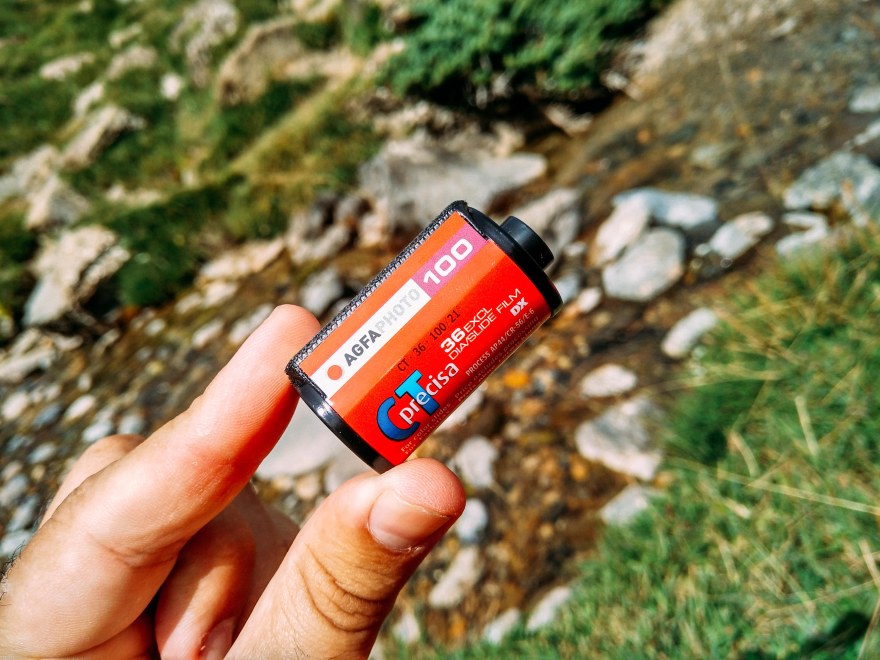
The Agfaphoto CT Precisa 100 is a 35mm slide film, daylight balanced and rated as ISO 100. This film rivals directly with the Fujifilm Provia 100 F, but depending on the store, but generally presents a higher price tag.
First, a little bit of background, this film is not just “Agfa” is “AgfaPhoto”. Agfa film and cameras were once prominent consumer products. However, in 2004, the consumer imaging division was sold to a company founded via management buyout. AgfaPhoto GmbH, as the new company was called, filed for bankruptcy after just one year. Nowadays, Lupus Imaging & Media has the exclusive global rights to manufacture and sell films, single-use cameras and analog cameras under the AgfaPhoto brand.
![]()
So, the iconic rhomboid logo found in old cameras like the “Optima” and film like the Chrome RSX was substituted by the new round logo of “Agfaphoto”.
![]()
In the same way, this film is the “Agfaphoto CT Precisa 100” not the old “Agfa CT Precisa” discontinued in 2005. Manufactured initially by Ferrania, and nowadays by FujiFilm.
| Name | AgfaPhoto CT Precisa 100 |
| ISO | 100 |
| Developer | E-6, AP-44 |
| Available formats | 35mm |
| Exposures | 36 |
| DX coding | Yes |
| Availability | ★★★☆☆
In “Lomography” stores and online. |
The Afgaphoto CT 100 precisa is a slide film, that means we will get a positive colorful strip, instead of the common negative film.

The benefit of slide film is that we can get a clear image of the colors capture and we will be able to correct the scanned image, and we can also use it in a slide projector (not so useful nowadays…). It will give us the correct tone that we captured that day, and we will be able to adjust or editing accordingly, a problem often found is that we will archive this slides and then forget how was the light or situation that day. The biggest inconvenience is that slides are less forgiving then negatives. A slight over or underexposure will give you a too dark or bright image. Negatives have a much more wider latitude, something similar to the digital dynamic range, it will give us much more room for error.
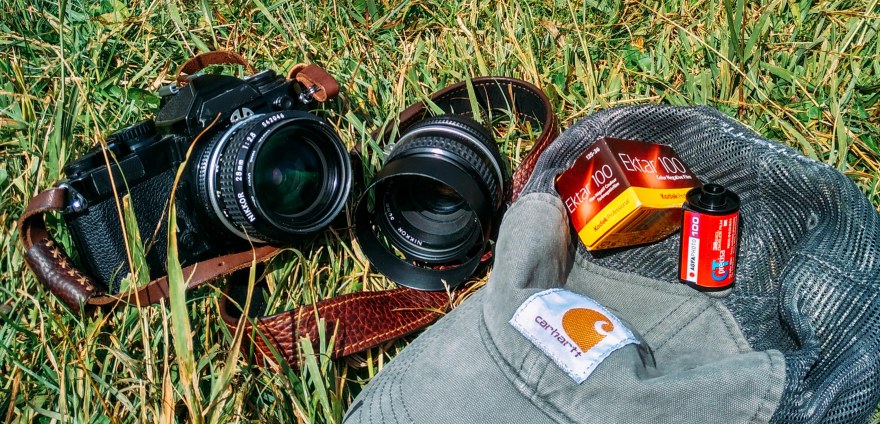
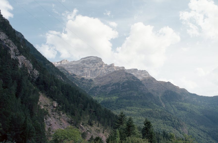
My idea for this film was to shoot landscapes, so I took it through a trip around Spain. The Nikon FM2 paired with a 28mm and a 50mm was the perfect setup to capture the vivid colors and blue skies that I found in the south of Spain and the Pyrenees.

The first thing to notice is that the AgfaPhoto CT Precisa 100 gives amazing and saturated colors, especially blues. But, the overall images lacks in contrast. Is actually not a flaw, the scanning is flat, but retains a lot of information, even in the shadows with minimum grain. That means that with a 30 second edit, you will obtain a crisp image with lots of detail. In this review all images are unedited.

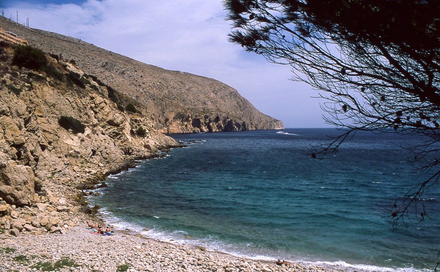
As mentioned before, the blue tones in AgfaPhoto CT Precisa 100 are amazing, they are really vivid and deep. In the first picture of the fisherman, we can see that from the very top of the sky to the seashore, the picture retains all the shades of blue. Simply exceptional.


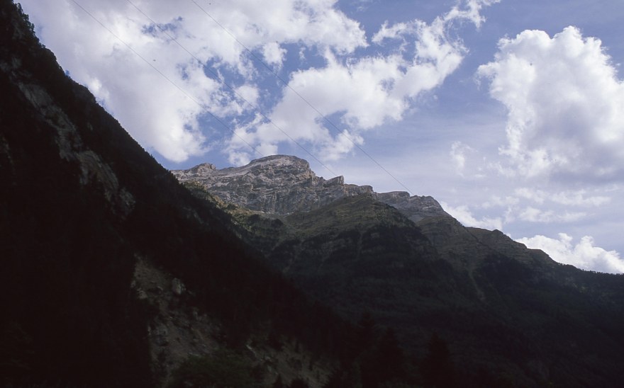
Greens are more bleached than blues, they lose vibrancy compared to the blues. Like I mentioned before, we a few edits, it will provide a great image but just the scan without any edit shows a muted green tone. I added a comparison with Ektar 100. We can see that Ektar has more latitude (like digital dynamic range) but definitely is less sharp than the CT 100.

The whole warm palette, although is not well represented in this pictures is a medium point in between the vibrant blues and the washed out greens. IT can be more accentuated through editing, but is really balanced and true to color. Reds a little bit more than yellow. But, in any case really pleasant.

I also decided to use this film for a series of portraits, as I keep mentioning during the article, it just needs a little bit of editing, with an extra “pop” to look great, here is an example:


Other portraits with and without flash in different skin tones. I’m not a fan of slide film,because it is very easy to completely blow up or darken the background, wasting an opportunity for a nice portrait. The film is great, the skin tones are really natural and look really true to color, with natural light and direct flash. Under controlled lighting, I’m sure it can deliver excellent results. Just using the light-meter in my camera I got tricked with the reflected light and under-exposed this portraits for at least one step. One of the reasons I prefer negative over slide, it is much more forgiving.


Color chart and measurement of the colors.

- RED: Average Colour R:195.0 G:105.0 B:105.0
- GREEN: Average Colour R:92.0 G:108.0 B:101.0
- YELLOW: Average Colour R:148.0 G:121.0 B:107.0
- BLUE: Average Colour R:54.0 G:60.0 B:88.0
You can take also a look at this article on How do I measure the colors?


In conclusion, the AgfaPhoto CT Precisa 100 is an excellent performer. The film here in Asian can be only found in Lomography stores. Therefore, I was really surprised since many of the examples that I found on-line are shot with “Lomography” cameras or developed in cross-process, all the pictures I found were kind of blurry or with funky colors. Nevertheless, the AgfaPhoto CT Precisa 100 was great, really sharp, retaining a lot of detail and with a surprising latitude for a slide film.
This film would be amazing for landscapes, portraits, macro or product photography. All the kinds of photography that need extra time in the darkroom or Photoshop if you have a more hybrid flow and you edit on your computer. It’s a shame that this film is not available in 120mm. Those massive slides would be amazing!

This film is definitely not for me, one of the reasons why I shoot film is to spend less time editing pictures. Shooting negative film I always obtain great pictures without the need of any editing other than occasional cropping and some scratch removal (in older negatives). That’s why I wouldn’t love to use this film as my standard. I also prefer negative films in the ISO range of 200-400, faster and more forgiving, but definitely far away from the quality offered by the AgfaPhoto CT Precisa 100.
YES ⇑
- Landscape, product photography, portrait.
- If you plan to work with those negatives after shooting.
- Clean, grainless, extremely detailed image.
NO ⇓
- If you don’t have the time to shoot carefully, you can’t just load the film and shoot.
- Portraits or situations with strong light contrast.
- It can be hard to find someone to develop this film, ask your local developer before invest in buying this film. You might consider Ektar 100 or Portra 160, easier to find and to develop.
Check out the gallery for more shots taken with this film!


![[FILM] TAIWAN Camping jingshan MAR2017 Nikon F100 Lomography 400023](https://carlosgrphoto.com/wp-content/uploads/2017/10/film-taiwan-camping-jingshan-mar2017-nikon-f100-lomography-400023.jpg?w=880)

![[FILM] TAIWAN Camping jingshan MAR2017 Nikon F100 Lomography 400026](https://carlosgrphoto.com/wp-content/uploads/2017/10/film-taiwan-camping-jingshan-mar2017-nikon-f100-lomography-400026.jpg?w=880)
![[FILM] TAIWAN hualien friends visiting MAY2017 Nikon F100 Lomography 400023](https://carlosgrphoto.com/wp-content/uploads/2017/10/film-taiwan-hualien-friends-visiting-may2017-nikon-f100-lomography-400023.jpg?w=880)
![[FILM] TAIWAN hualien friends visiting MAY2017 Nikon F100 Lomography 400003](https://carlosgrphoto.com/wp-content/uploads/2017/10/film-taiwan-hualien-friends-visiting-may2017-nikon-f100-lomography-400003.jpg?w=880)
![[FILM] TAIWAN hualien friends visiting MAY2017 Nikon F100 Lomography 400031](https://carlosgrphoto.com/wp-content/uploads/2017/10/film-taiwan-hualien-friends-visiting-may2017-nikon-f100-lomography-400031.jpg?w=880)
![[FILM] TAIWAN hualien friends visiting MAY2017 Nikon F100 Lomography 400004.jpg](https://carlosgrphoto.com/wp-content/uploads/2017/10/film-taiwan-hualien-friends-visiting-may2017-nikon-f100-lomography-4000041.jpg?w=880)
![[FILM] TAIWAN hualien friends visiting MAY2017 Nikon F100 Lomography 400010](https://carlosgrphoto.com/wp-content/uploads/2017/10/film-taiwan-hualien-friends-visiting-may2017-nikon-f100-lomography-400010.jpg?w=880)
![[FILM] TAIWAN Camping jingshan MAR2017 Nikon F100 Lomography 400014](https://carlosgrphoto.com/wp-content/uploads/2017/10/film-taiwan-camping-jingshan-mar2017-nikon-f100-lomography-400014.jpg?w=880)


![[FILM] TAIWAN hualien friends visiting MAY2017 Nikon F100 Lomography 400029](https://i0.wp.com/carlosgrphoto.com/wp-content/uploads/2017/10/film-taiwan-hualien-friends-visiting-may2017-nikon-f100-lomography-400029.jpg?w=285&h=180&ssl=1 "[FILM] TAIWAN hualien friends visiting MAY2017 Nikon F100 Lomography 400029")
![[FILM] TAIWAN Camping jingshan MAR2017 Nikon F100 Lomography 400006](https://i0.wp.com/carlosgrphoto.com/wp-content/uploads/2017/10/film-taiwan-camping-jingshan-mar2017-nikon-f100-lomography-400006.jpg?w=285&h=183&ssl=1 "[FILM] TAIWAN Camping jingshan MAR2017 Nikon F100 Lomography 400006")

![[FILM] TAIWAN hualien friends visiting MAY2017 Nikon F100 Lomography 400018](https://carlosgrphoto.com/wp-content/uploads/2017/10/film-taiwan-hualien-friends-visiting-may2017-nikon-f100-lomography-400018.jpg?w=880)
![[FILM] TAIWAN hualien friends visiting MAY2017 Nikon F100 Lomography 400004](https://i0.wp.com/carlosgrphoto.com/wp-content/uploads/2017/10/film-taiwan-hualien-friends-visiting-may2017-nikon-f100-lomography-4000041.jpg?w=582&h=367&ssl=1 "[FILM] TAIWAN hualien friends visiting MAY2017 Nikon F100 Lomography 400004")


![[FILM] TAIWAN hualien friends visiting MAY2017 Nikon F100 Lomography 400035](https://i0.wp.com/carlosgrphoto.com/wp-content/uploads/2017/10/film-taiwan-hualien-friends-visiting-may2017-nikon-f100-lomography-400035.jpg?w=157&h=248&ssl=1 "[FILM] TAIWAN hualien friends visiting MAY2017 Nikon F100 Lomography 400035")


![[FILM] TAIWAN hualien friends visiting MAY2017 Nikon F100 Lomography 400031](https://i0.wp.com/carlosgrphoto.com/wp-content/uploads/2017/10/film-taiwan-hualien-friends-visiting-may2017-nikon-f100-lomography-400031.jpg?w=158&h=248&ssl=1 "[FILM] TAIWAN hualien friends visiting MAY2017 Nikon F100 Lomography 400031")
![[FILM] TAIWAN hualien friends visiting MAY2017 Nikon F100 Lomography 400021](https://i0.wp.com/carlosgrphoto.com/wp-content/uploads/2017/10/film-taiwan-hualien-friends-visiting-may2017-nikon-f100-lomography-400021.jpg?w=587&h=368&ssl=1 "[FILM] TAIWAN hualien friends visiting MAY2017 Nikon F100 Lomography 400021")
![[FILM] TAIWAN hualien friends visiting MAY2017 Nikon F100 Lomography 400020](https://i0.wp.com/carlosgrphoto.com/wp-content/uploads/2017/10/film-taiwan-hualien-friends-visiting-may2017-nikon-f100-lomography-400020.jpg?w=285&h=178&ssl=1 "[FILM] TAIWAN hualien friends visiting MAY2017 Nikon F100 Lomography 400020")
![[FILM] TAIWAN hualien friends visiting MAY2017 Nikon F100 Lomography 400019](https://i0.wp.com/carlosgrphoto.com/wp-content/uploads/2017/10/film-taiwan-hualien-friends-visiting-may2017-nikon-f100-lomography-400019.jpg?w=285&h=186&ssl=1 "[FILM] TAIWAN hualien friends visiting MAY2017 Nikon F100 Lomography 400019")
![[FILM] TAIWAN hualien friends visiting MAY2017 Nikon F100 Lomography 400018](https://i0.wp.com/carlosgrphoto.com/wp-content/uploads/2017/10/film-taiwan-hualien-friends-visiting-may2017-nikon-f100-lomography-400018.jpg?w=393&h=257&ssl=1 "[FILM] TAIWAN hualien friends visiting MAY2017 Nikon F100 Lomography 400018")
![[FILM] TAIWAN hualien friends visiting MAY2017 Nikon F100 Lomography 400010](https://i0.wp.com/carlosgrphoto.com/wp-content/uploads/2017/10/film-taiwan-hualien-friends-visiting-may2017-nikon-f100-lomography-400010.jpg?w=393&h=248&ssl=1 "[FILM] TAIWAN hualien friends visiting MAY2017 Nikon F100 Lomography 400010")
![[FILM] TAIWAN hualien friends visiting MAY2017 Nikon F100 Lomography 400012](https://i0.wp.com/carlosgrphoto.com/wp-content/uploads/2017/10/film-taiwan-hualien-friends-visiting-may2017-nikon-f100-lomography-400012.jpg?w=393&h=247&ssl=1 "[FILM] TAIWAN hualien friends visiting MAY2017 Nikon F100 Lomography 400012")
![[FILM] TAIWAN hualien friends visiting MAY2017 Nikon F100 Lomography 400011](https://i0.wp.com/carlosgrphoto.com/wp-content/uploads/2017/10/film-taiwan-hualien-friends-visiting-may2017-nikon-f100-lomography-400011.jpg?w=479&h=760&ssl=1 "[FILM] TAIWAN hualien friends visiting MAY2017 Nikon F100 Lomography 400011")
![[FILM] TAIWAN hualien friends visiting MAY2017 Nikon F100 Lomography 400007](https://i0.wp.com/carlosgrphoto.com/wp-content/uploads/2017/10/film-taiwan-hualien-friends-visiting-may2017-nikon-f100-lomography-400007.jpg?w=308&h=198&ssl=1 "[FILM] TAIWAN hualien friends visiting MAY2017 Nikon F100 Lomography 400007")
![[FILM] TAIWAN hualien friends visiting MAY2017 Nikon F100 Lomography 400005](https://i0.wp.com/carlosgrphoto.com/wp-content/uploads/2017/10/film-taiwan-hualien-friends-visiting-may2017-nikon-f100-lomography-400005.jpg?w=308&h=194&ssl=1 "[FILM] TAIWAN hualien friends visiting MAY2017 Nikon F100 Lomography 400005")
![[FILM] TAIWAN hualien friends visiting MAY2017 Nikon F100 Lomography 400003](https://i0.wp.com/carlosgrphoto.com/wp-content/uploads/2017/10/film-taiwan-hualien-friends-visiting-may2017-nikon-f100-lomography-400003.jpg?w=249&h=396&ssl=1 "[FILM] TAIWAN hualien friends visiting MAY2017 Nikon F100 Lomography 400003")
![[FILM] TAIWAN hualien friends visiting MAY2017 Nikon F100 Lomography 400002](https://i0.wp.com/carlosgrphoto.com/wp-content/uploads/2017/10/film-taiwan-hualien-friends-visiting-may2017-nikon-f100-lomography-400002.jpg?w=311&h=196&ssl=1 "[FILM] TAIWAN hualien friends visiting MAY2017 Nikon F100 Lomography 400002")
![[FILM] TAIWAN hualien friends visiting MAY2017 Nikon F100 Lomography 400001](https://i0.wp.com/carlosgrphoto.com/wp-content/uploads/2017/10/film-taiwan-hualien-friends-visiting-may2017-nikon-f100-lomography-400001.jpg?w=311&h=196&ssl=1 "[FILM] TAIWAN hualien friends visiting MAY2017 Nikon F100 Lomography 400001")
![[FILM] TAIWAN Camping jingshan MAR2017 Nikon F100 Lomography 400035](https://i0.wp.com/carlosgrphoto.com/wp-content/uploads/2017/10/film-taiwan-camping-jingshan-mar2017-nikon-f100-lomography-400035.jpg?w=285&h=186&ssl=1 "[FILM] TAIWAN Camping jingshan MAR2017 Nikon F100 Lomography 400035")
![[FILM] TAIWAN Camping jingshan MAR2017 Nikon F100 Lomography 400032](https://i0.wp.com/carlosgrphoto.com/wp-content/uploads/2017/10/film-taiwan-camping-jingshan-mar2017-nikon-f100-lomography-400032.jpg?w=285&h=180&ssl=1 "[FILM] TAIWAN Camping jingshan MAR2017 Nikon F100 Lomography 400032")
![[FILM] TAIWAN Camping jingshan MAR2017 Nikon F100 Lomography 400030](https://i0.wp.com/carlosgrphoto.com/wp-content/uploads/2017/10/film-taiwan-camping-jingshan-mar2017-nikon-f100-lomography-400030.jpg?w=587&h=370&ssl=1 "[FILM] TAIWAN Camping jingshan MAR2017 Nikon F100 Lomography 400030")
![[FILM] TAIWAN Camping jingshan MAR2017 Nikon F100 Lomography 400034](https://i0.wp.com/carlosgrphoto.com/wp-content/uploads/2017/10/film-taiwan-camping-jingshan-mar2017-nikon-f100-lomography-400034.jpg?w=585&h=368&ssl=1 "[FILM] TAIWAN Camping jingshan MAR2017 Nikon F100 Lomography 400034")
![[FILM] TAIWAN Camping jingshan MAR2017 Nikon F100 Lomography 400028](https://i0.wp.com/carlosgrphoto.com/wp-content/uploads/2017/10/film-taiwan-camping-jingshan-mar2017-nikon-f100-lomography-400028.jpg?w=287&h=183&ssl=1 "[FILM] TAIWAN Camping jingshan MAR2017 Nikon F100 Lomography 400028")
![[FILM] TAIWAN Camping jingshan MAR2017 Nikon F100 Lomography 400027](https://i0.wp.com/carlosgrphoto.com/wp-content/uploads/2017/10/film-taiwan-camping-jingshan-mar2017-nikon-f100-lomography-400027.jpg?w=287&h=181&ssl=1 "[FILM] TAIWAN Camping jingshan MAR2017 Nikon F100 Lomography 400027")
![[FILM] TAIWAN Camping jingshan MAR2017 Nikon F100 Lomography 400026](https://i0.wp.com/carlosgrphoto.com/wp-content/uploads/2017/10/film-taiwan-camping-jingshan-mar2017-nikon-f100-lomography-400026.jpg?w=289&h=183&ssl=1 "[FILM] TAIWAN Camping jingshan MAR2017 Nikon F100 Lomography 400026")
![[FILM] TAIWAN Camping jingshan MAR2017 Nikon F100 Lomography 400025](https://i0.wp.com/carlosgrphoto.com/wp-content/uploads/2017/10/film-taiwan-camping-jingshan-mar2017-nikon-f100-lomography-400025.jpg?w=290&h=183&ssl=1 "[FILM] TAIWAN Camping jingshan MAR2017 Nikon F100 Lomography 400025")
![[FILM] TAIWAN Camping jingshan MAR2017 Nikon F100 Lomography 400024](https://i0.wp.com/carlosgrphoto.com/wp-content/uploads/2017/10/film-taiwan-camping-jingshan-mar2017-nikon-f100-lomography-400024.jpg?w=289&h=183&ssl=1 "[FILM] TAIWAN Camping jingshan MAR2017 Nikon F100 Lomography 400024")
![[FILM] TAIWAN Camping jingshan MAR2017 Nikon F100 Lomography 400021](https://i0.wp.com/carlosgrphoto.com/wp-content/uploads/2017/10/film-taiwan-camping-jingshan-mar2017-nikon-f100-lomography-400021.jpg?w=427&h=281&ssl=1 "[FILM] TAIWAN Camping jingshan MAR2017 Nikon F100 Lomography 400021")
![[FILM] TAIWAN Camping jingshan MAR2017 Nikon F100 Lomography 400020](https://i0.wp.com/carlosgrphoto.com/wp-content/uploads/2017/10/film-taiwan-camping-jingshan-mar2017-nikon-f100-lomography-400020.jpg?w=445&h=281&ssl=1 "[FILM] TAIWAN Camping jingshan MAR2017 Nikon F100 Lomography 400020")
![[FILM] TAIWAN Camping jingshan MAR2017 Nikon F100 Lomography 400017](https://i0.wp.com/carlosgrphoto.com/wp-content/uploads/2017/10/film-taiwan-camping-jingshan-mar2017-nikon-f100-lomography-400017.jpg?w=476&h=755&ssl=1 "[FILM] TAIWAN Camping jingshan MAR2017 Nikon F100 Lomography 400017")
![[FILM] TAIWAN Camping jingshan MAR2017 Nikon F100 Lomography 400016](https://i0.wp.com/carlosgrphoto.com/wp-content/uploads/2017/10/film-taiwan-camping-jingshan-mar2017-nikon-f100-lomography-400016.jpg?w=396&h=250&ssl=1 "[FILM] TAIWAN Camping jingshan MAR2017 Nikon F100 Lomography 400016")
![[FILM] TAIWAN Camping jingshan MAR2017 Nikon F100 Lomography 400015](https://i0.wp.com/carlosgrphoto.com/wp-content/uploads/2017/10/film-taiwan-camping-jingshan-mar2017-nikon-f100-lomography-400015.jpg?w=396&h=248&ssl=1 "[FILM] TAIWAN Camping jingshan MAR2017 Nikon F100 Lomography 400015")
![[FILM] TAIWAN Camping jingshan MAR2017 Nikon F100 Lomography 400014](https://i0.wp.com/carlosgrphoto.com/wp-content/uploads/2017/10/film-taiwan-camping-jingshan-mar2017-nikon-f100-lomography-400014.jpg?w=396&h=249&ssl=1 "[FILM] TAIWAN Camping jingshan MAR2017 Nikon F100 Lomography 400014")
![[FILM] TAIWAN Camping jingshan MAR2017 Nikon F100 Lomography 400006](https://i0.wp.com/carlosgrphoto.com/wp-content/uploads/2017/10/film-taiwan-camping-jingshan-mar2017-nikon-f100-lomography-400006.jpg?w=876&h=563&ssl=1 "[FILM] TAIWAN Camping jingshan MAR2017 Nikon F100 Lomography 400006")


![[FILM] TAIWAN tamkang tamsui JUN2017 Olympus OM-30 Kodak Vision3 50D018](https://carlosgrphoto.com/wp-content/uploads/2017/07/film-taiwan-tamkang-tamsui-jun2017-olympus-om-30-kodak-vision3-50d018.jpg?w=880)
![[FILM] TAIWAN tamkang tamsui JUN2017 Olympus OM-30 Kodak Vision3 50D031](https://carlosgrphoto.com/wp-content/uploads/2017/07/film-taiwan-tamkang-tamsui-jun2017-olympus-om-30-kodak-vision3-50d031.jpg?w=880)
![[FILM] TAIWAN tamkang tamsui JUN2017 Olympus OM-30 Kodak Vision3 50D030](https://carlosgrphoto.com/wp-content/uploads/2017/07/film-taiwan-tamkang-tamsui-jun2017-olympus-om-30-kodak-vision3-50d030.jpg?w=880)
![[FILM] TAIWAN tamkang tamsui JUN2017 Olympus OM-30 Kodak Vision3 50D003](https://carlosgrphoto.com/wp-content/uploads/2017/07/film-taiwan-tamkang-tamsui-jun2017-olympus-om-30-kodak-vision3-50d003.jpg?w=880)
![[FILM] TAIWAN tamkang tamsui JUN2017 Olympus OM-30 Kodak Vision3 50D012](https://carlosgrphoto.com/wp-content/uploads/2017/07/film-taiwan-tamkang-tamsui-jun2017-olympus-om-30-kodak-vision3-50d012.jpg?w=880)
![[FILM] TAIWAN tamkang tamsui JUN2017 Olympus OM-30 Kodak Vision3 50D011](https://carlosgrphoto.com/wp-content/uploads/2017/07/film-taiwan-tamkang-tamsui-jun2017-olympus-om-30-kodak-vision3-50d011.jpg?w=880)
![[FILM] TAIWAN tamkang tamsui JUN2017 Olympus OM-30 Kodak Vision3 50D007](https://carlosgrphoto.com/wp-content/uploads/2017/07/film-taiwan-tamkang-tamsui-jun2017-olympus-om-30-kodak-vision3-50d007.jpg?w=880)
![[FILM] TAIWAN tamkang tamsui JUN2017 Olympus OM-30 Kodak Vision3 50D008](https://carlosgrphoto.com/wp-content/uploads/2017/07/film-taiwan-tamkang-tamsui-jun2017-olympus-om-30-kodak-vision3-50d008.jpg?w=880)
![[FILM] TAIWAN tamkang tamsui JUN2017 Olympus OM-30 Kodak Vision3 50D005](https://carlosgrphoto.com/wp-content/uploads/2017/07/film-taiwan-tamkang-tamsui-jun2017-olympus-om-30-kodak-vision3-50d005.jpg?w=880)
![[FILM] TAIWAN tamkang tamsui JUN2017 Olympus OM-30 Kodak Vision3 50D002](https://carlosgrphoto.com/wp-content/uploads/2017/07/film-taiwan-tamkang-tamsui-jun2017-olympus-om-30-kodak-vision3-50d002.jpg?w=880)
![[FILM] TAIWAN tamkang tamsui JUN2017 Olympus OM-30 Kodak Vision3 50D023](https://i0.wp.com/carlosgrphoto.com/wp-content/uploads/2017/07/film-taiwan-tamkang-tamsui-jun2017-olympus-om-30-kodak-vision3-50d023.jpg?w=436&h=436&crop=1&ssl=1 "[FILM] TAIWAN tamkang tamsui JUN2017 Olympus OM-30 Kodak Vision3 50D023")
![[FILM] TAIWAN tamkang tamsui JUN2017 Olympus OM-30 Kodak Vision3 50D021](https://i0.wp.com/carlosgrphoto.com/wp-content/uploads/2017/07/film-taiwan-tamkang-tamsui-jun2017-olympus-om-30-kodak-vision3-50d021.jpg?w=436&h=436&crop=1&ssl=1 "[FILM] TAIWAN tamkang tamsui JUN2017 Olympus OM-30 Kodak Vision3 50D021")


![[FILM] TAIWAN tamkang tamsui JUN2017 Olympus OM-30 Kodak Vision3 50D014](https://carlosgrphoto.com/wp-content/uploads/2017/07/film-taiwan-tamkang-tamsui-jun2017-olympus-om-30-kodak-vision3-50d014.jpg?w=880)
![[FILM] TAIWAN tamkang tamsui JUN2017 Olympus OM-30 Kodak Vision3 50D026](https://i0.wp.com/carlosgrphoto.com/wp-content/uploads/2017/07/film-taiwan-tamkang-tamsui-jun2017-olympus-om-30-kodak-vision3-50d026.jpg?w=393&h=249&ssl=1 "[FILM] TAIWAN tamkang tamsui JUN2017 Olympus OM-30 Kodak Vision3 50D026")
![[FILM] TAIWAN tamkang tamsui JUN2017 Olympus OM-30 Kodak Vision3 50D036](https://i0.wp.com/carlosgrphoto.com/wp-content/uploads/2017/07/film-taiwan-tamkang-tamsui-jun2017-olympus-om-30-kodak-vision3-50d036.jpg?w=393&h=246&ssl=1 "[FILM] TAIWAN tamkang tamsui JUN2017 Olympus OM-30 Kodak Vision3 50D036")
![[FILM] TAIWAN tamkang tamsui JUN2017 Olympus OM-30 Kodak Vision3 50D010](https://i0.wp.com/carlosgrphoto.com/wp-content/uploads/2017/07/film-taiwan-tamkang-tamsui-jun2017-olympus-om-30-kodak-vision3-50d010.jpg?w=393&h=249&ssl=1 "[FILM] TAIWAN tamkang tamsui JUN2017 Olympus OM-30 Kodak Vision3 50D010")
![[FILM] TAIWAN tamkang tamsui JUN2017 Olympus OM-30 Kodak Vision3 50D004](https://i0.wp.com/carlosgrphoto.com/wp-content/uploads/2017/07/film-taiwan-tamkang-tamsui-jun2017-olympus-om-30-kodak-vision3-50d004.jpg?w=479&h=752&ssl=1 "[FILM] TAIWAN tamkang tamsui JUN2017 Olympus OM-30 Kodak Vision3 50D004")


![[FILM] TAIWAN tamkang tamsui JUN2017 Olympus OM-30 Kodak Vision3 50D038](https://i0.wp.com/carlosgrphoto.com/wp-content/uploads/2017/07/film-taiwan-tamkang-tamsui-jun2017-olympus-om-30-kodak-vision3-50d038.jpg?w=623&h=393&ssl=1 "[FILM] TAIWAN tamkang tamsui JUN2017 Olympus OM-30 Kodak Vision3 50D038")
![[FILM] TAIWAN tamkang tamsui JUN2017 Olympus OM-30 Kodak Vision3 50D036](https://i0.wp.com/carlosgrphoto.com/wp-content/uploads/2017/07/film-taiwan-tamkang-tamsui-jun2017-olympus-om-30-kodak-vision3-50d036.jpg?w=585&h=367&ssl=1 "[FILM] TAIWAN tamkang tamsui JUN2017 Olympus OM-30 Kodak Vision3 50D036")
![[FILM] TAIWAN tamkang tamsui JUN2017 Olympus OM-30 Kodak Vision3 50D035](https://i0.wp.com/carlosgrphoto.com/wp-content/uploads/2017/07/film-taiwan-tamkang-tamsui-jun2017-olympus-om-30-kodak-vision3-50d035.jpg?w=287&h=182&ssl=1 "[FILM] TAIWAN tamkang tamsui JUN2017 Olympus OM-30 Kodak Vision3 50D035")
![[FILM] TAIWAN tamkang tamsui JUN2017 Olympus OM-30 Kodak Vision3 50D034](https://i0.wp.com/carlosgrphoto.com/wp-content/uploads/2017/07/film-taiwan-tamkang-tamsui-jun2017-olympus-om-30-kodak-vision3-50d034.jpg?w=287&h=181&ssl=1 "[FILM] TAIWAN tamkang tamsui JUN2017 Olympus OM-30 Kodak Vision3 50D034")
![[FILM] TAIWAN tamkang tamsui JUN2017 Olympus OM-30 Kodak Vision3 50D033](https://i0.wp.com/carlosgrphoto.com/wp-content/uploads/2017/07/film-taiwan-tamkang-tamsui-jun2017-olympus-om-30-kodak-vision3-50d033.jpg?w=440&h=278&ssl=1 "[FILM] TAIWAN tamkang tamsui JUN2017 Olympus OM-30 Kodak Vision3 50D033")
![[FILM] TAIWAN tamkang tamsui JUN2017 Olympus OM-30 Kodak Vision3 50D031](https://i0.wp.com/carlosgrphoto.com/wp-content/uploads/2017/07/film-taiwan-tamkang-tamsui-jun2017-olympus-om-30-kodak-vision3-50d031.jpg?w=432&h=278&ssl=1 "[FILM] TAIWAN tamkang tamsui JUN2017 Olympus OM-30 Kodak Vision3 50D031")
![[FILM] TAIWAN tamkang tamsui JUN2017 Olympus OM-30 Kodak Vision3 50D030](https://i0.wp.com/carlosgrphoto.com/wp-content/uploads/2017/07/film-taiwan-tamkang-tamsui-jun2017-olympus-om-30-kodak-vision3-50d030.jpg?w=432&h=279&ssl=1 "[FILM] TAIWAN tamkang tamsui JUN2017 Olympus OM-30 Kodak Vision3 50D030")
![[FILM] TAIWAN tamkang tamsui JUN2017 Olympus OM-30 Kodak Vision3 50D029](https://i0.wp.com/carlosgrphoto.com/wp-content/uploads/2017/07/film-taiwan-tamkang-tamsui-jun2017-olympus-om-30-kodak-vision3-50d029.jpg?w=440&h=279&ssl=1 "[FILM] TAIWAN tamkang tamsui JUN2017 Olympus OM-30 Kodak Vision3 50D029")
![[FILM] TAIWAN tamkang tamsui JUN2017 Olympus OM-30 Kodak Vision3 50D028](https://i0.wp.com/carlosgrphoto.com/wp-content/uploads/2017/07/film-taiwan-tamkang-tamsui-jun2017-olympus-om-30-kodak-vision3-50d028.jpg?w=288&h=182&ssl=1 "[FILM] TAIWAN tamkang tamsui JUN2017 Olympus OM-30 Kodak Vision3 50D028")
![[FILM] TAIWAN tamkang tamsui JUN2017 Olympus OM-30 Kodak Vision3 50D027](https://i0.wp.com/carlosgrphoto.com/wp-content/uploads/2017/07/film-taiwan-tamkang-tamsui-jun2017-olympus-om-30-kodak-vision3-50d027.jpg?w=288&h=182&ssl=1 "[FILM] TAIWAN tamkang tamsui JUN2017 Olympus OM-30 Kodak Vision3 50D027")
![[FILM] TAIWAN tamkang tamsui JUN2017 Olympus OM-30 Kodak Vision3 50D023](https://i0.wp.com/carlosgrphoto.com/wp-content/uploads/2017/07/film-taiwan-tamkang-tamsui-jun2017-olympus-om-30-kodak-vision3-50d023.jpg?w=584&h=368&ssl=1 "[FILM] TAIWAN tamkang tamsui JUN2017 Olympus OM-30 Kodak Vision3 50D023")
![[FILM] TAIWAN tamkang tamsui JUN2017 Olympus OM-30 Kodak Vision3 50D021](https://i0.wp.com/carlosgrphoto.com/wp-content/uploads/2017/07/film-taiwan-tamkang-tamsui-jun2017-olympus-om-30-kodak-vision3-50d021.jpg?w=624&h=391&ssl=1 "[FILM] TAIWAN tamkang tamsui JUN2017 Olympus OM-30 Kodak Vision3 50D021")
![[FILM] TAIWAN tamkang tamsui JUN2017 Olympus OM-30 Kodak Vision3 50D025](https://i0.wp.com/carlosgrphoto.com/wp-content/uploads/2017/07/film-taiwan-tamkang-tamsui-jun2017-olympus-om-30-kodak-vision3-50d025.jpg?w=248&h=391&ssl=1 "[FILM] TAIWAN tamkang tamsui JUN2017 Olympus OM-30 Kodak Vision3 50D025")
![[FILM] TAIWAN tamkang tamsui JUN2017 Olympus OM-30 Kodak Vision3 50D026](https://i0.wp.com/carlosgrphoto.com/wp-content/uploads/2017/07/film-taiwan-tamkang-tamsui-jun2017-olympus-om-30-kodak-vision3-50d026.jpg?w=615&h=389&ssl=1 "[FILM] TAIWAN tamkang tamsui JUN2017 Olympus OM-30 Kodak Vision3 50D026")
![[FILM] TAIWAN tamkang tamsui JUN2017 Olympus OM-30 Kodak Vision3 50D018](https://i0.wp.com/carlosgrphoto.com/wp-content/uploads/2017/07/film-taiwan-tamkang-tamsui-jun2017-olympus-om-30-kodak-vision3-50d018.jpg?w=257&h=389&ssl=1 "[FILM] TAIWAN tamkang tamsui JUN2017 Olympus OM-30 Kodak Vision3 50D018")
![[FILM] TAIWAN tamkang tamsui JUN2017 Olympus OM-30 Kodak Vision3 50D017](https://i0.wp.com/carlosgrphoto.com/wp-content/uploads/2017/07/film-taiwan-tamkang-tamsui-jun2017-olympus-om-30-kodak-vision3-50d017.jpg?w=601&h=389&ssl=1 "[FILM] TAIWAN tamkang tamsui JUN2017 Olympus OM-30 Kodak Vision3 50D017")
![[FILM] TAIWAN tamkang tamsui JUN2017 Olympus OM-30 Kodak Vision3 50D016](https://i0.wp.com/carlosgrphoto.com/wp-content/uploads/2017/07/film-taiwan-tamkang-tamsui-jun2017-olympus-om-30-kodak-vision3-50d016.jpg?w=271&h=175&ssl=1 "[FILM] TAIWAN tamkang tamsui JUN2017 Olympus OM-30 Kodak Vision3 50D016")
![[FILM] TAIWAN tamkang tamsui JUN2017 Olympus OM-30 Kodak Vision3 50D014](https://i0.wp.com/carlosgrphoto.com/wp-content/uploads/2017/07/film-taiwan-tamkang-tamsui-jun2017-olympus-om-30-kodak-vision3-50d014.jpg?w=271&h=210&ssl=1 "[FILM] TAIWAN tamkang tamsui JUN2017 Olympus OM-30 Kodak Vision3 50D014")
![[FILM] TAIWAN tamkang tamsui JUN2017 Olympus OM-30 Kodak Vision3 50D012](https://i0.wp.com/carlosgrphoto.com/wp-content/uploads/2017/07/film-taiwan-tamkang-tamsui-jun2017-olympus-om-30-kodak-vision3-50d012.jpg?w=286&h=185&ssl=1 "[FILM] TAIWAN tamkang tamsui JUN2017 Olympus OM-30 Kodak Vision3 50D012")
![[FILM] TAIWAN tamkang tamsui JUN2017 Olympus OM-30 Kodak Vision3 50D011](https://i0.wp.com/carlosgrphoto.com/wp-content/uploads/2017/07/film-taiwan-tamkang-tamsui-jun2017-olympus-om-30-kodak-vision3-50d011.jpg?w=286&h=181&ssl=1 "[FILM] TAIWAN tamkang tamsui JUN2017 Olympus OM-30 Kodak Vision3 50D011")
![[FILM] TAIWAN tamkang tamsui JUN2017 Olympus OM-30 Kodak Vision3 50D010](https://i0.wp.com/carlosgrphoto.com/wp-content/uploads/2017/07/film-taiwan-tamkang-tamsui-jun2017-olympus-om-30-kodak-vision3-50d010.jpg?w=586&h=370&ssl=1 "[FILM] TAIWAN tamkang tamsui JUN2017 Olympus OM-30 Kodak Vision3 50D010")
![[FILM] TAIWAN tamkang tamsui JUN2017 Olympus OM-30 Kodak Vision3 50D009](https://i0.wp.com/carlosgrphoto.com/wp-content/uploads/2017/07/film-taiwan-tamkang-tamsui-jun2017-olympus-om-30-kodak-vision3-50d009.jpg?w=290&h=183&ssl=1 "[FILM] TAIWAN tamkang tamsui JUN2017 Olympus OM-30 Kodak Vision3 50D009")
![[FILM] TAIWAN tamkang tamsui JUN2017 Olympus OM-30 Kodak Vision3 50D008](https://i0.wp.com/carlosgrphoto.com/wp-content/uploads/2017/07/film-taiwan-tamkang-tamsui-jun2017-olympus-om-30-kodak-vision3-50d008.jpg?w=289&h=183&ssl=1 "[FILM] TAIWAN tamkang tamsui JUN2017 Olympus OM-30 Kodak Vision3 50D008")
![[FILM] TAIWAN tamkang tamsui JUN2017 Olympus OM-30 Kodak Vision3 50D007](https://i0.wp.com/carlosgrphoto.com/wp-content/uploads/2017/07/film-taiwan-tamkang-tamsui-jun2017-olympus-om-30-kodak-vision3-50d007.jpg?w=289&h=183&ssl=1 "[FILM] TAIWAN tamkang tamsui JUN2017 Olympus OM-30 Kodak Vision3 50D007")
![[FILM] TAIWAN tamkang tamsui JUN2017 Olympus OM-30 Kodak Vision3 50D006](https://i0.wp.com/carlosgrphoto.com/wp-content/uploads/2017/07/film-taiwan-tamkang-tamsui-jun2017-olympus-om-30-kodak-vision3-50d006.jpg?w=436&h=277&ssl=1 "[FILM] TAIWAN tamkang tamsui JUN2017 Olympus OM-30 Kodak Vision3 50D006")
![[FILM] TAIWAN tamkang tamsui JUN2017 Olympus OM-30 Kodak Vision3 50D005](https://i0.wp.com/carlosgrphoto.com/wp-content/uploads/2017/07/film-taiwan-tamkang-tamsui-jun2017-olympus-om-30-kodak-vision3-50d005.jpg?w=436&h=277&ssl=1 "[FILM] TAIWAN tamkang tamsui JUN2017 Olympus OM-30 Kodak Vision3 50D005")
![[FILM] TAIWAN tamkang tamsui JUN2017 Olympus OM-30 Kodak Vision3 50D004](https://i0.wp.com/carlosgrphoto.com/wp-content/uploads/2017/07/film-taiwan-tamkang-tamsui-jun2017-olympus-om-30-kodak-vision3-50d004.jpg?w=482&h=756&ssl=1 "[FILM] TAIWAN tamkang tamsui JUN2017 Olympus OM-30 Kodak Vision3 50D004")
![[FILM] TAIWAN tamkang tamsui JUN2017 Olympus OM-30 Kodak Vision3 50D003](https://i0.wp.com/carlosgrphoto.com/wp-content/uploads/2017/07/film-taiwan-tamkang-tamsui-jun2017-olympus-om-30-kodak-vision3-50d003.jpg?w=390&h=248&ssl=1 "[FILM] TAIWAN tamkang tamsui JUN2017 Olympus OM-30 Kodak Vision3 50D003")
![[FILM] TAIWAN tamkang tamsui JUN2017 Olympus OM-30 Kodak Vision3 50D002](https://i0.wp.com/carlosgrphoto.com/wp-content/uploads/2017/07/film-taiwan-tamkang-tamsui-jun2017-olympus-om-30-kodak-vision3-50d002.jpg?w=390&h=249&ssl=1 "[FILM] TAIWAN tamkang tamsui JUN2017 Olympus OM-30 Kodak Vision3 50D002")
![[FILM] TAIWAN tamkang tamsui JUN2017 Olympus OM-30 Kodak Vision3 50D001](https://i0.wp.com/carlosgrphoto.com/wp-content/uploads/2017/07/film-taiwan-tamkang-tamsui-jun2017-olympus-om-30-kodak-vision3-50d001.jpg?w=390&h=251&ssl=1 "[FILM] TAIWAN tamkang tamsui JUN2017 Olympus OM-30 Kodak Vision3 50D001")


![[FILM] TAIWAN friends sakura APR2017 Nikon F100 Fujicolor ProviaF 100029-2](https://carlosgrphoto.com/wp-content/uploads/2017/05/film-taiwan-friends-sakura-apr2017-nikon-f100-fujicolor-proviaf-100029-2.jpg?w=880)
![[FILM] TAIWAN friends sakura APR2017 Nikon F100 Fujicolor ProviaF 100005](https://carlosgrphoto.com/wp-content/uploads/2017/05/film-taiwan-friends-sakura-apr2017-nikon-f100-fujicolor-proviaf-100005.jpg?w=880)
![[FILM] TAIWAN friends sakura APR2017 Nikon F100 Fujicolor ProviaF 100025](https://carlosgrphoto.com/wp-content/uploads/2017/05/film-taiwan-friends-sakura-apr2017-nikon-f100-fujicolor-proviaf-100025.jpg?w=880)
![[FILM] TAIWAN friends sakura APR2017 Nikon F100 Fujicolor ProviaF 100022](https://carlosgrphoto.com/wp-content/uploads/2017/05/film-taiwan-friends-sakura-apr2017-nikon-f100-fujicolor-proviaf-100022.jpg?w=880)
![[FILM] TAIWAN friends sakura APR2017 Nikon F100 Fujicolor ProviaF 100013](https://carlosgrphoto.com/wp-content/uploads/2017/05/film-taiwan-friends-sakura-apr2017-nikon-f100-fujicolor-proviaf-100013.jpg?w=880)

![[FILM] TAIWAN friends sakura APR2017 Nikon F100 Fujicolor ProviaF 100006](https://carlosgrphoto.com/wp-content/uploads/2017/05/film-taiwan-friends-sakura-apr2017-nikon-f100-fujicolor-proviaf-100006.jpg?w=880)


![[FILM] TAIWAN friends sakura APR2017 Nikon F100 Fujicolor ProviaF 100017](https://carlosgrphoto.com/wp-content/uploads/2017/05/film-taiwan-friends-sakura-apr2017-nikon-f100-fujicolor-proviaf-100017.jpg?w=880)
![[FILM] TAIWAN friends sakura APR2017 Nikon F100 Fujicolor ProviaF 100015](https://i0.wp.com/carlosgrphoto.com/wp-content/uploads/2017/05/film-taiwan-friends-sakura-apr2017-nikon-f100-fujicolor-proviaf-100015.jpg?w=490&h=303&ssl=1 "[FILM] TAIWAN friends sakura APR2017 Nikon F100 Fujicolor ProviaF 100015")
![[FILM] TAIWAN friends sakura APR2017 Nikon F100 Fujicolor ProviaF 100027](https://i0.wp.com/carlosgrphoto.com/wp-content/uploads/2017/05/film-taiwan-friends-sakura-apr2017-nikon-f100-fujicolor-proviaf-100027.jpg?w=490&h=320&ssl=1 "[FILM] TAIWAN friends sakura APR2017 Nikon F100 Fujicolor ProviaF 100027")
![[FILM] TAIWAN friends sakura APR2017 Nikon F100 Fujicolor ProviaF 100023](https://i0.wp.com/carlosgrphoto.com/wp-content/uploads/2017/05/film-taiwan-friends-sakura-apr2017-nikon-f100-fujicolor-proviaf-100023.jpg?w=382&h=627&ssl=1 "[FILM] TAIWAN friends sakura APR2017 Nikon F100 Fujicolor ProviaF 100023")
![[FILM] TAIWAN friends sakura APR2017 Nikon F100 Fujicolor ProviaF 100027](https://i0.wp.com/carlosgrphoto.com/wp-content/uploads/2017/05/film-taiwan-friends-sakura-apr2017-nikon-f100-fujicolor-proviaf-100027.jpg?w=621&h=406&ssl=1 "[FILM] TAIWAN friends sakura APR2017 Nikon F100 Fujicolor ProviaF 100027")
![[FILM] TAIWAN friends sakura APR2017 Nikon F100 Fujicolor ProviaF 100026](https://i0.wp.com/carlosgrphoto.com/wp-content/uploads/2017/05/film-taiwan-friends-sakura-apr2017-nikon-f100-fujicolor-proviaf-100026.jpg?w=251&h=406&ssl=1 "[FILM] TAIWAN friends sakura APR2017 Nikon F100 Fujicolor ProviaF 100026")
![[FILM] TAIWAN friends sakura APR2017 Nikon F100 Fujicolor ProviaF 100025](https://i0.wp.com/carlosgrphoto.com/wp-content/uploads/2017/05/film-taiwan-friends-sakura-apr2017-nikon-f100-fujicolor-proviaf-100025.jpg?w=633&h=389&ssl=1 "[FILM] TAIWAN friends sakura APR2017 Nikon F100 Fujicolor ProviaF 100025")
![[FILM] TAIWAN friends sakura APR2017 Nikon F100 Fujicolor ProviaF 100024](https://i0.wp.com/carlosgrphoto.com/wp-content/uploads/2017/05/film-taiwan-friends-sakura-apr2017-nikon-f100-fujicolor-proviaf-100024.jpg?w=239&h=389&ssl=1 "[FILM] TAIWAN friends sakura APR2017 Nikon F100 Fujicolor ProviaF 100024")
![[FILM] TAIWAN friends sakura APR2017 Nikon F100 Fujicolor ProviaF 100023](https://i0.wp.com/carlosgrphoto.com/wp-content/uploads/2017/05/film-taiwan-friends-sakura-apr2017-nikon-f100-fujicolor-proviaf-100023.jpg?w=239&h=392&ssl=1 "[FILM] TAIWAN friends sakura APR2017 Nikon F100 Fujicolor ProviaF 100023")
![[FILM] TAIWAN friends sakura APR2017 Nikon F100 Fujicolor ProviaF 100022](https://i0.wp.com/carlosgrphoto.com/wp-content/uploads/2017/05/film-taiwan-friends-sakura-apr2017-nikon-f100-fujicolor-proviaf-100022.jpg?w=633&h=392&ssl=1 "[FILM] TAIWAN friends sakura APR2017 Nikon F100 Fujicolor ProviaF 100022")
![[FILM] TAIWAN friends sakura APR2017 Nikon F100 Fujicolor ProviaF 100021](https://i0.wp.com/carlosgrphoto.com/wp-content/uploads/2017/05/film-taiwan-friends-sakura-apr2017-nikon-f100-fujicolor-proviaf-100021.jpg?w=468&h=756&ssl=1 "[FILM] TAIWAN friends sakura APR2017 Nikon F100 Fujicolor ProviaF 100021")
![[FILM] TAIWAN friends sakura APR2017 Nikon F100 Fujicolor ProviaF 100020](https://i0.wp.com/carlosgrphoto.com/wp-content/uploads/2017/05/film-taiwan-friends-sakura-apr2017-nikon-f100-fujicolor-proviaf-100020.jpg?w=404&h=251&ssl=1 "[FILM] TAIWAN friends sakura APR2017 Nikon F100 Fujicolor ProviaF 100020")


![[FILM] TAIWAN friends sakura APR2017 Nikon F100 Fujicolor ProviaF 100017](https://i0.wp.com/carlosgrphoto.com/wp-content/uploads/2017/05/film-taiwan-friends-sakura-apr2017-nikon-f100-fujicolor-proviaf-100017.jpg?w=330&h=255&ssl=1 "[FILM] TAIWAN friends sakura APR2017 Nikon F100 Fujicolor ProviaF 100017")
![[FILM] TAIWAN friends sakura APR2017 Nikon F100 Fujicolor ProviaF 100015](https://i0.wp.com/carlosgrphoto.com/wp-content/uploads/2017/05/film-taiwan-friends-sakura-apr2017-nikon-f100-fujicolor-proviaf-100015.jpg?w=330&h=204&ssl=1 "[FILM] TAIWAN friends sakura APR2017 Nikon F100 Fujicolor ProviaF 100015")
![[FILM] TAIWAN friends sakura APR2017 Nikon F100 Fujicolor ProviaF 100014](https://i0.wp.com/carlosgrphoto.com/wp-content/uploads/2017/05/film-taiwan-friends-sakura-apr2017-nikon-f100-fujicolor-proviaf-100014.jpg?w=330&h=207&ssl=1 "[FILM] TAIWAN friends sakura APR2017 Nikon F100 Fujicolor ProviaF 100014")
![[FILM] TAIWAN friends sakura APR2017 Nikon F100 Fujicolor ProviaF 100013](https://i0.wp.com/carlosgrphoto.com/wp-content/uploads/2017/05/film-taiwan-friends-sakura-apr2017-nikon-f100-fujicolor-proviaf-100013.jpg?w=542&h=674&ssl=1 "[FILM] TAIWAN friends sakura APR2017 Nikon F100 Fujicolor ProviaF 100013")
![[FILM] TAIWAN friends sakura APR2017 Nikon F100 Fujicolor ProviaF 100012](https://i0.wp.com/carlosgrphoto.com/wp-content/uploads/2017/05/film-taiwan-friends-sakura-apr2017-nikon-f100-fujicolor-proviaf-100012.jpg?w=583&h=364&ssl=1 "[FILM] TAIWAN friends sakura APR2017 Nikon F100 Fujicolor ProviaF 100012")
![[FILM] TAIWAN friends sakura APR2017 Nikon F100 Fujicolor ProviaF 100011](https://i0.wp.com/carlosgrphoto.com/wp-content/uploads/2017/05/film-taiwan-friends-sakura-apr2017-nikon-f100-fujicolor-proviaf-100011.jpg?w=289&h=179&ssl=1 "[FILM] TAIWAN friends sakura APR2017 Nikon F100 Fujicolor ProviaF 100011")
![[FILM] TAIWAN friends sakura APR2017 Nikon F100 Fujicolor ProviaF 100010](https://i0.wp.com/carlosgrphoto.com/wp-content/uploads/2017/05/film-taiwan-friends-sakura-apr2017-nikon-f100-fujicolor-proviaf-100010.jpg?w=289&h=181&ssl=1 "[FILM] TAIWAN friends sakura APR2017 Nikon F100 Fujicolor ProviaF 100010")
![[FILM] TAIWAN friends sakura APR2017 Nikon F100 Fujicolor ProviaF 100009](https://i0.wp.com/carlosgrphoto.com/wp-content/uploads/2017/05/film-taiwan-friends-sakura-apr2017-nikon-f100-fujicolor-proviaf-100009.jpg?w=630&h=393&ssl=1 "[FILM] TAIWAN friends sakura APR2017 Nikon F100 Fujicolor ProviaF 100009")

![[FILM] TAIWAN friends sakura APR2017 Nikon F100 Fujicolor ProviaF 100007](https://i0.wp.com/carlosgrphoto.com/wp-content/uploads/2017/05/film-taiwan-friends-sakura-apr2017-nikon-f100-fujicolor-proviaf-100007.jpg?w=629&h=391&ssl=1 "[FILM] TAIWAN friends sakura APR2017 Nikon F100 Fujicolor ProviaF 100007")
![[FILM] TAIWAN friends sakura APR2017 Nikon F100 Fujicolor ProviaF 100006](https://i0.wp.com/carlosgrphoto.com/wp-content/uploads/2017/05/film-taiwan-friends-sakura-apr2017-nikon-f100-fujicolor-proviaf-100006.jpg?w=243&h=391&ssl=1 "[FILM] TAIWAN friends sakura APR2017 Nikon F100 Fujicolor ProviaF 100006")
![[FILM] TAIWAN friends sakura APR2017 Nikon F100 Fujicolor ProviaF 100005](https://i0.wp.com/carlosgrphoto.com/wp-content/uploads/2017/05/film-taiwan-friends-sakura-apr2017-nikon-f100-fujicolor-proviaf-100005.jpg?w=489&h=306&ssl=1 "[FILM] TAIWAN friends sakura APR2017 Nikon F100 Fujicolor ProviaF 100005")
![[FILM] TAIWAN friends sakura APR2017 Nikon F100 Fujicolor ProviaF 100004](https://i0.wp.com/carlosgrphoto.com/wp-content/uploads/2017/05/film-taiwan-friends-sakura-apr2017-nikon-f100-fujicolor-proviaf-100004.jpg?w=489&h=303&ssl=1 "[FILM] TAIWAN friends sakura APR2017 Nikon F100 Fujicolor ProviaF 100004")

