Over the past years, Fujifilm has been discontinuing films of all kinds, Astia and Fortia for professionals, the iconic black and white Neopan 400 and 1600 and even the consumer Superia 200. However, the Japanese market is a completely different story, Fujifilm has a complete line of films, widely available not only in specialized stores but also in convenience stores. One of them is the Fujicolor 100. Do not be confused with this film, is not the discontinued Superia 100 [CN] or the Fujicolor Industrial 100 業務記錄用, is a totally different film, only available in Japan. Without getting too technical, a quick look at the data sheet will show us the differences between these films

| Name | Fujicolor 100 |
| ISO | 100 |
| Developer | CN-16, C41 |
| Available formats | 35mm |
| Exposures | 36, 27, 24
Single roll or three packs. |
| DX coding | Yes |
| Availability | ★☆☆☆☆
Only in Japan |

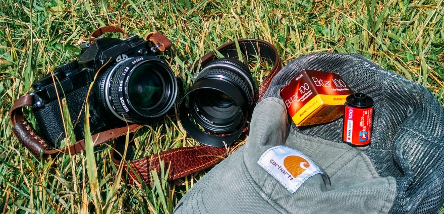
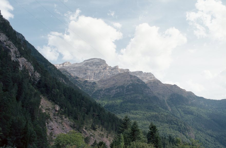
I was lucky enough to be able to visit Japan in 2018. Even though I brought several rolls of film, I was planning to go “film hunting” in the famous Yodobashi camera store. However, during the film morning in Kyoto, I was able to find some of the films I wanted in a small store by the Fushimi Inari temple, so I just went for it. Although that day I was already loaded and decided to keep the Fujicolor 100 for another day trip. I loaded it into my FM2 and paired with my 28mm f2.8 -50mm f1.8 traveling combo.

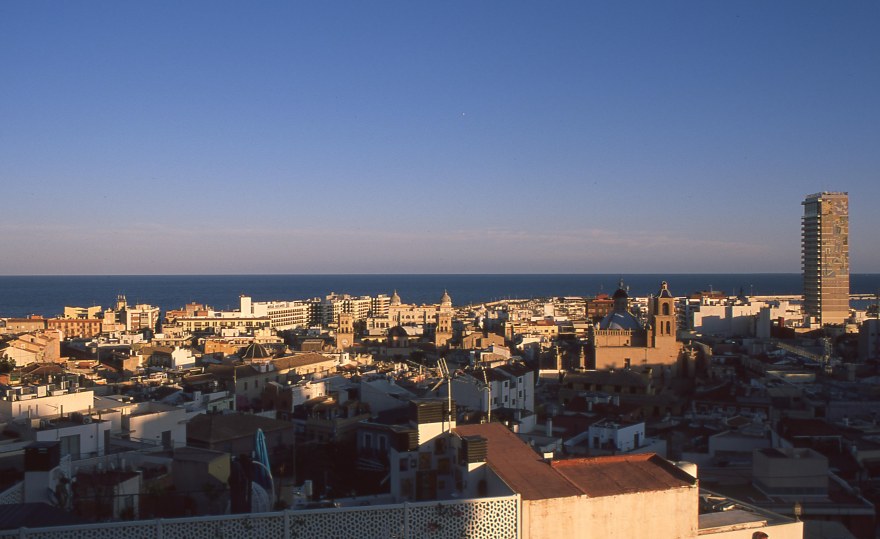
The first thing to notices is that reds are not as bright as with other reviewed Fujifilm films, instead of bright red the color obtained is more crimson. Slightly darker but really intense, I would say that is less distracting than bright reds.
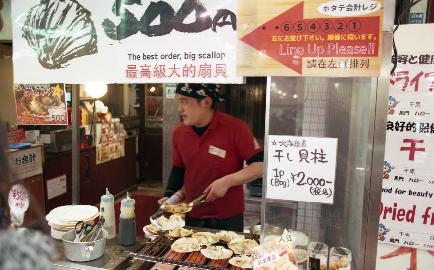

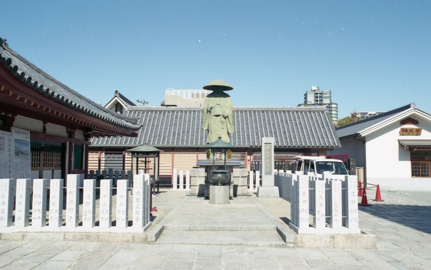
Same with the blue hues, I would say they are slightly less bright than in real life, the statue was quite bright blue, and in the picture I feel is more teal looking. But, that looks great on skies, even under harsh light, the Fujicolor 100 keeps so much of the blue tone in the sky.

Greens have a yellow tonality, same like I found in cheaper Kodak emulsions. Definitely not a bad thing, I love the brownish Kodak palette, but it definitely looks different from the classic greenish ting found in other Fujifilm films. Same with yellows, they are less bright yellow and more ocher.


I also shot a few portraits, with natural light and also with direct flash. Surprisingly, the film was great. I tend to not like Fujifilm films for portraits, since they tend to create a red tone in fair skin tones. Not only in the results I obtained, but also other photos that I found on-line, show a slight low contrast, that works well with portraits. With both, lighter skin tones and darker skin tones, there is a slight yellow cast, that could be also easily removed in post-production.
-002")
-001")
Color chart and measurement of the colors.
RED: Average Colour R:212.0 G:150.0 B:76.0
BLUE: Average Colour R:76.0 G:149.0 B:175.0
YELLOW: Average Colour R:230.0 G:210.0 B:13.0
GREEN: Average Colour R:192.0 G:209.0 B:96.0
You can take also a look at this article on How do I measure the colors?

I was really hesitant when I first bought this film, I tried similar films before like the Industrial 100 or Superia 200. Both of them were marketed equally to the Japanese Fujicolor 100, same customer target and “good rendition” of colors. But, I was fairly disappointed with the results of those films. However I was taken aback by the results, the color rendition is not great, it really does not reflect the colors from the scene as it happened. Nevertheless, the film has character, it has an amazing color palette, really characteristic, a little bit yellowish, undersaturated but that stills retain lots of detail with a minimum amount of grain.
-026")
-010")
-013")
Personally, the biggest drawbacks of this film for me are availability and low ISO. The low ISO factor is definitely subjective, I tend to prefer the 200-400 range, so I would go for the brother of this film the Superia PREMIUM 400, similar emulsion. It’s also available only in Japan, but with a couple of stops more of sensitivity. The other drawback would be availability, I’m currently based in Taiwan, so for me is just slightly more expensive than other films. It can be easy to find on Rakuten (the Japanese Amazon) in 27 and 36 exposures. For around the price of a roll of Kodak Ektar or Portra 160. However for people in Europe or America, the price of a three pack, can skyrocket to more than double of a pro film. Even I loved this film, I don’t think is worth the price tag including the shipping.
YES ⇑
- With good light conditions is a great, balanced film for every situation
- I like it for portraits, low contrast, low grain but retains high detail.
- If you like its own character and color palette.
NO ⇓
- If you have to pay a massive extra for shipping, there are other options as good as this film.
- If you look for high fidelity and true to life colors, I would choose another film for product or landscape photography
Check out the gallery for more shots taken with the Fujicolor 100


-035")
-033")
-031")
-030")
-029")
-028")
-027")
-026")
-025")
-024")
-023")
-022")
-021")
-019")
-018")
-017")
-016")
-015")
-014")
-013")
-012")
-011")
-009")
-008")
-010")
-007")
-006")
-004")
-003")
-005")
-002")
-001")


![[FILM] TAIWAN tamkang tamsui JUN2017 Olympus OM-30 Kodak Vision3 50D018](https://carlosgrphoto.com/wp-content/uploads/2017/07/film-taiwan-tamkang-tamsui-jun2017-olympus-om-30-kodak-vision3-50d018.jpg?w=880)
![[FILM] TAIWAN tamkang tamsui JUN2017 Olympus OM-30 Kodak Vision3 50D031](https://carlosgrphoto.com/wp-content/uploads/2017/07/film-taiwan-tamkang-tamsui-jun2017-olympus-om-30-kodak-vision3-50d031.jpg?w=880)
![[FILM] TAIWAN tamkang tamsui JUN2017 Olympus OM-30 Kodak Vision3 50D030](https://carlosgrphoto.com/wp-content/uploads/2017/07/film-taiwan-tamkang-tamsui-jun2017-olympus-om-30-kodak-vision3-50d030.jpg?w=880)
![[FILM] TAIWAN tamkang tamsui JUN2017 Olympus OM-30 Kodak Vision3 50D003](https://carlosgrphoto.com/wp-content/uploads/2017/07/film-taiwan-tamkang-tamsui-jun2017-olympus-om-30-kodak-vision3-50d003.jpg?w=880)
![[FILM] TAIWAN tamkang tamsui JUN2017 Olympus OM-30 Kodak Vision3 50D012](https://carlosgrphoto.com/wp-content/uploads/2017/07/film-taiwan-tamkang-tamsui-jun2017-olympus-om-30-kodak-vision3-50d012.jpg?w=880)
![[FILM] TAIWAN tamkang tamsui JUN2017 Olympus OM-30 Kodak Vision3 50D011](https://carlosgrphoto.com/wp-content/uploads/2017/07/film-taiwan-tamkang-tamsui-jun2017-olympus-om-30-kodak-vision3-50d011.jpg?w=880)
![[FILM] TAIWAN tamkang tamsui JUN2017 Olympus OM-30 Kodak Vision3 50D007](https://carlosgrphoto.com/wp-content/uploads/2017/07/film-taiwan-tamkang-tamsui-jun2017-olympus-om-30-kodak-vision3-50d007.jpg?w=880)
![[FILM] TAIWAN tamkang tamsui JUN2017 Olympus OM-30 Kodak Vision3 50D008](https://carlosgrphoto.com/wp-content/uploads/2017/07/film-taiwan-tamkang-tamsui-jun2017-olympus-om-30-kodak-vision3-50d008.jpg?w=880)
![[FILM] TAIWAN tamkang tamsui JUN2017 Olympus OM-30 Kodak Vision3 50D005](https://carlosgrphoto.com/wp-content/uploads/2017/07/film-taiwan-tamkang-tamsui-jun2017-olympus-om-30-kodak-vision3-50d005.jpg?w=880)
![[FILM] TAIWAN tamkang tamsui JUN2017 Olympus OM-30 Kodak Vision3 50D002](https://carlosgrphoto.com/wp-content/uploads/2017/07/film-taiwan-tamkang-tamsui-jun2017-olympus-om-30-kodak-vision3-50d002.jpg?w=880)
![[FILM] TAIWAN tamkang tamsui JUN2017 Olympus OM-30 Kodak Vision3 50D023](https://i0.wp.com/carlosgrphoto.com/wp-content/uploads/2017/07/film-taiwan-tamkang-tamsui-jun2017-olympus-om-30-kodak-vision3-50d023.jpg?w=436&h=436&crop=1&ssl=1 "[FILM] TAIWAN tamkang tamsui JUN2017 Olympus OM-30 Kodak Vision3 50D023")
![[FILM] TAIWAN tamkang tamsui JUN2017 Olympus OM-30 Kodak Vision3 50D021](https://i0.wp.com/carlosgrphoto.com/wp-content/uploads/2017/07/film-taiwan-tamkang-tamsui-jun2017-olympus-om-30-kodak-vision3-50d021.jpg?w=436&h=436&crop=1&ssl=1 "[FILM] TAIWAN tamkang tamsui JUN2017 Olympus OM-30 Kodak Vision3 50D021")


![[FILM] TAIWAN tamkang tamsui JUN2017 Olympus OM-30 Kodak Vision3 50D014](https://carlosgrphoto.com/wp-content/uploads/2017/07/film-taiwan-tamkang-tamsui-jun2017-olympus-om-30-kodak-vision3-50d014.jpg?w=880)
![[FILM] TAIWAN tamkang tamsui JUN2017 Olympus OM-30 Kodak Vision3 50D026](https://i0.wp.com/carlosgrphoto.com/wp-content/uploads/2017/07/film-taiwan-tamkang-tamsui-jun2017-olympus-om-30-kodak-vision3-50d026.jpg?w=393&h=249&ssl=1 "[FILM] TAIWAN tamkang tamsui JUN2017 Olympus OM-30 Kodak Vision3 50D026")
![[FILM] TAIWAN tamkang tamsui JUN2017 Olympus OM-30 Kodak Vision3 50D036](https://i0.wp.com/carlosgrphoto.com/wp-content/uploads/2017/07/film-taiwan-tamkang-tamsui-jun2017-olympus-om-30-kodak-vision3-50d036.jpg?w=393&h=246&ssl=1 "[FILM] TAIWAN tamkang tamsui JUN2017 Olympus OM-30 Kodak Vision3 50D036")
![[FILM] TAIWAN tamkang tamsui JUN2017 Olympus OM-30 Kodak Vision3 50D010](https://i0.wp.com/carlosgrphoto.com/wp-content/uploads/2017/07/film-taiwan-tamkang-tamsui-jun2017-olympus-om-30-kodak-vision3-50d010.jpg?w=393&h=249&ssl=1 "[FILM] TAIWAN tamkang tamsui JUN2017 Olympus OM-30 Kodak Vision3 50D010")
![[FILM] TAIWAN tamkang tamsui JUN2017 Olympus OM-30 Kodak Vision3 50D004](https://i0.wp.com/carlosgrphoto.com/wp-content/uploads/2017/07/film-taiwan-tamkang-tamsui-jun2017-olympus-om-30-kodak-vision3-50d004.jpg?w=479&h=752&ssl=1 "[FILM] TAIWAN tamkang tamsui JUN2017 Olympus OM-30 Kodak Vision3 50D004")


![[FILM] TAIWAN tamkang tamsui JUN2017 Olympus OM-30 Kodak Vision3 50D038](https://i0.wp.com/carlosgrphoto.com/wp-content/uploads/2017/07/film-taiwan-tamkang-tamsui-jun2017-olympus-om-30-kodak-vision3-50d038.jpg?w=623&h=393&ssl=1 "[FILM] TAIWAN tamkang tamsui JUN2017 Olympus OM-30 Kodak Vision3 50D038")
![[FILM] TAIWAN tamkang tamsui JUN2017 Olympus OM-30 Kodak Vision3 50D036](https://i0.wp.com/carlosgrphoto.com/wp-content/uploads/2017/07/film-taiwan-tamkang-tamsui-jun2017-olympus-om-30-kodak-vision3-50d036.jpg?w=585&h=367&ssl=1 "[FILM] TAIWAN tamkang tamsui JUN2017 Olympus OM-30 Kodak Vision3 50D036")
![[FILM] TAIWAN tamkang tamsui JUN2017 Olympus OM-30 Kodak Vision3 50D035](https://i0.wp.com/carlosgrphoto.com/wp-content/uploads/2017/07/film-taiwan-tamkang-tamsui-jun2017-olympus-om-30-kodak-vision3-50d035.jpg?w=287&h=182&ssl=1 "[FILM] TAIWAN tamkang tamsui JUN2017 Olympus OM-30 Kodak Vision3 50D035")
![[FILM] TAIWAN tamkang tamsui JUN2017 Olympus OM-30 Kodak Vision3 50D034](https://i0.wp.com/carlosgrphoto.com/wp-content/uploads/2017/07/film-taiwan-tamkang-tamsui-jun2017-olympus-om-30-kodak-vision3-50d034.jpg?w=287&h=181&ssl=1 "[FILM] TAIWAN tamkang tamsui JUN2017 Olympus OM-30 Kodak Vision3 50D034")
![[FILM] TAIWAN tamkang tamsui JUN2017 Olympus OM-30 Kodak Vision3 50D033](https://i0.wp.com/carlosgrphoto.com/wp-content/uploads/2017/07/film-taiwan-tamkang-tamsui-jun2017-olympus-om-30-kodak-vision3-50d033.jpg?w=440&h=278&ssl=1 "[FILM] TAIWAN tamkang tamsui JUN2017 Olympus OM-30 Kodak Vision3 50D033")
![[FILM] TAIWAN tamkang tamsui JUN2017 Olympus OM-30 Kodak Vision3 50D031](https://i0.wp.com/carlosgrphoto.com/wp-content/uploads/2017/07/film-taiwan-tamkang-tamsui-jun2017-olympus-om-30-kodak-vision3-50d031.jpg?w=432&h=278&ssl=1 "[FILM] TAIWAN tamkang tamsui JUN2017 Olympus OM-30 Kodak Vision3 50D031")
![[FILM] TAIWAN tamkang tamsui JUN2017 Olympus OM-30 Kodak Vision3 50D030](https://i0.wp.com/carlosgrphoto.com/wp-content/uploads/2017/07/film-taiwan-tamkang-tamsui-jun2017-olympus-om-30-kodak-vision3-50d030.jpg?w=432&h=279&ssl=1 "[FILM] TAIWAN tamkang tamsui JUN2017 Olympus OM-30 Kodak Vision3 50D030")
![[FILM] TAIWAN tamkang tamsui JUN2017 Olympus OM-30 Kodak Vision3 50D029](https://i0.wp.com/carlosgrphoto.com/wp-content/uploads/2017/07/film-taiwan-tamkang-tamsui-jun2017-olympus-om-30-kodak-vision3-50d029.jpg?w=440&h=279&ssl=1 "[FILM] TAIWAN tamkang tamsui JUN2017 Olympus OM-30 Kodak Vision3 50D029")
![[FILM] TAIWAN tamkang tamsui JUN2017 Olympus OM-30 Kodak Vision3 50D028](https://i0.wp.com/carlosgrphoto.com/wp-content/uploads/2017/07/film-taiwan-tamkang-tamsui-jun2017-olympus-om-30-kodak-vision3-50d028.jpg?w=288&h=182&ssl=1 "[FILM] TAIWAN tamkang tamsui JUN2017 Olympus OM-30 Kodak Vision3 50D028")
![[FILM] TAIWAN tamkang tamsui JUN2017 Olympus OM-30 Kodak Vision3 50D027](https://i0.wp.com/carlosgrphoto.com/wp-content/uploads/2017/07/film-taiwan-tamkang-tamsui-jun2017-olympus-om-30-kodak-vision3-50d027.jpg?w=288&h=182&ssl=1 "[FILM] TAIWAN tamkang tamsui JUN2017 Olympus OM-30 Kodak Vision3 50D027")
![[FILM] TAIWAN tamkang tamsui JUN2017 Olympus OM-30 Kodak Vision3 50D023](https://i0.wp.com/carlosgrphoto.com/wp-content/uploads/2017/07/film-taiwan-tamkang-tamsui-jun2017-olympus-om-30-kodak-vision3-50d023.jpg?w=584&h=368&ssl=1 "[FILM] TAIWAN tamkang tamsui JUN2017 Olympus OM-30 Kodak Vision3 50D023")
![[FILM] TAIWAN tamkang tamsui JUN2017 Olympus OM-30 Kodak Vision3 50D021](https://i0.wp.com/carlosgrphoto.com/wp-content/uploads/2017/07/film-taiwan-tamkang-tamsui-jun2017-olympus-om-30-kodak-vision3-50d021.jpg?w=624&h=391&ssl=1 "[FILM] TAIWAN tamkang tamsui JUN2017 Olympus OM-30 Kodak Vision3 50D021")
![[FILM] TAIWAN tamkang tamsui JUN2017 Olympus OM-30 Kodak Vision3 50D025](https://i0.wp.com/carlosgrphoto.com/wp-content/uploads/2017/07/film-taiwan-tamkang-tamsui-jun2017-olympus-om-30-kodak-vision3-50d025.jpg?w=248&h=391&ssl=1 "[FILM] TAIWAN tamkang tamsui JUN2017 Olympus OM-30 Kodak Vision3 50D025")
![[FILM] TAIWAN tamkang tamsui JUN2017 Olympus OM-30 Kodak Vision3 50D026](https://i0.wp.com/carlosgrphoto.com/wp-content/uploads/2017/07/film-taiwan-tamkang-tamsui-jun2017-olympus-om-30-kodak-vision3-50d026.jpg?w=615&h=389&ssl=1 "[FILM] TAIWAN tamkang tamsui JUN2017 Olympus OM-30 Kodak Vision3 50D026")
![[FILM] TAIWAN tamkang tamsui JUN2017 Olympus OM-30 Kodak Vision3 50D018](https://i0.wp.com/carlosgrphoto.com/wp-content/uploads/2017/07/film-taiwan-tamkang-tamsui-jun2017-olympus-om-30-kodak-vision3-50d018.jpg?w=257&h=389&ssl=1 "[FILM] TAIWAN tamkang tamsui JUN2017 Olympus OM-30 Kodak Vision3 50D018")
![[FILM] TAIWAN tamkang tamsui JUN2017 Olympus OM-30 Kodak Vision3 50D017](https://i0.wp.com/carlosgrphoto.com/wp-content/uploads/2017/07/film-taiwan-tamkang-tamsui-jun2017-olympus-om-30-kodak-vision3-50d017.jpg?w=601&h=389&ssl=1 "[FILM] TAIWAN tamkang tamsui JUN2017 Olympus OM-30 Kodak Vision3 50D017")
![[FILM] TAIWAN tamkang tamsui JUN2017 Olympus OM-30 Kodak Vision3 50D016](https://i0.wp.com/carlosgrphoto.com/wp-content/uploads/2017/07/film-taiwan-tamkang-tamsui-jun2017-olympus-om-30-kodak-vision3-50d016.jpg?w=271&h=175&ssl=1 "[FILM] TAIWAN tamkang tamsui JUN2017 Olympus OM-30 Kodak Vision3 50D016")
![[FILM] TAIWAN tamkang tamsui JUN2017 Olympus OM-30 Kodak Vision3 50D014](https://i0.wp.com/carlosgrphoto.com/wp-content/uploads/2017/07/film-taiwan-tamkang-tamsui-jun2017-olympus-om-30-kodak-vision3-50d014.jpg?w=271&h=210&ssl=1 "[FILM] TAIWAN tamkang tamsui JUN2017 Olympus OM-30 Kodak Vision3 50D014")
![[FILM] TAIWAN tamkang tamsui JUN2017 Olympus OM-30 Kodak Vision3 50D012](https://i0.wp.com/carlosgrphoto.com/wp-content/uploads/2017/07/film-taiwan-tamkang-tamsui-jun2017-olympus-om-30-kodak-vision3-50d012.jpg?w=286&h=185&ssl=1 "[FILM] TAIWAN tamkang tamsui JUN2017 Olympus OM-30 Kodak Vision3 50D012")
![[FILM] TAIWAN tamkang tamsui JUN2017 Olympus OM-30 Kodak Vision3 50D011](https://i0.wp.com/carlosgrphoto.com/wp-content/uploads/2017/07/film-taiwan-tamkang-tamsui-jun2017-olympus-om-30-kodak-vision3-50d011.jpg?w=286&h=181&ssl=1 "[FILM] TAIWAN tamkang tamsui JUN2017 Olympus OM-30 Kodak Vision3 50D011")
![[FILM] TAIWAN tamkang tamsui JUN2017 Olympus OM-30 Kodak Vision3 50D010](https://i0.wp.com/carlosgrphoto.com/wp-content/uploads/2017/07/film-taiwan-tamkang-tamsui-jun2017-olympus-om-30-kodak-vision3-50d010.jpg?w=586&h=370&ssl=1 "[FILM] TAIWAN tamkang tamsui JUN2017 Olympus OM-30 Kodak Vision3 50D010")
![[FILM] TAIWAN tamkang tamsui JUN2017 Olympus OM-30 Kodak Vision3 50D009](https://i0.wp.com/carlosgrphoto.com/wp-content/uploads/2017/07/film-taiwan-tamkang-tamsui-jun2017-olympus-om-30-kodak-vision3-50d009.jpg?w=290&h=183&ssl=1 "[FILM] TAIWAN tamkang tamsui JUN2017 Olympus OM-30 Kodak Vision3 50D009")
![[FILM] TAIWAN tamkang tamsui JUN2017 Olympus OM-30 Kodak Vision3 50D008](https://i0.wp.com/carlosgrphoto.com/wp-content/uploads/2017/07/film-taiwan-tamkang-tamsui-jun2017-olympus-om-30-kodak-vision3-50d008.jpg?w=289&h=183&ssl=1 "[FILM] TAIWAN tamkang tamsui JUN2017 Olympus OM-30 Kodak Vision3 50D008")
![[FILM] TAIWAN tamkang tamsui JUN2017 Olympus OM-30 Kodak Vision3 50D007](https://i0.wp.com/carlosgrphoto.com/wp-content/uploads/2017/07/film-taiwan-tamkang-tamsui-jun2017-olympus-om-30-kodak-vision3-50d007.jpg?w=289&h=183&ssl=1 "[FILM] TAIWAN tamkang tamsui JUN2017 Olympus OM-30 Kodak Vision3 50D007")
![[FILM] TAIWAN tamkang tamsui JUN2017 Olympus OM-30 Kodak Vision3 50D006](https://i0.wp.com/carlosgrphoto.com/wp-content/uploads/2017/07/film-taiwan-tamkang-tamsui-jun2017-olympus-om-30-kodak-vision3-50d006.jpg?w=436&h=277&ssl=1 "[FILM] TAIWAN tamkang tamsui JUN2017 Olympus OM-30 Kodak Vision3 50D006")
![[FILM] TAIWAN tamkang tamsui JUN2017 Olympus OM-30 Kodak Vision3 50D005](https://i0.wp.com/carlosgrphoto.com/wp-content/uploads/2017/07/film-taiwan-tamkang-tamsui-jun2017-olympus-om-30-kodak-vision3-50d005.jpg?w=436&h=277&ssl=1 "[FILM] TAIWAN tamkang tamsui JUN2017 Olympus OM-30 Kodak Vision3 50D005")
![[FILM] TAIWAN tamkang tamsui JUN2017 Olympus OM-30 Kodak Vision3 50D004](https://i0.wp.com/carlosgrphoto.com/wp-content/uploads/2017/07/film-taiwan-tamkang-tamsui-jun2017-olympus-om-30-kodak-vision3-50d004.jpg?w=482&h=756&ssl=1 "[FILM] TAIWAN tamkang tamsui JUN2017 Olympus OM-30 Kodak Vision3 50D004")
![[FILM] TAIWAN tamkang tamsui JUN2017 Olympus OM-30 Kodak Vision3 50D003](https://i0.wp.com/carlosgrphoto.com/wp-content/uploads/2017/07/film-taiwan-tamkang-tamsui-jun2017-olympus-om-30-kodak-vision3-50d003.jpg?w=390&h=248&ssl=1 "[FILM] TAIWAN tamkang tamsui JUN2017 Olympus OM-30 Kodak Vision3 50D003")
![[FILM] TAIWAN tamkang tamsui JUN2017 Olympus OM-30 Kodak Vision3 50D002](https://i0.wp.com/carlosgrphoto.com/wp-content/uploads/2017/07/film-taiwan-tamkang-tamsui-jun2017-olympus-om-30-kodak-vision3-50d002.jpg?w=390&h=249&ssl=1 "[FILM] TAIWAN tamkang tamsui JUN2017 Olympus OM-30 Kodak Vision3 50D002")
![[FILM] TAIWAN tamkang tamsui JUN2017 Olympus OM-30 Kodak Vision3 50D001](https://i0.wp.com/carlosgrphoto.com/wp-content/uploads/2017/07/film-taiwan-tamkang-tamsui-jun2017-olympus-om-30-kodak-vision3-50d001.jpg?w=390&h=251&ssl=1 "[FILM] TAIWAN tamkang tamsui JUN2017 Olympus OM-30 Kodak Vision3 50D001")


![[FILM] TAIWAN friends sakura APR2017 Nikon F100 Fujicolor ProviaF 100029-2](https://carlosgrphoto.com/wp-content/uploads/2017/05/film-taiwan-friends-sakura-apr2017-nikon-f100-fujicolor-proviaf-100029-2.jpg?w=880)
![[FILM] TAIWAN friends sakura APR2017 Nikon F100 Fujicolor ProviaF 100005](https://carlosgrphoto.com/wp-content/uploads/2017/05/film-taiwan-friends-sakura-apr2017-nikon-f100-fujicolor-proviaf-100005.jpg?w=880)
![[FILM] TAIWAN friends sakura APR2017 Nikon F100 Fujicolor ProviaF 100025](https://carlosgrphoto.com/wp-content/uploads/2017/05/film-taiwan-friends-sakura-apr2017-nikon-f100-fujicolor-proviaf-100025.jpg?w=880)
![[FILM] TAIWAN friends sakura APR2017 Nikon F100 Fujicolor ProviaF 100022](https://carlosgrphoto.com/wp-content/uploads/2017/05/film-taiwan-friends-sakura-apr2017-nikon-f100-fujicolor-proviaf-100022.jpg?w=880)
![[FILM] TAIWAN friends sakura APR2017 Nikon F100 Fujicolor ProviaF 100013](https://carlosgrphoto.com/wp-content/uploads/2017/05/film-taiwan-friends-sakura-apr2017-nikon-f100-fujicolor-proviaf-100013.jpg?w=880)

![[FILM] TAIWAN friends sakura APR2017 Nikon F100 Fujicolor ProviaF 100006](https://carlosgrphoto.com/wp-content/uploads/2017/05/film-taiwan-friends-sakura-apr2017-nikon-f100-fujicolor-proviaf-100006.jpg?w=880)


![[FILM] TAIWAN friends sakura APR2017 Nikon F100 Fujicolor ProviaF 100017](https://carlosgrphoto.com/wp-content/uploads/2017/05/film-taiwan-friends-sakura-apr2017-nikon-f100-fujicolor-proviaf-100017.jpg?w=880)
![[FILM] TAIWAN friends sakura APR2017 Nikon F100 Fujicolor ProviaF 100015](https://i0.wp.com/carlosgrphoto.com/wp-content/uploads/2017/05/film-taiwan-friends-sakura-apr2017-nikon-f100-fujicolor-proviaf-100015.jpg?w=490&h=303&ssl=1 "[FILM] TAIWAN friends sakura APR2017 Nikon F100 Fujicolor ProviaF 100015")
![[FILM] TAIWAN friends sakura APR2017 Nikon F100 Fujicolor ProviaF 100027](https://i0.wp.com/carlosgrphoto.com/wp-content/uploads/2017/05/film-taiwan-friends-sakura-apr2017-nikon-f100-fujicolor-proviaf-100027.jpg?w=490&h=320&ssl=1 "[FILM] TAIWAN friends sakura APR2017 Nikon F100 Fujicolor ProviaF 100027")
![[FILM] TAIWAN friends sakura APR2017 Nikon F100 Fujicolor ProviaF 100023](https://i0.wp.com/carlosgrphoto.com/wp-content/uploads/2017/05/film-taiwan-friends-sakura-apr2017-nikon-f100-fujicolor-proviaf-100023.jpg?w=382&h=627&ssl=1 "[FILM] TAIWAN friends sakura APR2017 Nikon F100 Fujicolor ProviaF 100023")
![[FILM] TAIWAN friends sakura APR2017 Nikon F100 Fujicolor ProviaF 100027](https://i0.wp.com/carlosgrphoto.com/wp-content/uploads/2017/05/film-taiwan-friends-sakura-apr2017-nikon-f100-fujicolor-proviaf-100027.jpg?w=621&h=406&ssl=1 "[FILM] TAIWAN friends sakura APR2017 Nikon F100 Fujicolor ProviaF 100027")
![[FILM] TAIWAN friends sakura APR2017 Nikon F100 Fujicolor ProviaF 100026](https://i0.wp.com/carlosgrphoto.com/wp-content/uploads/2017/05/film-taiwan-friends-sakura-apr2017-nikon-f100-fujicolor-proviaf-100026.jpg?w=251&h=406&ssl=1 "[FILM] TAIWAN friends sakura APR2017 Nikon F100 Fujicolor ProviaF 100026")
![[FILM] TAIWAN friends sakura APR2017 Nikon F100 Fujicolor ProviaF 100025](https://i0.wp.com/carlosgrphoto.com/wp-content/uploads/2017/05/film-taiwan-friends-sakura-apr2017-nikon-f100-fujicolor-proviaf-100025.jpg?w=633&h=389&ssl=1 "[FILM] TAIWAN friends sakura APR2017 Nikon F100 Fujicolor ProviaF 100025")
![[FILM] TAIWAN friends sakura APR2017 Nikon F100 Fujicolor ProviaF 100024](https://i0.wp.com/carlosgrphoto.com/wp-content/uploads/2017/05/film-taiwan-friends-sakura-apr2017-nikon-f100-fujicolor-proviaf-100024.jpg?w=239&h=389&ssl=1 "[FILM] TAIWAN friends sakura APR2017 Nikon F100 Fujicolor ProviaF 100024")
![[FILM] TAIWAN friends sakura APR2017 Nikon F100 Fujicolor ProviaF 100023](https://i0.wp.com/carlosgrphoto.com/wp-content/uploads/2017/05/film-taiwan-friends-sakura-apr2017-nikon-f100-fujicolor-proviaf-100023.jpg?w=239&h=392&ssl=1 "[FILM] TAIWAN friends sakura APR2017 Nikon F100 Fujicolor ProviaF 100023")
![[FILM] TAIWAN friends sakura APR2017 Nikon F100 Fujicolor ProviaF 100022](https://i0.wp.com/carlosgrphoto.com/wp-content/uploads/2017/05/film-taiwan-friends-sakura-apr2017-nikon-f100-fujicolor-proviaf-100022.jpg?w=633&h=392&ssl=1 "[FILM] TAIWAN friends sakura APR2017 Nikon F100 Fujicolor ProviaF 100022")
![[FILM] TAIWAN friends sakura APR2017 Nikon F100 Fujicolor ProviaF 100021](https://i0.wp.com/carlosgrphoto.com/wp-content/uploads/2017/05/film-taiwan-friends-sakura-apr2017-nikon-f100-fujicolor-proviaf-100021.jpg?w=468&h=756&ssl=1 "[FILM] TAIWAN friends sakura APR2017 Nikon F100 Fujicolor ProviaF 100021")
![[FILM] TAIWAN friends sakura APR2017 Nikon F100 Fujicolor ProviaF 100020](https://i0.wp.com/carlosgrphoto.com/wp-content/uploads/2017/05/film-taiwan-friends-sakura-apr2017-nikon-f100-fujicolor-proviaf-100020.jpg?w=404&h=251&ssl=1 "[FILM] TAIWAN friends sakura APR2017 Nikon F100 Fujicolor ProviaF 100020")


![[FILM] TAIWAN friends sakura APR2017 Nikon F100 Fujicolor ProviaF 100017](https://i0.wp.com/carlosgrphoto.com/wp-content/uploads/2017/05/film-taiwan-friends-sakura-apr2017-nikon-f100-fujicolor-proviaf-100017.jpg?w=330&h=255&ssl=1 "[FILM] TAIWAN friends sakura APR2017 Nikon F100 Fujicolor ProviaF 100017")
![[FILM] TAIWAN friends sakura APR2017 Nikon F100 Fujicolor ProviaF 100015](https://i0.wp.com/carlosgrphoto.com/wp-content/uploads/2017/05/film-taiwan-friends-sakura-apr2017-nikon-f100-fujicolor-proviaf-100015.jpg?w=330&h=204&ssl=1 "[FILM] TAIWAN friends sakura APR2017 Nikon F100 Fujicolor ProviaF 100015")
![[FILM] TAIWAN friends sakura APR2017 Nikon F100 Fujicolor ProviaF 100014](https://i0.wp.com/carlosgrphoto.com/wp-content/uploads/2017/05/film-taiwan-friends-sakura-apr2017-nikon-f100-fujicolor-proviaf-100014.jpg?w=330&h=207&ssl=1 "[FILM] TAIWAN friends sakura APR2017 Nikon F100 Fujicolor ProviaF 100014")
![[FILM] TAIWAN friends sakura APR2017 Nikon F100 Fujicolor ProviaF 100013](https://i0.wp.com/carlosgrphoto.com/wp-content/uploads/2017/05/film-taiwan-friends-sakura-apr2017-nikon-f100-fujicolor-proviaf-100013.jpg?w=542&h=674&ssl=1 "[FILM] TAIWAN friends sakura APR2017 Nikon F100 Fujicolor ProviaF 100013")
![[FILM] TAIWAN friends sakura APR2017 Nikon F100 Fujicolor ProviaF 100012](https://i0.wp.com/carlosgrphoto.com/wp-content/uploads/2017/05/film-taiwan-friends-sakura-apr2017-nikon-f100-fujicolor-proviaf-100012.jpg?w=583&h=364&ssl=1 "[FILM] TAIWAN friends sakura APR2017 Nikon F100 Fujicolor ProviaF 100012")
![[FILM] TAIWAN friends sakura APR2017 Nikon F100 Fujicolor ProviaF 100011](https://i0.wp.com/carlosgrphoto.com/wp-content/uploads/2017/05/film-taiwan-friends-sakura-apr2017-nikon-f100-fujicolor-proviaf-100011.jpg?w=289&h=179&ssl=1 "[FILM] TAIWAN friends sakura APR2017 Nikon F100 Fujicolor ProviaF 100011")
![[FILM] TAIWAN friends sakura APR2017 Nikon F100 Fujicolor ProviaF 100010](https://i0.wp.com/carlosgrphoto.com/wp-content/uploads/2017/05/film-taiwan-friends-sakura-apr2017-nikon-f100-fujicolor-proviaf-100010.jpg?w=289&h=181&ssl=1 "[FILM] TAIWAN friends sakura APR2017 Nikon F100 Fujicolor ProviaF 100010")
![[FILM] TAIWAN friends sakura APR2017 Nikon F100 Fujicolor ProviaF 100009](https://i0.wp.com/carlosgrphoto.com/wp-content/uploads/2017/05/film-taiwan-friends-sakura-apr2017-nikon-f100-fujicolor-proviaf-100009.jpg?w=630&h=393&ssl=1 "[FILM] TAIWAN friends sakura APR2017 Nikon F100 Fujicolor ProviaF 100009")

![[FILM] TAIWAN friends sakura APR2017 Nikon F100 Fujicolor ProviaF 100007](https://i0.wp.com/carlosgrphoto.com/wp-content/uploads/2017/05/film-taiwan-friends-sakura-apr2017-nikon-f100-fujicolor-proviaf-100007.jpg?w=629&h=391&ssl=1 "[FILM] TAIWAN friends sakura APR2017 Nikon F100 Fujicolor ProviaF 100007")
![[FILM] TAIWAN friends sakura APR2017 Nikon F100 Fujicolor ProviaF 100006](https://i0.wp.com/carlosgrphoto.com/wp-content/uploads/2017/05/film-taiwan-friends-sakura-apr2017-nikon-f100-fujicolor-proviaf-100006.jpg?w=243&h=391&ssl=1 "[FILM] TAIWAN friends sakura APR2017 Nikon F100 Fujicolor ProviaF 100006")
![[FILM] TAIWAN friends sakura APR2017 Nikon F100 Fujicolor ProviaF 100005](https://i0.wp.com/carlosgrphoto.com/wp-content/uploads/2017/05/film-taiwan-friends-sakura-apr2017-nikon-f100-fujicolor-proviaf-100005.jpg?w=489&h=306&ssl=1 "[FILM] TAIWAN friends sakura APR2017 Nikon F100 Fujicolor ProviaF 100005")
![[FILM] TAIWAN friends sakura APR2017 Nikon F100 Fujicolor ProviaF 100004](https://i0.wp.com/carlosgrphoto.com/wp-content/uploads/2017/05/film-taiwan-friends-sakura-apr2017-nikon-f100-fujicolor-proviaf-100004.jpg?w=489&h=303&ssl=1 "[FILM] TAIWAN friends sakura APR2017 Nikon F100 Fujicolor ProviaF 100004")

