The Fujicolor Superia X-Tra 400 is one of the last remaining consumer series offered by Fujifilm. It is a really versatile ISO400 film, balanced for daylight and widely available everywhere. Most of the other consumer films offered by Fujifilm have been discontinued like Reala and Superia 100 in 2009. After that, in 2017 Superia 200 and X-tra 800 (both reviewed in the past) were also discontinued outside Japan. Leaving the Fujicolor C200 and X-TRA 400 as their only consumer films worldwide.

Fujifilm in Japan is a complete different story. Worldwide we see less and less films from them (leaving aside their INSTAX series). But, for the Japanese market, apart of the Superia X-tra 400, Fujifilm Japan launched in 2009 the Superia PREMIUM 400 with improved exposure latitude and optimized for Japanese skin tones (definition from their voucher) and without the 4th color layer. Alongside with the PREMIUM 400 and only for the Japanese market there is the Superia VENUS 800, different to the Superia X-TRA 800 and the amazing Fujicolor 100. Luckily, on a recent trip to Japan I could test them all, but they are quite hard to find outside the Japanese market. This review is for the worldwide available Superia X-Tra 400.
| Name | Superia X-TRA 400 |
| ISO | 400 |
| Developer | C-41 |
| Available formats | 35mm |
| Exposures | 24, 36 |
| DX Coding | Yes |
| Availability | ★★★★★ |

It is a very tempting film because of its price, as of today, is the cheapest 400ISO color film in B&H. Agfacolor Vista 400 is gone and the Kodak Ultramax 400 is slightly more expensive, it is a great option for shooter on a tight budget. Price and availability made this film my top choice many times, that’s why I shot so many rolls of this film. For this review, I will include some rolls that I shot with multiple cameras, Nikon FM, F3, F4, F90x and a FM2n (My current and favorite camera). Always paired with a 28mm or a 50mm. I was able shoot it in different locations: Taiwan, Spain, Ireland in different times and lights.
![[Film] SPAIN TAIWAN - boat sanxia - AUG2016 -Nikon FM S - Fujifilm XTRA 400 -026](https://carlosgrphoto.com/wp-content/uploads/2018/07/film-spain-taiwan-boat-sanxia-aug2016-nikon-fm-s-fujifilm-xtra-400-026.jpg?w=880)

![[FILM] TAIWAN yuanshan street MAR2017 Nikon F4 Fujicolor X-TRA 400017](https://carlosgrphoto.com/wp-content/uploads/2018/07/film-taiwan-yuanshan-street-mar2017-nikon-f4-fujicolor-x-tra-400017.jpg?w=880)
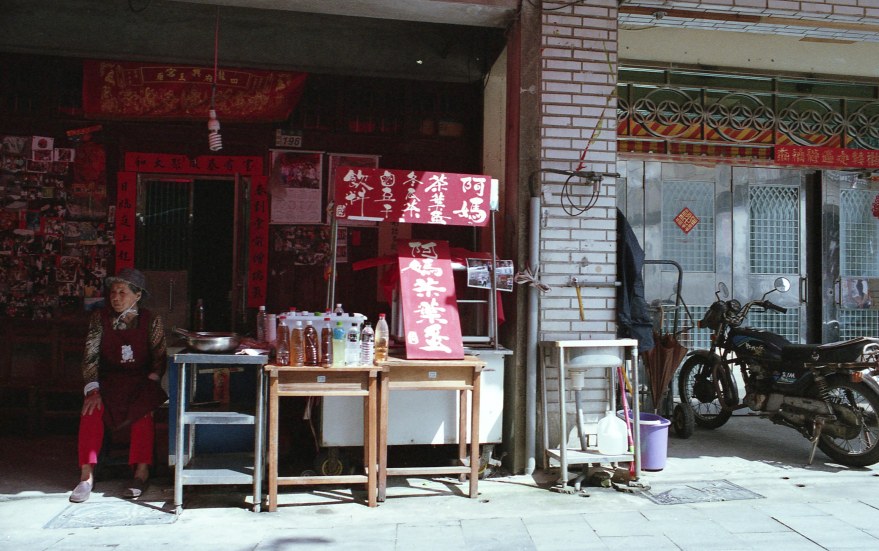
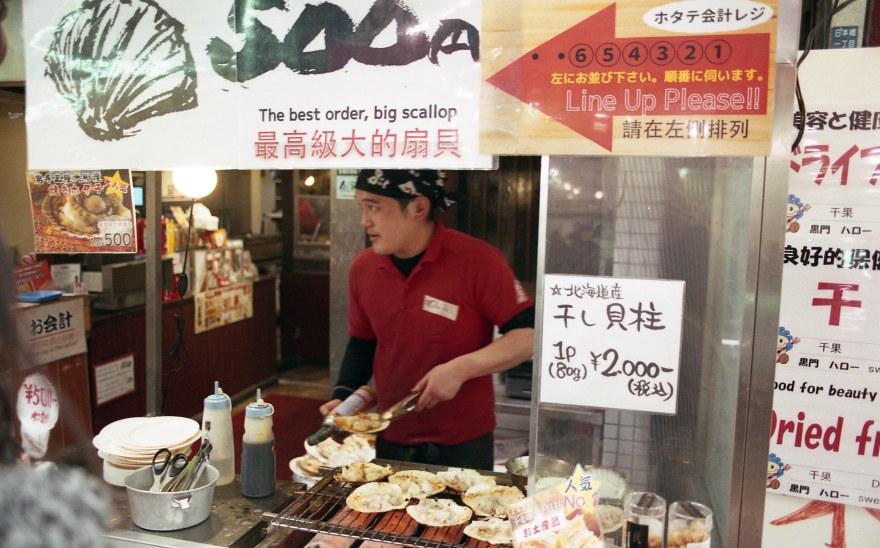
Reds are simply amazing in this film! Really punchy and saturated. When using it for street photography, reds completely pop. Reds can even be distracting sometimes, and they will affect some lighter skin tones (more on that later).
![[FILM] IRELAND TAIWAN maria ireland taipei NIKON FM(S) Fujifilm XTRA400-004](https://carlosgrphoto.com/wp-content/uploads/2018/07/film-ireland-taiwan-maria-ireland-taipei-nikon-fms-fujifilm-xtra400-004.jpg?w=880)
![[FILM] TAIWAN yuanshan street MAR2017 Nikon F4 Fujicolor X-TRA 400015](https://carlosgrphoto.com/wp-content/uploads/2018/07/film-taiwan-yuanshan-street-mar2017-nikon-f4-fujicolor-x-tra-400015.jpg?w=880)
![[FILM] TAIWAN yuanshan street MAR2017 Nikon F4 Fujicolor X-TRA 400012](https://carlosgrphoto.com/wp-content/uploads/2018/07/film-taiwan-yuanshan-street-mar2017-nikon-f4-fujicolor-x-tra-400012.jpg?w=880)
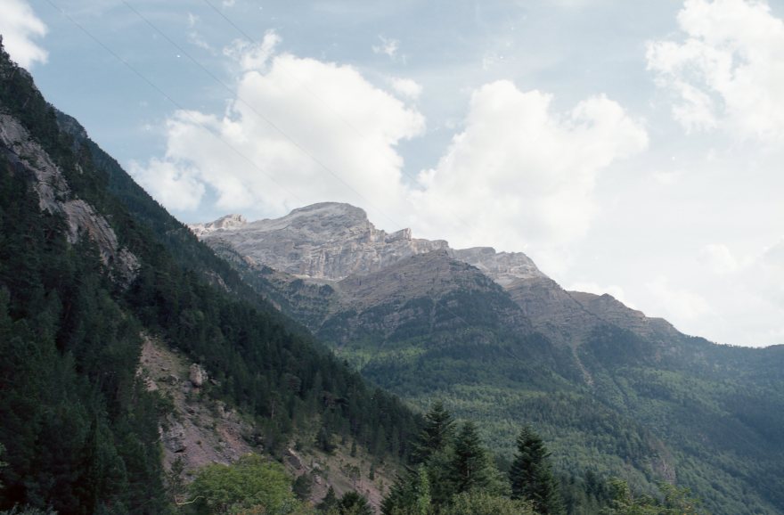
Along with the red tones, greens are also really high in contrast. I really love the green in nature landscapes. Foliage looks great, even is not a great film for landscapes (lack of detail retention and grain) , is definitely a great film for a day out at the park or hiking. Shadows also tend to adopt a greenish tone, really characteristic of Fujifilm films, you either love it or hate it.

![[Film] SPAIN TAIWAN - boat sanxia - AUG2016 -Nikon FM S - Fujifilm XTRA 400 -002](https://carlosgrphoto.com/wp-content/uploads/2018/07/film-spain-taiwan-boat-sanxia-aug2016-nikon-fm-s-fujifilm-xtra-400-002.jpg?w=880)
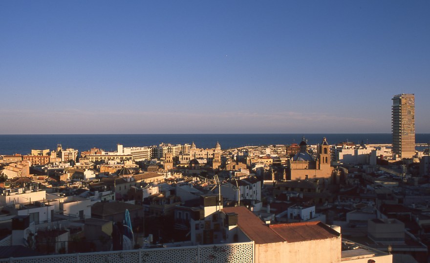
Although, not as striking as greens or reds. Blues are really beautiful and balanced. Particularly with warm light, blues are really true to color.
![[FILM] TAIWAN yuanshan street MAR2017 Nikon F4 Fujicolor X-TRA 400021](https://carlosgrphoto.com/wp-content/uploads/2018/07/film-taiwan-yuanshan-street-mar2017-nikon-f4-fujicolor-x-tra-400021.jpg?w=880)

Same as blues, yellows are really balanced and pleasing. They can come up a little bit dark sometimes. It really remind me to other Fujifilm series, the industrial 業務記錄用 , only for sale in Japan.
In addition, I shot some portraits in different lights, with and without flash.


The biggest problem that I see in this film, the ruddy skin tones. Although I praised the red tones before, I believe they are not really flattering when dealing with skin tones. Darker skin tones become slightly red, but people with lighter skin tones will become straight up pink! Since I like to include people in my pictures, this factor become decisive when choosing film. I found the same problem before with Kodak Ektar 100, great film for landscapes, but definitely not the best for portraits. This can be solved overexposing one or two stops the film, I will talk a little bit more about this onwards.
Color chart and measurement of the colors.

RED Average Colour R:217.0 G:135.0 B:89.0
BLUE Average Colour R:92.0 G:163.0 B:196.0
YELLOW Average Colour R:233.0 G:203.0 B:55.0
GREEN Average Colour R:197.0 G:211.0 B:131.0
See also: How do I measure the colors?
![[FILM] TAIWAN Jorge Taipei center DEC2015 Nikon F3 Fujifilm X-TRA 400025](https://carlosgrphoto.com/wp-content/uploads/2018/07/film-taiwan-jorge-taipei-center-dec2015-nikon-f3-fujifilm-x-tra-400025.jpg?w=880)
![[FILM] TAIWAN Jorge Taipei center DEC2015 Nikon F3 Fujifilm X-TRA 400026](https://i0.wp.com/carlosgrphoto.com/wp-content/uploads/2018/07/film-taiwan-jorge-taipei-center-dec2015-nikon-f3-fujifilm-x-tra-400026.jpg?w=476&h=755&ssl=1 "[FILM] TAIWAN Jorge Taipei center DEC2015 Nikon F3 Fujifilm X-TRA 400026")
![[Film] SPAIN TAIWAN - boat sanxia - AUG2016 -Nikon FM S - Fujifilm XTRA 400 -008](https://i0.wp.com/carlosgrphoto.com/wp-content/uploads/2018/07/film-spain-taiwan-boat-sanxia-aug2016-nikon-fm-s-fujifilm-xtra-400-008.jpg?w=396&h=247&ssl=1 "[Film] SPAIN TAIWAN - boat sanxia - AUG2016 -Nikon FM S - Fujifilm XTRA 400 -008")
![[Film] SPAIN TAIWAN - boat sanxia - AUG2016 -Nikon FM S - Fujifilm XTRA 400 -007](https://i0.wp.com/carlosgrphoto.com/wp-content/uploads/2018/07/film-spain-taiwan-boat-sanxia-aug2016-nikon-fm-s-fujifilm-xtra-400-007.jpg?w=396&h=252&ssl=1 "[Film] SPAIN TAIWAN - boat sanxia - AUG2016 -Nikon FM S - Fujifilm XTRA 400 -007")


I really enjoyed shooting this film. It cover all the bases, easy to find in stores and on-line, a cheap quality option. I like ISO400 films, it is really functional and not too grainy considering the speed. You can always have one in your bag, experiment with it, since is DX coded, you can also put it in your compact camera and good to go.
It is definitely not my favorite film, I don’t hate the green cast that some of the photos have. However, I can’t stand the ruddy (red) skin tones. I want to like this film more, but I like to include subjects in my pictures and I hate that everyone looks so red. Looking for information on how to solve this problem I found out this blog on How to shoot Superia X-Tra 400 , It strongly recommend to shoot two stops over exposed “Most consumer films do better with about two stops of overexposure and Fuji Superia 400 Xtra is no exception. You want to rate it around ISO 100 (metering from the shadows) if you” have enough light, which is 2 stops over box speed.” So I decided to try it myself, and shot a film overexposing 1 stop and underexposing 1 stop.
Underexposing X-TRA 400
Setting 800ASA in your camera will underexpose by one stop. It will accentuate the green-red tones, that can give a really cool effect if you are playing with the shadows as elements, but definitely not my favorite when dealing with skin tones or detail.
![[FILM] TAIWAN Jorge Taipei center DEC2015 Nikon F3 Fujifilm X-TRA 400006](https://carlosgrphoto.com/wp-content/uploads/2018/07/film-taiwan-jorge-taipei-center-dec2015-nikon-f3-fujifilm-x-tra-400006.jpg?w=880)
Overexposing X-TRA 400
Setting your camera at 200ISO will overexpose your film by one stop. It will mute a little bit the red and green tones and will give you a more pleasant pastel tones. And Bingo! better skin tones. After this last overexposed frames, I started to like more X-tra 400.


In conclusion, a great all-around film that, in my opinion really needs to be overexposed for at least one stop to get the best of it. I personally would choose first Kodak Ultramax 400 or the recently discontinued Agfacolor Vista 400. But you can’t go wrong with this film. I saw some people on-line that do amazing work with this film.
YES ⇑
- Daily use, versatile, high speed, load it in your camera and ready to go.
- Great price! If you are on a budget, you will not be disappointed.
- Great for wildlife and macro, greens and reds just pop!
NO ⇓
- If you don’t like red skin tones.
- I find the colors more pleasant when shooting at ISO100-200, so if you really need a high speed film, think about it twice.
- It doesn’t pull well, it gets too grainy. Go better for the Superia X-tra 800.
Check out the gallery for more shots taken with this film!


![[FILM] TAIWAN yuanshan street MAR2017 Nikon F4 Fujicolor X-TRA 400035](https://i0.wp.com/carlosgrphoto.com/wp-content/uploads/2018/07/film-taiwan-yuanshan-street-mar2017-nikon-f4-fujicolor-x-tra-400035.jpg?w=290&h=181&ssl=1 "[FILM] TAIWAN yuanshan street MAR2017 Nikon F4 Fujicolor X-TRA 400035")
![[FILM] TAIWAN yuanshan street MAR2017 Nikon F4 Fujicolor X-TRA 400032](https://i0.wp.com/carlosgrphoto.com/wp-content/uploads/2018/07/film-taiwan-yuanshan-street-mar2017-nikon-f4-fujicolor-x-tra-400032.jpg?w=290&h=181&ssl=1 "[FILM] TAIWAN yuanshan street MAR2017 Nikon F4 Fujicolor X-TRA 400032")
![[FILM] TAIWAN yuanshan street MAR2017 Nikon F4 Fujicolor X-TRA 400030](https://i0.wp.com/carlosgrphoto.com/wp-content/uploads/2018/07/film-taiwan-yuanshan-street-mar2017-nikon-f4-fujicolor-x-tra-400030.jpg?w=582&h=366&ssl=1 "[FILM] TAIWAN yuanshan street MAR2017 Nikon F4 Fujicolor X-TRA 400030")
![[FILM] TAIWAN yuanshan street MAR2017 Nikon F4 Fujicolor X-TRA 400029](https://i0.wp.com/carlosgrphoto.com/wp-content/uploads/2018/07/film-taiwan-yuanshan-street-mar2017-nikon-f4-fujicolor-x-tra-400029.jpg?w=436&h=273&ssl=1 "[FILM] TAIWAN yuanshan street MAR2017 Nikon F4 Fujicolor X-TRA 400029")
![[FILM] TAIWAN yuanshan street MAR2017 Nikon F4 Fujicolor X-TRA 400028](https://i0.wp.com/carlosgrphoto.com/wp-content/uploads/2018/07/film-taiwan-yuanshan-street-mar2017-nikon-f4-fujicolor-x-tra-400028.jpg?w=436&h=273&ssl=1 "[FILM] TAIWAN yuanshan street MAR2017 Nikon F4 Fujicolor X-TRA 400028")
![[FILM] TAIWAN yuanshan street MAR2017 Nikon F4 Fujicolor X-TRA 400027](https://i0.wp.com/carlosgrphoto.com/wp-content/uploads/2018/07/film-taiwan-yuanshan-street-mar2017-nikon-f4-fujicolor-x-tra-400027.jpg?w=475&h=756&ssl=1 "[FILM] TAIWAN yuanshan street MAR2017 Nikon F4 Fujicolor X-TRA 400027")

![[FILM] TAIWAN yuanshan street MAR2017 Nikon F4 Fujicolor X-TRA 400024](https://i0.wp.com/carlosgrphoto.com/wp-content/uploads/2018/07/film-taiwan-yuanshan-street-mar2017-nikon-f4-fujicolor-x-tra-400024.jpg?w=397&h=251&ssl=1 "[FILM] TAIWAN yuanshan street MAR2017 Nikon F4 Fujicolor X-TRA 400024")
![[FILM] TAIWAN yuanshan street MAR2017 Nikon F4 Fujicolor X-TRA 400023](https://i0.wp.com/carlosgrphoto.com/wp-content/uploads/2018/07/film-taiwan-yuanshan-street-mar2017-nikon-f4-fujicolor-x-tra-400023.jpg?w=397&h=247&ssl=1 "[FILM] TAIWAN yuanshan street MAR2017 Nikon F4 Fujicolor X-TRA 400023")
![[FILM] TAIWAN yuanshan street MAR2017 Nikon F4 Fujicolor X-TRA 400021](https://i0.wp.com/carlosgrphoto.com/wp-content/uploads/2018/07/film-taiwan-yuanshan-street-mar2017-nikon-f4-fujicolor-x-tra-400021.jpg?w=290&h=181&ssl=1 "[FILM] TAIWAN yuanshan street MAR2017 Nikon F4 Fujicolor X-TRA 400021")
![[FILM] TAIWAN yuanshan street MAR2017 Nikon F4 Fujicolor X-TRA 400020](https://i0.wp.com/carlosgrphoto.com/wp-content/uploads/2018/07/film-taiwan-yuanshan-street-mar2017-nikon-f4-fujicolor-x-tra-400020.jpg?w=288&h=181&ssl=1 "[FILM] TAIWAN yuanshan street MAR2017 Nikon F4 Fujicolor X-TRA 400020")
![[FILM] TAIWAN yuanshan street MAR2017 Nikon F4 Fujicolor X-TRA 400019](https://i0.wp.com/carlosgrphoto.com/wp-content/uploads/2018/07/film-taiwan-yuanshan-street-mar2017-nikon-f4-fujicolor-x-tra-400019.jpg?w=290&h=181&ssl=1 "[FILM] TAIWAN yuanshan street MAR2017 Nikon F4 Fujicolor X-TRA 400019")
![[FILM] TAIWAN yuanshan street MAR2017 Nikon F4 Fujicolor X-TRA 400018](https://i0.wp.com/carlosgrphoto.com/wp-content/uploads/2018/07/film-taiwan-yuanshan-street-mar2017-nikon-f4-fujicolor-x-tra-400018.jpg?w=582&h=368&ssl=1 "[FILM] TAIWAN yuanshan street MAR2017 Nikon F4 Fujicolor X-TRA 400018")
![[FILM] TAIWAN yuanshan street MAR2017 Nikon F4 Fujicolor X-TRA 400017](https://i0.wp.com/carlosgrphoto.com/wp-content/uploads/2018/07/film-taiwan-yuanshan-street-mar2017-nikon-f4-fujicolor-x-tra-400017.jpg?w=290&h=182&ssl=1 "[FILM] TAIWAN yuanshan street MAR2017 Nikon F4 Fujicolor X-TRA 400017")
![[FILM] TAIWAN yuanshan street MAR2017 Nikon F4 Fujicolor X-TRA 400016](https://i0.wp.com/carlosgrphoto.com/wp-content/uploads/2018/07/film-taiwan-yuanshan-street-mar2017-nikon-f4-fujicolor-x-tra-400016.jpg?w=290&h=182&ssl=1 "[FILM] TAIWAN yuanshan street MAR2017 Nikon F4 Fujicolor X-TRA 400016")
![[FILM] TAIWAN yuanshan street MAR2017 Nikon F4 Fujicolor X-TRA 400015](https://i0.wp.com/carlosgrphoto.com/wp-content/uploads/2018/07/film-taiwan-yuanshan-street-mar2017-nikon-f4-fujicolor-x-tra-400015.jpg?w=309&h=195&ssl=1 "[FILM] TAIWAN yuanshan street MAR2017 Nikon F4 Fujicolor X-TRA 400015")
![[FILM] TAIWAN yuanshan street MAR2017 Nikon F4 Fujicolor X-TRA 400012](https://i0.wp.com/carlosgrphoto.com/wp-content/uploads/2018/07/film-taiwan-yuanshan-street-mar2017-nikon-f4-fujicolor-x-tra-400012.jpg?w=309&h=196&ssl=1 "[FILM] TAIWAN yuanshan street MAR2017 Nikon F4 Fujicolor X-TRA 400012")
![[FILM] TAIWAN yuanshan street MAR2017 Nikon F4 Fujicolor X-TRA 400011](https://i0.wp.com/carlosgrphoto.com/wp-content/uploads/2018/07/film-taiwan-yuanshan-street-mar2017-nikon-f4-fujicolor-x-tra-400011.jpg?w=251&h=395&ssl=1 "[FILM] TAIWAN yuanshan street MAR2017 Nikon F4 Fujicolor X-TRA 400011")
![[FILM] TAIWAN yuanshan street MAR2017 Nikon F4 Fujicolor X-TRA 400010](https://i0.wp.com/carlosgrphoto.com/wp-content/uploads/2018/07/film-taiwan-yuanshan-street-mar2017-nikon-f4-fujicolor-x-tra-400010.jpg?w=308&h=196&ssl=1 "[FILM] TAIWAN yuanshan street MAR2017 Nikon F4 Fujicolor X-TRA 400010")
![[FILM] TAIWAN yuanshan street MAR2017 Nikon F4 Fujicolor X-TRA 400009](https://i0.wp.com/carlosgrphoto.com/wp-content/uploads/2018/07/film-taiwan-yuanshan-street-mar2017-nikon-f4-fujicolor-x-tra-400009.jpg?w=308&h=195&ssl=1 "[FILM] TAIWAN yuanshan street MAR2017 Nikon F4 Fujicolor X-TRA 400009")
![[FILM] TAIWAN yuanshan street MAR2017 Nikon F4 Fujicolor X-TRA 400007](https://i0.wp.com/carlosgrphoto.com/wp-content/uploads/2018/07/film-taiwan-yuanshan-street-mar2017-nikon-f4-fujicolor-x-tra-400007.jpg?w=253&h=392&ssl=1 "[FILM] TAIWAN yuanshan street MAR2017 Nikon F4 Fujicolor X-TRA 400007")
![[FILM] TAIWAN yuanshan street MAR2017 Nikon F4 Fujicolor X-TRA 400006](https://i0.wp.com/carlosgrphoto.com/wp-content/uploads/2018/07/film-taiwan-yuanshan-street-mar2017-nikon-f4-fujicolor-x-tra-400006.jpg?w=619&h=392&ssl=1 "[FILM] TAIWAN yuanshan street MAR2017 Nikon F4 Fujicolor X-TRA 400006")
![[FILM] TAIWAN yuanshan street MAR2017 Nikon F4 Fujicolor X-TRA 400002](https://i0.wp.com/carlosgrphoto.com/wp-content/uploads/2018/07/film-taiwan-yuanshan-street-mar2017-nikon-f4-fujicolor-x-tra-400002.jpg?w=481&h=758&ssl=1 "[FILM] TAIWAN yuanshan street MAR2017 Nikon F4 Fujicolor X-TRA 400002")
![[FILM] TAIWAN yuanshan street MAR2017 Nikon F4 Fujicolor X-TRA 400001](https://i0.wp.com/carlosgrphoto.com/wp-content/uploads/2018/07/film-taiwan-yuanshan-street-mar2017-nikon-f4-fujicolor-x-tra-400001.jpg?w=391&h=253&ssl=1 "[FILM] TAIWAN yuanshan street MAR2017 Nikon F4 Fujicolor X-TRA 400001")
![[FILM] TAIWAN Jorge Taipei center DEC2015 Nikon F3 Fujifilm X-TRA 400034](https://i0.wp.com/carlosgrphoto.com/wp-content/uploads/2018/07/film-taiwan-jorge-taipei-center-dec2015-nikon-f3-fujifilm-x-tra-400034.jpg?w=391&h=247&ssl=1 "[FILM] TAIWAN Jorge Taipei center DEC2015 Nikon F3 Fujifilm X-TRA 400034")
![[FILM] TAIWAN Jorge Taipei center DEC2015 Nikon F3 Fujifilm X-TRA 400030](https://i0.wp.com/carlosgrphoto.com/wp-content/uploads/2018/07/film-taiwan-jorge-taipei-center-dec2015-nikon-f3-fujifilm-x-tra-400030.jpg?w=391&h=250&ssl=1 "[FILM] TAIWAN Jorge Taipei center DEC2015 Nikon F3 Fujifilm X-TRA 400030")
![[FILM] TAIWAN Jorge Taipei center DEC2015 Nikon F3 Fujifilm X-TRA 400028](https://i0.wp.com/carlosgrphoto.com/wp-content/uploads/2018/07/film-taiwan-jorge-taipei-center-dec2015-nikon-f3-fujifilm-x-tra-400028.jpg?w=485&h=306&ssl=1 "[FILM] TAIWAN Jorge Taipei center DEC2015 Nikon F3 Fujifilm X-TRA 400028")
![[FILM] TAIWAN Jorge Taipei center DEC2015 Nikon F3 Fujifilm X-TRA 400027](https://i0.wp.com/carlosgrphoto.com/wp-content/uploads/2018/07/film-taiwan-jorge-taipei-center-dec2015-nikon-f3-fujifilm-x-tra-400027.jpg?w=485&h=305&ssl=1 "[FILM] TAIWAN Jorge Taipei center DEC2015 Nikon F3 Fujifilm X-TRA 400027")
![[FILM] TAIWAN Jorge Taipei center DEC2015 Nikon F3 Fujifilm X-TRA 400026](https://i0.wp.com/carlosgrphoto.com/wp-content/uploads/2018/07/film-taiwan-jorge-taipei-center-dec2015-nikon-f3-fujifilm-x-tra-400026.jpg?w=387&h=615&ssl=1 "[FILM] TAIWAN Jorge Taipei center DEC2015 Nikon F3 Fujifilm X-TRA 400026")
![[FILM] TAIWAN -Beach Drinking - APR2016 - Konica Z-UP70 - Fujifilm XTRA 400 -029](https://i0.wp.com/carlosgrphoto.com/wp-content/uploads/2018/07/film-taiwan-beach-drinking-apr2016-konica-z-up70-fujifilm-xtra-400-029.jpg?w=585&h=370&ssl=1 "[FILM] TAIWAN -Beach Drinking - APR2016 - Konica Z-UP70 - Fujifilm XTRA 400 -029")
![[FILM] TAIWAN -Beach Drinking - APR2016 - Konica Z-UP70 - Fujifilm XTRA 400 -035](https://i0.wp.com/carlosgrphoto.com/wp-content/uploads/2018/07/film-taiwan-beach-drinking-apr2016-konica-z-up70-fujifilm-xtra-400-035.jpg?w=287&h=182&ssl=1 "[FILM] TAIWAN -Beach Drinking - APR2016 - Konica Z-UP70 - Fujifilm XTRA 400 -035")
![[FILM] TAIWAN Jorge Taipei center DEC2015 Nikon F3 Fujifilm X-TRA 400001](https://i0.wp.com/carlosgrphoto.com/wp-content/uploads/2018/07/film-taiwan-jorge-taipei-center-dec2015-nikon-f3-fujifilm-x-tra-400001.jpg?w=287&h=184&ssl=1 "[FILM] TAIWAN Jorge Taipei center DEC2015 Nikon F3 Fujifilm X-TRA 400001")
![[FILM] TAIWAN Jorge Taipei center DEC2015 Nikon F3 Fujifilm X-TRA 400002](https://i0.wp.com/carlosgrphoto.com/wp-content/uploads/2018/07/film-taiwan-jorge-taipei-center-dec2015-nikon-f3-fujifilm-x-tra-400002.jpg?w=445&h=288&ssl=1 "[FILM] TAIWAN Jorge Taipei center DEC2015 Nikon F3 Fujifilm X-TRA 400002")
![[FILM] TAIWAN Jorge Taipei center DEC2015 Nikon F3 Fujifilm X-TRA 400006](https://i0.wp.com/carlosgrphoto.com/wp-content/uploads/2018/07/film-taiwan-jorge-taipei-center-dec2015-nikon-f3-fujifilm-x-tra-400006.jpg?w=427&h=288&ssl=1 "[FILM] TAIWAN Jorge Taipei center DEC2015 Nikon F3 Fujifilm X-TRA 400006")
![[FILM] TAIWAN Jorge Taipei center DEC2015 Nikon F3 Fujifilm X-TRA 400004](https://i0.wp.com/carlosgrphoto.com/wp-content/uploads/2018/07/film-taiwan-jorge-taipei-center-dec2015-nikon-f3-fujifilm-x-tra-400004.jpg?w=432&h=279&ssl=1 "[FILM] TAIWAN Jorge Taipei center DEC2015 Nikon F3 Fujifilm X-TRA 400004")
![[FILM] TAIWAN Jorge Taipei center DEC2015 Nikon F3 Fujifilm X-TRA 400013](https://i0.wp.com/carlosgrphoto.com/wp-content/uploads/2018/07/film-taiwan-jorge-taipei-center-dec2015-nikon-f3-fujifilm-x-tra-400013.jpg?w=440&h=279&ssl=1 "[FILM] TAIWAN Jorge Taipei center DEC2015 Nikon F3 Fujifilm X-TRA 400013")
![[FILM] TAIWAN Jorge Taipei center DEC2015 Nikon F3 Fujifilm X-TRA 400016](https://i0.wp.com/carlosgrphoto.com/wp-content/uploads/2018/07/film-taiwan-jorge-taipei-center-dec2015-nikon-f3-fujifilm-x-tra-400016.jpg?w=288&h=183&ssl=1 "[FILM] TAIWAN Jorge Taipei center DEC2015 Nikon F3 Fujifilm X-TRA 400016")
![[FILM] TAIWAN Jorge Taipei center DEC2015 Nikon F3 Fujifilm X-TRA 400021](https://i0.wp.com/carlosgrphoto.com/wp-content/uploads/2018/07/film-taiwan-jorge-taipei-center-dec2015-nikon-f3-fujifilm-x-tra-400021.jpg?w=288&h=182&ssl=1 "[FILM] TAIWAN Jorge Taipei center DEC2015 Nikon F3 Fujifilm X-TRA 400021")
![[FILM] TAIWAN Jorge Taipei center DEC2015 Nikon F3 Fujifilm X-TRA 400022](https://i0.wp.com/carlosgrphoto.com/wp-content/uploads/2018/07/film-taiwan-jorge-taipei-center-dec2015-nikon-f3-fujifilm-x-tra-400022.jpg?w=584&h=369&ssl=1 "[FILM] TAIWAN Jorge Taipei center DEC2015 Nikon F3 Fujifilm X-TRA 400022")
![[FILM] TAIWAN Jorge Taipei center DEC2015 Nikon F3 Fujifilm X-TRA 400023](https://i0.wp.com/carlosgrphoto.com/wp-content/uploads/2018/07/film-taiwan-jorge-taipei-center-dec2015-nikon-f3-fujifilm-x-tra-400023.jpg?w=583&h=369&ssl=1 "[FILM] TAIWAN Jorge Taipei center DEC2015 Nikon F3 Fujifilm X-TRA 400023")
![[FILM] TAIWAN Jorge Taipei center DEC2015 Nikon F3 Fujifilm X-TRA 400025](https://i0.wp.com/carlosgrphoto.com/wp-content/uploads/2018/07/film-taiwan-jorge-taipei-center-dec2015-nikon-f3-fujifilm-x-tra-400025.jpg?w=289&h=182&ssl=1 "[FILM] TAIWAN Jorge Taipei center DEC2015 Nikon F3 Fujifilm X-TRA 400025")
![[FILM] TAIWAN -Beach Drinking - APR2016 - Konica Z-UP70 - Fujifilm XTRA 400 -025](https://i0.wp.com/carlosgrphoto.com/wp-content/uploads/2018/07/film-taiwan-beach-drinking-apr2016-konica-z-up70-fujifilm-xtra-400-025.jpg?w=289&h=183&ssl=1 "[FILM] TAIWAN -Beach Drinking - APR2016 - Konica Z-UP70 - Fujifilm XTRA 400 -025")

![[FILM] TAIWAN -Beach Drinking - APR2016 - Konica Z-UP70 - Fujifilm XTRA 400 -012](https://i0.wp.com/carlosgrphoto.com/wp-content/uploads/2018/07/film-taiwan-beach-drinking-apr2016-konica-z-up70-fujifilm-xtra-400-012.jpg?w=435&h=278&ssl=1 "[FILM] TAIWAN -Beach Drinking - APR2016 - Konica Z-UP70 - Fujifilm XTRA 400 -012")
![[FILM] TAIWAN -Beach Drinking - APR2016 - Konica Z-UP70 - Fujifilm XTRA 400 -008](https://i0.wp.com/carlosgrphoto.com/wp-content/uploads/2018/07/film-taiwan-beach-drinking-apr2016-konica-z-up70-fujifilm-xtra-400-008.jpg?w=435&h=276&ssl=1 "[FILM] TAIWAN -Beach Drinking - APR2016 - Konica Z-UP70 - Fujifilm XTRA 400 -008")
![[Film] SPAIN TAIWAN - boat sanxia - AUG2016 -Nikon FM S - Fujifilm XTRA 400 -035](https://i0.wp.com/carlosgrphoto.com/wp-content/uploads/2018/07/film-spain-taiwan-boat-sanxia-aug2016-nikon-fm-s-fujifilm-xtra-400-035.jpg?w=437&h=276&ssl=1 "[Film] SPAIN TAIWAN - boat sanxia - AUG2016 -Nikon FM S - Fujifilm XTRA 400 -035")
![[Film] SPAIN TAIWAN - boat sanxia - AUG2016 -Nikon FM S - Fujifilm XTRA 400 -034](https://i0.wp.com/carlosgrphoto.com/wp-content/uploads/2018/07/film-spain-taiwan-boat-sanxia-aug2016-nikon-fm-s-fujifilm-xtra-400-034.jpg?w=287&h=184&ssl=1 "[Film] SPAIN TAIWAN - boat sanxia - AUG2016 -Nikon FM S - Fujifilm XTRA 400 -034")
![[Film] SPAIN TAIWAN - boat sanxia - AUG2016 -Nikon FM S - Fujifilm XTRA 400 -033](https://i0.wp.com/carlosgrphoto.com/wp-content/uploads/2018/07/film-spain-taiwan-boat-sanxia-aug2016-nikon-fm-s-fujifilm-xtra-400-033.jpg?w=287&h=182&ssl=1 "[Film] SPAIN TAIWAN - boat sanxia - AUG2016 -Nikon FM S - Fujifilm XTRA 400 -033")
![[Film] SPAIN TAIWAN - boat sanxia - AUG2016 -Nikon FM S - Fujifilm XTRA 400 -032](https://i0.wp.com/carlosgrphoto.com/wp-content/uploads/2018/07/film-spain-taiwan-boat-sanxia-aug2016-nikon-fm-s-fujifilm-xtra-400-032.jpg?w=585&h=370&ssl=1 "[Film] SPAIN TAIWAN - boat sanxia - AUG2016 -Nikon FM S - Fujifilm XTRA 400 -032")
![[Film] SPAIN TAIWAN - boat sanxia - AUG2016 -Nikon FM S - Fujifilm XTRA 400 -031](https://i0.wp.com/carlosgrphoto.com/wp-content/uploads/2018/07/film-spain-taiwan-boat-sanxia-aug2016-nikon-fm-s-fujifilm-xtra-400-031.jpg?w=583&h=365&ssl=1 "[Film] SPAIN TAIWAN - boat sanxia - AUG2016 -Nikon FM S - Fujifilm XTRA 400 -031")
![[Film] SPAIN TAIWAN - boat sanxia - AUG2016 -Nikon FM S - Fujifilm XTRA 400 -029](https://i0.wp.com/carlosgrphoto.com/wp-content/uploads/2018/07/film-spain-taiwan-boat-sanxia-aug2016-nikon-fm-s-fujifilm-xtra-400-029.jpg?w=289&h=181&ssl=1 "[Film] SPAIN TAIWAN - boat sanxia - AUG2016 -Nikon FM S - Fujifilm XTRA 400 -029")
![[Film] SPAIN TAIWAN - boat sanxia - AUG2016 -Nikon FM S - Fujifilm XTRA 400 -030](https://i0.wp.com/carlosgrphoto.com/wp-content/uploads/2018/07/film-spain-taiwan-boat-sanxia-aug2016-nikon-fm-s-fujifilm-xtra-400-030.jpg?w=289&h=180&ssl=1 "[Film] SPAIN TAIWAN - boat sanxia - AUG2016 -Nikon FM S - Fujifilm XTRA 400 -030")
![[Film] SPAIN TAIWAN - boat sanxia - AUG2016 -Nikon FM S - Fujifilm XTRA 400 -002](https://i0.wp.com/carlosgrphoto.com/wp-content/uploads/2018/07/film-spain-taiwan-boat-sanxia-aug2016-nikon-fm-s-fujifilm-xtra-400-002.jpg?w=437&h=277&ssl=1 "[Film] SPAIN TAIWAN - boat sanxia - AUG2016 -Nikon FM S - Fujifilm XTRA 400 -002")

![[Film] SPAIN TAIWAN - boat sanxia - AUG2016 -Nikon FM S - Fujifilm XTRA 400 -007](https://i0.wp.com/carlosgrphoto.com/wp-content/uploads/2018/07/film-spain-taiwan-boat-sanxia-aug2016-nikon-fm-s-fujifilm-xtra-400-007.jpg?w=432&h=275&ssl=1 "[Film] SPAIN TAIWAN - boat sanxia - AUG2016 -Nikon FM S - Fujifilm XTRA 400 -007")
![[Film] SPAIN TAIWAN - boat sanxia - AUG2016 -Nikon FM S - Fujifilm XTRA 400 -008](https://i0.wp.com/carlosgrphoto.com/wp-content/uploads/2018/07/film-spain-taiwan-boat-sanxia-aug2016-nikon-fm-s-fujifilm-xtra-400-008.jpg?w=440&h=275&ssl=1 "[Film] SPAIN TAIWAN - boat sanxia - AUG2016 -Nikon FM S - Fujifilm XTRA 400 -008")
![[Film] SPAIN TAIWAN - boat sanxia - AUG2016 -Nikon FM S - Fujifilm XTRA 400 -009](https://i0.wp.com/carlosgrphoto.com/wp-content/uploads/2018/07/film-spain-taiwan-boat-sanxia-aug2016-nikon-fm-s-fujifilm-xtra-400-009.jpg?w=311&h=195&ssl=1 "[Film] SPAIN TAIWAN - boat sanxia - AUG2016 -Nikon FM S - Fujifilm XTRA 400 -009")
![[Film] SPAIN TAIWAN - boat sanxia - AUG2016 -Nikon FM S - Fujifilm XTRA 400 -010](https://i0.wp.com/carlosgrphoto.com/wp-content/uploads/2018/07/film-spain-taiwan-boat-sanxia-aug2016-nikon-fm-s-fujifilm-xtra-400-010.jpg?w=311&h=194&ssl=1 "[Film] SPAIN TAIWAN - boat sanxia - AUG2016 -Nikon FM S - Fujifilm XTRA 400 -010")
![[Film] SPAIN TAIWAN - boat sanxia - AUG2016 -Nikon FM S - Fujifilm XTRA 400 -011](https://i0.wp.com/carlosgrphoto.com/wp-content/uploads/2018/07/film-spain-taiwan-boat-sanxia-aug2016-nikon-fm-s-fujifilm-xtra-400-011.jpg?w=246&h=393&ssl=1 "[Film] SPAIN TAIWAN - boat sanxia - AUG2016 -Nikon FM S - Fujifilm XTRA 400 -011")
![[Film] SPAIN TAIWAN - boat sanxia - AUG2016 -Nikon FM S - Fujifilm XTRA 400 -012](https://i0.wp.com/carlosgrphoto.com/wp-content/uploads/2018/07/film-spain-taiwan-boat-sanxia-aug2016-nikon-fm-s-fujifilm-xtra-400-012.jpg?w=311&h=195&ssl=1 "[Film] SPAIN TAIWAN - boat sanxia - AUG2016 -Nikon FM S - Fujifilm XTRA 400 -012")
![[Film] SPAIN TAIWAN - boat sanxia - AUG2016 -Nikon FM S - Fujifilm XTRA 400 -013](https://i0.wp.com/carlosgrphoto.com/wp-content/uploads/2018/07/film-spain-taiwan-boat-sanxia-aug2016-nikon-fm-s-fujifilm-xtra-400-013.jpg?w=311&h=194&ssl=1 "[Film] SPAIN TAIWAN - boat sanxia - AUG2016 -Nikon FM S - Fujifilm XTRA 400 -013")
![[Film] SPAIN TAIWAN - boat sanxia - AUG2016 -Nikon FM S - Fujifilm XTRA 400 -024](https://i0.wp.com/carlosgrphoto.com/wp-content/uploads/2018/07/film-spain-taiwan-boat-sanxia-aug2016-nikon-fm-s-fujifilm-xtra-400-024.jpg?w=583&h=377&ssl=1 "[Film] SPAIN TAIWAN - boat sanxia - AUG2016 -Nikon FM S - Fujifilm XTRA 400 -024")
![[Film] SPAIN TAIWAN - boat sanxia - AUG2016 -Nikon FM S - Fujifilm XTRA 400 -026](https://i0.wp.com/carlosgrphoto.com/wp-content/uploads/2018/07/film-spain-taiwan-boat-sanxia-aug2016-nikon-fm-s-fujifilm-xtra-400-026.jpg?w=289&h=186&ssl=1 "[Film] SPAIN TAIWAN - boat sanxia - AUG2016 -Nikon FM S - Fujifilm XTRA 400 -026")
![[Film] SPAIN TAIWAN - boat sanxia - AUG2016 -Nikon FM S - Fujifilm XTRA 400 -028](https://i0.wp.com/carlosgrphoto.com/wp-content/uploads/2018/07/film-spain-taiwan-boat-sanxia-aug2016-nikon-fm-s-fujifilm-xtra-400-028.jpg?w=289&h=187&ssl=1 "[Film] SPAIN TAIWAN - boat sanxia - AUG2016 -Nikon FM S - Fujifilm XTRA 400 -028")
![[FILM] IRELAND TAIWAN maria ireland taipei NIKON FM(S) Fujifilm XTRA400-032](https://i0.wp.com/carlosgrphoto.com/wp-content/uploads/2018/07/film-ireland-taiwan-maria-ireland-taipei-nikon-fms-fujifilm-xtra400-032.jpg?w=272&h=170&ssl=1 "[FILM] IRELAND TAIWAN maria ireland taipei NIKON FM(S) Fujifilm XTRA400-032")
![[FILM] IRELAND TAIWAN maria ireland taipei NIKON FM(S) Fujifilm XTRA400-031](https://i0.wp.com/carlosgrphoto.com/wp-content/uploads/2018/07/film-ireland-taiwan-maria-ireland-taipei-nikon-fms-fujifilm-xtra400-031.jpg?w=272&h=171&ssl=1 "[FILM] IRELAND TAIWAN maria ireland taipei NIKON FM(S) Fujifilm XTRA400-031")
![[FILM] IRELAND TAIWAN maria ireland taipei NIKON FM(S) Fujifilm XTRA400-029](https://i0.wp.com/carlosgrphoto.com/wp-content/uploads/2018/07/film-ireland-taiwan-maria-ireland-taipei-nikon-fms-fujifilm-xtra400-029.jpg?w=272&h=171&ssl=1 "[FILM] IRELAND TAIWAN maria ireland taipei NIKON FM(S) Fujifilm XTRA400-029")
![[FILM] IRELAND TAIWAN maria ireland taipei NIKON FM(S) Fujifilm XTRA400-028](https://i0.wp.com/carlosgrphoto.com/wp-content/uploads/2018/07/film-ireland-taiwan-maria-ireland-taipei-nikon-fms-fujifilm-xtra400-028.jpg?w=326&h=520&ssl=1 "[FILM] IRELAND TAIWAN maria ireland taipei NIKON FM(S) Fujifilm XTRA400-028")
![[FILM] IRELAND TAIWAN maria ireland taipei NIKON FM(S) Fujifilm XTRA400-027](https://i0.wp.com/carlosgrphoto.com/wp-content/uploads/2018/07/film-ireland-taiwan-maria-ireland-taipei-nikon-fms-fujifilm-xtra400-027.jpg?w=270&h=172&ssl=1 "[FILM] IRELAND TAIWAN maria ireland taipei NIKON FM(S) Fujifilm XTRA400-027")
![[FILM] IRELAND TAIWAN maria ireland taipei NIKON FM(S) Fujifilm XTRA400-023](https://i0.wp.com/carlosgrphoto.com/wp-content/uploads/2018/07/film-ireland-taiwan-maria-ireland-taipei-nikon-fms-fujifilm-xtra400-023.jpg?w=270&h=170&ssl=1 "[FILM] IRELAND TAIWAN maria ireland taipei NIKON FM(S) Fujifilm XTRA400-023")
![[FILM] IRELAND TAIWAN maria ireland taipei NIKON FM(S) Fujifilm XTRA400-022](https://i0.wp.com/carlosgrphoto.com/wp-content/uploads/2018/07/film-ireland-taiwan-maria-ireland-taipei-nikon-fms-fujifilm-xtra400-022.jpg?w=270&h=170&ssl=1 "[FILM] IRELAND TAIWAN maria ireland taipei NIKON FM(S) Fujifilm XTRA400-022")
![[FILM] IRELAND TAIWAN maria ireland taipei NIKON FM(S) Fujifilm XTRA400-021](https://i0.wp.com/carlosgrphoto.com/wp-content/uploads/2018/07/film-ireland-taiwan-maria-ireland-taipei-nikon-fms-fujifilm-xtra400-021.jpg?w=287&h=181&ssl=1 "[FILM] IRELAND TAIWAN maria ireland taipei NIKON FM(S) Fujifilm XTRA400-021")
![[FILM] IRELAND TAIWAN maria ireland taipei NIKON FM(S) Fujifilm XTRA400-019](https://i0.wp.com/carlosgrphoto.com/wp-content/uploads/2018/07/film-ireland-taiwan-maria-ireland-taipei-nikon-fms-fujifilm-xtra400-019.jpg?w=287&h=183&ssl=1 "[FILM] IRELAND TAIWAN maria ireland taipei NIKON FM(S) Fujifilm XTRA400-019")
![[FILM] IRELAND TAIWAN maria ireland taipei NIKON FM(S) Fujifilm XTRA400-017](https://i0.wp.com/carlosgrphoto.com/wp-content/uploads/2018/07/film-ireland-taiwan-maria-ireland-taipei-nikon-fms-fujifilm-xtra400-017.jpg?w=585&h=368&ssl=1 "[FILM] IRELAND TAIWAN maria ireland taipei NIKON FM(S) Fujifilm XTRA400-017")
![[FILM] IRELAND TAIWAN maria ireland taipei NIKON FM(S) Fujifilm XTRA400-016](https://i0.wp.com/carlosgrphoto.com/wp-content/uploads/2018/07/film-ireland-taiwan-maria-ireland-taipei-nikon-fms-fujifilm-xtra400-016.jpg?w=437&h=274&ssl=1 "[FILM] IRELAND TAIWAN maria ireland taipei NIKON FM(S) Fujifilm XTRA400-016")
![[FILM] IRELAND TAIWAN maria ireland taipei NIKON FM(S) Fujifilm XTRA400-015](https://i0.wp.com/carlosgrphoto.com/wp-content/uploads/2018/07/film-ireland-taiwan-maria-ireland-taipei-nikon-fms-fujifilm-xtra400-015.jpg?w=435&h=274&ssl=1 "[FILM] IRELAND TAIWAN maria ireland taipei NIKON FM(S) Fujifilm XTRA400-015")
![[FILM] IRELAND TAIWAN maria ireland taipei NIKON FM(S) Fujifilm XTRA400-014](https://i0.wp.com/carlosgrphoto.com/wp-content/uploads/2018/07/film-ireland-taiwan-maria-ireland-taipei-nikon-fms-fujifilm-xtra400-014.jpg?w=266&h=421&ssl=1 "[FILM] IRELAND TAIWAN maria ireland taipei NIKON FM(S) Fujifilm XTRA400-014")
![[FILM] IRELAND TAIWAN maria ireland taipei NIKON FM(S) Fujifilm XTRA400-013](https://i0.wp.com/carlosgrphoto.com/wp-content/uploads/2018/07/film-ireland-taiwan-maria-ireland-taipei-nikon-fms-fujifilm-xtra400-013.jpg?w=329&h=206&ssl=1 "[FILM] IRELAND TAIWAN maria ireland taipei NIKON FM(S) Fujifilm XTRA400-013")
![[FILM] IRELAND TAIWAN maria ireland taipei NIKON FM(S) Fujifilm XTRA400-012](https://i0.wp.com/carlosgrphoto.com/wp-content/uploads/2018/07/film-ireland-taiwan-maria-ireland-taipei-nikon-fms-fujifilm-xtra400-012.jpg?w=329&h=211&ssl=1 "[FILM] IRELAND TAIWAN maria ireland taipei NIKON FM(S) Fujifilm XTRA400-012")
![[FILM] IRELAND TAIWAN maria ireland taipei NIKON FM(S) Fujifilm XTRA400-011](https://i0.wp.com/carlosgrphoto.com/wp-content/uploads/2018/07/film-ireland-taiwan-maria-ireland-taipei-nikon-fms-fujifilm-xtra400-011.jpg?w=273&h=421&ssl=1 "[FILM] IRELAND TAIWAN maria ireland taipei NIKON FM(S) Fujifilm XTRA400-011")
![[FILM] IRELAND TAIWAN maria ireland taipei NIKON FM(S) Fujifilm XTRA400-009](https://i0.wp.com/carlosgrphoto.com/wp-content/uploads/2018/07/film-ireland-taiwan-maria-ireland-taipei-nikon-fms-fujifilm-xtra400-009.jpg?w=584&h=368&ssl=1 "[FILM] IRELAND TAIWAN maria ireland taipei NIKON FM(S) Fujifilm XTRA400-009")
![[FILM] IRELAND TAIWAN maria ireland taipei NIKON FM(S) Fujifilm XTRA400-007](https://i0.wp.com/carlosgrphoto.com/wp-content/uploads/2018/07/film-ireland-taiwan-maria-ireland-taipei-nikon-fms-fujifilm-xtra400-007.jpg?w=288&h=182&ssl=1 "[FILM] IRELAND TAIWAN maria ireland taipei NIKON FM(S) Fujifilm XTRA400-007")
![[FILM] IRELAND TAIWAN maria ireland taipei NIKON FM(S) Fujifilm XTRA400-006](https://i0.wp.com/carlosgrphoto.com/wp-content/uploads/2018/07/film-ireland-taiwan-maria-ireland-taipei-nikon-fms-fujifilm-xtra400-006.jpg?w=288&h=182&ssl=1 "[FILM] IRELAND TAIWAN maria ireland taipei NIKON FM(S) Fujifilm XTRA400-006")
![[FILM] IRELAND TAIWAN maria ireland taipei NIKON FM(S) Fujifilm XTRA400-004](https://i0.wp.com/carlosgrphoto.com/wp-content/uploads/2018/07/film-ireland-taiwan-maria-ireland-taipei-nikon-fms-fujifilm-xtra400-004.jpg?w=216&h=136&ssl=1 "[FILM] IRELAND TAIWAN maria ireland taipei NIKON FM(S) Fujifilm XTRA400-004")
![[FILM] IRELAND TAIWAN maria ireland taipei NIKON FM(S) Fujifilm XTRA400-003](https://i0.wp.com/carlosgrphoto.com/wp-content/uploads/2018/07/film-ireland-taiwan-maria-ireland-taipei-nikon-fms-fujifilm-xtra400-003.jpg?w=216&h=136&ssl=1 "[FILM] IRELAND TAIWAN maria ireland taipei NIKON FM(S) Fujifilm XTRA400-003")
![[FILM] IRELAND TAIWAN maria ireland taipei NIKON FM(S) Fujifilm XTRA400-002](https://i0.wp.com/carlosgrphoto.com/wp-content/uploads/2018/07/film-ireland-taiwan-maria-ireland-taipei-nikon-fms-fujifilm-xtra400-002.jpg?w=216&h=136&ssl=1 "[FILM] IRELAND TAIWAN maria ireland taipei NIKON FM(S) Fujifilm XTRA400-002")
![[FILM] IRELAND TAIWAN maria ireland taipei NIKON FM(S) Fujifilm XTRA400-001](https://i0.wp.com/carlosgrphoto.com/wp-content/uploads/2018/07/film-ireland-taiwan-maria-ireland-taipei-nikon-fms-fujifilm-xtra400-001.jpg?w=216&h=136&ssl=1 "[FILM] IRELAND TAIWAN maria ireland taipei NIKON FM(S) Fujifilm XTRA400-001")


-002")
-001")


-026")
-010")
-013")


-035")
-033")
-031")
-030")
-029")
-028")
-027")
-026")
-025")
-024")
-023")
-022")
-021")
-019")
-018")
-017")
-016")
-015")
-014")
-013")
-012")
-011")
-009")
-008")
-010")
-007")
-006")
-004")
-003")
-005")
-002")
-001")


![[FILM] TAIWAN Camping jingshan MAR2017 Nikon F100 Lomography 400023](https://carlosgrphoto.com/wp-content/uploads/2017/10/film-taiwan-camping-jingshan-mar2017-nikon-f100-lomography-400023.jpg?w=880)

![[FILM] TAIWAN Camping jingshan MAR2017 Nikon F100 Lomography 400026](https://carlosgrphoto.com/wp-content/uploads/2017/10/film-taiwan-camping-jingshan-mar2017-nikon-f100-lomography-400026.jpg?w=880)
![[FILM] TAIWAN hualien friends visiting MAY2017 Nikon F100 Lomography 400023](https://carlosgrphoto.com/wp-content/uploads/2017/10/film-taiwan-hualien-friends-visiting-may2017-nikon-f100-lomography-400023.jpg?w=880)
![[FILM] TAIWAN hualien friends visiting MAY2017 Nikon F100 Lomography 400003](https://carlosgrphoto.com/wp-content/uploads/2017/10/film-taiwan-hualien-friends-visiting-may2017-nikon-f100-lomography-400003.jpg?w=880)
![[FILM] TAIWAN hualien friends visiting MAY2017 Nikon F100 Lomography 400031](https://carlosgrphoto.com/wp-content/uploads/2017/10/film-taiwan-hualien-friends-visiting-may2017-nikon-f100-lomography-400031.jpg?w=880)
![[FILM] TAIWAN hualien friends visiting MAY2017 Nikon F100 Lomography 400004.jpg](https://carlosgrphoto.com/wp-content/uploads/2017/10/film-taiwan-hualien-friends-visiting-may2017-nikon-f100-lomography-4000041.jpg?w=880)
![[FILM] TAIWAN hualien friends visiting MAY2017 Nikon F100 Lomography 400010](https://carlosgrphoto.com/wp-content/uploads/2017/10/film-taiwan-hualien-friends-visiting-may2017-nikon-f100-lomography-400010.jpg?w=880)
![[FILM] TAIWAN Camping jingshan MAR2017 Nikon F100 Lomography 400014](https://carlosgrphoto.com/wp-content/uploads/2017/10/film-taiwan-camping-jingshan-mar2017-nikon-f100-lomography-400014.jpg?w=880)


![[FILM] TAIWAN hualien friends visiting MAY2017 Nikon F100 Lomography 400029](https://i0.wp.com/carlosgrphoto.com/wp-content/uploads/2017/10/film-taiwan-hualien-friends-visiting-may2017-nikon-f100-lomography-400029.jpg?w=285&h=180&ssl=1 "[FILM] TAIWAN hualien friends visiting MAY2017 Nikon F100 Lomography 400029")
![[FILM] TAIWAN Camping jingshan MAR2017 Nikon F100 Lomography 400006](https://i0.wp.com/carlosgrphoto.com/wp-content/uploads/2017/10/film-taiwan-camping-jingshan-mar2017-nikon-f100-lomography-400006.jpg?w=285&h=183&ssl=1 "[FILM] TAIWAN Camping jingshan MAR2017 Nikon F100 Lomography 400006")

![[FILM] TAIWAN hualien friends visiting MAY2017 Nikon F100 Lomography 400018](https://carlosgrphoto.com/wp-content/uploads/2017/10/film-taiwan-hualien-friends-visiting-may2017-nikon-f100-lomography-400018.jpg?w=880)
![[FILM] TAIWAN hualien friends visiting MAY2017 Nikon F100 Lomography 400004](https://i0.wp.com/carlosgrphoto.com/wp-content/uploads/2017/10/film-taiwan-hualien-friends-visiting-may2017-nikon-f100-lomography-4000041.jpg?w=582&h=367&ssl=1 "[FILM] TAIWAN hualien friends visiting MAY2017 Nikon F100 Lomography 400004")


![[FILM] TAIWAN hualien friends visiting MAY2017 Nikon F100 Lomography 400035](https://i0.wp.com/carlosgrphoto.com/wp-content/uploads/2017/10/film-taiwan-hualien-friends-visiting-may2017-nikon-f100-lomography-400035.jpg?w=157&h=248&ssl=1 "[FILM] TAIWAN hualien friends visiting MAY2017 Nikon F100 Lomography 400035")


![[FILM] TAIWAN hualien friends visiting MAY2017 Nikon F100 Lomography 400031](https://i0.wp.com/carlosgrphoto.com/wp-content/uploads/2017/10/film-taiwan-hualien-friends-visiting-may2017-nikon-f100-lomography-400031.jpg?w=158&h=248&ssl=1 "[FILM] TAIWAN hualien friends visiting MAY2017 Nikon F100 Lomography 400031")
![[FILM] TAIWAN hualien friends visiting MAY2017 Nikon F100 Lomography 400021](https://i0.wp.com/carlosgrphoto.com/wp-content/uploads/2017/10/film-taiwan-hualien-friends-visiting-may2017-nikon-f100-lomography-400021.jpg?w=587&h=368&ssl=1 "[FILM] TAIWAN hualien friends visiting MAY2017 Nikon F100 Lomography 400021")
![[FILM] TAIWAN hualien friends visiting MAY2017 Nikon F100 Lomography 400020](https://i0.wp.com/carlosgrphoto.com/wp-content/uploads/2017/10/film-taiwan-hualien-friends-visiting-may2017-nikon-f100-lomography-400020.jpg?w=285&h=178&ssl=1 "[FILM] TAIWAN hualien friends visiting MAY2017 Nikon F100 Lomography 400020")
![[FILM] TAIWAN hualien friends visiting MAY2017 Nikon F100 Lomography 400019](https://i0.wp.com/carlosgrphoto.com/wp-content/uploads/2017/10/film-taiwan-hualien-friends-visiting-may2017-nikon-f100-lomography-400019.jpg?w=285&h=186&ssl=1 "[FILM] TAIWAN hualien friends visiting MAY2017 Nikon F100 Lomography 400019")
![[FILM] TAIWAN hualien friends visiting MAY2017 Nikon F100 Lomography 400018](https://i0.wp.com/carlosgrphoto.com/wp-content/uploads/2017/10/film-taiwan-hualien-friends-visiting-may2017-nikon-f100-lomography-400018.jpg?w=393&h=257&ssl=1 "[FILM] TAIWAN hualien friends visiting MAY2017 Nikon F100 Lomography 400018")
![[FILM] TAIWAN hualien friends visiting MAY2017 Nikon F100 Lomography 400010](https://i0.wp.com/carlosgrphoto.com/wp-content/uploads/2017/10/film-taiwan-hualien-friends-visiting-may2017-nikon-f100-lomography-400010.jpg?w=393&h=248&ssl=1 "[FILM] TAIWAN hualien friends visiting MAY2017 Nikon F100 Lomography 400010")
![[FILM] TAIWAN hualien friends visiting MAY2017 Nikon F100 Lomography 400012](https://i0.wp.com/carlosgrphoto.com/wp-content/uploads/2017/10/film-taiwan-hualien-friends-visiting-may2017-nikon-f100-lomography-400012.jpg?w=393&h=247&ssl=1 "[FILM] TAIWAN hualien friends visiting MAY2017 Nikon F100 Lomography 400012")
![[FILM] TAIWAN hualien friends visiting MAY2017 Nikon F100 Lomography 400011](https://i0.wp.com/carlosgrphoto.com/wp-content/uploads/2017/10/film-taiwan-hualien-friends-visiting-may2017-nikon-f100-lomography-400011.jpg?w=479&h=760&ssl=1 "[FILM] TAIWAN hualien friends visiting MAY2017 Nikon F100 Lomography 400011")
![[FILM] TAIWAN hualien friends visiting MAY2017 Nikon F100 Lomography 400007](https://i0.wp.com/carlosgrphoto.com/wp-content/uploads/2017/10/film-taiwan-hualien-friends-visiting-may2017-nikon-f100-lomography-400007.jpg?w=308&h=198&ssl=1 "[FILM] TAIWAN hualien friends visiting MAY2017 Nikon F100 Lomography 400007")
![[FILM] TAIWAN hualien friends visiting MAY2017 Nikon F100 Lomography 400005](https://i0.wp.com/carlosgrphoto.com/wp-content/uploads/2017/10/film-taiwan-hualien-friends-visiting-may2017-nikon-f100-lomography-400005.jpg?w=308&h=194&ssl=1 "[FILM] TAIWAN hualien friends visiting MAY2017 Nikon F100 Lomography 400005")
![[FILM] TAIWAN hualien friends visiting MAY2017 Nikon F100 Lomography 400003](https://i0.wp.com/carlosgrphoto.com/wp-content/uploads/2017/10/film-taiwan-hualien-friends-visiting-may2017-nikon-f100-lomography-400003.jpg?w=249&h=396&ssl=1 "[FILM] TAIWAN hualien friends visiting MAY2017 Nikon F100 Lomography 400003")
![[FILM] TAIWAN hualien friends visiting MAY2017 Nikon F100 Lomography 400002](https://i0.wp.com/carlosgrphoto.com/wp-content/uploads/2017/10/film-taiwan-hualien-friends-visiting-may2017-nikon-f100-lomography-400002.jpg?w=311&h=196&ssl=1 "[FILM] TAIWAN hualien friends visiting MAY2017 Nikon F100 Lomography 400002")
![[FILM] TAIWAN hualien friends visiting MAY2017 Nikon F100 Lomography 400001](https://i0.wp.com/carlosgrphoto.com/wp-content/uploads/2017/10/film-taiwan-hualien-friends-visiting-may2017-nikon-f100-lomography-400001.jpg?w=311&h=196&ssl=1 "[FILM] TAIWAN hualien friends visiting MAY2017 Nikon F100 Lomography 400001")
![[FILM] TAIWAN Camping jingshan MAR2017 Nikon F100 Lomography 400035](https://i0.wp.com/carlosgrphoto.com/wp-content/uploads/2017/10/film-taiwan-camping-jingshan-mar2017-nikon-f100-lomography-400035.jpg?w=285&h=186&ssl=1 "[FILM] TAIWAN Camping jingshan MAR2017 Nikon F100 Lomography 400035")
![[FILM] TAIWAN Camping jingshan MAR2017 Nikon F100 Lomography 400032](https://i0.wp.com/carlosgrphoto.com/wp-content/uploads/2017/10/film-taiwan-camping-jingshan-mar2017-nikon-f100-lomography-400032.jpg?w=285&h=180&ssl=1 "[FILM] TAIWAN Camping jingshan MAR2017 Nikon F100 Lomography 400032")
![[FILM] TAIWAN Camping jingshan MAR2017 Nikon F100 Lomography 400030](https://i0.wp.com/carlosgrphoto.com/wp-content/uploads/2017/10/film-taiwan-camping-jingshan-mar2017-nikon-f100-lomography-400030.jpg?w=587&h=370&ssl=1 "[FILM] TAIWAN Camping jingshan MAR2017 Nikon F100 Lomography 400030")
![[FILM] TAIWAN Camping jingshan MAR2017 Nikon F100 Lomography 400034](https://i0.wp.com/carlosgrphoto.com/wp-content/uploads/2017/10/film-taiwan-camping-jingshan-mar2017-nikon-f100-lomography-400034.jpg?w=585&h=368&ssl=1 "[FILM] TAIWAN Camping jingshan MAR2017 Nikon F100 Lomography 400034")
![[FILM] TAIWAN Camping jingshan MAR2017 Nikon F100 Lomography 400028](https://i0.wp.com/carlosgrphoto.com/wp-content/uploads/2017/10/film-taiwan-camping-jingshan-mar2017-nikon-f100-lomography-400028.jpg?w=287&h=183&ssl=1 "[FILM] TAIWAN Camping jingshan MAR2017 Nikon F100 Lomography 400028")
![[FILM] TAIWAN Camping jingshan MAR2017 Nikon F100 Lomography 400027](https://i0.wp.com/carlosgrphoto.com/wp-content/uploads/2017/10/film-taiwan-camping-jingshan-mar2017-nikon-f100-lomography-400027.jpg?w=287&h=181&ssl=1 "[FILM] TAIWAN Camping jingshan MAR2017 Nikon F100 Lomography 400027")
![[FILM] TAIWAN Camping jingshan MAR2017 Nikon F100 Lomography 400026](https://i0.wp.com/carlosgrphoto.com/wp-content/uploads/2017/10/film-taiwan-camping-jingshan-mar2017-nikon-f100-lomography-400026.jpg?w=289&h=183&ssl=1 "[FILM] TAIWAN Camping jingshan MAR2017 Nikon F100 Lomography 400026")
![[FILM] TAIWAN Camping jingshan MAR2017 Nikon F100 Lomography 400025](https://i0.wp.com/carlosgrphoto.com/wp-content/uploads/2017/10/film-taiwan-camping-jingshan-mar2017-nikon-f100-lomography-400025.jpg?w=290&h=183&ssl=1 "[FILM] TAIWAN Camping jingshan MAR2017 Nikon F100 Lomography 400025")
![[FILM] TAIWAN Camping jingshan MAR2017 Nikon F100 Lomography 400024](https://i0.wp.com/carlosgrphoto.com/wp-content/uploads/2017/10/film-taiwan-camping-jingshan-mar2017-nikon-f100-lomography-400024.jpg?w=289&h=183&ssl=1 "[FILM] TAIWAN Camping jingshan MAR2017 Nikon F100 Lomography 400024")
![[FILM] TAIWAN Camping jingshan MAR2017 Nikon F100 Lomography 400021](https://i0.wp.com/carlosgrphoto.com/wp-content/uploads/2017/10/film-taiwan-camping-jingshan-mar2017-nikon-f100-lomography-400021.jpg?w=427&h=281&ssl=1 "[FILM] TAIWAN Camping jingshan MAR2017 Nikon F100 Lomography 400021")
![[FILM] TAIWAN Camping jingshan MAR2017 Nikon F100 Lomography 400020](https://i0.wp.com/carlosgrphoto.com/wp-content/uploads/2017/10/film-taiwan-camping-jingshan-mar2017-nikon-f100-lomography-400020.jpg?w=445&h=281&ssl=1 "[FILM] TAIWAN Camping jingshan MAR2017 Nikon F100 Lomography 400020")
![[FILM] TAIWAN Camping jingshan MAR2017 Nikon F100 Lomography 400017](https://i0.wp.com/carlosgrphoto.com/wp-content/uploads/2017/10/film-taiwan-camping-jingshan-mar2017-nikon-f100-lomography-400017.jpg?w=476&h=755&ssl=1 "[FILM] TAIWAN Camping jingshan MAR2017 Nikon F100 Lomography 400017")
![[FILM] TAIWAN Camping jingshan MAR2017 Nikon F100 Lomography 400016](https://i0.wp.com/carlosgrphoto.com/wp-content/uploads/2017/10/film-taiwan-camping-jingshan-mar2017-nikon-f100-lomography-400016.jpg?w=396&h=250&ssl=1 "[FILM] TAIWAN Camping jingshan MAR2017 Nikon F100 Lomography 400016")
![[FILM] TAIWAN Camping jingshan MAR2017 Nikon F100 Lomography 400015](https://i0.wp.com/carlosgrphoto.com/wp-content/uploads/2017/10/film-taiwan-camping-jingshan-mar2017-nikon-f100-lomography-400015.jpg?w=396&h=248&ssl=1 "[FILM] TAIWAN Camping jingshan MAR2017 Nikon F100 Lomography 400015")
![[FILM] TAIWAN Camping jingshan MAR2017 Nikon F100 Lomography 400014](https://i0.wp.com/carlosgrphoto.com/wp-content/uploads/2017/10/film-taiwan-camping-jingshan-mar2017-nikon-f100-lomography-400014.jpg?w=396&h=249&ssl=1 "[FILM] TAIWAN Camping jingshan MAR2017 Nikon F100 Lomography 400014")
![[FILM] TAIWAN Camping jingshan MAR2017 Nikon F100 Lomography 400006](https://i0.wp.com/carlosgrphoto.com/wp-content/uploads/2017/10/film-taiwan-camping-jingshan-mar2017-nikon-f100-lomography-400006.jpg?w=876&h=563&ssl=1 "[FILM] TAIWAN Camping jingshan MAR2017 Nikon F100 Lomography 400006")


![[FILM] TAIWAN tamkang tamsui JUN2017 Olympus OM-30 Kodak Vision3 50D018](https://carlosgrphoto.com/wp-content/uploads/2017/07/film-taiwan-tamkang-tamsui-jun2017-olympus-om-30-kodak-vision3-50d018.jpg?w=880)
![[FILM] TAIWAN tamkang tamsui JUN2017 Olympus OM-30 Kodak Vision3 50D031](https://carlosgrphoto.com/wp-content/uploads/2017/07/film-taiwan-tamkang-tamsui-jun2017-olympus-om-30-kodak-vision3-50d031.jpg?w=880)
![[FILM] TAIWAN tamkang tamsui JUN2017 Olympus OM-30 Kodak Vision3 50D030](https://carlosgrphoto.com/wp-content/uploads/2017/07/film-taiwan-tamkang-tamsui-jun2017-olympus-om-30-kodak-vision3-50d030.jpg?w=880)
![[FILM] TAIWAN tamkang tamsui JUN2017 Olympus OM-30 Kodak Vision3 50D003](https://carlosgrphoto.com/wp-content/uploads/2017/07/film-taiwan-tamkang-tamsui-jun2017-olympus-om-30-kodak-vision3-50d003.jpg?w=880)
![[FILM] TAIWAN tamkang tamsui JUN2017 Olympus OM-30 Kodak Vision3 50D012](https://carlosgrphoto.com/wp-content/uploads/2017/07/film-taiwan-tamkang-tamsui-jun2017-olympus-om-30-kodak-vision3-50d012.jpg?w=880)
![[FILM] TAIWAN tamkang tamsui JUN2017 Olympus OM-30 Kodak Vision3 50D011](https://carlosgrphoto.com/wp-content/uploads/2017/07/film-taiwan-tamkang-tamsui-jun2017-olympus-om-30-kodak-vision3-50d011.jpg?w=880)
![[FILM] TAIWAN tamkang tamsui JUN2017 Olympus OM-30 Kodak Vision3 50D007](https://carlosgrphoto.com/wp-content/uploads/2017/07/film-taiwan-tamkang-tamsui-jun2017-olympus-om-30-kodak-vision3-50d007.jpg?w=880)
![[FILM] TAIWAN tamkang tamsui JUN2017 Olympus OM-30 Kodak Vision3 50D008](https://carlosgrphoto.com/wp-content/uploads/2017/07/film-taiwan-tamkang-tamsui-jun2017-olympus-om-30-kodak-vision3-50d008.jpg?w=880)
![[FILM] TAIWAN tamkang tamsui JUN2017 Olympus OM-30 Kodak Vision3 50D005](https://carlosgrphoto.com/wp-content/uploads/2017/07/film-taiwan-tamkang-tamsui-jun2017-olympus-om-30-kodak-vision3-50d005.jpg?w=880)
![[FILM] TAIWAN tamkang tamsui JUN2017 Olympus OM-30 Kodak Vision3 50D002](https://carlosgrphoto.com/wp-content/uploads/2017/07/film-taiwan-tamkang-tamsui-jun2017-olympus-om-30-kodak-vision3-50d002.jpg?w=880)
![[FILM] TAIWAN tamkang tamsui JUN2017 Olympus OM-30 Kodak Vision3 50D023](https://i0.wp.com/carlosgrphoto.com/wp-content/uploads/2017/07/film-taiwan-tamkang-tamsui-jun2017-olympus-om-30-kodak-vision3-50d023.jpg?w=436&h=436&crop=1&ssl=1 "[FILM] TAIWAN tamkang tamsui JUN2017 Olympus OM-30 Kodak Vision3 50D023")
![[FILM] TAIWAN tamkang tamsui JUN2017 Olympus OM-30 Kodak Vision3 50D021](https://i0.wp.com/carlosgrphoto.com/wp-content/uploads/2017/07/film-taiwan-tamkang-tamsui-jun2017-olympus-om-30-kodak-vision3-50d021.jpg?w=436&h=436&crop=1&ssl=1 "[FILM] TAIWAN tamkang tamsui JUN2017 Olympus OM-30 Kodak Vision3 50D021")


![[FILM] TAIWAN tamkang tamsui JUN2017 Olympus OM-30 Kodak Vision3 50D014](https://carlosgrphoto.com/wp-content/uploads/2017/07/film-taiwan-tamkang-tamsui-jun2017-olympus-om-30-kodak-vision3-50d014.jpg?w=880)
![[FILM] TAIWAN tamkang tamsui JUN2017 Olympus OM-30 Kodak Vision3 50D026](https://i0.wp.com/carlosgrphoto.com/wp-content/uploads/2017/07/film-taiwan-tamkang-tamsui-jun2017-olympus-om-30-kodak-vision3-50d026.jpg?w=393&h=249&ssl=1 "[FILM] TAIWAN tamkang tamsui JUN2017 Olympus OM-30 Kodak Vision3 50D026")
![[FILM] TAIWAN tamkang tamsui JUN2017 Olympus OM-30 Kodak Vision3 50D036](https://i0.wp.com/carlosgrphoto.com/wp-content/uploads/2017/07/film-taiwan-tamkang-tamsui-jun2017-olympus-om-30-kodak-vision3-50d036.jpg?w=393&h=246&ssl=1 "[FILM] TAIWAN tamkang tamsui JUN2017 Olympus OM-30 Kodak Vision3 50D036")
![[FILM] TAIWAN tamkang tamsui JUN2017 Olympus OM-30 Kodak Vision3 50D010](https://i0.wp.com/carlosgrphoto.com/wp-content/uploads/2017/07/film-taiwan-tamkang-tamsui-jun2017-olympus-om-30-kodak-vision3-50d010.jpg?w=393&h=249&ssl=1 "[FILM] TAIWAN tamkang tamsui JUN2017 Olympus OM-30 Kodak Vision3 50D010")
![[FILM] TAIWAN tamkang tamsui JUN2017 Olympus OM-30 Kodak Vision3 50D004](https://i0.wp.com/carlosgrphoto.com/wp-content/uploads/2017/07/film-taiwan-tamkang-tamsui-jun2017-olympus-om-30-kodak-vision3-50d004.jpg?w=479&h=752&ssl=1 "[FILM] TAIWAN tamkang tamsui JUN2017 Olympus OM-30 Kodak Vision3 50D004")


![[FILM] TAIWAN tamkang tamsui JUN2017 Olympus OM-30 Kodak Vision3 50D038](https://i0.wp.com/carlosgrphoto.com/wp-content/uploads/2017/07/film-taiwan-tamkang-tamsui-jun2017-olympus-om-30-kodak-vision3-50d038.jpg?w=623&h=393&ssl=1 "[FILM] TAIWAN tamkang tamsui JUN2017 Olympus OM-30 Kodak Vision3 50D038")
![[FILM] TAIWAN tamkang tamsui JUN2017 Olympus OM-30 Kodak Vision3 50D036](https://i0.wp.com/carlosgrphoto.com/wp-content/uploads/2017/07/film-taiwan-tamkang-tamsui-jun2017-olympus-om-30-kodak-vision3-50d036.jpg?w=585&h=367&ssl=1 "[FILM] TAIWAN tamkang tamsui JUN2017 Olympus OM-30 Kodak Vision3 50D036")
![[FILM] TAIWAN tamkang tamsui JUN2017 Olympus OM-30 Kodak Vision3 50D035](https://i0.wp.com/carlosgrphoto.com/wp-content/uploads/2017/07/film-taiwan-tamkang-tamsui-jun2017-olympus-om-30-kodak-vision3-50d035.jpg?w=287&h=182&ssl=1 "[FILM] TAIWAN tamkang tamsui JUN2017 Olympus OM-30 Kodak Vision3 50D035")
![[FILM] TAIWAN tamkang tamsui JUN2017 Olympus OM-30 Kodak Vision3 50D034](https://i0.wp.com/carlosgrphoto.com/wp-content/uploads/2017/07/film-taiwan-tamkang-tamsui-jun2017-olympus-om-30-kodak-vision3-50d034.jpg?w=287&h=181&ssl=1 "[FILM] TAIWAN tamkang tamsui JUN2017 Olympus OM-30 Kodak Vision3 50D034")
![[FILM] TAIWAN tamkang tamsui JUN2017 Olympus OM-30 Kodak Vision3 50D033](https://i0.wp.com/carlosgrphoto.com/wp-content/uploads/2017/07/film-taiwan-tamkang-tamsui-jun2017-olympus-om-30-kodak-vision3-50d033.jpg?w=440&h=278&ssl=1 "[FILM] TAIWAN tamkang tamsui JUN2017 Olympus OM-30 Kodak Vision3 50D033")
![[FILM] TAIWAN tamkang tamsui JUN2017 Olympus OM-30 Kodak Vision3 50D031](https://i0.wp.com/carlosgrphoto.com/wp-content/uploads/2017/07/film-taiwan-tamkang-tamsui-jun2017-olympus-om-30-kodak-vision3-50d031.jpg?w=432&h=278&ssl=1 "[FILM] TAIWAN tamkang tamsui JUN2017 Olympus OM-30 Kodak Vision3 50D031")
![[FILM] TAIWAN tamkang tamsui JUN2017 Olympus OM-30 Kodak Vision3 50D030](https://i0.wp.com/carlosgrphoto.com/wp-content/uploads/2017/07/film-taiwan-tamkang-tamsui-jun2017-olympus-om-30-kodak-vision3-50d030.jpg?w=432&h=279&ssl=1 "[FILM] TAIWAN tamkang tamsui JUN2017 Olympus OM-30 Kodak Vision3 50D030")
![[FILM] TAIWAN tamkang tamsui JUN2017 Olympus OM-30 Kodak Vision3 50D029](https://i0.wp.com/carlosgrphoto.com/wp-content/uploads/2017/07/film-taiwan-tamkang-tamsui-jun2017-olympus-om-30-kodak-vision3-50d029.jpg?w=440&h=279&ssl=1 "[FILM] TAIWAN tamkang tamsui JUN2017 Olympus OM-30 Kodak Vision3 50D029")
![[FILM] TAIWAN tamkang tamsui JUN2017 Olympus OM-30 Kodak Vision3 50D028](https://i0.wp.com/carlosgrphoto.com/wp-content/uploads/2017/07/film-taiwan-tamkang-tamsui-jun2017-olympus-om-30-kodak-vision3-50d028.jpg?w=288&h=182&ssl=1 "[FILM] TAIWAN tamkang tamsui JUN2017 Olympus OM-30 Kodak Vision3 50D028")
![[FILM] TAIWAN tamkang tamsui JUN2017 Olympus OM-30 Kodak Vision3 50D027](https://i0.wp.com/carlosgrphoto.com/wp-content/uploads/2017/07/film-taiwan-tamkang-tamsui-jun2017-olympus-om-30-kodak-vision3-50d027.jpg?w=288&h=182&ssl=1 "[FILM] TAIWAN tamkang tamsui JUN2017 Olympus OM-30 Kodak Vision3 50D027")
![[FILM] TAIWAN tamkang tamsui JUN2017 Olympus OM-30 Kodak Vision3 50D023](https://i0.wp.com/carlosgrphoto.com/wp-content/uploads/2017/07/film-taiwan-tamkang-tamsui-jun2017-olympus-om-30-kodak-vision3-50d023.jpg?w=584&h=368&ssl=1 "[FILM] TAIWAN tamkang tamsui JUN2017 Olympus OM-30 Kodak Vision3 50D023")
![[FILM] TAIWAN tamkang tamsui JUN2017 Olympus OM-30 Kodak Vision3 50D021](https://i0.wp.com/carlosgrphoto.com/wp-content/uploads/2017/07/film-taiwan-tamkang-tamsui-jun2017-olympus-om-30-kodak-vision3-50d021.jpg?w=624&h=391&ssl=1 "[FILM] TAIWAN tamkang tamsui JUN2017 Olympus OM-30 Kodak Vision3 50D021")
![[FILM] TAIWAN tamkang tamsui JUN2017 Olympus OM-30 Kodak Vision3 50D025](https://i0.wp.com/carlosgrphoto.com/wp-content/uploads/2017/07/film-taiwan-tamkang-tamsui-jun2017-olympus-om-30-kodak-vision3-50d025.jpg?w=248&h=391&ssl=1 "[FILM] TAIWAN tamkang tamsui JUN2017 Olympus OM-30 Kodak Vision3 50D025")
![[FILM] TAIWAN tamkang tamsui JUN2017 Olympus OM-30 Kodak Vision3 50D026](https://i0.wp.com/carlosgrphoto.com/wp-content/uploads/2017/07/film-taiwan-tamkang-tamsui-jun2017-olympus-om-30-kodak-vision3-50d026.jpg?w=615&h=389&ssl=1 "[FILM] TAIWAN tamkang tamsui JUN2017 Olympus OM-30 Kodak Vision3 50D026")
![[FILM] TAIWAN tamkang tamsui JUN2017 Olympus OM-30 Kodak Vision3 50D018](https://i0.wp.com/carlosgrphoto.com/wp-content/uploads/2017/07/film-taiwan-tamkang-tamsui-jun2017-olympus-om-30-kodak-vision3-50d018.jpg?w=257&h=389&ssl=1 "[FILM] TAIWAN tamkang tamsui JUN2017 Olympus OM-30 Kodak Vision3 50D018")
![[FILM] TAIWAN tamkang tamsui JUN2017 Olympus OM-30 Kodak Vision3 50D017](https://i0.wp.com/carlosgrphoto.com/wp-content/uploads/2017/07/film-taiwan-tamkang-tamsui-jun2017-olympus-om-30-kodak-vision3-50d017.jpg?w=601&h=389&ssl=1 "[FILM] TAIWAN tamkang tamsui JUN2017 Olympus OM-30 Kodak Vision3 50D017")
![[FILM] TAIWAN tamkang tamsui JUN2017 Olympus OM-30 Kodak Vision3 50D016](https://i0.wp.com/carlosgrphoto.com/wp-content/uploads/2017/07/film-taiwan-tamkang-tamsui-jun2017-olympus-om-30-kodak-vision3-50d016.jpg?w=271&h=175&ssl=1 "[FILM] TAIWAN tamkang tamsui JUN2017 Olympus OM-30 Kodak Vision3 50D016")
![[FILM] TAIWAN tamkang tamsui JUN2017 Olympus OM-30 Kodak Vision3 50D014](https://i0.wp.com/carlosgrphoto.com/wp-content/uploads/2017/07/film-taiwan-tamkang-tamsui-jun2017-olympus-om-30-kodak-vision3-50d014.jpg?w=271&h=210&ssl=1 "[FILM] TAIWAN tamkang tamsui JUN2017 Olympus OM-30 Kodak Vision3 50D014")
![[FILM] TAIWAN tamkang tamsui JUN2017 Olympus OM-30 Kodak Vision3 50D012](https://i0.wp.com/carlosgrphoto.com/wp-content/uploads/2017/07/film-taiwan-tamkang-tamsui-jun2017-olympus-om-30-kodak-vision3-50d012.jpg?w=286&h=185&ssl=1 "[FILM] TAIWAN tamkang tamsui JUN2017 Olympus OM-30 Kodak Vision3 50D012")
![[FILM] TAIWAN tamkang tamsui JUN2017 Olympus OM-30 Kodak Vision3 50D011](https://i0.wp.com/carlosgrphoto.com/wp-content/uploads/2017/07/film-taiwan-tamkang-tamsui-jun2017-olympus-om-30-kodak-vision3-50d011.jpg?w=286&h=181&ssl=1 "[FILM] TAIWAN tamkang tamsui JUN2017 Olympus OM-30 Kodak Vision3 50D011")
![[FILM] TAIWAN tamkang tamsui JUN2017 Olympus OM-30 Kodak Vision3 50D010](https://i0.wp.com/carlosgrphoto.com/wp-content/uploads/2017/07/film-taiwan-tamkang-tamsui-jun2017-olympus-om-30-kodak-vision3-50d010.jpg?w=586&h=370&ssl=1 "[FILM] TAIWAN tamkang tamsui JUN2017 Olympus OM-30 Kodak Vision3 50D010")
![[FILM] TAIWAN tamkang tamsui JUN2017 Olympus OM-30 Kodak Vision3 50D009](https://i0.wp.com/carlosgrphoto.com/wp-content/uploads/2017/07/film-taiwan-tamkang-tamsui-jun2017-olympus-om-30-kodak-vision3-50d009.jpg?w=290&h=183&ssl=1 "[FILM] TAIWAN tamkang tamsui JUN2017 Olympus OM-30 Kodak Vision3 50D009")
![[FILM] TAIWAN tamkang tamsui JUN2017 Olympus OM-30 Kodak Vision3 50D008](https://i0.wp.com/carlosgrphoto.com/wp-content/uploads/2017/07/film-taiwan-tamkang-tamsui-jun2017-olympus-om-30-kodak-vision3-50d008.jpg?w=289&h=183&ssl=1 "[FILM] TAIWAN tamkang tamsui JUN2017 Olympus OM-30 Kodak Vision3 50D008")
![[FILM] TAIWAN tamkang tamsui JUN2017 Olympus OM-30 Kodak Vision3 50D007](https://i0.wp.com/carlosgrphoto.com/wp-content/uploads/2017/07/film-taiwan-tamkang-tamsui-jun2017-olympus-om-30-kodak-vision3-50d007.jpg?w=289&h=183&ssl=1 "[FILM] TAIWAN tamkang tamsui JUN2017 Olympus OM-30 Kodak Vision3 50D007")
![[FILM] TAIWAN tamkang tamsui JUN2017 Olympus OM-30 Kodak Vision3 50D006](https://i0.wp.com/carlosgrphoto.com/wp-content/uploads/2017/07/film-taiwan-tamkang-tamsui-jun2017-olympus-om-30-kodak-vision3-50d006.jpg?w=436&h=277&ssl=1 "[FILM] TAIWAN tamkang tamsui JUN2017 Olympus OM-30 Kodak Vision3 50D006")
![[FILM] TAIWAN tamkang tamsui JUN2017 Olympus OM-30 Kodak Vision3 50D005](https://i0.wp.com/carlosgrphoto.com/wp-content/uploads/2017/07/film-taiwan-tamkang-tamsui-jun2017-olympus-om-30-kodak-vision3-50d005.jpg?w=436&h=277&ssl=1 "[FILM] TAIWAN tamkang tamsui JUN2017 Olympus OM-30 Kodak Vision3 50D005")
![[FILM] TAIWAN tamkang tamsui JUN2017 Olympus OM-30 Kodak Vision3 50D004](https://i0.wp.com/carlosgrphoto.com/wp-content/uploads/2017/07/film-taiwan-tamkang-tamsui-jun2017-olympus-om-30-kodak-vision3-50d004.jpg?w=482&h=756&ssl=1 "[FILM] TAIWAN tamkang tamsui JUN2017 Olympus OM-30 Kodak Vision3 50D004")
![[FILM] TAIWAN tamkang tamsui JUN2017 Olympus OM-30 Kodak Vision3 50D003](https://i0.wp.com/carlosgrphoto.com/wp-content/uploads/2017/07/film-taiwan-tamkang-tamsui-jun2017-olympus-om-30-kodak-vision3-50d003.jpg?w=390&h=248&ssl=1 "[FILM] TAIWAN tamkang tamsui JUN2017 Olympus OM-30 Kodak Vision3 50D003")
![[FILM] TAIWAN tamkang tamsui JUN2017 Olympus OM-30 Kodak Vision3 50D002](https://i0.wp.com/carlosgrphoto.com/wp-content/uploads/2017/07/film-taiwan-tamkang-tamsui-jun2017-olympus-om-30-kodak-vision3-50d002.jpg?w=390&h=249&ssl=1 "[FILM] TAIWAN tamkang tamsui JUN2017 Olympus OM-30 Kodak Vision3 50D002")
![[FILM] TAIWAN tamkang tamsui JUN2017 Olympus OM-30 Kodak Vision3 50D001](https://i0.wp.com/carlosgrphoto.com/wp-content/uploads/2017/07/film-taiwan-tamkang-tamsui-jun2017-olympus-om-30-kodak-vision3-50d001.jpg?w=390&h=251&ssl=1 "[FILM] TAIWAN tamkang tamsui JUN2017 Olympus OM-30 Kodak Vision3 50D001")

![[FILM] VIETNAM TAIWAN tamsui ho chi minh city FEB2017 Nikon F100 Fujicolor ETERNA VIVID 250D-009](https://carlosgrphoto.com/wp-content/uploads/2017/06/film-vietnam-taiwan-tamsui-ho-chi-minh-city-feb2017-nikon-f100-fujicolor-eterna-vivid-250d-009.jpg?w=880)
![[FILM] VIETNAM TAIWAN tamsui ho chi minh city FEB2017 Nikon F100 Fujicolor ETERNA VIVID 250D-029](https://carlosgrphoto.com/wp-content/uploads/2017/06/film-vietnam-taiwan-tamsui-ho-chi-minh-city-feb2017-nikon-f100-fujicolor-eterna-vivid-250d-029.jpg?w=880)
![[FILM] TAIWAN FQ - sanxia - walkaround - Nikon FM B - Fujicolor ETERNA VIVID 250D013](https://carlosgrphoto.com/wp-content/uploads/2017/06/film-taiwan-fq-sanxia-walkaround-nikon-fm-b-fujicolor-eterna-vivid-250d013.jpg?w=880)
![[FILM] VIETNAM TAIWAN tamsui ho chi minh city FEB2017 Nikon F100 Fujicolor ETERNA VIVID 250D-034](https://carlosgrphoto.com/wp-content/uploads/2017/06/film-vietnam-taiwan-tamsui-ho-chi-minh-city-feb2017-nikon-f100-fujicolor-eterna-vivid-250d-034.jpg?w=880)
![[FILM] VIETNAM TAIWAN tamsui ho chi minh city FEB2017 Nikon F100 Fujicolor ETERNA VIVID 250D-020](https://carlosgrphoto.com/wp-content/uploads/2017/06/film-vietnam-taiwan-tamsui-ho-chi-minh-city-feb2017-nikon-f100-fujicolor-eterna-vivid-250d-020.jpg?w=880)
![[FILM] VIETNAM TAIWAN tamsui ho chi minh city FEB2017 Nikon F100 Fujicolor ETERNA VIVID 250D-011](https://carlosgrphoto.com/wp-content/uploads/2017/06/film-vietnam-taiwan-tamsui-ho-chi-minh-city-feb2017-nikon-f100-fujicolor-eterna-vivid-250d-011.jpg?w=880)
![[FILM] VIETNAM TAIWAN tamsui ho chi minh city FEB2017 Nikon F100 Fujicolor ETERNA VIVID 250D-007](https://carlosgrphoto.com/wp-content/uploads/2017/06/film-vietnam-taiwan-tamsui-ho-chi-minh-city-feb2017-nikon-f100-fujicolor-eterna-vivid-250d-007.jpg?w=880)
![[FILM] VIETNAM TAIWAN tamsui ho chi minh city FEB2017 Nikon F100 Fujicolor ETERNA VIVID 250D-003](https://carlosgrphoto.com/wp-content/uploads/2017/06/film-vietnam-taiwan-tamsui-ho-chi-minh-city-feb2017-nikon-f100-fujicolor-eterna-vivid-250d-003.jpg?w=880)
![[FILM] VIETNAM TAIWAN tamsui ho chi minh city FEB2017 Nikon F100 Fujicolor ETERNA VIVID 250D-004](https://carlosgrphoto.com/wp-content/uploads/2017/06/film-vietnam-taiwan-tamsui-ho-chi-minh-city-feb2017-nikon-f100-fujicolor-eterna-vivid-250d-004.jpg?w=880)


![[FILM] VIETNAM TAIWAN tamsui ho chi minh city FEB2017 Nikon F100 Fujicolor ETERNA VIVID 250D-018](https://i0.wp.com/carlosgrphoto.com/wp-content/uploads/2017/06/film-vietnam-taiwan-tamsui-ho-chi-minh-city-feb2017-nikon-f100-fujicolor-eterna-vivid-250d-018.jpg?w=396&h=254&ssl=1 "[FILM] VIETNAM TAIWAN tamsui ho chi minh city FEB2017 Nikon F100 Fujicolor ETERNA VIVID 250D-018")
![[FILM] VIETNAM TAIWAN tamsui ho chi minh city FEB2017 Nikon F100 Fujicolor ETERNA VIVID 250D-008](https://i0.wp.com/carlosgrphoto.com/wp-content/uploads/2017/06/film-vietnam-taiwan-tamsui-ho-chi-minh-city-feb2017-nikon-f100-fujicolor-eterna-vivid-250d-008.jpg?w=396&h=249&ssl=1 "[FILM] VIETNAM TAIWAN tamsui ho chi minh city FEB2017 Nikon F100 Fujicolor ETERNA VIVID 250D-008")
![[FILM] VIETNAM TAIWAN tamsui ho chi minh city FEB2017 Nikon F100 Fujicolor ETERNA VIVID 250D-013](https://i0.wp.com/carlosgrphoto.com/wp-content/uploads/2017/06/film-vietnam-taiwan-tamsui-ho-chi-minh-city-feb2017-nikon-f100-fujicolor-eterna-vivid-250d-013.jpg?w=396&h=253&ssl=1 "[FILM] VIETNAM TAIWAN tamsui ho chi minh city FEB2017 Nikon F100 Fujicolor ETERNA VIVID 250D-013")
![[FILM] TAIWAN FQ - sanxia - walkaround - Nikon FM B - Fujicolor ETERNA VIVID 250D004](https://i0.wp.com/carlosgrphoto.com/wp-content/uploads/2017/06/film-taiwan-fq-sanxia-walkaround-nikon-fm-b-fujicolor-eterna-vivid-250d004.jpg?w=476&h=764&ssl=1 "[FILM] TAIWAN FQ - sanxia - walkaround - Nikon FM B - Fujicolor ETERNA VIVID 250D004")
![[FILM] VIETNAM TAIWAN tamsui ho chi minh city FEB2017 Nikon F100 Fujicolor ETERNA VIVID 250D-035](https://i0.wp.com/carlosgrphoto.com/wp-content/uploads/2017/06/film-vietnam-taiwan-tamsui-ho-chi-minh-city-feb2017-nikon-f100-fujicolor-eterna-vivid-250d-035.jpg?w=514&h=727&ssl=1 "[FILM] VIETNAM TAIWAN tamsui ho chi minh city FEB2017 Nikon F100 Fujicolor ETERNA VIVID 250D-035")
![[FILM] VIETNAM TAIWAN tamsui ho chi minh city FEB2017 Nikon F100 Fujicolor ETERNA VIVID 250D-034](https://i0.wp.com/carlosgrphoto.com/wp-content/uploads/2017/06/film-vietnam-taiwan-tamsui-ho-chi-minh-city-feb2017-nikon-f100-fujicolor-eterna-vivid-250d-034.jpg?w=358&h=253&ssl=1 "[FILM] VIETNAM TAIWAN tamsui ho chi minh city FEB2017 Nikon F100 Fujicolor ETERNA VIVID 250D-034")
![[FILM] VIETNAM TAIWAN tamsui ho chi minh city FEB2017 Nikon F100 Fujicolor ETERNA VIVID 250D-032](https://i0.wp.com/carlosgrphoto.com/wp-content/uploads/2017/06/film-vietnam-taiwan-tamsui-ho-chi-minh-city-feb2017-nikon-f100-fujicolor-eterna-vivid-250d-032.jpg?w=358&h=237&ssl=1 "[FILM] VIETNAM TAIWAN tamsui ho chi minh city FEB2017 Nikon F100 Fujicolor ETERNA VIVID 250D-032")
![[FILM] VIETNAM TAIWAN tamsui ho chi minh city FEB2017 Nikon F100 Fujicolor ETERNA VIVID 250D-031](https://i0.wp.com/carlosgrphoto.com/wp-content/uploads/2017/06/film-vietnam-taiwan-tamsui-ho-chi-minh-city-feb2017-nikon-f100-fujicolor-eterna-vivid-250d-031.jpg?w=358&h=229&ssl=1 "[FILM] VIETNAM TAIWAN tamsui ho chi minh city FEB2017 Nikon F100 Fujicolor ETERNA VIVID 250D-031")
![[FILM] VIETNAM TAIWAN tamsui ho chi minh city FEB2017 Nikon F100 Fujicolor ETERNA VIVID 250D-029](https://i0.wp.com/carlosgrphoto.com/wp-content/uploads/2017/06/film-vietnam-taiwan-tamsui-ho-chi-minh-city-feb2017-nikon-f100-fujicolor-eterna-vivid-250d-029.jpg?w=392&h=616&ssl=1 "[FILM] VIETNAM TAIWAN tamsui ho chi minh city FEB2017 Nikon F100 Fujicolor ETERNA VIVID 250D-029")
![[FILM] VIETNAM TAIWAN tamsui ho chi minh city FEB2017 Nikon F100 Fujicolor ETERNA VIVID 250D-028](https://i0.wp.com/carlosgrphoto.com/wp-content/uploads/2017/06/film-vietnam-taiwan-tamsui-ho-chi-minh-city-feb2017-nikon-f100-fujicolor-eterna-vivid-250d-028.jpg?w=480&h=308&ssl=1 "[FILM] VIETNAM TAIWAN tamsui ho chi minh city FEB2017 Nikon F100 Fujicolor ETERNA VIVID 250D-028")
![[FILM] VIETNAM TAIWAN tamsui ho chi minh city FEB2017 Nikon F100 Fujicolor ETERNA VIVID 250D-026](https://i0.wp.com/carlosgrphoto.com/wp-content/uploads/2017/06/film-vietnam-taiwan-tamsui-ho-chi-minh-city-feb2017-nikon-f100-fujicolor-eterna-vivid-250d-026.jpg?w=480&h=304&ssl=1 "[FILM] VIETNAM TAIWAN tamsui ho chi minh city FEB2017 Nikon F100 Fujicolor ETERNA VIVID 250D-026")
![[FILM] VIETNAM TAIWAN tamsui ho chi minh city FEB2017 Nikon F100 Fujicolor ETERNA VIVID 250D-025](https://i0.wp.com/carlosgrphoto.com/wp-content/uploads/2017/06/film-vietnam-taiwan-tamsui-ho-chi-minh-city-feb2017-nikon-f100-fujicolor-eterna-vivid-250d-025.jpg?w=289&h=183&ssl=1 "[FILM] VIETNAM TAIWAN tamsui ho chi minh city FEB2017 Nikon F100 Fujicolor ETERNA VIVID 250D-025")
![[FILM] VIETNAM TAIWAN tamsui ho chi minh city FEB2017 Nikon F100 Fujicolor ETERNA VIVID 250D-024](https://i0.wp.com/carlosgrphoto.com/wp-content/uploads/2017/06/film-vietnam-taiwan-tamsui-ho-chi-minh-city-feb2017-nikon-f100-fujicolor-eterna-vivid-250d-024.jpg?w=289&h=183&ssl=1 "[FILM] VIETNAM TAIWAN tamsui ho chi minh city FEB2017 Nikon F100 Fujicolor ETERNA VIVID 250D-024")
![[FILM] VIETNAM TAIWAN tamsui ho chi minh city FEB2017 Nikon F100 Fujicolor ETERNA VIVID 250D-023](https://i0.wp.com/carlosgrphoto.com/wp-content/uploads/2017/06/film-vietnam-taiwan-tamsui-ho-chi-minh-city-feb2017-nikon-f100-fujicolor-eterna-vivid-250d-023.jpg?w=583&h=370&ssl=1 "[FILM] VIETNAM TAIWAN tamsui ho chi minh city FEB2017 Nikon F100 Fujicolor ETERNA VIVID 250D-023")


![[FILM] VIETNAM TAIWAN tamsui ho chi minh city FEB2017 Nikon F100 Fujicolor ETERNA VIVID 250D-020](https://i0.wp.com/carlosgrphoto.com/wp-content/uploads/2017/06/film-vietnam-taiwan-tamsui-ho-chi-minh-city-feb2017-nikon-f100-fujicolor-eterna-vivid-250d-020.jpg?w=269&h=170&ssl=1 "[FILM] VIETNAM TAIWAN tamsui ho chi minh city FEB2017 Nikon F100 Fujicolor ETERNA VIVID 250D-020")
![[FILM] VIETNAM TAIWAN tamsui ho chi minh city FEB2017 Nikon F100 Fujicolor ETERNA VIVID 250D-019](https://i0.wp.com/carlosgrphoto.com/wp-content/uploads/2017/06/film-vietnam-taiwan-tamsui-ho-chi-minh-city-feb2017-nikon-f100-fujicolor-eterna-vivid-250d-019.jpg?w=332&h=520&ssl=1 "[FILM] VIETNAM TAIWAN tamsui ho chi minh city FEB2017 Nikon F100 Fujicolor ETERNA VIVID 250D-019")
![[FILM] VIETNAM TAIWAN tamsui ho chi minh city FEB2017 Nikon F100 Fujicolor ETERNA VIVID 250D-018](https://i0.wp.com/carlosgrphoto.com/wp-content/uploads/2017/06/film-vietnam-taiwan-tamsui-ho-chi-minh-city-feb2017-nikon-f100-fujicolor-eterna-vivid-250d-018.jpg?w=267&h=171&ssl=1 "[FILM] VIETNAM TAIWAN tamsui ho chi minh city FEB2017 Nikon F100 Fujicolor ETERNA VIVID 250D-018")
![[FILM] VIETNAM TAIWAN tamsui ho chi minh city FEB2017 Nikon F100 Fujicolor ETERNA VIVID 250D-017](https://i0.wp.com/carlosgrphoto.com/wp-content/uploads/2017/06/film-vietnam-taiwan-tamsui-ho-chi-minh-city-feb2017-nikon-f100-fujicolor-eterna-vivid-250d-017.jpg?w=267&h=170&ssl=1 "[FILM] VIETNAM TAIWAN tamsui ho chi minh city FEB2017 Nikon F100 Fujicolor ETERNA VIVID 250D-017")
![[FILM] VIETNAM TAIWAN tamsui ho chi minh city FEB2017 Nikon F100 Fujicolor ETERNA VIVID 250D-013](https://i0.wp.com/carlosgrphoto.com/wp-content/uploads/2017/06/film-vietnam-taiwan-tamsui-ho-chi-minh-city-feb2017-nikon-f100-fujicolor-eterna-vivid-250d-013.jpg?w=267&h=171&ssl=1 "[FILM] VIETNAM TAIWAN tamsui ho chi minh city FEB2017 Nikon F100 Fujicolor ETERNA VIVID 250D-013")
![[FILM] VIETNAM TAIWAN tamsui ho chi minh city FEB2017 Nikon F100 Fujicolor ETERNA VIVID 250D-011](https://i0.wp.com/carlosgrphoto.com/wp-content/uploads/2017/06/film-vietnam-taiwan-tamsui-ho-chi-minh-city-feb2017-nikon-f100-fujicolor-eterna-vivid-250d-011.jpg?w=475&h=756&ssl=1 "[FILM] VIETNAM TAIWAN tamsui ho chi minh city FEB2017 Nikon F100 Fujicolor ETERNA VIVID 250D-011")
![[FILM] VIETNAM TAIWAN tamsui ho chi minh city FEB2017 Nikon F100 Fujicolor ETERNA VIVID 250D-010](https://i0.wp.com/carlosgrphoto.com/wp-content/uploads/2017/06/film-vietnam-taiwan-tamsui-ho-chi-minh-city-feb2017-nikon-f100-fujicolor-eterna-vivid-250d-010.jpg?w=397&h=249&ssl=1 "[FILM] VIETNAM TAIWAN tamsui ho chi minh city FEB2017 Nikon F100 Fujicolor ETERNA VIVID 250D-010")
![[FILM] VIETNAM TAIWAN tamsui ho chi minh city FEB2017 Nikon F100 Fujicolor ETERNA VIVID 250D-009](https://i0.wp.com/carlosgrphoto.com/wp-content/uploads/2017/06/film-vietnam-taiwan-tamsui-ho-chi-minh-city-feb2017-nikon-f100-fujicolor-eterna-vivid-250d-009.jpg?w=397&h=250&ssl=1 "[FILM] VIETNAM TAIWAN tamsui ho chi minh city FEB2017 Nikon F100 Fujicolor ETERNA VIVID 250D-009")
![[FILM] VIETNAM TAIWAN tamsui ho chi minh city FEB2017 Nikon F100 Fujicolor ETERNA VIVID 250D-008](https://i0.wp.com/carlosgrphoto.com/wp-content/uploads/2017/06/film-vietnam-taiwan-tamsui-ho-chi-minh-city-feb2017-nikon-f100-fujicolor-eterna-vivid-250d-008.jpg?w=397&h=249&ssl=1 "[FILM] VIETNAM TAIWAN tamsui ho chi minh city FEB2017 Nikon F100 Fujicolor ETERNA VIVID 250D-008")
![[FILM] VIETNAM TAIWAN tamsui ho chi minh city FEB2017 Nikon F100 Fujicolor ETERNA VIVID 250D-007](https://i0.wp.com/carlosgrphoto.com/wp-content/uploads/2017/06/film-vietnam-taiwan-tamsui-ho-chi-minh-city-feb2017-nikon-f100-fujicolor-eterna-vivid-250d-007.jpg?w=582&h=369&ssl=1 "[FILM] VIETNAM TAIWAN tamsui ho chi minh city FEB2017 Nikon F100 Fujicolor ETERNA VIVID 250D-007")
![[FILM] VIETNAM TAIWAN tamsui ho chi minh city FEB2017 Nikon F100 Fujicolor ETERNA VIVID 250D-003](https://i0.wp.com/carlosgrphoto.com/wp-content/uploads/2017/06/film-vietnam-taiwan-tamsui-ho-chi-minh-city-feb2017-nikon-f100-fujicolor-eterna-vivid-250d-003.jpg?w=290&h=182&ssl=1 "[FILM] VIETNAM TAIWAN tamsui ho chi minh city FEB2017 Nikon F100 Fujicolor ETERNA VIVID 250D-003")
![[FILM] VIETNAM TAIWAN tamsui ho chi minh city FEB2017 Nikon F100 Fujicolor ETERNA VIVID 250D-002](https://i0.wp.com/carlosgrphoto.com/wp-content/uploads/2017/06/film-vietnam-taiwan-tamsui-ho-chi-minh-city-feb2017-nikon-f100-fujicolor-eterna-vivid-250d-002.jpg?w=290&h=183&ssl=1 "[FILM] VIETNAM TAIWAN tamsui ho chi minh city FEB2017 Nikon F100 Fujicolor ETERNA VIVID 250D-002")
![[FILM] VIETNAM TAIWAN tamsui ho chi minh city FEB2017 Nikon F100 Fujicolor ETERNA VIVID 250D-001](https://i0.wp.com/carlosgrphoto.com/wp-content/uploads/2017/06/film-vietnam-taiwan-tamsui-ho-chi-minh-city-feb2017-nikon-f100-fujicolor-eterna-vivid-250d-001.jpg?w=294&h=185&ssl=1 "[FILM] VIETNAM TAIWAN tamsui ho chi minh city FEB2017 Nikon F100 Fujicolor ETERNA VIVID 250D-001")
![[FILM] TAIWAN FQ - sanxia - walkaround - Nikon FM B - Fujicolor ETERNA VIVID 250D025](https://i0.wp.com/carlosgrphoto.com/wp-content/uploads/2017/06/film-taiwan-fq-sanxia-walkaround-nikon-fm-b-fujicolor-eterna-vivid-250d025.jpg?w=294&h=185&ssl=1 "[FILM] TAIWAN FQ - sanxia - walkaround - Nikon FM B - Fujicolor ETERNA VIVID 250D025")

![[FILM] TAIWAN FQ - sanxia - walkaround - Nikon FM B - Fujicolor ETERNA VIVID 250D023](https://i0.wp.com/carlosgrphoto.com/wp-content/uploads/2017/06/film-taiwan-fq-sanxia-walkaround-nikon-fm-b-fujicolor-eterna-vivid-250d023.jpg?w=437&h=277&ssl=1 "[FILM] TAIWAN FQ - sanxia - walkaround - Nikon FM B - Fujicolor ETERNA VIVID 250D023")
![[FILM] TAIWAN FQ - sanxia - walkaround - Nikon FM B - Fujicolor ETERNA VIVID 250D021](https://i0.wp.com/carlosgrphoto.com/wp-content/uploads/2017/06/film-taiwan-fq-sanxia-walkaround-nikon-fm-b-fujicolor-eterna-vivid-250d021.jpg?w=435&h=277&ssl=1 "[FILM] TAIWAN FQ - sanxia - walkaround - Nikon FM B - Fujicolor ETERNA VIVID 250D021")
![[FILM] TAIWAN FQ - sanxia - walkaround - Nikon FM B - Fujicolor ETERNA VIVID 250D020](https://i0.wp.com/carlosgrphoto.com/wp-content/uploads/2017/06/film-taiwan-fq-sanxia-walkaround-nikon-fm-b-fujicolor-eterna-vivid-250d020.jpg?w=440&h=277&ssl=1 "[FILM] TAIWAN FQ - sanxia - walkaround - Nikon FM B - Fujicolor ETERNA VIVID 250D020")
![[FILM] TAIWAN FQ - sanxia - walkaround - Nikon FM B - Fujicolor ETERNA VIVID 250D018](https://i0.wp.com/carlosgrphoto.com/wp-content/uploads/2017/06/film-taiwan-fq-sanxia-walkaround-nikon-fm-b-fujicolor-eterna-vivid-250d018.jpg?w=432&h=277&ssl=1 "[FILM] TAIWAN FQ - sanxia - walkaround - Nikon FM B - Fujicolor ETERNA VIVID 250D018")
![[FILM] TAIWAN FQ - sanxia - walkaround - Nikon FM B - Fujicolor ETERNA VIVID 250D017](https://i0.wp.com/carlosgrphoto.com/wp-content/uploads/2017/06/film-taiwan-fq-sanxia-walkaround-nikon-fm-b-fujicolor-eterna-vivid-250d017.jpg?w=558&h=401&ssl=1 "[FILM] TAIWAN FQ - sanxia - walkaround - Nikon FM B - Fujicolor ETERNA VIVID 250D017")
![[FILM] TAIWAN FQ - sanxia - walkaround - Nikon FM B - Fujicolor ETERNA VIVID 250D016](https://i0.wp.com/carlosgrphoto.com/wp-content/uploads/2017/06/film-taiwan-fq-sanxia-walkaround-nikon-fm-b-fujicolor-eterna-vivid-250d016.jpg?w=314&h=199&ssl=1 "[FILM] TAIWAN FQ - sanxia - walkaround - Nikon FM B - Fujicolor ETERNA VIVID 250D016")
![[FILM] TAIWAN FQ - sanxia - walkaround - Nikon FM B - Fujicolor ETERNA VIVID 250D015](https://i0.wp.com/carlosgrphoto.com/wp-content/uploads/2017/06/film-taiwan-fq-sanxia-walkaround-nikon-fm-b-fujicolor-eterna-vivid-250d015.jpg?w=314&h=198&ssl=1 "[FILM] TAIWAN FQ - sanxia - walkaround - Nikon FM B - Fujicolor ETERNA VIVID 250D015")
![[FILM] TAIWAN FQ - sanxia - walkaround - Nikon FM B - Fujicolor ETERNA VIVID 250D014](https://i0.wp.com/carlosgrphoto.com/wp-content/uploads/2017/06/film-taiwan-fq-sanxia-walkaround-nikon-fm-b-fujicolor-eterna-vivid-250d014.jpg?w=398&h=251&ssl=1 "[FILM] TAIWAN FQ - sanxia - walkaround - Nikon FM B - Fujicolor ETERNA VIVID 250D014")
![[FILM] TAIWAN FQ - sanxia - walkaround - Nikon FM B - Fujicolor ETERNA VIVID 250D013](https://i0.wp.com/carlosgrphoto.com/wp-content/uploads/2017/06/film-taiwan-fq-sanxia-walkaround-nikon-fm-b-fujicolor-eterna-vivid-250d013.jpg?w=398&h=251&ssl=1 "[FILM] TAIWAN FQ - sanxia - walkaround - Nikon FM B - Fujicolor ETERNA VIVID 250D013")
![[FILM] TAIWAN FQ - sanxia - walkaround - Nikon FM B - Fujicolor ETERNA VIVID 250D010](https://i0.wp.com/carlosgrphoto.com/wp-content/uploads/2017/06/film-taiwan-fq-sanxia-walkaround-nikon-fm-b-fujicolor-eterna-vivid-250d010.jpg?w=398&h=250&ssl=1 "[FILM] TAIWAN FQ - sanxia - walkaround - Nikon FM B - Fujicolor ETERNA VIVID 250D010")
![[FILM] TAIWAN FQ - sanxia - walkaround - Nikon FM B - Fujicolor ETERNA VIVID 250D004](https://i0.wp.com/carlosgrphoto.com/wp-content/uploads/2017/06/film-taiwan-fq-sanxia-walkaround-nikon-fm-b-fujicolor-eterna-vivid-250d004.jpg?w=474&h=760&ssl=1 "[FILM] TAIWAN FQ - sanxia - walkaround - Nikon FM B - Fujicolor ETERNA VIVID 250D004")
![[FILM] TAIWAN FQ - sanxia - walkaround - Nikon FM B - Fujicolor ETERNA VIVID 250D003](https://i0.wp.com/carlosgrphoto.com/wp-content/uploads/2017/06/film-taiwan-fq-sanxia-walkaround-nikon-fm-b-fujicolor-eterna-vivid-250d003.jpg?w=436&h=271&ssl=1 "[FILM] TAIWAN FQ - sanxia - walkaround - Nikon FM B - Fujicolor ETERNA VIVID 250D003")
![[FILM] TAIWAN FQ - sanxia - walkaround - Nikon FM B - Fujicolor ETERNA VIVID 250D002](https://i0.wp.com/carlosgrphoto.com/wp-content/uploads/2017/06/film-taiwan-fq-sanxia-walkaround-nikon-fm-b-fujicolor-eterna-vivid-250d002.jpg?w=436&h=271&ssl=1 "[FILM] TAIWAN FQ - sanxia - walkaround - Nikon FM B - Fujicolor ETERNA VIVID 250D002")
![[FILM] TAIWAN FQ - sanxia - walkaround - Nikon FM B - Fujicolor ETERNA VIVID 250D001](https://i0.wp.com/carlosgrphoto.com/wp-content/uploads/2017/06/film-taiwan-fq-sanxia-walkaround-nikon-fm-b-fujicolor-eterna-vivid-250d001.jpg?w=876&h=547&ssl=1 "[FILM] TAIWAN FQ - sanxia - walkaround - Nikon FM B - Fujicolor ETERNA VIVID 250D001")


 The Cinestill 800T Tungsten is a re-treated
![[FILM] TAIWAN fisherman wharf ravioli JUL2016 Nikon FM Polypan F50 -031](https://carlosgrphoto.com/wp-content/uploads/2017/06/film-taiwan-fisherman-wharf-ravioli-jul2016-nikon-fm-polypan-f50-031.jpg?w=880)

![[FILM] TAIWAN tamsui emily ravioli JUN2016 Nikon FM(s) Kodak TMax400013](https://carlosgrphoto.com/wp-content/uploads/2017/06/film-taiwan-tamsui-emily-ravioli-jun2016-nikon-fms-kodak-tmax400013.jpg?w=880)


![[FILM] TAIWAN friends sakura APR2017 Nikon F100 Fujicolor ProviaF 100029-2](https://carlosgrphoto.com/wp-content/uploads/2017/05/film-taiwan-friends-sakura-apr2017-nikon-f100-fujicolor-proviaf-100029-2.jpg?w=880)
![[FILM] TAIWAN friends sakura APR2017 Nikon F100 Fujicolor ProviaF 100005](https://carlosgrphoto.com/wp-content/uploads/2017/05/film-taiwan-friends-sakura-apr2017-nikon-f100-fujicolor-proviaf-100005.jpg?w=880)
![[FILM] TAIWAN friends sakura APR2017 Nikon F100 Fujicolor ProviaF 100025](https://carlosgrphoto.com/wp-content/uploads/2017/05/film-taiwan-friends-sakura-apr2017-nikon-f100-fujicolor-proviaf-100025.jpg?w=880)
![[FILM] TAIWAN friends sakura APR2017 Nikon F100 Fujicolor ProviaF 100022](https://carlosgrphoto.com/wp-content/uploads/2017/05/film-taiwan-friends-sakura-apr2017-nikon-f100-fujicolor-proviaf-100022.jpg?w=880)
![[FILM] TAIWAN friends sakura APR2017 Nikon F100 Fujicolor ProviaF 100013](https://carlosgrphoto.com/wp-content/uploads/2017/05/film-taiwan-friends-sakura-apr2017-nikon-f100-fujicolor-proviaf-100013.jpg?w=880)

![[FILM] TAIWAN friends sakura APR2017 Nikon F100 Fujicolor ProviaF 100006](https://carlosgrphoto.com/wp-content/uploads/2017/05/film-taiwan-friends-sakura-apr2017-nikon-f100-fujicolor-proviaf-100006.jpg?w=880)


![[FILM] TAIWAN friends sakura APR2017 Nikon F100 Fujicolor ProviaF 100017](https://carlosgrphoto.com/wp-content/uploads/2017/05/film-taiwan-friends-sakura-apr2017-nikon-f100-fujicolor-proviaf-100017.jpg?w=880)
![[FILM] TAIWAN friends sakura APR2017 Nikon F100 Fujicolor ProviaF 100015](https://i0.wp.com/carlosgrphoto.com/wp-content/uploads/2017/05/film-taiwan-friends-sakura-apr2017-nikon-f100-fujicolor-proviaf-100015.jpg?w=490&h=303&ssl=1 "[FILM] TAIWAN friends sakura APR2017 Nikon F100 Fujicolor ProviaF 100015")
![[FILM] TAIWAN friends sakura APR2017 Nikon F100 Fujicolor ProviaF 100027](https://i0.wp.com/carlosgrphoto.com/wp-content/uploads/2017/05/film-taiwan-friends-sakura-apr2017-nikon-f100-fujicolor-proviaf-100027.jpg?w=490&h=320&ssl=1 "[FILM] TAIWAN friends sakura APR2017 Nikon F100 Fujicolor ProviaF 100027")
![[FILM] TAIWAN friends sakura APR2017 Nikon F100 Fujicolor ProviaF 100023](https://i0.wp.com/carlosgrphoto.com/wp-content/uploads/2017/05/film-taiwan-friends-sakura-apr2017-nikon-f100-fujicolor-proviaf-100023.jpg?w=382&h=627&ssl=1 "[FILM] TAIWAN friends sakura APR2017 Nikon F100 Fujicolor ProviaF 100023")
![[FILM] TAIWAN friends sakura APR2017 Nikon F100 Fujicolor ProviaF 100027](https://i0.wp.com/carlosgrphoto.com/wp-content/uploads/2017/05/film-taiwan-friends-sakura-apr2017-nikon-f100-fujicolor-proviaf-100027.jpg?w=621&h=406&ssl=1 "[FILM] TAIWAN friends sakura APR2017 Nikon F100 Fujicolor ProviaF 100027")
![[FILM] TAIWAN friends sakura APR2017 Nikon F100 Fujicolor ProviaF 100026](https://i0.wp.com/carlosgrphoto.com/wp-content/uploads/2017/05/film-taiwan-friends-sakura-apr2017-nikon-f100-fujicolor-proviaf-100026.jpg?w=251&h=406&ssl=1 "[FILM] TAIWAN friends sakura APR2017 Nikon F100 Fujicolor ProviaF 100026")
![[FILM] TAIWAN friends sakura APR2017 Nikon F100 Fujicolor ProviaF 100025](https://i0.wp.com/carlosgrphoto.com/wp-content/uploads/2017/05/film-taiwan-friends-sakura-apr2017-nikon-f100-fujicolor-proviaf-100025.jpg?w=633&h=389&ssl=1 "[FILM] TAIWAN friends sakura APR2017 Nikon F100 Fujicolor ProviaF 100025")
![[FILM] TAIWAN friends sakura APR2017 Nikon F100 Fujicolor ProviaF 100024](https://i0.wp.com/carlosgrphoto.com/wp-content/uploads/2017/05/film-taiwan-friends-sakura-apr2017-nikon-f100-fujicolor-proviaf-100024.jpg?w=239&h=389&ssl=1 "[FILM] TAIWAN friends sakura APR2017 Nikon F100 Fujicolor ProviaF 100024")
![[FILM] TAIWAN friends sakura APR2017 Nikon F100 Fujicolor ProviaF 100023](https://i0.wp.com/carlosgrphoto.com/wp-content/uploads/2017/05/film-taiwan-friends-sakura-apr2017-nikon-f100-fujicolor-proviaf-100023.jpg?w=239&h=392&ssl=1 "[FILM] TAIWAN friends sakura APR2017 Nikon F100 Fujicolor ProviaF 100023")
![[FILM] TAIWAN friends sakura APR2017 Nikon F100 Fujicolor ProviaF 100022](https://i0.wp.com/carlosgrphoto.com/wp-content/uploads/2017/05/film-taiwan-friends-sakura-apr2017-nikon-f100-fujicolor-proviaf-100022.jpg?w=633&h=392&ssl=1 "[FILM] TAIWAN friends sakura APR2017 Nikon F100 Fujicolor ProviaF 100022")
![[FILM] TAIWAN friends sakura APR2017 Nikon F100 Fujicolor ProviaF 100021](https://i0.wp.com/carlosgrphoto.com/wp-content/uploads/2017/05/film-taiwan-friends-sakura-apr2017-nikon-f100-fujicolor-proviaf-100021.jpg?w=468&h=756&ssl=1 "[FILM] TAIWAN friends sakura APR2017 Nikon F100 Fujicolor ProviaF 100021")
![[FILM] TAIWAN friends sakura APR2017 Nikon F100 Fujicolor ProviaF 100020](https://i0.wp.com/carlosgrphoto.com/wp-content/uploads/2017/05/film-taiwan-friends-sakura-apr2017-nikon-f100-fujicolor-proviaf-100020.jpg?w=404&h=251&ssl=1 "[FILM] TAIWAN friends sakura APR2017 Nikon F100 Fujicolor ProviaF 100020")


![[FILM] TAIWAN friends sakura APR2017 Nikon F100 Fujicolor ProviaF 100017](https://i0.wp.com/carlosgrphoto.com/wp-content/uploads/2017/05/film-taiwan-friends-sakura-apr2017-nikon-f100-fujicolor-proviaf-100017.jpg?w=330&h=255&ssl=1 "[FILM] TAIWAN friends sakura APR2017 Nikon F100 Fujicolor ProviaF 100017")
![[FILM] TAIWAN friends sakura APR2017 Nikon F100 Fujicolor ProviaF 100015](https://i0.wp.com/carlosgrphoto.com/wp-content/uploads/2017/05/film-taiwan-friends-sakura-apr2017-nikon-f100-fujicolor-proviaf-100015.jpg?w=330&h=204&ssl=1 "[FILM] TAIWAN friends sakura APR2017 Nikon F100 Fujicolor ProviaF 100015")
![[FILM] TAIWAN friends sakura APR2017 Nikon F100 Fujicolor ProviaF 100014](https://i0.wp.com/carlosgrphoto.com/wp-content/uploads/2017/05/film-taiwan-friends-sakura-apr2017-nikon-f100-fujicolor-proviaf-100014.jpg?w=330&h=207&ssl=1 "[FILM] TAIWAN friends sakura APR2017 Nikon F100 Fujicolor ProviaF 100014")
![[FILM] TAIWAN friends sakura APR2017 Nikon F100 Fujicolor ProviaF 100013](https://i0.wp.com/carlosgrphoto.com/wp-content/uploads/2017/05/film-taiwan-friends-sakura-apr2017-nikon-f100-fujicolor-proviaf-100013.jpg?w=542&h=674&ssl=1 "[FILM] TAIWAN friends sakura APR2017 Nikon F100 Fujicolor ProviaF 100013")
![[FILM] TAIWAN friends sakura APR2017 Nikon F100 Fujicolor ProviaF 100012](https://i0.wp.com/carlosgrphoto.com/wp-content/uploads/2017/05/film-taiwan-friends-sakura-apr2017-nikon-f100-fujicolor-proviaf-100012.jpg?w=583&h=364&ssl=1 "[FILM] TAIWAN friends sakura APR2017 Nikon F100 Fujicolor ProviaF 100012")
![[FILM] TAIWAN friends sakura APR2017 Nikon F100 Fujicolor ProviaF 100011](https://i0.wp.com/carlosgrphoto.com/wp-content/uploads/2017/05/film-taiwan-friends-sakura-apr2017-nikon-f100-fujicolor-proviaf-100011.jpg?w=289&h=179&ssl=1 "[FILM] TAIWAN friends sakura APR2017 Nikon F100 Fujicolor ProviaF 100011")
![[FILM] TAIWAN friends sakura APR2017 Nikon F100 Fujicolor ProviaF 100010](https://i0.wp.com/carlosgrphoto.com/wp-content/uploads/2017/05/film-taiwan-friends-sakura-apr2017-nikon-f100-fujicolor-proviaf-100010.jpg?w=289&h=181&ssl=1 "[FILM] TAIWAN friends sakura APR2017 Nikon F100 Fujicolor ProviaF 100010")
![[FILM] TAIWAN friends sakura APR2017 Nikon F100 Fujicolor ProviaF 100009](https://i0.wp.com/carlosgrphoto.com/wp-content/uploads/2017/05/film-taiwan-friends-sakura-apr2017-nikon-f100-fujicolor-proviaf-100009.jpg?w=630&h=393&ssl=1 "[FILM] TAIWAN friends sakura APR2017 Nikon F100 Fujicolor ProviaF 100009")

![[FILM] TAIWAN friends sakura APR2017 Nikon F100 Fujicolor ProviaF 100007](https://i0.wp.com/carlosgrphoto.com/wp-content/uploads/2017/05/film-taiwan-friends-sakura-apr2017-nikon-f100-fujicolor-proviaf-100007.jpg?w=629&h=391&ssl=1 "[FILM] TAIWAN friends sakura APR2017 Nikon F100 Fujicolor ProviaF 100007")
![[FILM] TAIWAN friends sakura APR2017 Nikon F100 Fujicolor ProviaF 100006](https://i0.wp.com/carlosgrphoto.com/wp-content/uploads/2017/05/film-taiwan-friends-sakura-apr2017-nikon-f100-fujicolor-proviaf-100006.jpg?w=243&h=391&ssl=1 "[FILM] TAIWAN friends sakura APR2017 Nikon F100 Fujicolor ProviaF 100006")
![[FILM] TAIWAN friends sakura APR2017 Nikon F100 Fujicolor ProviaF 100005](https://i0.wp.com/carlosgrphoto.com/wp-content/uploads/2017/05/film-taiwan-friends-sakura-apr2017-nikon-f100-fujicolor-proviaf-100005.jpg?w=489&h=306&ssl=1 "[FILM] TAIWAN friends sakura APR2017 Nikon F100 Fujicolor ProviaF 100005")
![[FILM] TAIWAN friends sakura APR2017 Nikon F100 Fujicolor ProviaF 100004](https://i0.wp.com/carlosgrphoto.com/wp-content/uploads/2017/05/film-taiwan-friends-sakura-apr2017-nikon-f100-fujicolor-proviaf-100004.jpg?w=489&h=303&ssl=1 "[FILM] TAIWAN friends sakura APR2017 Nikon F100 Fujicolor ProviaF 100004")


![[FILM] TAIWAN Beach Taipei APR2017 Nikon FM(B) Adox Color Implosion 100 @200034](https://carlosgrphoto.com/wp-content/uploads/2017/05/film-taiwan-beach-taipei-apr2017-nikon-fmb-adox-color-implosion-100-200034.jpg?w=880)
![[FILM] TAIWAN Beach Taipei APR2017 Nikon FM(B) Adox Color Implosion 100 @200020](https://carlosgrphoto.com/wp-content/uploads/2017/05/film-taiwan-beach-taipei-apr2017-nikon-fmb-adox-color-implosion-100-200020.jpg?w=880)

![[FILM] TAIWAN Beach Taipei APR2017 Nikon FM(B) Adox Color Implosion 100 @200016](https://carlosgrphoto.com/wp-content/uploads/2017/05/film-taiwan-beach-taipei-apr2017-nikon-fmb-adox-color-implosion-100-200016.jpg?w=880)
![[FILM] TAIWAN Beach Taipei APR2017 Nikon FM(B) Adox Color Implosion 100 @200031](https://carlosgrphoto.com/wp-content/uploads/2017/05/film-taiwan-beach-taipei-apr2017-nikon-fmb-adox-color-implosion-100-200031.jpg?w=880)
![[FILM] TAIWAN Beach Taipei APR2017 Nikon FM(B) Adox Color Implosion 100 @200011](https://carlosgrphoto.com/wp-content/uploads/2017/05/film-taiwan-beach-taipei-apr2017-nikon-fmb-adox-color-implosion-100-200011.jpg?w=880)
![[FILM] TAIWAN Beach Taipei APR2017 Nikon FM(B) Adox Color Implosion 100 @200024](https://carlosgrphoto.com/wp-content/uploads/2017/05/film-taiwan-beach-taipei-apr2017-nikon-fmb-adox-color-implosion-100-200024.jpg?w=880)
![[FILM] TAIWAN Beach Taipei APR2017 Nikon FM(B) Adox Color Implosion 100 @200025](https://carlosgrphoto.com/wp-content/uploads/2017/05/film-taiwan-beach-taipei-apr2017-nikon-fmb-adox-color-implosion-100-200025.jpg?w=880)
 Adox Color Implosion 100 @200015")
 Adox Color Implosion 100 @200014")
 Adox Color Implosion 100 @200012")
 Adox Color Implosion 100 @200001")
![[FILM] TAIWAN Beach Taipei APR2017 Nikon FM(B) Adox Color Implosion 100 @200010](https://carlosgrphoto.com/wp-content/uploads/2017/05/film-taiwan-beach-taipei-apr2017-nikon-fmb-adox-color-implosion-100-200010.jpg?w=880)
![[FILM] TAIWAN Beach Taipei APR2017 Nikon FM(B) Adox Color Implosion 100 @200030](https://carlosgrphoto.com/wp-content/uploads/2017/05/film-taiwan-beach-taipei-apr2017-nikon-fmb-adox-color-implosion-100-200030.jpg?w=880)
![[FILM] TAIWAN Beach Taipei APR2017 Nikon FM(B) Adox Color Implosion 100 @200029](https://carlosgrphoto.com/wp-content/uploads/2017/05/film-taiwan-beach-taipei-apr2017-nikon-fmb-adox-color-implosion-100-200029.jpg?w=880)
![[FILM] TAIWAN Beach Taipei APR2017 Nikon FM(B) Adox Color Implosion 100 @200028](https://carlosgrphoto.com/wp-content/uploads/2017/05/film-taiwan-beach-taipei-apr2017-nikon-fmb-adox-color-implosion-100-200028.jpg?w=880)
![[FILM] TAIWAN Beach Taipei APR2017 Nikon FM(B) Adox Color Implosion 100 @200030](https://i0.wp.com/carlosgrphoto.com/wp-content/uploads/2017/05/film-taiwan-beach-taipei-apr2017-nikon-fmb-adox-color-implosion-100-200030.jpg?w=289&h=289&crop=1&ssl=1 "[FILM] TAIWAN Beach Taipei APR2017 Nikon FM(B) Adox Color Implosion 100 @200030")
![[FILM] TAIWAN Beach Taipei APR2017 Nikon FM(B) Adox Color Implosion 100 @200029](https://i0.wp.com/carlosgrphoto.com/wp-content/uploads/2017/05/film-taiwan-beach-taipei-apr2017-nikon-fmb-adox-color-implosion-100-200029.jpg?w=289&h=289&crop=1&ssl=1 "[FILM] TAIWAN Beach Taipei APR2017 Nikon FM(B) Adox Color Implosion 100 @200029")
![[FILM] TAIWAN Beach Taipei APR2017 Nikon FM(B) Adox Color Implosion 100 @200028](https://i0.wp.com/carlosgrphoto.com/wp-content/uploads/2017/05/film-taiwan-beach-taipei-apr2017-nikon-fmb-adox-color-implosion-100-200028.jpg?w=289&h=289&crop=1&ssl=1 "[FILM] TAIWAN Beach Taipei APR2017 Nikon FM(B) Adox Color Implosion 100 @200028")
![[FILM] TAIWAN Beach Taipei APR2017 Nikon FM(B) Adox Color Implosion 100 @200002](https://carlosgrphoto.com/wp-content/uploads/2017/05/film-taiwan-beach-taipei-apr2017-nikon-fmb-adox-color-implosion-100-200002.jpg?w=880)
![[FILM] TAIWAN Beach Taipei APR2017 Nikon FM(B) Adox Color Implosion 100 @200006](https://i0.wp.com/carlosgrphoto.com/wp-content/uploads/2017/05/film-taiwan-beach-taipei-apr2017-nikon-fmb-adox-color-implosion-100-200006.jpg?w=449&h=674&ssl=1 "[FILM] TAIWAN Beach Taipei APR2017 Nikon FM(B) Adox Color Implosion 100 @200006")
![[FILM] TAIWAN Beach Taipei APR2017 Nikon FM(B) Adox Color Implosion 100 @200021](https://i0.wp.com/carlosgrphoto.com/wp-content/uploads/2017/05/film-taiwan-beach-taipei-apr2017-nikon-fmb-adox-color-implosion-100-200021.jpg?w=423&h=674&ssl=1 "[FILM] TAIWAN Beach Taipei APR2017 Nikon FM(B) Adox Color Implosion 100 @200021")
![[FILM] TAIWAN Beach Taipei APR2017 Nikon FM(B) Adox Color Implosion 100 @200004](https://i0.wp.com/carlosgrphoto.com/wp-content/uploads/2017/05/film-taiwan-beach-taipei-apr2017-nikon-fmb-adox-color-implosion-100-200004.jpg?w=876&h=562&ssl=1 "[FILM] TAIWAN Beach Taipei APR2017 Nikon FM(B) Adox Color Implosion 100 @200004")
![[FILM] TAIWAN Beach Taipei APR2017 Nikon FM(B) Adox Color Implosion 100 @200035](https://i0.wp.com/carlosgrphoto.com/wp-content/uploads/2017/05/film-taiwan-beach-taipei-apr2017-nikon-fmb-adox-color-implosion-100-200035.jpg?w=439&h=700&ssl=1 "[FILM] TAIWAN Beach Taipei APR2017 Nikon FM(B) Adox Color Implosion 100 @200035")
![[FILM] TAIWAN Beach Taipei APR2017 Nikon FM(B) Adox Color Implosion 100 @200034](https://i0.wp.com/carlosgrphoto.com/wp-content/uploads/2017/05/film-taiwan-beach-taipei-apr2017-nikon-fmb-adox-color-implosion-100-200034.jpg?w=433&h=700&ssl=1 "[FILM] TAIWAN Beach Taipei APR2017 Nikon FM(B) Adox Color Implosion 100 @200034")
![[FILM] TAIWAN Beach Taipei APR2017 Nikon FM(B) Adox Color Implosion 100 @200033](https://i0.wp.com/carlosgrphoto.com/wp-content/uploads/2017/05/film-taiwan-beach-taipei-apr2017-nikon-fmb-adox-color-implosion-100-200033.jpg?w=312&h=193&ssl=1 "[FILM] TAIWAN Beach Taipei APR2017 Nikon FM(B) Adox Color Implosion 100 @200033")
![[FILM] TAIWAN Beach Taipei APR2017 Nikon FM(B) Adox Color Implosion 100 @200032](https://i0.wp.com/carlosgrphoto.com/wp-content/uploads/2017/05/film-taiwan-beach-taipei-apr2017-nikon-fmb-adox-color-implosion-100-200032.jpg?w=312&h=194&ssl=1 "[FILM] TAIWAN Beach Taipei APR2017 Nikon FM(B) Adox Color Implosion 100 @200032")
![[FILM] TAIWAN Beach Taipei APR2017 Nikon FM(B) Adox Color Implosion 100 @200031](https://i0.wp.com/carlosgrphoto.com/wp-content/uploads/2017/05/film-taiwan-beach-taipei-apr2017-nikon-fmb-adox-color-implosion-100-200031.jpg?w=251&h=391&ssl=1 "[FILM] TAIWAN Beach Taipei APR2017 Nikon FM(B) Adox Color Implosion 100 @200031")
![[FILM] TAIWAN Beach Taipei APR2017 Nikon FM(B) Adox Color Implosion 100 @200030](https://i0.wp.com/carlosgrphoto.com/wp-content/uploads/2017/05/film-taiwan-beach-taipei-apr2017-nikon-fmb-adox-color-implosion-100-200030.jpg?w=305&h=194&ssl=1 "[FILM] TAIWAN Beach Taipei APR2017 Nikon FM(B) Adox Color Implosion 100 @200030")
![[FILM] TAIWAN Beach Taipei APR2017 Nikon FM(B) Adox Color Implosion 100 @200029](https://i0.wp.com/carlosgrphoto.com/wp-content/uploads/2017/05/film-taiwan-beach-taipei-apr2017-nikon-fmb-adox-color-implosion-100-200029.jpg?w=305&h=193&ssl=1 "[FILM] TAIWAN Beach Taipei APR2017 Nikon FM(B) Adox Color Implosion 100 @200029")
![[FILM] TAIWAN Beach Taipei APR2017 Nikon FM(B) Adox Color Implosion 100 @200028](https://i0.wp.com/carlosgrphoto.com/wp-content/uploads/2017/05/film-taiwan-beach-taipei-apr2017-nikon-fmb-adox-color-implosion-100-200028.jpg?w=623&h=396&ssl=1 "[FILM] TAIWAN Beach Taipei APR2017 Nikon FM(B) Adox Color Implosion 100 @200028")
![[FILM] TAIWAN Beach Taipei APR2017 Nikon FM(B) Adox Color Implosion 100 @200023](https://i0.wp.com/carlosgrphoto.com/wp-content/uploads/2017/05/film-taiwan-beach-taipei-apr2017-nikon-fmb-adox-color-implosion-100-200023.jpg?w=249&h=396&ssl=1 "[FILM] TAIWAN Beach Taipei APR2017 Nikon FM(B) Adox Color Implosion 100 @200023")
![[FILM] TAIWAN Beach Taipei APR2017 Nikon FM(B) Adox Color Implosion 100 @200024](https://i0.wp.com/carlosgrphoto.com/wp-content/uploads/2017/05/film-taiwan-beach-taipei-apr2017-nikon-fmb-adox-color-implosion-100-200024.jpg?w=395&h=248&ssl=1 "[FILM] TAIWAN Beach Taipei APR2017 Nikon FM(B) Adox Color Implosion 100 @200024")
![[FILM] TAIWAN Beach Taipei APR2017 Nikon FM(B) Adox Color Implosion 100 @200025](https://i0.wp.com/carlosgrphoto.com/wp-content/uploads/2017/05/film-taiwan-beach-taipei-apr2017-nikon-fmb-adox-color-implosion-100-200025.jpg?w=395&h=251&ssl=1 "[FILM] TAIWAN Beach Taipei APR2017 Nikon FM(B) Adox Color Implosion 100 @200025")
![[FILM] TAIWAN Beach Taipei APR2017 Nikon FM(B) Adox Color Implosion 100 @200027](https://i0.wp.com/carlosgrphoto.com/wp-content/uploads/2017/05/film-taiwan-beach-taipei-apr2017-nikon-fmb-adox-color-implosion-100-200027.jpg?w=395&h=252&ssl=1 "[FILM] TAIWAN Beach Taipei APR2017 Nikon FM(B) Adox Color Implosion 100 @200027")
![[FILM] TAIWAN Beach Taipei APR2017 Nikon FM(B) Adox Color Implosion 100 @200021](https://i0.wp.com/carlosgrphoto.com/wp-content/uploads/2017/05/film-taiwan-beach-taipei-apr2017-nikon-fmb-adox-color-implosion-100-200021.jpg?w=477&h=759&ssl=1 "[FILM] TAIWAN Beach Taipei APR2017 Nikon FM(B) Adox Color Implosion 100 @200021")
![[FILM] TAIWAN Beach Taipei APR2017 Nikon FM(B) Adox Color Implosion 100 @200020](https://i0.wp.com/carlosgrphoto.com/wp-content/uploads/2017/05/film-taiwan-beach-taipei-apr2017-nikon-fmb-adox-color-implosion-100-200020.jpg?w=433&h=684&ssl=1 "[FILM] TAIWAN Beach Taipei APR2017 Nikon FM(B) Adox Color Implosion 100 @200020")
![[FILM] TAIWAN Beach Taipei APR2017 Nikon FM(B) Adox Color Implosion 100 @200016](https://i0.wp.com/carlosgrphoto.com/wp-content/uploads/2017/05/film-taiwan-beach-taipei-apr2017-nikon-fmb-adox-color-implosion-100-200016.jpg?w=439&h=684&ssl=1 "[FILM] TAIWAN Beach Taipei APR2017 Nikon FM(B) Adox Color Implosion 100 @200016")
 Adox Color Implosion 100 @200015")
 Adox Color Implosion 100 @200014")
 Adox Color Implosion 100 @200012")
![[FILM] TAIWAN Beach Taipei APR2017 Nikon FM(B) Adox Color Implosion 100 @200011](https://i0.wp.com/carlosgrphoto.com/wp-content/uploads/2017/05/film-taiwan-beach-taipei-apr2017-nikon-fmb-adox-color-implosion-100-200011.jpg?w=623&h=394&ssl=1 "[FILM] TAIWAN Beach Taipei APR2017 Nikon FM(B) Adox Color Implosion 100 @200011")
![[FILM] TAIWAN Beach Taipei APR2017 Nikon FM(B) Adox Color Implosion 100 @200010](https://i0.wp.com/carlosgrphoto.com/wp-content/uploads/2017/05/film-taiwan-beach-taipei-apr2017-nikon-fmb-adox-color-implosion-100-200010.jpg?w=249&h=394&ssl=1 "[FILM] TAIWAN Beach Taipei APR2017 Nikon FM(B) Adox Color Implosion 100 @200010")
![[FILM] TAIWAN Beach Taipei APR2017 Nikon FM(B) Adox Color Implosion 100 @200009](https://i0.wp.com/carlosgrphoto.com/wp-content/uploads/2017/05/film-taiwan-beach-taipei-apr2017-nikon-fmb-adox-color-implosion-100-200009.jpg?w=471&h=299&ssl=1 "[FILM] TAIWAN Beach Taipei APR2017 Nikon FM(B) Adox Color Implosion 100 @200009")
![[FILM] TAIWAN Beach Taipei APR2017 Nikon FM(B) Adox Color Implosion 100 @200008](https://i0.wp.com/carlosgrphoto.com/wp-content/uploads/2017/05/film-taiwan-beach-taipei-apr2017-nikon-fmb-adox-color-implosion-100-200008.jpg?w=471&h=299&ssl=1 "[FILM] TAIWAN Beach Taipei APR2017 Nikon FM(B) Adox Color Implosion 100 @200008")
![[FILM] TAIWAN Beach Taipei APR2017 Nikon FM(B) Adox Color Implosion 100 @200006](https://i0.wp.com/carlosgrphoto.com/wp-content/uploads/2017/05/film-taiwan-beach-taipei-apr2017-nikon-fmb-adox-color-implosion-100-200006.jpg?w=401&h=602&ssl=1 "[FILM] TAIWAN Beach Taipei APR2017 Nikon FM(B) Adox Color Implosion 100 @200006")
![[FILM] TAIWAN Beach Taipei APR2017 Nikon FM(B) Adox Color Implosion 100 @200005](https://i0.wp.com/carlosgrphoto.com/wp-content/uploads/2017/05/film-taiwan-beach-taipei-apr2017-nikon-fmb-adox-color-implosion-100-200005.jpg?w=435&h=280&ssl=1 "[FILM] TAIWAN Beach Taipei APR2017 Nikon FM(B) Adox Color Implosion 100 @200005")
![[FILM] TAIWAN Beach Taipei APR2017 Nikon FM(B) Adox Color Implosion 100 @200004](https://i0.wp.com/carlosgrphoto.com/wp-content/uploads/2017/05/film-taiwan-beach-taipei-apr2017-nikon-fmb-adox-color-implosion-100-200004.jpg?w=437&h=280&ssl=1 "[FILM] TAIWAN Beach Taipei APR2017 Nikon FM(B) Adox Color Implosion 100 @200004")
![[FILM] TAIWAN Beach Taipei APR2017 Nikon FM(B) Adox Color Implosion 100 @200003](https://i0.wp.com/carlosgrphoto.com/wp-content/uploads/2017/05/film-taiwan-beach-taipei-apr2017-nikon-fmb-adox-color-implosion-100-200003.jpg?w=603&h=387&ssl=1 "[FILM] TAIWAN Beach Taipei APR2017 Nikon FM(B) Adox Color Implosion 100 @200003")
![[FILM] TAIWAN Beach Taipei APR2017 Nikon FM(B) Adox Color Implosion 100 @200002](https://i0.wp.com/carlosgrphoto.com/wp-content/uploads/2017/05/film-taiwan-beach-taipei-apr2017-nikon-fmb-adox-color-implosion-100-200002.jpg?w=269&h=211&ssl=1 "[FILM] TAIWAN Beach Taipei APR2017 Nikon FM(B) Adox Color Implosion 100 @200002")
 Adox Color Implosion 100 @200001")
