The Fujicolor ETERNA Vivid 250D is a motion picture film from Fujifilm. Motion picture film when enclosed in single-spool, light-tight cassette, can be used in normal photographic cameras.
The first thing to consider when choosing this film, other than the ISO and color balance, is its Rem-jet layer. If you never heard that word before, I recommend you to read this article first:
The ETERNA Vivid 250D is a film with a 250 ISO but with a very wide latitude, being able to be shot easily at 400-800 ISO. The “D” in 250D stands for Daylight, it is a daylight balanced (5500K) color negative motion picture film. Most 35mm films are also daylight balanced.
Since the film has to be re-spooled. Every store or manufacturer can have a different “sticker” or appearance in the outside, so when buying this film, look for the specifications and name, more than the color or style of the film. Mine was bought in “Bokkeh” in Taipei. If not mistaken, they also have an on-line store.

| Name | Fujicolor ETERNA Vivid 250D |
| ISO | 250 |
| Developer | C-41, ECN-2. |
| Available formats | 35mm |
| Exposures | 36* |
| DX coding | No* |
| Availability | ★★☆☆☆
Mostly on-line or specialized stores that also develop this kind of film. |
*Depending on the re-spooling.
I had a small problem with this film, one of the rolls got a little bit messed up, my Nikon FM was starting to fail, and I got several unintended double exposures. Luckily enough, the other roll in the F100 during a trip to Vietnam came out perfectly, both shot at ISO 250. When I started scanning the film, I was really expecting “Vivid” colors, some over-saturated stuff, kind of like the old Fujifilm “Fortia” However, the image is contrasty but with a little bit washed off colors, with a pastel blue tone all around. Especially in the shade areas.
![[FILM] VIETNAM TAIWAN tamsui ho chi minh city FEB2017 Nikon F100 Fujicolor ETERNA VIVID 250D-009](https://carlosgrphoto.com/wp-content/uploads/2017/06/film-vietnam-taiwan-tamsui-ho-chi-minh-city-feb2017-nikon-f100-fujicolor-eterna-vivid-250d-009.jpg?w=880)
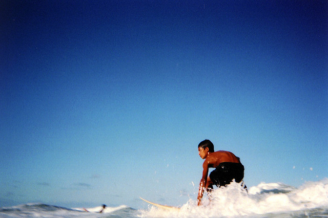
Red is the color that most stands out, the red tones are vibrant and differentiate from the rest of the scene. The film is day balanced, however, the slight blue tint that I found seems to work great in night scenes too.
![[FILM] VIETNAM TAIWAN tamsui ho chi minh city FEB2017 Nikon F100 Fujicolor ETERNA VIVID 250D-029](https://carlosgrphoto.com/wp-content/uploads/2017/06/film-vietnam-taiwan-tamsui-ho-chi-minh-city-feb2017-nikon-f100-fujicolor-eterna-vivid-250d-029.jpg?w=880)
![[FILM] TAIWAN FQ - sanxia - walkaround - Nikon FM B - Fujicolor ETERNA VIVID 250D013](https://carlosgrphoto.com/wp-content/uploads/2017/06/film-taiwan-fq-sanxia-walkaround-nikon-fm-b-fujicolor-eterna-vivid-250d013.jpg?w=880)
Blues are amazing, there is plenty of detail and tonalities in the transition. The skies look really vibrant and dark, same for the water. Although the blue tint also affects the black tones and make them kind of really dark blue, instead of black. Like the buildings or the mountains in these two pictures, I believe it gives a cool, cinematic effect.
![[FILM] VIETNAM TAIWAN tamsui ho chi minh city FEB2017 Nikon F100 Fujicolor ETERNA VIVID 250D-034](https://carlosgrphoto.com/wp-content/uploads/2017/06/film-vietnam-taiwan-tamsui-ho-chi-minh-city-feb2017-nikon-f100-fujicolor-eterna-vivid-250d-034.jpg?w=880)
![[FILM] VIETNAM TAIWAN tamsui ho chi minh city FEB2017 Nikon F100 Fujicolor ETERNA VIVID 250D-020](https://carlosgrphoto.com/wp-content/uploads/2017/06/film-vietnam-taiwan-tamsui-ho-chi-minh-city-feb2017-nikon-f100-fujicolor-eterna-vivid-250d-020.jpg?w=880)
Reds are great, blues too, affordable film, there’s something fishy going on here. What about greens and yellows… And that is the drawback of this film. Greens and yellows are totally washed off. Really flat colors, without any “pop out” feeling. Especially the green tones. Yellows are a bit better, but not by much.
![[FILM] VIETNAM TAIWAN tamsui ho chi minh city FEB2017 Nikon F100 Fujicolor ETERNA VIVID 250D-011](https://carlosgrphoto.com/wp-content/uploads/2017/06/film-vietnam-taiwan-tamsui-ho-chi-minh-city-feb2017-nikon-f100-fujicolor-eterna-vivid-250d-011.jpg?w=880)
![[FILM] VIETNAM TAIWAN tamsui ho chi minh city FEB2017 Nikon F100 Fujicolor ETERNA VIVID 250D-007](https://carlosgrphoto.com/wp-content/uploads/2017/06/film-vietnam-taiwan-tamsui-ho-chi-minh-city-feb2017-nikon-f100-fujicolor-eterna-vivid-250d-007.jpg?w=880)
In this picture we can feel how the yellow in the wall is a little bit better, but i think is just related to the high contrast of the situation. Still not very vibrant.
![[FILM] VIETNAM TAIWAN tamsui ho chi minh city FEB2017 Nikon F100 Fujicolor ETERNA VIVID 250D-003](https://carlosgrphoto.com/wp-content/uploads/2017/06/film-vietnam-taiwan-tamsui-ho-chi-minh-city-feb2017-nikon-f100-fujicolor-eterna-vivid-250d-003.jpg?w=880)
Color chart and measurement of the colors.
![[FILM] VIETNAM TAIWAN tamsui ho chi minh city FEB2017 Nikon F100 Fujicolor ETERNA VIVID 250D-004](https://carlosgrphoto.com/wp-content/uploads/2017/06/film-vietnam-taiwan-tamsui-ho-chi-minh-city-feb2017-nikon-f100-fujicolor-eterna-vivid-250d-004.jpg?w=880)
- RED Average Colour R:199.0 G:140.0 B:111.0
- GREEN Average Colour R:126.0 G:179.0 B:115.0
- BLUE Average Colour R:53.0 G:93.0 B:146.0
- YELLOW Average Colour R:222.0 G:217.0 B:114.0
You can take also a look on this article on How do I measure the colors?
Finally, I tested this film in some portraits, with some friends with a lighter skin tone (Maggie) and darker skin tones (Ailton and Michelle) under natural light and direct flash, to see how this film reacts to different situations. As you can see, I forgot that my Nikon FM doesn’t sync over 125, and in one of the pictures, I messed up with the flash. You can click to enlarge this gallery.


Even giving a cold tone palette, I surprisingly like this film for portraits. It balances the natural warm color of the skin giving a really natural feeling. Again, for a film labeled as “vivid”, I was expecting more saturated colors instead of these pastel tones.
![[FILM] VIETNAM TAIWAN tamsui ho chi minh city FEB2017 Nikon F100 Fujicolor ETERNA VIVID 250D-018](https://i0.wp.com/carlosgrphoto.com/wp-content/uploads/2017/06/film-vietnam-taiwan-tamsui-ho-chi-minh-city-feb2017-nikon-f100-fujicolor-eterna-vivid-250d-018.jpg?w=396&h=254&ssl=1 "[FILM] VIETNAM TAIWAN tamsui ho chi minh city FEB2017 Nikon F100 Fujicolor ETERNA VIVID 250D-018")
![[FILM] VIETNAM TAIWAN tamsui ho chi minh city FEB2017 Nikon F100 Fujicolor ETERNA VIVID 250D-008](https://i0.wp.com/carlosgrphoto.com/wp-content/uploads/2017/06/film-vietnam-taiwan-tamsui-ho-chi-minh-city-feb2017-nikon-f100-fujicolor-eterna-vivid-250d-008.jpg?w=396&h=249&ssl=1 "[FILM] VIETNAM TAIWAN tamsui ho chi minh city FEB2017 Nikon F100 Fujicolor ETERNA VIVID 250D-008")
![[FILM] VIETNAM TAIWAN tamsui ho chi minh city FEB2017 Nikon F100 Fujicolor ETERNA VIVID 250D-013](https://i0.wp.com/carlosgrphoto.com/wp-content/uploads/2017/06/film-vietnam-taiwan-tamsui-ho-chi-minh-city-feb2017-nikon-f100-fujicolor-eterna-vivid-250d-013.jpg?w=396&h=253&ssl=1 "[FILM] VIETNAM TAIWAN tamsui ho chi minh city FEB2017 Nikon F100 Fujicolor ETERNA VIVID 250D-013")
![[FILM] TAIWAN FQ - sanxia - walkaround - Nikon FM B - Fujicolor ETERNA VIVID 250D004](https://i0.wp.com/carlosgrphoto.com/wp-content/uploads/2017/06/film-taiwan-fq-sanxia-walkaround-nikon-fm-b-fujicolor-eterna-vivid-250d004.jpg?w=476&h=764&ssl=1 "[FILM] TAIWAN FQ - sanxia - walkaround - Nikon FM B - Fujicolor ETERNA VIVID 250D004")
Wrapping up, it is a very interesting film. It has a really good latitude, although I only shot it at 250, it can be pushed a couple of stops with no problem. It retains quite a lot of detail, and most importantly those pastel, blue, pinkish tones are a really nice add to a film in the price range. Equivalents like Superia 200 (green tones) or Kodak Gold 200 (warmish tones) look quite different to this one. I wouldn’t choose this film for the only reason that is a pain in the ass quite inconvenient for me to ride an hour of subway to have it developed. But if its convenient for you, or you have to send it anyway. I would definitely go for it.
YES ⇑
- For daily use, good speed and easy to push if needed.
- Purple/ blue tones look great if you plan to shoot at dusk (tungsten lights) or in the blue hour.
- If you can develop it easily, it can be found on-line at a good price.
- I surprisingly liked this film for portraits, even is no Portra or 400H, it really does a great job.
NO ⇓
- If you can’t stand light blue cast in your photos. Or you are looking for a warmer feeling.
- If you have to spend extra money developing, I would choose any other film of that range (price/ISO).
- Nature landscapes, always depending on your style, of course, I just don’t find appealing those muted greens in landscape photography.
Check out the gallery for more shots taken with this film!
![[FILM] VIETNAM TAIWAN tamsui ho chi minh city FEB2017 Nikon F100 Fujicolor ETERNA VIVID 250D-035](https://i0.wp.com/carlosgrphoto.com/wp-content/uploads/2017/06/film-vietnam-taiwan-tamsui-ho-chi-minh-city-feb2017-nikon-f100-fujicolor-eterna-vivid-250d-035.jpg?w=514&h=727&ssl=1 "[FILM] VIETNAM TAIWAN tamsui ho chi minh city FEB2017 Nikon F100 Fujicolor ETERNA VIVID 250D-035")
![[FILM] VIETNAM TAIWAN tamsui ho chi minh city FEB2017 Nikon F100 Fujicolor ETERNA VIVID 250D-034](https://i0.wp.com/carlosgrphoto.com/wp-content/uploads/2017/06/film-vietnam-taiwan-tamsui-ho-chi-minh-city-feb2017-nikon-f100-fujicolor-eterna-vivid-250d-034.jpg?w=358&h=253&ssl=1 "[FILM] VIETNAM TAIWAN tamsui ho chi minh city FEB2017 Nikon F100 Fujicolor ETERNA VIVID 250D-034")
![[FILM] VIETNAM TAIWAN tamsui ho chi minh city FEB2017 Nikon F100 Fujicolor ETERNA VIVID 250D-032](https://i0.wp.com/carlosgrphoto.com/wp-content/uploads/2017/06/film-vietnam-taiwan-tamsui-ho-chi-minh-city-feb2017-nikon-f100-fujicolor-eterna-vivid-250d-032.jpg?w=358&h=237&ssl=1 "[FILM] VIETNAM TAIWAN tamsui ho chi minh city FEB2017 Nikon F100 Fujicolor ETERNA VIVID 250D-032")
![[FILM] VIETNAM TAIWAN tamsui ho chi minh city FEB2017 Nikon F100 Fujicolor ETERNA VIVID 250D-031](https://i0.wp.com/carlosgrphoto.com/wp-content/uploads/2017/06/film-vietnam-taiwan-tamsui-ho-chi-minh-city-feb2017-nikon-f100-fujicolor-eterna-vivid-250d-031.jpg?w=358&h=229&ssl=1 "[FILM] VIETNAM TAIWAN tamsui ho chi minh city FEB2017 Nikon F100 Fujicolor ETERNA VIVID 250D-031")
![[FILM] VIETNAM TAIWAN tamsui ho chi minh city FEB2017 Nikon F100 Fujicolor ETERNA VIVID 250D-029](https://i0.wp.com/carlosgrphoto.com/wp-content/uploads/2017/06/film-vietnam-taiwan-tamsui-ho-chi-minh-city-feb2017-nikon-f100-fujicolor-eterna-vivid-250d-029.jpg?w=392&h=616&ssl=1 "[FILM] VIETNAM TAIWAN tamsui ho chi minh city FEB2017 Nikon F100 Fujicolor ETERNA VIVID 250D-029")
![[FILM] VIETNAM TAIWAN tamsui ho chi minh city FEB2017 Nikon F100 Fujicolor ETERNA VIVID 250D-028](https://i0.wp.com/carlosgrphoto.com/wp-content/uploads/2017/06/film-vietnam-taiwan-tamsui-ho-chi-minh-city-feb2017-nikon-f100-fujicolor-eterna-vivid-250d-028.jpg?w=480&h=308&ssl=1 "[FILM] VIETNAM TAIWAN tamsui ho chi minh city FEB2017 Nikon F100 Fujicolor ETERNA VIVID 250D-028")
![[FILM] VIETNAM TAIWAN tamsui ho chi minh city FEB2017 Nikon F100 Fujicolor ETERNA VIVID 250D-026](https://i0.wp.com/carlosgrphoto.com/wp-content/uploads/2017/06/film-vietnam-taiwan-tamsui-ho-chi-minh-city-feb2017-nikon-f100-fujicolor-eterna-vivid-250d-026.jpg?w=480&h=304&ssl=1 "[FILM] VIETNAM TAIWAN tamsui ho chi minh city FEB2017 Nikon F100 Fujicolor ETERNA VIVID 250D-026")
![[FILM] VIETNAM TAIWAN tamsui ho chi minh city FEB2017 Nikon F100 Fujicolor ETERNA VIVID 250D-025](https://i0.wp.com/carlosgrphoto.com/wp-content/uploads/2017/06/film-vietnam-taiwan-tamsui-ho-chi-minh-city-feb2017-nikon-f100-fujicolor-eterna-vivid-250d-025.jpg?w=289&h=183&ssl=1 "[FILM] VIETNAM TAIWAN tamsui ho chi minh city FEB2017 Nikon F100 Fujicolor ETERNA VIVID 250D-025")
![[FILM] VIETNAM TAIWAN tamsui ho chi minh city FEB2017 Nikon F100 Fujicolor ETERNA VIVID 250D-024](https://i0.wp.com/carlosgrphoto.com/wp-content/uploads/2017/06/film-vietnam-taiwan-tamsui-ho-chi-minh-city-feb2017-nikon-f100-fujicolor-eterna-vivid-250d-024.jpg?w=289&h=183&ssl=1 "[FILM] VIETNAM TAIWAN tamsui ho chi minh city FEB2017 Nikon F100 Fujicolor ETERNA VIVID 250D-024")
![[FILM] VIETNAM TAIWAN tamsui ho chi minh city FEB2017 Nikon F100 Fujicolor ETERNA VIVID 250D-023](https://i0.wp.com/carlosgrphoto.com/wp-content/uploads/2017/06/film-vietnam-taiwan-tamsui-ho-chi-minh-city-feb2017-nikon-f100-fujicolor-eterna-vivid-250d-023.jpg?w=583&h=370&ssl=1 "[FILM] VIETNAM TAIWAN tamsui ho chi minh city FEB2017 Nikon F100 Fujicolor ETERNA VIVID 250D-023")


![[FILM] VIETNAM TAIWAN tamsui ho chi minh city FEB2017 Nikon F100 Fujicolor ETERNA VIVID 250D-020](https://i0.wp.com/carlosgrphoto.com/wp-content/uploads/2017/06/film-vietnam-taiwan-tamsui-ho-chi-minh-city-feb2017-nikon-f100-fujicolor-eterna-vivid-250d-020.jpg?w=269&h=170&ssl=1 "[FILM] VIETNAM TAIWAN tamsui ho chi minh city FEB2017 Nikon F100 Fujicolor ETERNA VIVID 250D-020")
![[FILM] VIETNAM TAIWAN tamsui ho chi minh city FEB2017 Nikon F100 Fujicolor ETERNA VIVID 250D-019](https://i0.wp.com/carlosgrphoto.com/wp-content/uploads/2017/06/film-vietnam-taiwan-tamsui-ho-chi-minh-city-feb2017-nikon-f100-fujicolor-eterna-vivid-250d-019.jpg?w=332&h=520&ssl=1 "[FILM] VIETNAM TAIWAN tamsui ho chi minh city FEB2017 Nikon F100 Fujicolor ETERNA VIVID 250D-019")
![[FILM] VIETNAM TAIWAN tamsui ho chi minh city FEB2017 Nikon F100 Fujicolor ETERNA VIVID 250D-018](https://i0.wp.com/carlosgrphoto.com/wp-content/uploads/2017/06/film-vietnam-taiwan-tamsui-ho-chi-minh-city-feb2017-nikon-f100-fujicolor-eterna-vivid-250d-018.jpg?w=267&h=171&ssl=1 "[FILM] VIETNAM TAIWAN tamsui ho chi minh city FEB2017 Nikon F100 Fujicolor ETERNA VIVID 250D-018")
![[FILM] VIETNAM TAIWAN tamsui ho chi minh city FEB2017 Nikon F100 Fujicolor ETERNA VIVID 250D-017](https://i0.wp.com/carlosgrphoto.com/wp-content/uploads/2017/06/film-vietnam-taiwan-tamsui-ho-chi-minh-city-feb2017-nikon-f100-fujicolor-eterna-vivid-250d-017.jpg?w=267&h=170&ssl=1 "[FILM] VIETNAM TAIWAN tamsui ho chi minh city FEB2017 Nikon F100 Fujicolor ETERNA VIVID 250D-017")
![[FILM] VIETNAM TAIWAN tamsui ho chi minh city FEB2017 Nikon F100 Fujicolor ETERNA VIVID 250D-013](https://i0.wp.com/carlosgrphoto.com/wp-content/uploads/2017/06/film-vietnam-taiwan-tamsui-ho-chi-minh-city-feb2017-nikon-f100-fujicolor-eterna-vivid-250d-013.jpg?w=267&h=171&ssl=1 "[FILM] VIETNAM TAIWAN tamsui ho chi minh city FEB2017 Nikon F100 Fujicolor ETERNA VIVID 250D-013")
![[FILM] VIETNAM TAIWAN tamsui ho chi minh city FEB2017 Nikon F100 Fujicolor ETERNA VIVID 250D-011](https://i0.wp.com/carlosgrphoto.com/wp-content/uploads/2017/06/film-vietnam-taiwan-tamsui-ho-chi-minh-city-feb2017-nikon-f100-fujicolor-eterna-vivid-250d-011.jpg?w=475&h=756&ssl=1 "[FILM] VIETNAM TAIWAN tamsui ho chi minh city FEB2017 Nikon F100 Fujicolor ETERNA VIVID 250D-011")
![[FILM] VIETNAM TAIWAN tamsui ho chi minh city FEB2017 Nikon F100 Fujicolor ETERNA VIVID 250D-010](https://i0.wp.com/carlosgrphoto.com/wp-content/uploads/2017/06/film-vietnam-taiwan-tamsui-ho-chi-minh-city-feb2017-nikon-f100-fujicolor-eterna-vivid-250d-010.jpg?w=397&h=249&ssl=1 "[FILM] VIETNAM TAIWAN tamsui ho chi minh city FEB2017 Nikon F100 Fujicolor ETERNA VIVID 250D-010")
![[FILM] VIETNAM TAIWAN tamsui ho chi minh city FEB2017 Nikon F100 Fujicolor ETERNA VIVID 250D-009](https://i0.wp.com/carlosgrphoto.com/wp-content/uploads/2017/06/film-vietnam-taiwan-tamsui-ho-chi-minh-city-feb2017-nikon-f100-fujicolor-eterna-vivid-250d-009.jpg?w=397&h=250&ssl=1 "[FILM] VIETNAM TAIWAN tamsui ho chi minh city FEB2017 Nikon F100 Fujicolor ETERNA VIVID 250D-009")
![[FILM] VIETNAM TAIWAN tamsui ho chi minh city FEB2017 Nikon F100 Fujicolor ETERNA VIVID 250D-008](https://i0.wp.com/carlosgrphoto.com/wp-content/uploads/2017/06/film-vietnam-taiwan-tamsui-ho-chi-minh-city-feb2017-nikon-f100-fujicolor-eterna-vivid-250d-008.jpg?w=397&h=249&ssl=1 "[FILM] VIETNAM TAIWAN tamsui ho chi minh city FEB2017 Nikon F100 Fujicolor ETERNA VIVID 250D-008")
![[FILM] VIETNAM TAIWAN tamsui ho chi minh city FEB2017 Nikon F100 Fujicolor ETERNA VIVID 250D-007](https://i0.wp.com/carlosgrphoto.com/wp-content/uploads/2017/06/film-vietnam-taiwan-tamsui-ho-chi-minh-city-feb2017-nikon-f100-fujicolor-eterna-vivid-250d-007.jpg?w=582&h=369&ssl=1 "[FILM] VIETNAM TAIWAN tamsui ho chi minh city FEB2017 Nikon F100 Fujicolor ETERNA VIVID 250D-007")
![[FILM] VIETNAM TAIWAN tamsui ho chi minh city FEB2017 Nikon F100 Fujicolor ETERNA VIVID 250D-003](https://i0.wp.com/carlosgrphoto.com/wp-content/uploads/2017/06/film-vietnam-taiwan-tamsui-ho-chi-minh-city-feb2017-nikon-f100-fujicolor-eterna-vivid-250d-003.jpg?w=290&h=182&ssl=1 "[FILM] VIETNAM TAIWAN tamsui ho chi minh city FEB2017 Nikon F100 Fujicolor ETERNA VIVID 250D-003")
![[FILM] VIETNAM TAIWAN tamsui ho chi minh city FEB2017 Nikon F100 Fujicolor ETERNA VIVID 250D-002](https://i0.wp.com/carlosgrphoto.com/wp-content/uploads/2017/06/film-vietnam-taiwan-tamsui-ho-chi-minh-city-feb2017-nikon-f100-fujicolor-eterna-vivid-250d-002.jpg?w=290&h=183&ssl=1 "[FILM] VIETNAM TAIWAN tamsui ho chi minh city FEB2017 Nikon F100 Fujicolor ETERNA VIVID 250D-002")
![[FILM] VIETNAM TAIWAN tamsui ho chi minh city FEB2017 Nikon F100 Fujicolor ETERNA VIVID 250D-001](https://i0.wp.com/carlosgrphoto.com/wp-content/uploads/2017/06/film-vietnam-taiwan-tamsui-ho-chi-minh-city-feb2017-nikon-f100-fujicolor-eterna-vivid-250d-001.jpg?w=294&h=185&ssl=1 "[FILM] VIETNAM TAIWAN tamsui ho chi minh city FEB2017 Nikon F100 Fujicolor ETERNA VIVID 250D-001")
![[FILM] TAIWAN FQ - sanxia - walkaround - Nikon FM B - Fujicolor ETERNA VIVID 250D025](https://i0.wp.com/carlosgrphoto.com/wp-content/uploads/2017/06/film-taiwan-fq-sanxia-walkaround-nikon-fm-b-fujicolor-eterna-vivid-250d025.jpg?w=294&h=185&ssl=1 "[FILM] TAIWAN FQ - sanxia - walkaround - Nikon FM B - Fujicolor ETERNA VIVID 250D025")

![[FILM] TAIWAN FQ - sanxia - walkaround - Nikon FM B - Fujicolor ETERNA VIVID 250D023](https://i0.wp.com/carlosgrphoto.com/wp-content/uploads/2017/06/film-taiwan-fq-sanxia-walkaround-nikon-fm-b-fujicolor-eterna-vivid-250d023.jpg?w=437&h=277&ssl=1 "[FILM] TAIWAN FQ - sanxia - walkaround - Nikon FM B - Fujicolor ETERNA VIVID 250D023")
![[FILM] TAIWAN FQ - sanxia - walkaround - Nikon FM B - Fujicolor ETERNA VIVID 250D021](https://i0.wp.com/carlosgrphoto.com/wp-content/uploads/2017/06/film-taiwan-fq-sanxia-walkaround-nikon-fm-b-fujicolor-eterna-vivid-250d021.jpg?w=435&h=277&ssl=1 "[FILM] TAIWAN FQ - sanxia - walkaround - Nikon FM B - Fujicolor ETERNA VIVID 250D021")
![[FILM] TAIWAN FQ - sanxia - walkaround - Nikon FM B - Fujicolor ETERNA VIVID 250D020](https://i0.wp.com/carlosgrphoto.com/wp-content/uploads/2017/06/film-taiwan-fq-sanxia-walkaround-nikon-fm-b-fujicolor-eterna-vivid-250d020.jpg?w=440&h=277&ssl=1 "[FILM] TAIWAN FQ - sanxia - walkaround - Nikon FM B - Fujicolor ETERNA VIVID 250D020")
![[FILM] TAIWAN FQ - sanxia - walkaround - Nikon FM B - Fujicolor ETERNA VIVID 250D018](https://i0.wp.com/carlosgrphoto.com/wp-content/uploads/2017/06/film-taiwan-fq-sanxia-walkaround-nikon-fm-b-fujicolor-eterna-vivid-250d018.jpg?w=432&h=277&ssl=1 "[FILM] TAIWAN FQ - sanxia - walkaround - Nikon FM B - Fujicolor ETERNA VIVID 250D018")
![[FILM] TAIWAN FQ - sanxia - walkaround - Nikon FM B - Fujicolor ETERNA VIVID 250D017](https://i0.wp.com/carlosgrphoto.com/wp-content/uploads/2017/06/film-taiwan-fq-sanxia-walkaround-nikon-fm-b-fujicolor-eterna-vivid-250d017.jpg?w=558&h=401&ssl=1 "[FILM] TAIWAN FQ - sanxia - walkaround - Nikon FM B - Fujicolor ETERNA VIVID 250D017")
![[FILM] TAIWAN FQ - sanxia - walkaround - Nikon FM B - Fujicolor ETERNA VIVID 250D016](https://i0.wp.com/carlosgrphoto.com/wp-content/uploads/2017/06/film-taiwan-fq-sanxia-walkaround-nikon-fm-b-fujicolor-eterna-vivid-250d016.jpg?w=314&h=199&ssl=1 "[FILM] TAIWAN FQ - sanxia - walkaround - Nikon FM B - Fujicolor ETERNA VIVID 250D016")
![[FILM] TAIWAN FQ - sanxia - walkaround - Nikon FM B - Fujicolor ETERNA VIVID 250D015](https://i0.wp.com/carlosgrphoto.com/wp-content/uploads/2017/06/film-taiwan-fq-sanxia-walkaround-nikon-fm-b-fujicolor-eterna-vivid-250d015.jpg?w=314&h=198&ssl=1 "[FILM] TAIWAN FQ - sanxia - walkaround - Nikon FM B - Fujicolor ETERNA VIVID 250D015")
![[FILM] TAIWAN FQ - sanxia - walkaround - Nikon FM B - Fujicolor ETERNA VIVID 250D014](https://i0.wp.com/carlosgrphoto.com/wp-content/uploads/2017/06/film-taiwan-fq-sanxia-walkaround-nikon-fm-b-fujicolor-eterna-vivid-250d014.jpg?w=398&h=251&ssl=1 "[FILM] TAIWAN FQ - sanxia - walkaround - Nikon FM B - Fujicolor ETERNA VIVID 250D014")
![[FILM] TAIWAN FQ - sanxia - walkaround - Nikon FM B - Fujicolor ETERNA VIVID 250D013](https://i0.wp.com/carlosgrphoto.com/wp-content/uploads/2017/06/film-taiwan-fq-sanxia-walkaround-nikon-fm-b-fujicolor-eterna-vivid-250d013.jpg?w=398&h=251&ssl=1 "[FILM] TAIWAN FQ - sanxia - walkaround - Nikon FM B - Fujicolor ETERNA VIVID 250D013")
![[FILM] TAIWAN FQ - sanxia - walkaround - Nikon FM B - Fujicolor ETERNA VIVID 250D010](https://i0.wp.com/carlosgrphoto.com/wp-content/uploads/2017/06/film-taiwan-fq-sanxia-walkaround-nikon-fm-b-fujicolor-eterna-vivid-250d010.jpg?w=398&h=250&ssl=1 "[FILM] TAIWAN FQ - sanxia - walkaround - Nikon FM B - Fujicolor ETERNA VIVID 250D010")
![[FILM] TAIWAN FQ - sanxia - walkaround - Nikon FM B - Fujicolor ETERNA VIVID 250D004](https://i0.wp.com/carlosgrphoto.com/wp-content/uploads/2017/06/film-taiwan-fq-sanxia-walkaround-nikon-fm-b-fujicolor-eterna-vivid-250d004.jpg?w=474&h=760&ssl=1 "[FILM] TAIWAN FQ - sanxia - walkaround - Nikon FM B - Fujicolor ETERNA VIVID 250D004")
![[FILM] TAIWAN FQ - sanxia - walkaround - Nikon FM B - Fujicolor ETERNA VIVID 250D003](https://i0.wp.com/carlosgrphoto.com/wp-content/uploads/2017/06/film-taiwan-fq-sanxia-walkaround-nikon-fm-b-fujicolor-eterna-vivid-250d003.jpg?w=436&h=271&ssl=1 "[FILM] TAIWAN FQ - sanxia - walkaround - Nikon FM B - Fujicolor ETERNA VIVID 250D003")
![[FILM] TAIWAN FQ - sanxia - walkaround - Nikon FM B - Fujicolor ETERNA VIVID 250D002](https://i0.wp.com/carlosgrphoto.com/wp-content/uploads/2017/06/film-taiwan-fq-sanxia-walkaround-nikon-fm-b-fujicolor-eterna-vivid-250d002.jpg?w=436&h=271&ssl=1 "[FILM] TAIWAN FQ - sanxia - walkaround - Nikon FM B - Fujicolor ETERNA VIVID 250D002")
![[FILM] TAIWAN FQ - sanxia - walkaround - Nikon FM B - Fujicolor ETERNA VIVID 250D001](https://i0.wp.com/carlosgrphoto.com/wp-content/uploads/2017/06/film-taiwan-fq-sanxia-walkaround-nikon-fm-b-fujicolor-eterna-vivid-250d001.jpg?w=876&h=547&ssl=1 "[FILM] TAIWAN FQ - sanxia - walkaround - Nikon FM B - Fujicolor ETERNA VIVID 250D001")


 The Cinestill 800T Tungsten is a re-treated
![[FILM] TAIWAN fisherman wharf ravioli JUL2016 Nikon FM Polypan F50 -031](https://carlosgrphoto.com/wp-content/uploads/2017/06/film-taiwan-fisherman-wharf-ravioli-jul2016-nikon-fm-polypan-f50-031.jpg?w=880)

![[FILM] TAIWAN tamsui emily ravioli JUN2016 Nikon FM(s) Kodak TMax400013](https://carlosgrphoto.com/wp-content/uploads/2017/06/film-taiwan-tamsui-emily-ravioli-jun2016-nikon-fms-kodak-tmax400013.jpg?w=880)


![[FILM] TAIWAN friends sakura APR2017 Nikon F100 Fujicolor ProviaF 100029-2](https://carlosgrphoto.com/wp-content/uploads/2017/05/film-taiwan-friends-sakura-apr2017-nikon-f100-fujicolor-proviaf-100029-2.jpg?w=880)
![[FILM] TAIWAN friends sakura APR2017 Nikon F100 Fujicolor ProviaF 100005](https://carlosgrphoto.com/wp-content/uploads/2017/05/film-taiwan-friends-sakura-apr2017-nikon-f100-fujicolor-proviaf-100005.jpg?w=880)
![[FILM] TAIWAN friends sakura APR2017 Nikon F100 Fujicolor ProviaF 100025](https://carlosgrphoto.com/wp-content/uploads/2017/05/film-taiwan-friends-sakura-apr2017-nikon-f100-fujicolor-proviaf-100025.jpg?w=880)
![[FILM] TAIWAN friends sakura APR2017 Nikon F100 Fujicolor ProviaF 100022](https://carlosgrphoto.com/wp-content/uploads/2017/05/film-taiwan-friends-sakura-apr2017-nikon-f100-fujicolor-proviaf-100022.jpg?w=880)
![[FILM] TAIWAN friends sakura APR2017 Nikon F100 Fujicolor ProviaF 100013](https://carlosgrphoto.com/wp-content/uploads/2017/05/film-taiwan-friends-sakura-apr2017-nikon-f100-fujicolor-proviaf-100013.jpg?w=880)

![[FILM] TAIWAN friends sakura APR2017 Nikon F100 Fujicolor ProviaF 100006](https://carlosgrphoto.com/wp-content/uploads/2017/05/film-taiwan-friends-sakura-apr2017-nikon-f100-fujicolor-proviaf-100006.jpg?w=880)


![[FILM] TAIWAN friends sakura APR2017 Nikon F100 Fujicolor ProviaF 100017](https://carlosgrphoto.com/wp-content/uploads/2017/05/film-taiwan-friends-sakura-apr2017-nikon-f100-fujicolor-proviaf-100017.jpg?w=880)
![[FILM] TAIWAN friends sakura APR2017 Nikon F100 Fujicolor ProviaF 100015](https://i0.wp.com/carlosgrphoto.com/wp-content/uploads/2017/05/film-taiwan-friends-sakura-apr2017-nikon-f100-fujicolor-proviaf-100015.jpg?w=490&h=303&ssl=1 "[FILM] TAIWAN friends sakura APR2017 Nikon F100 Fujicolor ProviaF 100015")
![[FILM] TAIWAN friends sakura APR2017 Nikon F100 Fujicolor ProviaF 100027](https://i0.wp.com/carlosgrphoto.com/wp-content/uploads/2017/05/film-taiwan-friends-sakura-apr2017-nikon-f100-fujicolor-proviaf-100027.jpg?w=490&h=320&ssl=1 "[FILM] TAIWAN friends sakura APR2017 Nikon F100 Fujicolor ProviaF 100027")
![[FILM] TAIWAN friends sakura APR2017 Nikon F100 Fujicolor ProviaF 100023](https://i0.wp.com/carlosgrphoto.com/wp-content/uploads/2017/05/film-taiwan-friends-sakura-apr2017-nikon-f100-fujicolor-proviaf-100023.jpg?w=382&h=627&ssl=1 "[FILM] TAIWAN friends sakura APR2017 Nikon F100 Fujicolor ProviaF 100023")
![[FILM] TAIWAN friends sakura APR2017 Nikon F100 Fujicolor ProviaF 100027](https://i0.wp.com/carlosgrphoto.com/wp-content/uploads/2017/05/film-taiwan-friends-sakura-apr2017-nikon-f100-fujicolor-proviaf-100027.jpg?w=621&h=406&ssl=1 "[FILM] TAIWAN friends sakura APR2017 Nikon F100 Fujicolor ProviaF 100027")
![[FILM] TAIWAN friends sakura APR2017 Nikon F100 Fujicolor ProviaF 100026](https://i0.wp.com/carlosgrphoto.com/wp-content/uploads/2017/05/film-taiwan-friends-sakura-apr2017-nikon-f100-fujicolor-proviaf-100026.jpg?w=251&h=406&ssl=1 "[FILM] TAIWAN friends sakura APR2017 Nikon F100 Fujicolor ProviaF 100026")
![[FILM] TAIWAN friends sakura APR2017 Nikon F100 Fujicolor ProviaF 100025](https://i0.wp.com/carlosgrphoto.com/wp-content/uploads/2017/05/film-taiwan-friends-sakura-apr2017-nikon-f100-fujicolor-proviaf-100025.jpg?w=633&h=389&ssl=1 "[FILM] TAIWAN friends sakura APR2017 Nikon F100 Fujicolor ProviaF 100025")
![[FILM] TAIWAN friends sakura APR2017 Nikon F100 Fujicolor ProviaF 100024](https://i0.wp.com/carlosgrphoto.com/wp-content/uploads/2017/05/film-taiwan-friends-sakura-apr2017-nikon-f100-fujicolor-proviaf-100024.jpg?w=239&h=389&ssl=1 "[FILM] TAIWAN friends sakura APR2017 Nikon F100 Fujicolor ProviaF 100024")
![[FILM] TAIWAN friends sakura APR2017 Nikon F100 Fujicolor ProviaF 100023](https://i0.wp.com/carlosgrphoto.com/wp-content/uploads/2017/05/film-taiwan-friends-sakura-apr2017-nikon-f100-fujicolor-proviaf-100023.jpg?w=239&h=392&ssl=1 "[FILM] TAIWAN friends sakura APR2017 Nikon F100 Fujicolor ProviaF 100023")
![[FILM] TAIWAN friends sakura APR2017 Nikon F100 Fujicolor ProviaF 100022](https://i0.wp.com/carlosgrphoto.com/wp-content/uploads/2017/05/film-taiwan-friends-sakura-apr2017-nikon-f100-fujicolor-proviaf-100022.jpg?w=633&h=392&ssl=1 "[FILM] TAIWAN friends sakura APR2017 Nikon F100 Fujicolor ProviaF 100022")
![[FILM] TAIWAN friends sakura APR2017 Nikon F100 Fujicolor ProviaF 100021](https://i0.wp.com/carlosgrphoto.com/wp-content/uploads/2017/05/film-taiwan-friends-sakura-apr2017-nikon-f100-fujicolor-proviaf-100021.jpg?w=468&h=756&ssl=1 "[FILM] TAIWAN friends sakura APR2017 Nikon F100 Fujicolor ProviaF 100021")
![[FILM] TAIWAN friends sakura APR2017 Nikon F100 Fujicolor ProviaF 100020](https://i0.wp.com/carlosgrphoto.com/wp-content/uploads/2017/05/film-taiwan-friends-sakura-apr2017-nikon-f100-fujicolor-proviaf-100020.jpg?w=404&h=251&ssl=1 "[FILM] TAIWAN friends sakura APR2017 Nikon F100 Fujicolor ProviaF 100020")


![[FILM] TAIWAN friends sakura APR2017 Nikon F100 Fujicolor ProviaF 100017](https://i0.wp.com/carlosgrphoto.com/wp-content/uploads/2017/05/film-taiwan-friends-sakura-apr2017-nikon-f100-fujicolor-proviaf-100017.jpg?w=330&h=255&ssl=1 "[FILM] TAIWAN friends sakura APR2017 Nikon F100 Fujicolor ProviaF 100017")
![[FILM] TAIWAN friends sakura APR2017 Nikon F100 Fujicolor ProviaF 100015](https://i0.wp.com/carlosgrphoto.com/wp-content/uploads/2017/05/film-taiwan-friends-sakura-apr2017-nikon-f100-fujicolor-proviaf-100015.jpg?w=330&h=204&ssl=1 "[FILM] TAIWAN friends sakura APR2017 Nikon F100 Fujicolor ProviaF 100015")
![[FILM] TAIWAN friends sakura APR2017 Nikon F100 Fujicolor ProviaF 100014](https://i0.wp.com/carlosgrphoto.com/wp-content/uploads/2017/05/film-taiwan-friends-sakura-apr2017-nikon-f100-fujicolor-proviaf-100014.jpg?w=330&h=207&ssl=1 "[FILM] TAIWAN friends sakura APR2017 Nikon F100 Fujicolor ProviaF 100014")
![[FILM] TAIWAN friends sakura APR2017 Nikon F100 Fujicolor ProviaF 100013](https://i0.wp.com/carlosgrphoto.com/wp-content/uploads/2017/05/film-taiwan-friends-sakura-apr2017-nikon-f100-fujicolor-proviaf-100013.jpg?w=542&h=674&ssl=1 "[FILM] TAIWAN friends sakura APR2017 Nikon F100 Fujicolor ProviaF 100013")
![[FILM] TAIWAN friends sakura APR2017 Nikon F100 Fujicolor ProviaF 100012](https://i0.wp.com/carlosgrphoto.com/wp-content/uploads/2017/05/film-taiwan-friends-sakura-apr2017-nikon-f100-fujicolor-proviaf-100012.jpg?w=583&h=364&ssl=1 "[FILM] TAIWAN friends sakura APR2017 Nikon F100 Fujicolor ProviaF 100012")
![[FILM] TAIWAN friends sakura APR2017 Nikon F100 Fujicolor ProviaF 100011](https://i0.wp.com/carlosgrphoto.com/wp-content/uploads/2017/05/film-taiwan-friends-sakura-apr2017-nikon-f100-fujicolor-proviaf-100011.jpg?w=289&h=179&ssl=1 "[FILM] TAIWAN friends sakura APR2017 Nikon F100 Fujicolor ProviaF 100011")
![[FILM] TAIWAN friends sakura APR2017 Nikon F100 Fujicolor ProviaF 100010](https://i0.wp.com/carlosgrphoto.com/wp-content/uploads/2017/05/film-taiwan-friends-sakura-apr2017-nikon-f100-fujicolor-proviaf-100010.jpg?w=289&h=181&ssl=1 "[FILM] TAIWAN friends sakura APR2017 Nikon F100 Fujicolor ProviaF 100010")
![[FILM] TAIWAN friends sakura APR2017 Nikon F100 Fujicolor ProviaF 100009](https://i0.wp.com/carlosgrphoto.com/wp-content/uploads/2017/05/film-taiwan-friends-sakura-apr2017-nikon-f100-fujicolor-proviaf-100009.jpg?w=630&h=393&ssl=1 "[FILM] TAIWAN friends sakura APR2017 Nikon F100 Fujicolor ProviaF 100009")

![[FILM] TAIWAN friends sakura APR2017 Nikon F100 Fujicolor ProviaF 100007](https://i0.wp.com/carlosgrphoto.com/wp-content/uploads/2017/05/film-taiwan-friends-sakura-apr2017-nikon-f100-fujicolor-proviaf-100007.jpg?w=629&h=391&ssl=1 "[FILM] TAIWAN friends sakura APR2017 Nikon F100 Fujicolor ProviaF 100007")
![[FILM] TAIWAN friends sakura APR2017 Nikon F100 Fujicolor ProviaF 100006](https://i0.wp.com/carlosgrphoto.com/wp-content/uploads/2017/05/film-taiwan-friends-sakura-apr2017-nikon-f100-fujicolor-proviaf-100006.jpg?w=243&h=391&ssl=1 "[FILM] TAIWAN friends sakura APR2017 Nikon F100 Fujicolor ProviaF 100006")
![[FILM] TAIWAN friends sakura APR2017 Nikon F100 Fujicolor ProviaF 100005](https://i0.wp.com/carlosgrphoto.com/wp-content/uploads/2017/05/film-taiwan-friends-sakura-apr2017-nikon-f100-fujicolor-proviaf-100005.jpg?w=489&h=306&ssl=1 "[FILM] TAIWAN friends sakura APR2017 Nikon F100 Fujicolor ProviaF 100005")
![[FILM] TAIWAN friends sakura APR2017 Nikon F100 Fujicolor ProviaF 100004](https://i0.wp.com/carlosgrphoto.com/wp-content/uploads/2017/05/film-taiwan-friends-sakura-apr2017-nikon-f100-fujicolor-proviaf-100004.jpg?w=489&h=303&ssl=1 "[FILM] TAIWAN friends sakura APR2017 Nikon F100 Fujicolor ProviaF 100004")


![[FILM] TAIWAN Beach Taipei APR2017 Nikon FM(B) Adox Color Implosion 100 @200034](https://carlosgrphoto.com/wp-content/uploads/2017/05/film-taiwan-beach-taipei-apr2017-nikon-fmb-adox-color-implosion-100-200034.jpg?w=880)
![[FILM] TAIWAN Beach Taipei APR2017 Nikon FM(B) Adox Color Implosion 100 @200020](https://carlosgrphoto.com/wp-content/uploads/2017/05/film-taiwan-beach-taipei-apr2017-nikon-fmb-adox-color-implosion-100-200020.jpg?w=880)

![[FILM] TAIWAN Beach Taipei APR2017 Nikon FM(B) Adox Color Implosion 100 @200016](https://carlosgrphoto.com/wp-content/uploads/2017/05/film-taiwan-beach-taipei-apr2017-nikon-fmb-adox-color-implosion-100-200016.jpg?w=880)
![[FILM] TAIWAN Beach Taipei APR2017 Nikon FM(B) Adox Color Implosion 100 @200031](https://carlosgrphoto.com/wp-content/uploads/2017/05/film-taiwan-beach-taipei-apr2017-nikon-fmb-adox-color-implosion-100-200031.jpg?w=880)
![[FILM] TAIWAN Beach Taipei APR2017 Nikon FM(B) Adox Color Implosion 100 @200011](https://carlosgrphoto.com/wp-content/uploads/2017/05/film-taiwan-beach-taipei-apr2017-nikon-fmb-adox-color-implosion-100-200011.jpg?w=880)
![[FILM] TAIWAN Beach Taipei APR2017 Nikon FM(B) Adox Color Implosion 100 @200024](https://carlosgrphoto.com/wp-content/uploads/2017/05/film-taiwan-beach-taipei-apr2017-nikon-fmb-adox-color-implosion-100-200024.jpg?w=880)
![[FILM] TAIWAN Beach Taipei APR2017 Nikon FM(B) Adox Color Implosion 100 @200025](https://carlosgrphoto.com/wp-content/uploads/2017/05/film-taiwan-beach-taipei-apr2017-nikon-fmb-adox-color-implosion-100-200025.jpg?w=880)
 Adox Color Implosion 100 @200015")
 Adox Color Implosion 100 @200014")
 Adox Color Implosion 100 @200012")
 Adox Color Implosion 100 @200001")
![[FILM] TAIWAN Beach Taipei APR2017 Nikon FM(B) Adox Color Implosion 100 @200010](https://carlosgrphoto.com/wp-content/uploads/2017/05/film-taiwan-beach-taipei-apr2017-nikon-fmb-adox-color-implosion-100-200010.jpg?w=880)
![[FILM] TAIWAN Beach Taipei APR2017 Nikon FM(B) Adox Color Implosion 100 @200030](https://carlosgrphoto.com/wp-content/uploads/2017/05/film-taiwan-beach-taipei-apr2017-nikon-fmb-adox-color-implosion-100-200030.jpg?w=880)
![[FILM] TAIWAN Beach Taipei APR2017 Nikon FM(B) Adox Color Implosion 100 @200029](https://carlosgrphoto.com/wp-content/uploads/2017/05/film-taiwan-beach-taipei-apr2017-nikon-fmb-adox-color-implosion-100-200029.jpg?w=880)
![[FILM] TAIWAN Beach Taipei APR2017 Nikon FM(B) Adox Color Implosion 100 @200028](https://carlosgrphoto.com/wp-content/uploads/2017/05/film-taiwan-beach-taipei-apr2017-nikon-fmb-adox-color-implosion-100-200028.jpg?w=880)
![[FILM] TAIWAN Beach Taipei APR2017 Nikon FM(B) Adox Color Implosion 100 @200030](https://i0.wp.com/carlosgrphoto.com/wp-content/uploads/2017/05/film-taiwan-beach-taipei-apr2017-nikon-fmb-adox-color-implosion-100-200030.jpg?w=289&h=289&crop=1&ssl=1 "[FILM] TAIWAN Beach Taipei APR2017 Nikon FM(B) Adox Color Implosion 100 @200030")
![[FILM] TAIWAN Beach Taipei APR2017 Nikon FM(B) Adox Color Implosion 100 @200029](https://i0.wp.com/carlosgrphoto.com/wp-content/uploads/2017/05/film-taiwan-beach-taipei-apr2017-nikon-fmb-adox-color-implosion-100-200029.jpg?w=289&h=289&crop=1&ssl=1 "[FILM] TAIWAN Beach Taipei APR2017 Nikon FM(B) Adox Color Implosion 100 @200029")
![[FILM] TAIWAN Beach Taipei APR2017 Nikon FM(B) Adox Color Implosion 100 @200028](https://i0.wp.com/carlosgrphoto.com/wp-content/uploads/2017/05/film-taiwan-beach-taipei-apr2017-nikon-fmb-adox-color-implosion-100-200028.jpg?w=289&h=289&crop=1&ssl=1 "[FILM] TAIWAN Beach Taipei APR2017 Nikon FM(B) Adox Color Implosion 100 @200028")
![[FILM] TAIWAN Beach Taipei APR2017 Nikon FM(B) Adox Color Implosion 100 @200002](https://carlosgrphoto.com/wp-content/uploads/2017/05/film-taiwan-beach-taipei-apr2017-nikon-fmb-adox-color-implosion-100-200002.jpg?w=880)
![[FILM] TAIWAN Beach Taipei APR2017 Nikon FM(B) Adox Color Implosion 100 @200006](https://i0.wp.com/carlosgrphoto.com/wp-content/uploads/2017/05/film-taiwan-beach-taipei-apr2017-nikon-fmb-adox-color-implosion-100-200006.jpg?w=449&h=674&ssl=1 "[FILM] TAIWAN Beach Taipei APR2017 Nikon FM(B) Adox Color Implosion 100 @200006")
![[FILM] TAIWAN Beach Taipei APR2017 Nikon FM(B) Adox Color Implosion 100 @200021](https://i0.wp.com/carlosgrphoto.com/wp-content/uploads/2017/05/film-taiwan-beach-taipei-apr2017-nikon-fmb-adox-color-implosion-100-200021.jpg?w=423&h=674&ssl=1 "[FILM] TAIWAN Beach Taipei APR2017 Nikon FM(B) Adox Color Implosion 100 @200021")
![[FILM] TAIWAN Beach Taipei APR2017 Nikon FM(B) Adox Color Implosion 100 @200004](https://i0.wp.com/carlosgrphoto.com/wp-content/uploads/2017/05/film-taiwan-beach-taipei-apr2017-nikon-fmb-adox-color-implosion-100-200004.jpg?w=876&h=562&ssl=1 "[FILM] TAIWAN Beach Taipei APR2017 Nikon FM(B) Adox Color Implosion 100 @200004")
![[FILM] TAIWAN Beach Taipei APR2017 Nikon FM(B) Adox Color Implosion 100 @200035](https://i0.wp.com/carlosgrphoto.com/wp-content/uploads/2017/05/film-taiwan-beach-taipei-apr2017-nikon-fmb-adox-color-implosion-100-200035.jpg?w=439&h=700&ssl=1 "[FILM] TAIWAN Beach Taipei APR2017 Nikon FM(B) Adox Color Implosion 100 @200035")
![[FILM] TAIWAN Beach Taipei APR2017 Nikon FM(B) Adox Color Implosion 100 @200034](https://i0.wp.com/carlosgrphoto.com/wp-content/uploads/2017/05/film-taiwan-beach-taipei-apr2017-nikon-fmb-adox-color-implosion-100-200034.jpg?w=433&h=700&ssl=1 "[FILM] TAIWAN Beach Taipei APR2017 Nikon FM(B) Adox Color Implosion 100 @200034")
![[FILM] TAIWAN Beach Taipei APR2017 Nikon FM(B) Adox Color Implosion 100 @200033](https://i0.wp.com/carlosgrphoto.com/wp-content/uploads/2017/05/film-taiwan-beach-taipei-apr2017-nikon-fmb-adox-color-implosion-100-200033.jpg?w=312&h=193&ssl=1 "[FILM] TAIWAN Beach Taipei APR2017 Nikon FM(B) Adox Color Implosion 100 @200033")
![[FILM] TAIWAN Beach Taipei APR2017 Nikon FM(B) Adox Color Implosion 100 @200032](https://i0.wp.com/carlosgrphoto.com/wp-content/uploads/2017/05/film-taiwan-beach-taipei-apr2017-nikon-fmb-adox-color-implosion-100-200032.jpg?w=312&h=194&ssl=1 "[FILM] TAIWAN Beach Taipei APR2017 Nikon FM(B) Adox Color Implosion 100 @200032")
![[FILM] TAIWAN Beach Taipei APR2017 Nikon FM(B) Adox Color Implosion 100 @200031](https://i0.wp.com/carlosgrphoto.com/wp-content/uploads/2017/05/film-taiwan-beach-taipei-apr2017-nikon-fmb-adox-color-implosion-100-200031.jpg?w=251&h=391&ssl=1 "[FILM] TAIWAN Beach Taipei APR2017 Nikon FM(B) Adox Color Implosion 100 @200031")
![[FILM] TAIWAN Beach Taipei APR2017 Nikon FM(B) Adox Color Implosion 100 @200030](https://i0.wp.com/carlosgrphoto.com/wp-content/uploads/2017/05/film-taiwan-beach-taipei-apr2017-nikon-fmb-adox-color-implosion-100-200030.jpg?w=305&h=194&ssl=1 "[FILM] TAIWAN Beach Taipei APR2017 Nikon FM(B) Adox Color Implosion 100 @200030")
![[FILM] TAIWAN Beach Taipei APR2017 Nikon FM(B) Adox Color Implosion 100 @200029](https://i0.wp.com/carlosgrphoto.com/wp-content/uploads/2017/05/film-taiwan-beach-taipei-apr2017-nikon-fmb-adox-color-implosion-100-200029.jpg?w=305&h=193&ssl=1 "[FILM] TAIWAN Beach Taipei APR2017 Nikon FM(B) Adox Color Implosion 100 @200029")
![[FILM] TAIWAN Beach Taipei APR2017 Nikon FM(B) Adox Color Implosion 100 @200028](https://i0.wp.com/carlosgrphoto.com/wp-content/uploads/2017/05/film-taiwan-beach-taipei-apr2017-nikon-fmb-adox-color-implosion-100-200028.jpg?w=623&h=396&ssl=1 "[FILM] TAIWAN Beach Taipei APR2017 Nikon FM(B) Adox Color Implosion 100 @200028")
![[FILM] TAIWAN Beach Taipei APR2017 Nikon FM(B) Adox Color Implosion 100 @200023](https://i0.wp.com/carlosgrphoto.com/wp-content/uploads/2017/05/film-taiwan-beach-taipei-apr2017-nikon-fmb-adox-color-implosion-100-200023.jpg?w=249&h=396&ssl=1 "[FILM] TAIWAN Beach Taipei APR2017 Nikon FM(B) Adox Color Implosion 100 @200023")
![[FILM] TAIWAN Beach Taipei APR2017 Nikon FM(B) Adox Color Implosion 100 @200024](https://i0.wp.com/carlosgrphoto.com/wp-content/uploads/2017/05/film-taiwan-beach-taipei-apr2017-nikon-fmb-adox-color-implosion-100-200024.jpg?w=395&h=248&ssl=1 "[FILM] TAIWAN Beach Taipei APR2017 Nikon FM(B) Adox Color Implosion 100 @200024")
![[FILM] TAIWAN Beach Taipei APR2017 Nikon FM(B) Adox Color Implosion 100 @200025](https://i0.wp.com/carlosgrphoto.com/wp-content/uploads/2017/05/film-taiwan-beach-taipei-apr2017-nikon-fmb-adox-color-implosion-100-200025.jpg?w=395&h=251&ssl=1 "[FILM] TAIWAN Beach Taipei APR2017 Nikon FM(B) Adox Color Implosion 100 @200025")
![[FILM] TAIWAN Beach Taipei APR2017 Nikon FM(B) Adox Color Implosion 100 @200027](https://i0.wp.com/carlosgrphoto.com/wp-content/uploads/2017/05/film-taiwan-beach-taipei-apr2017-nikon-fmb-adox-color-implosion-100-200027.jpg?w=395&h=252&ssl=1 "[FILM] TAIWAN Beach Taipei APR2017 Nikon FM(B) Adox Color Implosion 100 @200027")
![[FILM] TAIWAN Beach Taipei APR2017 Nikon FM(B) Adox Color Implosion 100 @200021](https://i0.wp.com/carlosgrphoto.com/wp-content/uploads/2017/05/film-taiwan-beach-taipei-apr2017-nikon-fmb-adox-color-implosion-100-200021.jpg?w=477&h=759&ssl=1 "[FILM] TAIWAN Beach Taipei APR2017 Nikon FM(B) Adox Color Implosion 100 @200021")
![[FILM] TAIWAN Beach Taipei APR2017 Nikon FM(B) Adox Color Implosion 100 @200020](https://i0.wp.com/carlosgrphoto.com/wp-content/uploads/2017/05/film-taiwan-beach-taipei-apr2017-nikon-fmb-adox-color-implosion-100-200020.jpg?w=433&h=684&ssl=1 "[FILM] TAIWAN Beach Taipei APR2017 Nikon FM(B) Adox Color Implosion 100 @200020")
![[FILM] TAIWAN Beach Taipei APR2017 Nikon FM(B) Adox Color Implosion 100 @200016](https://i0.wp.com/carlosgrphoto.com/wp-content/uploads/2017/05/film-taiwan-beach-taipei-apr2017-nikon-fmb-adox-color-implosion-100-200016.jpg?w=439&h=684&ssl=1 "[FILM] TAIWAN Beach Taipei APR2017 Nikon FM(B) Adox Color Implosion 100 @200016")
 Adox Color Implosion 100 @200015")
 Adox Color Implosion 100 @200014")
 Adox Color Implosion 100 @200012")
![[FILM] TAIWAN Beach Taipei APR2017 Nikon FM(B) Adox Color Implosion 100 @200011](https://i0.wp.com/carlosgrphoto.com/wp-content/uploads/2017/05/film-taiwan-beach-taipei-apr2017-nikon-fmb-adox-color-implosion-100-200011.jpg?w=623&h=394&ssl=1 "[FILM] TAIWAN Beach Taipei APR2017 Nikon FM(B) Adox Color Implosion 100 @200011")
![[FILM] TAIWAN Beach Taipei APR2017 Nikon FM(B) Adox Color Implosion 100 @200010](https://i0.wp.com/carlosgrphoto.com/wp-content/uploads/2017/05/film-taiwan-beach-taipei-apr2017-nikon-fmb-adox-color-implosion-100-200010.jpg?w=249&h=394&ssl=1 "[FILM] TAIWAN Beach Taipei APR2017 Nikon FM(B) Adox Color Implosion 100 @200010")
![[FILM] TAIWAN Beach Taipei APR2017 Nikon FM(B) Adox Color Implosion 100 @200009](https://i0.wp.com/carlosgrphoto.com/wp-content/uploads/2017/05/film-taiwan-beach-taipei-apr2017-nikon-fmb-adox-color-implosion-100-200009.jpg?w=471&h=299&ssl=1 "[FILM] TAIWAN Beach Taipei APR2017 Nikon FM(B) Adox Color Implosion 100 @200009")
![[FILM] TAIWAN Beach Taipei APR2017 Nikon FM(B) Adox Color Implosion 100 @200008](https://i0.wp.com/carlosgrphoto.com/wp-content/uploads/2017/05/film-taiwan-beach-taipei-apr2017-nikon-fmb-adox-color-implosion-100-200008.jpg?w=471&h=299&ssl=1 "[FILM] TAIWAN Beach Taipei APR2017 Nikon FM(B) Adox Color Implosion 100 @200008")
![[FILM] TAIWAN Beach Taipei APR2017 Nikon FM(B) Adox Color Implosion 100 @200006](https://i0.wp.com/carlosgrphoto.com/wp-content/uploads/2017/05/film-taiwan-beach-taipei-apr2017-nikon-fmb-adox-color-implosion-100-200006.jpg?w=401&h=602&ssl=1 "[FILM] TAIWAN Beach Taipei APR2017 Nikon FM(B) Adox Color Implosion 100 @200006")
![[FILM] TAIWAN Beach Taipei APR2017 Nikon FM(B) Adox Color Implosion 100 @200005](https://i0.wp.com/carlosgrphoto.com/wp-content/uploads/2017/05/film-taiwan-beach-taipei-apr2017-nikon-fmb-adox-color-implosion-100-200005.jpg?w=435&h=280&ssl=1 "[FILM] TAIWAN Beach Taipei APR2017 Nikon FM(B) Adox Color Implosion 100 @200005")
![[FILM] TAIWAN Beach Taipei APR2017 Nikon FM(B) Adox Color Implosion 100 @200004](https://i0.wp.com/carlosgrphoto.com/wp-content/uploads/2017/05/film-taiwan-beach-taipei-apr2017-nikon-fmb-adox-color-implosion-100-200004.jpg?w=437&h=280&ssl=1 "[FILM] TAIWAN Beach Taipei APR2017 Nikon FM(B) Adox Color Implosion 100 @200004")
![[FILM] TAIWAN Beach Taipei APR2017 Nikon FM(B) Adox Color Implosion 100 @200003](https://i0.wp.com/carlosgrphoto.com/wp-content/uploads/2017/05/film-taiwan-beach-taipei-apr2017-nikon-fmb-adox-color-implosion-100-200003.jpg?w=603&h=387&ssl=1 "[FILM] TAIWAN Beach Taipei APR2017 Nikon FM(B) Adox Color Implosion 100 @200003")
![[FILM] TAIWAN Beach Taipei APR2017 Nikon FM(B) Adox Color Implosion 100 @200002](https://i0.wp.com/carlosgrphoto.com/wp-content/uploads/2017/05/film-taiwan-beach-taipei-apr2017-nikon-fmb-adox-color-implosion-100-200002.jpg?w=269&h=211&ssl=1 "[FILM] TAIWAN Beach Taipei APR2017 Nikon FM(B) Adox Color Implosion 100 @200002")
 Adox Color Implosion 100 @200001")


![[FILM] US TAIWAN makiko iowa Nikon FM(B) Fujifilm Superia 800-020](https://carlosgrphoto.com/wp-content/uploads/2017/04/film-us-taiwan-makiko-iowa-nikon-fmb-fujifilm-superia-800-020.jpg?w=880)
![[FILM] US TAIWAN makiko iowa Nikon FM(B) Fujifilm Superia 800-023](https://carlosgrphoto.com/wp-content/uploads/2017/04/film-us-taiwan-makiko-iowa-nikon-fmb-fujifilm-superia-800-023.jpg?w=880)
![[FILM] US TAIWAN makiko iowa Nikon FM(B) Fujifilm Superia 800-022](https://carlosgrphoto.com/wp-content/uploads/2017/04/film-us-taiwan-makiko-iowa-nikon-fmb-fujifilm-superia-800-022.jpg?w=880)
![[FILM] US TAIWAN makiko iowa Nikon FM(B) Fujifilm Superia 800-014](https://carlosgrphoto.com/wp-content/uploads/2017/04/film-us-taiwan-makiko-iowa-nikon-fmb-fujifilm-superia-800-014.jpg?w=880)
![[FILM] US TAIWAN makiko iowa Nikon FM(B) Fujifilm Superia 800-015](https://carlosgrphoto.com/wp-content/uploads/2017/04/film-us-taiwan-makiko-iowa-nikon-fmb-fujifilm-superia-800-015.jpg?w=880)
![[FILM] US TAIWAN makiko iowa Nikon FM(B) Fujifilm Superia 800-010](https://carlosgrphoto.com/wp-content/uploads/2017/04/film-us-taiwan-makiko-iowa-nikon-fmb-fujifilm-superia-800-010.jpg?w=880)
![[FILM] US TAIWAN makiko iowa Nikon FM(B) Fujifilm Superia 800-021](https://carlosgrphoto.com/wp-content/uploads/2017/04/film-us-taiwan-makiko-iowa-nikon-fmb-fujifilm-superia-800-021.jpg?w=880)
 Fujifilm Superia 800-020")
 Fujifilm Superia 800-019")
 Fujifilm Superia 800-007")
 Fujifilm Superia 800-006")
![[FILM] TAIWAN US portraits makiko test Nikon FM(S) Kodak Gold 200 003-2](https://carlosgrphoto.com/wp-content/uploads/2017/03/film-taiwan-us-portraits-makiko-test-nikon-fms-kodak-gold-200-003-2.jpg?w=880)
![[FILM] US TAIWAN makiko iowa Nikon FM(B) Fujifilm Superia 800-007-2](https://carlosgrphoto.com/wp-content/uploads/2017/04/film-us-taiwan-makiko-iowa-nikon-fmb-fujifilm-superia-800-007-2.jpg?w=880)
![[FILM] US TAIWAN makiko iowa Nikon FM(B) Fujifilm Superia 800-018](https://carlosgrphoto.com/wp-content/uploads/2017/04/film-us-taiwan-makiko-iowa-nikon-fmb-fujifilm-superia-800-018.jpg?w=880)
![[FILM] US TAIWAN makiko iowa Nikon FM(B) Fujifilm Superia 800-009](https://carlosgrphoto.com/wp-content/uploads/2017/04/film-us-taiwan-makiko-iowa-nikon-fmb-fujifilm-superia-800-009.jpg?w=880)
![[FILM] US TAIWAN makiko iowa Nikon FM(B) Fujifilm Superia 800-001](https://carlosgrphoto.com/wp-content/uploads/2017/04/film-us-taiwan-makiko-iowa-nikon-fmb-fujifilm-superia-800-001.jpg?w=880)

![[FILM] US TAIWAN makiko iowa Nikon FM(B) Fujifilm Superia 800-024](https://i0.wp.com/carlosgrphoto.com/wp-content/uploads/2017/04/film-us-taiwan-makiko-iowa-nikon-fmb-fujifilm-superia-800-024.jpg?w=617&h=390&ssl=1 "[FILM] US TAIWAN makiko iowa Nikon FM(B) Fujifilm Superia 800-024")
![[FILM] US TAIWAN makiko iowa Nikon FM(B) Fujifilm Superia 800-023](https://i0.wp.com/carlosgrphoto.com/wp-content/uploads/2017/04/film-us-taiwan-makiko-iowa-nikon-fmb-fujifilm-superia-800-023.jpg?w=255&h=390&ssl=1 "[FILM] US TAIWAN makiko iowa Nikon FM(B) Fujifilm Superia 800-023")
![[FILM] US TAIWAN makiko iowa Nikon FM(B) Fujifilm Superia 800-022](https://i0.wp.com/carlosgrphoto.com/wp-content/uploads/2017/04/film-us-taiwan-makiko-iowa-nikon-fmb-fujifilm-superia-800-022.jpg?w=583&h=366&ssl=1 "[FILM] US TAIWAN makiko iowa Nikon FM(B) Fujifilm Superia 800-022")
![[FILM] US TAIWAN makiko iowa Nikon FM(B) Fujifilm Superia 800-021](https://i0.wp.com/carlosgrphoto.com/wp-content/uploads/2017/04/film-us-taiwan-makiko-iowa-nikon-fmb-fujifilm-superia-800-021.jpg?w=289&h=182&ssl=1 "[FILM] US TAIWAN makiko iowa Nikon FM(B) Fujifilm Superia 800-021")
 Fujifilm Superia 800-020")
 Fujifilm Superia 800-019")
![[FILM] US TAIWAN makiko iowa Nikon FM(B) Fujifilm Superia 800-025](https://i0.wp.com/carlosgrphoto.com/wp-content/uploads/2017/04/film-us-taiwan-makiko-iowa-nikon-fmb-fujifilm-superia-800-025.jpg?w=329&h=210&ssl=1 "[FILM] US TAIWAN makiko iowa Nikon FM(B) Fujifilm Superia 800-025")
![[FILM] US TAIWAN makiko iowa Nikon FM(B) Fujifilm Superia 800-018](https://i0.wp.com/carlosgrphoto.com/wp-content/uploads/2017/04/film-us-taiwan-makiko-iowa-nikon-fmb-fujifilm-superia-800-018.jpg?w=543&h=419&ssl=1 "[FILM] US TAIWAN makiko iowa Nikon FM(B) Fujifilm Superia 800-018")
![[FILM] US TAIWAN makiko iowa Nikon FM(B) Fujifilm Superia 800-016](https://i0.wp.com/carlosgrphoto.com/wp-content/uploads/2017/04/film-us-taiwan-makiko-iowa-nikon-fmb-fujifilm-superia-800-016.jpg?w=438&h=273&ssl=1 "[FILM] US TAIWAN makiko iowa Nikon FM(B) Fujifilm Superia 800-016")
![[FILM] US TAIWAN makiko iowa Nikon FM(B) Fujifilm Superia 800-015](https://i0.wp.com/carlosgrphoto.com/wp-content/uploads/2017/04/film-us-taiwan-makiko-iowa-nikon-fmb-fujifilm-superia-800-015.jpg?w=434&h=273&ssl=1 "[FILM] US TAIWAN makiko iowa Nikon FM(B) Fujifilm Superia 800-015")
![[FILM] US TAIWAN makiko iowa Nikon FM(B) Fujifilm Superia 800-014](https://i0.wp.com/carlosgrphoto.com/wp-content/uploads/2017/04/film-us-taiwan-makiko-iowa-nikon-fmb-fujifilm-superia-800-014.jpg?w=392&h=250&ssl=1 "[FILM] US TAIWAN makiko iowa Nikon FM(B) Fujifilm Superia 800-014")
![[FILM] US TAIWAN makiko iowa Nikon FM(B) Fujifilm Superia 800-013](https://i0.wp.com/carlosgrphoto.com/wp-content/uploads/2017/04/film-us-taiwan-makiko-iowa-nikon-fmb-fujifilm-superia-800-013.jpg?w=392&h=251&ssl=1 "[FILM] US TAIWAN makiko iowa Nikon FM(B) Fujifilm Superia 800-013")
![[FILM] US TAIWAN makiko iowa Nikon FM(B) Fujifilm Superia 800-012](https://i0.wp.com/carlosgrphoto.com/wp-content/uploads/2017/04/film-us-taiwan-makiko-iowa-nikon-fmb-fujifilm-superia-800-012.jpg?w=392&h=254&ssl=1 "[FILM] US TAIWAN makiko iowa Nikon FM(B) Fujifilm Superia 800-012")
 Fujifilm Superia 800-007")
 Fujifilm Superia 800-006")
![[FILM] US TAIWAN makiko iowa Nikon FM(B) Fujifilm Superia 800-010](https://i0.wp.com/carlosgrphoto.com/wp-content/uploads/2017/04/film-us-taiwan-makiko-iowa-nikon-fmb-fujifilm-superia-800-010.jpg?w=293&h=183&ssl=1 "[FILM] US TAIWAN makiko iowa Nikon FM(B) Fujifilm Superia 800-010")
![[FILM] US TAIWAN makiko iowa Nikon FM(B) Fujifilm Superia 800-009](https://i0.wp.com/carlosgrphoto.com/wp-content/uploads/2017/04/film-us-taiwan-makiko-iowa-nikon-fmb-fujifilm-superia-800-009.jpg?w=293&h=184&ssl=1 "[FILM] US TAIWAN makiko iowa Nikon FM(B) Fujifilm Superia 800-009")
![[FILM] US TAIWAN makiko iowa Nikon FM(B) Fujifilm Superia 800-004](https://i0.wp.com/carlosgrphoto.com/wp-content/uploads/2017/04/film-us-taiwan-makiko-iowa-nikon-fmb-fujifilm-superia-800-004.jpg?w=484&h=308&ssl=1 "[FILM] US TAIWAN makiko iowa Nikon FM(B) Fujifilm Superia 800-004")
![[FILM] US TAIWAN makiko iowa Nikon FM(B) Fujifilm Superia 800-003](https://i0.wp.com/carlosgrphoto.com/wp-content/uploads/2017/04/film-us-taiwan-makiko-iowa-nikon-fmb-fujifilm-superia-800-003.jpg?w=484&h=305&ssl=1 "[FILM] US TAIWAN makiko iowa Nikon FM(B) Fujifilm Superia 800-003")
![[FILM] US TAIWAN makiko iowa Nikon FM(B) Fujifilm Superia 800-002](https://i0.wp.com/carlosgrphoto.com/wp-content/uploads/2017/04/film-us-taiwan-makiko-iowa-nikon-fmb-fujifilm-superia-800-002.jpg?w=388&h=617&ssl=1 "[FILM] US TAIWAN makiko iowa Nikon FM(B) Fujifilm Superia 800-002")
![[FILM] US TAIWAN makiko iowa Nikon FM(B) Fujifilm Superia 800-005](https://i0.wp.com/carlosgrphoto.com/wp-content/uploads/2017/04/film-us-taiwan-makiko-iowa-nikon-fmb-fujifilm-superia-800-005.jpg?w=224&h=141&ssl=1 "[FILM] US TAIWAN makiko iowa Nikon FM(B) Fujifilm Superia 800-005")
![[FILM] US TAIWAN makiko iowa Nikon FM(B) Fujifilm Superia 800-001](https://i0.wp.com/carlosgrphoto.com/wp-content/uploads/2017/04/film-us-taiwan-makiko-iowa-nikon-fmb-fujifilm-superia-800-001.jpg?w=224&h=141&ssl=1 "[FILM] US TAIWAN makiko iowa Nikon FM(B) Fujifilm Superia 800-001")

![[FILM] USA TAIWAN chritmas sanxia - Nikon FM(B) - Tudor 200001](https://i0.wp.com/carlosgrphoto.com/wp-content/uploads/2017/04/film-usa-taiwan-chritmas-sanxia-nikon-fmb-tudor-200001.jpg?w=141&h=141&crop=1&ssl=1 "[FILM] USA TAIWAN chritmas sanxia - Nikon FM(B) - Tudor 200001")


![[FILM] USA christmas DEC2016 - Nikon FM (s) - Kodak Gold 200 -038](https://carlosgrphoto.com/wp-content/uploads/2017/03/film-usa-christmas-dec2016-nikon-fm-s-kodak-gold-200-038.jpg?w=880)
![[FILM] USA TAIWAN christmas finals JAN2017 Nikon FM(s) Kodak Gold 200 -003](https://carlosgrphoto.com/wp-content/uploads/2017/03/film-usa-taiwan-christmas-finals-jan2017-nikon-fms-kodak-gold-200-003.jpg?w=880)
![[FILM] TAIWAN US portraits makiko test Nikon FM(S) Kodak Gold 200 011](https://carlosgrphoto.com/wp-content/uploads/2017/03/film-taiwan-us-portraits-makiko-test-nikon-fms-kodak-gold-200-011.jpg?w=880)
![[FILM] TAIWAN US portraits makiko test Nikon FM(S) Kodak Gold 200 013](https://carlosgrphoto.com/wp-content/uploads/2017/03/film-taiwan-us-portraits-makiko-test-nikon-fms-kodak-gold-200-013.jpg?w=880)
![[FILM] USA TAIWAN christmas finals JAN2017 Nikon FM(s) Kodak Gold 200 -012](https://carlosgrphoto.com/wp-content/uploads/2017/03/film-usa-taiwan-christmas-finals-jan2017-nikon-fms-kodak-gold-200-012.jpg?w=880)
![[FILM] TAIWAN US portraits makiko test Nikon FM(S) Kodak Gold 200 006](https://carlosgrphoto.com/wp-content/uploads/2017/03/film-taiwan-us-portraits-makiko-test-nikon-fms-kodak-gold-200-006.jpg?w=880)
![[FILM] USA TAIWAN christmas finals JAN2017 Nikon FM(s) Kodak Gold 200 -015](https://carlosgrphoto.com/wp-content/uploads/2017/03/film-usa-taiwan-christmas-finals-jan2017-nikon-fms-kodak-gold-200-015.jpg?w=880)
 Kodak Gold 200 003")
 Kodak Gold 200 004")
 Kodak Gold 200 018")
 Kodak Gold 200 019")
![[FILM] TAIWAN US portraits makiko test Nikon FM(S) Kodak Gold 200 003](https://carlosgrphoto.com/wp-content/uploads/2017/03/film-taiwan-us-portraits-makiko-test-nikon-fms-kodak-gold-200-003.jpg?w=402&h=254)
![[FILM] TAIWAN US portraits makiko test Nikon FM(S) Kodak Gold 200 003-2](https://carlosgrphoto.com/wp-content/uploads/2017/03/film-taiwan-us-portraits-makiko-test-nikon-fms-kodak-gold-200-003-2.jpg?w=408&h=258)
![[FILM] TAIWAN US portraits makiko test Nikon FM(S) Kodak Gold 200 010](https://carlosgrphoto.com/wp-content/uploads/2017/03/film-taiwan-us-portraits-makiko-test-nikon-fms-kodak-gold-200-010.jpg?w=880)
![[FILM] USA christmas DEC2016 - Nikon FM (s) - Kodak Gold 200 -017](https://carlosgrphoto.com/wp-content/uploads/2017/03/film-usa-christmas-dec2016-nikon-fm-s-kodak-gold-200-017.jpg?w=880)
![[FILM] TAIWAN US portraits makiko test Nikon FM(S) Kodak Gold 200 017](https://carlosgrphoto.com/wp-content/uploads/2017/03/film-taiwan-us-portraits-makiko-test-nikon-fms-kodak-gold-200-017.jpg?w=880)
![[FILM] USA TAIWAN christmas finals JAN2017 Nikon FM(s) Kodak Gold 200 -024](https://carlosgrphoto.com/wp-content/uploads/2017/03/film-usa-taiwan-christmas-finals-jan2017-nikon-fms-kodak-gold-200-024.jpg?w=880)
![[FILM] USA christmas DEC2016 - Nikon FM (s) - Kodak Gold 200 -036](https://i0.wp.com/carlosgrphoto.com/wp-content/uploads/2017/03/film-usa-christmas-dec2016-nikon-fm-s-kodak-gold-200-036.jpg?w=589&h=370&ssl=1 "[FILM] USA christmas DEC2016 - Nikon FM (s) - Kodak Gold 200 -036")
![[FILM] USA TAIWAN christmas finals JAN2017 Nikon FM(s) Kodak Gold 200 -022](https://i0.wp.com/carlosgrphoto.com/wp-content/uploads/2017/03/film-usa-taiwan-christmas-finals-jan2017-nikon-fms-kodak-gold-200-022.jpg?w=283&h=184&ssl=1 "[FILM] USA TAIWAN christmas finals JAN2017 Nikon FM(s) Kodak Gold 200 -022")
 Kodak Gold 200 004")
![[FILM] USA TAIWAN christmas finals JAN2017 Nikon FM(s) Kodak Gold 200 -002](https://i0.wp.com/carlosgrphoto.com/wp-content/uploads/2017/03/film-usa-taiwan-christmas-finals-jan2017-nikon-fms-kodak-gold-200-002.jpg?w=284&h=180&ssl=1 "[FILM] USA TAIWAN christmas finals JAN2017 Nikon FM(s) Kodak Gold 200 -002")
![[FILM] USA christmas DEC2016 - Nikon FM (s) - Kodak Gold 200 -041](https://i0.wp.com/carlosgrphoto.com/wp-content/uploads/2017/03/film-usa-christmas-dec2016-nikon-fm-s-kodak-gold-200-041.jpg?w=284&h=188&ssl=1 "[FILM] USA christmas DEC2016 - Nikon FM (s) - Kodak Gold 200 -041")
![[FILM] USA christmas DEC2016 - Nikon FM (s) - Kodak Gold 200 -026](https://i0.wp.com/carlosgrphoto.com/wp-content/uploads/2017/03/film-usa-christmas-dec2016-nikon-fm-s-kodak-gold-200-026.jpg?w=588&h=372&ssl=1 "[FILM] USA christmas DEC2016 - Nikon FM (s) - Kodak Gold 200 -026")

![[FILM] USA TAIWAN christmas finals JAN2017 Nikon FM(s) Kodak Gold 200 -003](https://i0.wp.com/carlosgrphoto.com/wp-content/uploads/2017/03/film-usa-taiwan-christmas-finals-jan2017-nikon-fms-kodak-gold-200-003.jpg?w=530&h=342&ssl=1 "[FILM] USA TAIWAN christmas finals JAN2017 Nikon FM(s) Kodak Gold 200 -003")
![[FILM] USA christmas DEC2016 - Nikon FM (s) - Kodak Gold 200 -017](https://i0.wp.com/carlosgrphoto.com/wp-content/uploads/2017/03/film-usa-christmas-dec2016-nikon-fm-s-kodak-gold-200-017.jpg?w=160&h=247&ssl=1 "[FILM] USA christmas DEC2016 - Nikon FM (s) - Kodak Gold 200 -017")
![[FILM] TAIWAN US portraits makiko test Nikon FM(S) Kodak Gold 200 013](https://i0.wp.com/carlosgrphoto.com/wp-content/uploads/2017/03/film-taiwan-us-portraits-makiko-test-nikon-fms-kodak-gold-200-013.jpg?w=392&h=247&ssl=1 "[FILM] TAIWAN US portraits makiko test Nikon FM(S) Kodak Gold 200 013")
![[FILM] USA christmas DEC2016 - Nikon FM (s) - Kodak Gold 200 -027](https://i0.wp.com/carlosgrphoto.com/wp-content/uploads/2017/03/film-usa-christmas-dec2016-nikon-fm-s-kodak-gold-200-027.jpg?w=156&h=247&ssl=1 "[FILM] USA christmas DEC2016 - Nikon FM (s) - Kodak Gold 200 -027")
![[FILM] TAIWAN US portraits makiko test Nikon FM(S) Kodak Gold 200 014](https://i0.wp.com/carlosgrphoto.com/wp-content/uploads/2017/03/film-taiwan-us-portraits-makiko-test-nikon-fms-kodak-gold-200-014.jpg?w=156&h=247&ssl=1 "[FILM] TAIWAN US portraits makiko test Nikon FM(S) Kodak Gold 200 014")
![[FILM] USA TAIWAN christmas finals JAN2017 Nikon FM(s) Kodak Gold 200 -014](https://i0.wp.com/carlosgrphoto.com/wp-content/uploads/2017/03/film-usa-taiwan-christmas-finals-jan2017-nikon-fms-kodak-gold-200-014.jpg?w=582&h=372&ssl=1 "[FILM] USA TAIWAN christmas finals JAN2017 Nikon FM(s) Kodak Gold 200 -014")
![[FILM] USA christmas DEC2016 - Nikon FM (s) - Kodak Gold 200 -020](https://i0.wp.com/carlosgrphoto.com/wp-content/uploads/2017/03/film-usa-christmas-dec2016-nikon-fm-s-kodak-gold-200-020.jpg?w=290&h=182&ssl=1 "[FILM] USA christmas DEC2016 - Nikon FM (s) - Kodak Gold 200 -020")
![[FILM] TAIWAN US portraits makiko test Nikon FM(S) Kodak Gold 200 007](https://i0.wp.com/carlosgrphoto.com/wp-content/uploads/2017/03/film-taiwan-us-portraits-makiko-test-nikon-fms-kodak-gold-200-007.jpg?w=290&h=186&ssl=1 "[FILM] TAIWAN US portraits makiko test Nikon FM(S) Kodak Gold 200 007")
![[FILM] USA christmas DEC2016 - Nikon FM (s) - Kodak Gold 200 -034](https://i0.wp.com/carlosgrphoto.com/wp-content/uploads/2017/03/film-usa-christmas-dec2016-nikon-fm-s-kodak-gold-200-034.jpg?w=291&h=184&ssl=1 "[FILM] USA christmas DEC2016 - Nikon FM (s) - Kodak Gold 200 -034")
![[FILM] USA TAIWAN christmas finals JAN2017 Nikon FM(s) Kodak Gold 200 -021](https://i0.wp.com/carlosgrphoto.com/wp-content/uploads/2017/03/film-usa-taiwan-christmas-finals-jan2017-nikon-fms-kodak-gold-200-021.jpg?w=291&h=184&ssl=1 "[FILM] USA TAIWAN christmas finals JAN2017 Nikon FM(s) Kodak Gold 200 -021")
![[FILM] TAIWAN US portraits makiko test Nikon FM(S) Kodak Gold 200 006](https://i0.wp.com/carlosgrphoto.com/wp-content/uploads/2017/03/film-taiwan-us-portraits-makiko-test-nikon-fms-kodak-gold-200-006.jpg?w=581&h=372&ssl=1 "[FILM] TAIWAN US portraits makiko test Nikon FM(S) Kodak Gold 200 006")
![[FILM] USA christmas DEC2016 - Nikon FM (s) - Kodak Gold 200 -039](https://i0.wp.com/carlosgrphoto.com/wp-content/uploads/2017/03/film-usa-christmas-dec2016-nikon-fm-s-kodak-gold-200-039.jpg?w=437&h=275&ssl=1 "[FILM] USA christmas DEC2016 - Nikon FM (s) - Kodak Gold 200 -039")
![[FILM] USA TAIWAN christmas finals JAN2017 Nikon FM(s) Kodak Gold 200 -019](https://i0.wp.com/carlosgrphoto.com/wp-content/uploads/2017/03/film-usa-taiwan-christmas-finals-jan2017-nikon-fms-kodak-gold-200-019.jpg?w=435&h=275&ssl=1 "[FILM] USA TAIWAN christmas finals JAN2017 Nikon FM(s) Kodak Gold 200 -019")
![[FILM] USA christmas DEC2016 - Nikon FM (s) - Kodak Gold 200 -037](https://i0.wp.com/carlosgrphoto.com/wp-content/uploads/2017/03/film-usa-christmas-dec2016-nikon-fm-s-kodak-gold-200-037.jpg?w=451&h=283&ssl=1 "[FILM] USA christmas DEC2016 - Nikon FM (s) - Kodak Gold 200 -037")
![[FILM] USA christmas DEC2016 - Nikon FM (s) - Kodak Gold 200 -021](https://i0.wp.com/carlosgrphoto.com/wp-content/uploads/2017/03/film-usa-christmas-dec2016-nikon-fm-s-kodak-gold-200-021.jpg?w=421&h=283&ssl=1 "[FILM] USA christmas DEC2016 - Nikon FM (s) - Kodak Gold 200 -021")
![[FILM] TAIWAN US portraits makiko test Nikon FM(S) Kodak Gold 200 010](https://i0.wp.com/carlosgrphoto.com/wp-content/uploads/2017/03/film-taiwan-us-portraits-makiko-test-nikon-fms-kodak-gold-200-010.jpg?w=428&h=274&ssl=1 "[FILM] TAIWAN US portraits makiko test Nikon FM(S) Kodak Gold 200 010")
![[FILM] USA TAIWAN christmas finals JAN2017 Nikon FM(s) Kodak Gold 200 -026](https://i0.wp.com/carlosgrphoto.com/wp-content/uploads/2017/03/film-usa-taiwan-christmas-finals-jan2017-nikon-fms-kodak-gold-200-026.jpg?w=444&h=274&ssl=1 "[FILM] USA TAIWAN christmas finals JAN2017 Nikon FM(s) Kodak Gold 200 -026")
![[FILM] TAIWAN US portraits makiko test Nikon FM(S) Kodak Gold 200 012](https://i0.wp.com/carlosgrphoto.com/wp-content/uploads/2017/03/film-taiwan-us-portraits-makiko-test-nikon-fms-kodak-gold-200-012.jpg?w=436&h=693&ssl=1 "[FILM] TAIWAN US portraits makiko test Nikon FM(S) Kodak Gold 200 012")
![[FILM] TAIWAN US portraits makiko test Nikon FM(S) Kodak Gold 200 011](https://i0.wp.com/carlosgrphoto.com/wp-content/uploads/2017/03/film-taiwan-us-portraits-makiko-test-nikon-fms-kodak-gold-200-011.jpg?w=436&h=693&ssl=1 "[FILM] TAIWAN US portraits makiko test Nikon FM(S) Kodak Gold 200 011")
![[FILM] USA christmas DEC2016 - Nikon FM (s) - Kodak Gold 200 -023](https://i0.wp.com/carlosgrphoto.com/wp-content/uploads/2017/03/film-usa-christmas-dec2016-nikon-fm-s-kodak-gold-200-023.jpg?w=578&h=373&ssl=1 "[FILM] USA christmas DEC2016 - Nikon FM (s) - Kodak Gold 200 -023")
![[FILM] USA TAIWAN christmas finals JAN2017 Nikon FM(s) Kodak Gold 200 -023](https://i0.wp.com/carlosgrphoto.com/wp-content/uploads/2017/03/film-usa-taiwan-christmas-finals-jan2017-nikon-fms-kodak-gold-200-023.jpg?w=294&h=183&ssl=1 "[FILM] USA TAIWAN christmas finals JAN2017 Nikon FM(s) Kodak Gold 200 -023")
![[FILM] USA christmas DEC2016 - Nikon FM (s) - Kodak Gold 200 -024](https://i0.wp.com/carlosgrphoto.com/wp-content/uploads/2017/03/film-usa-christmas-dec2016-nikon-fm-s-kodak-gold-200-024.jpg?w=294&h=186&ssl=1 "[FILM] USA christmas DEC2016 - Nikon FM (s) - Kodak Gold 200 -024")
![[FILM] TAIWAN US portraits makiko test Nikon FM(S) Kodak Gold 200 009](https://i0.wp.com/carlosgrphoto.com/wp-content/uploads/2017/03/film-taiwan-us-portraits-makiko-test-nikon-fms-kodak-gold-200-009.jpg?w=288&h=183&ssl=1 "[FILM] TAIWAN US portraits makiko test Nikon FM(S) Kodak Gold 200 009")
![[FILM] USA TAIWAN christmas finals JAN2017 Nikon FM(s) Kodak Gold 200 -007](https://i0.wp.com/carlosgrphoto.com/wp-content/uploads/2017/03/film-usa-taiwan-christmas-finals-jan2017-nikon-fms-kodak-gold-200-007.jpg?w=288&h=180&ssl=1 "[FILM] USA TAIWAN christmas finals JAN2017 Nikon FM(s) Kodak Gold 200 -007")
 Kodak Gold 200 019")
![[FILM] USA christmas DEC2016 - Nikon FM (s) - Kodak Gold 200 -019](https://i0.wp.com/carlosgrphoto.com/wp-content/uploads/2017/03/film-usa-christmas-dec2016-nikon-fm-s-kodak-gold-200-019.jpg?w=436&h=275&ssl=1 "[FILM] USA christmas DEC2016 - Nikon FM (s) - Kodak Gold 200 -019")
![[FILM] USA christmas DEC2016 - Nikon FM (s) - Kodak Gold 200 -038](https://i0.wp.com/carlosgrphoto.com/wp-content/uploads/2017/03/film-usa-christmas-dec2016-nikon-fm-s-kodak-gold-200-038.jpg?w=436&h=275&ssl=1 "[FILM] USA christmas DEC2016 - Nikon FM (s) - Kodak Gold 200 -038")
![[FILM] USA christmas DEC2016 - Nikon FM (s) - Kodak Gold 200 -033](https://i0.wp.com/carlosgrphoto.com/wp-content/uploads/2017/03/film-usa-christmas-dec2016-nikon-fm-s-kodak-gold-200-033.jpg?w=214&h=137&ssl=1 "[FILM] USA christmas DEC2016 - Nikon FM (s) - Kodak Gold 200 -033")
![[FILM] USA christmas DEC2016 - Nikon FM (s) - Kodak Gold 200 -025](https://i0.wp.com/carlosgrphoto.com/wp-content/uploads/2017/03/film-usa-christmas-dec2016-nikon-fm-s-kodak-gold-200-025.jpg?w=216&h=137&ssl=1 "[FILM] USA christmas DEC2016 - Nikon FM (s) - Kodak Gold 200 -025")
 Kodak Gold 200 003")
 Kodak Gold 200 018")

![[FILM] TAIWAN - Jorge Kaohsiung - DEC2015 - Nikon F3 Kodak Ultramax 400 -004](https://carlosgrphoto.com/wp-content/uploads/2017/03/film-taiwan-jorge-kaohsiung-dec2015-nikon-f3-kodak-ultramax-400-0041.jpg?w=880)
![[FILM] TAIWAN - Jorge Kaohsiung - DEC2015 - Nikon F3 Kodak Ultramax 400 -005](https://carlosgrphoto.com/wp-content/uploads/2017/03/film-taiwan-jorge-kaohsiung-dec2015-nikon-f3-kodak-ultramax-400-0051.jpg?w=880)
![[FILM] TAIWAN - Jorge Kaohsiung - DEC2015 - Nikon F3 Kodak Ultramax 400 -006](https://carlosgrphoto.com/wp-content/uploads/2017/03/film-taiwan-jorge-kaohsiung-dec2015-nikon-f3-kodak-ultramax-400-0061.jpg?w=880)
![[FILM] TAIWAN - First week Tamsui - AUG2014 Nikon F3 Kodak Ultramax 400 -006](https://carlosgrphoto.com/wp-content/uploads/2017/03/film-taiwan-first-week-tamsui-aug2014-nikon-f3-kodak-ultramax-400-0061.jpg?w=880)
![[FILM] TAIWAN FQ - hiking street OCT2016 - Nikon FM Kodak Ultramax 400 -033](https://carlosgrphoto.com/wp-content/uploads/2017/03/film-taiwan-fq-hiking-street-oct2016-nikon-fm-kodak-ultramax-400-0331.jpg?w=880)
![[FILM] TAIWAN - Jorge Kaohsiung - DEC2015 - Nikon F3 Kodak Ultramax 400 -007](https://carlosgrphoto.com/wp-content/uploads/2017/03/film-taiwan-jorge-kaohsiung-dec2015-nikon-f3-kodak-ultramax-400-0071.jpg?w=880)
![[FILM] TAIWAN Jorge Pingxi DEC2015 Nikon F3 Kodak Ultramax 400-019](https://carlosgrphoto.com/wp-content/uploads/2017/03/film-taiwan-jorge-pingxi-dec2015-nikon-f3-kodak-ultramax-400-0191.jpg?w=880)
![[FILM] TAIWAN - First week Tamsui - AUG2014 Nikon F3 Kodak Ultramax 400 -021](https://carlosgrphoto.com/wp-content/uploads/2017/03/film-taiwan-first-week-tamsui-aug2014-nikon-f3-kodak-ultramax-400-0211.jpg?w=880)
![[FILM] TAIWAN FQ - hiking street OCT2016 - Nikon FM Kodak Ultramax 400 -014](https://carlosgrphoto.com/wp-content/uploads/2017/03/film-taiwan-fq-hiking-street-oct2016-nikon-fm-kodak-ultramax-400-0141.jpg?w=880)
![[FILM] TAIWAN Jorge Pingxi DEC2015 Nikon F3 Kodak Ultramax 400-015](https://carlosgrphoto.com/wp-content/uploads/2017/03/film-taiwan-jorge-pingxi-dec2015-nikon-f3-kodak-ultramax-400-0151.jpg?w=880)
![[FILM] TAIWAN Jorge Pingxi DEC2015 Nikon F3 Kodak Ultramax 400-023](https://carlosgrphoto.com/wp-content/uploads/2017/03/film-taiwan-jorge-pingxi-dec2015-nikon-f3-kodak-ultramax-400-0231.jpg?w=880)
![[FILM] TAIWAN FQ - hiking street OCT2016 - Nikon FM Kodak Ultramax 400 -021](https://carlosgrphoto.com/wp-content/uploads/2017/03/film-taiwan-fq-hiking-street-oct2016-nikon-fm-kodak-ultramax-400-0211.jpg?w=880)
![[FILM] TAIWAN FQ - hiking street OCT2016 - Nikon FM Kodak Ultramax 400 -024](https://carlosgrphoto.com/wp-content/uploads/2017/03/film-taiwan-fq-hiking-street-oct2016-nikon-fm-kodak-ultramax-400-0241.jpg?w=880)


![[FILM] TAIWAN FQ - hiking street OCT2016 - Nikon FM Kodak Ultramax 400 -005](https://carlosgrphoto.com/wp-content/uploads/2017/03/film-taiwan-fq-hiking-street-oct2016-nikon-fm-kodak-ultramax-400-0051.jpg?w=880)
![[FILM] TAIWAN - Jorge Kaohsiung - DEC2015 - Nikon F3 Kodak Ultramax 400 -006](https://i0.wp.com/carlosgrphoto.com/wp-content/uploads/2017/03/film-taiwan-jorge-kaohsiung-dec2015-nikon-f3-kodak-ultramax-400-0062.jpg?w=289&h=180&ssl=1 "[FILM] TAIWAN - Jorge Kaohsiung - DEC2015 - Nikon F3 Kodak Ultramax 400 -006")
![[FILM] TAIWAN - Jorge Kaohsiung - DEC2015 - Nikon F3 Kodak Ultramax 400 -005](https://i0.wp.com/carlosgrphoto.com/wp-content/uploads/2017/03/film-taiwan-jorge-kaohsiung-dec2015-nikon-f3-kodak-ultramax-400-0052.jpg?w=289&h=183&ssl=1 "[FILM] TAIWAN - Jorge Kaohsiung - DEC2015 - Nikon F3 Kodak Ultramax 400 -005")
![[FILM] TAIWAN - Jorge Kaohsiung - DEC2015 - Nikon F3 Kodak Ultramax 400 -004](https://i0.wp.com/carlosgrphoto.com/wp-content/uploads/2017/03/film-taiwan-jorge-kaohsiung-dec2015-nikon-f3-kodak-ultramax-400-0042.jpg?w=583&h=367&ssl=1 "[FILM] TAIWAN - Jorge Kaohsiung - DEC2015 - Nikon F3 Kodak Ultramax 400 -004")
![[FILM] TAIWAN Jorge Pingxi DEC2015 Nikon F3 Kodak Ultramax 400-032](https://i0.wp.com/carlosgrphoto.com/wp-content/uploads/2017/03/film-taiwan-jorge-pingxi-dec2015-nikon-f3-kodak-ultramax-400-0321.jpg?w=583&h=367&ssl=1 "[FILM] TAIWAN Jorge Pingxi DEC2015 Nikon F3 Kodak Ultramax 400-032")
![[FILM] TAIWAN Jorge Pingxi DEC2015 Nikon F3 Kodak Ultramax 400-029](https://i0.wp.com/carlosgrphoto.com/wp-content/uploads/2017/03/film-taiwan-jorge-pingxi-dec2015-nikon-f3-kodak-ultramax-400-0291.jpg?w=289&h=182&ssl=1 "[FILM] TAIWAN Jorge Pingxi DEC2015 Nikon F3 Kodak Ultramax 400-029")
![[FILM] TAIWAN Jorge Pingxi DEC2015 Nikon F3 Kodak Ultramax 400-023](https://i0.wp.com/carlosgrphoto.com/wp-content/uploads/2017/03/film-taiwan-jorge-pingxi-dec2015-nikon-f3-kodak-ultramax-400-0231.jpg?w=289&h=181&ssl=1 "[FILM] TAIWAN Jorge Pingxi DEC2015 Nikon F3 Kodak Ultramax 400-023")
![[FILM] TAIWAN Jorge Pingxi DEC2015 Nikon F3 Kodak Ultramax 400-019](https://i0.wp.com/carlosgrphoto.com/wp-content/uploads/2017/03/film-taiwan-jorge-pingxi-dec2015-nikon-f3-kodak-ultramax-400-0191.jpg?w=440&h=276&ssl=1 "[FILM] TAIWAN Jorge Pingxi DEC2015 Nikon F3 Kodak Ultramax 400-019")
![[FILM] TAIWAN Jorge Pingxi DEC2015 Nikon F3 Kodak Ultramax 400-018](https://i0.wp.com/carlosgrphoto.com/wp-content/uploads/2017/03/film-taiwan-jorge-pingxi-dec2015-nikon-f3-kodak-ultramax-400-0181.jpg?w=432&h=276&ssl=1 "[FILM] TAIWAN Jorge Pingxi DEC2015 Nikon F3 Kodak Ultramax 400-018")
![[FILM] TAIWAN Jorge Pingxi DEC2015 Nikon F3 Kodak Ultramax 400-015](https://i0.wp.com/carlosgrphoto.com/wp-content/uploads/2017/03/film-taiwan-jorge-pingxi-dec2015-nikon-f3-kodak-ultramax-400-0151.jpg?w=431&h=275&ssl=1 "[FILM] TAIWAN Jorge Pingxi DEC2015 Nikon F3 Kodak Ultramax 400-015")
![[FILM] TAIWAN FQ - hiking street OCT2016 - Nikon FM Kodak Ultramax 400 -033](https://i0.wp.com/carlosgrphoto.com/wp-content/uploads/2017/03/film-taiwan-fq-hiking-street-oct2016-nikon-fm-kodak-ultramax-400-0331.jpg?w=441&h=275&ssl=1 "[FILM] TAIWAN FQ - hiking street OCT2016 - Nikon FM Kodak Ultramax 400 -033")
![[FILM] TAIWAN FQ - hiking street OCT2016 - Nikon FM Kodak Ultramax 400 -034](https://i0.wp.com/carlosgrphoto.com/wp-content/uploads/2017/03/film-taiwan-fq-hiking-street-oct2016-nikon-fm-kodak-ultramax-400-0341.jpg?w=286&h=183&ssl=1 "[FILM] TAIWAN FQ - hiking street OCT2016 - Nikon FM Kodak Ultramax 400 -034")
![[FILM] TAIWAN Jorge Pingxi DEC2015 Nikon F3 Kodak Ultramax 400-001](https://i0.wp.com/carlosgrphoto.com/wp-content/uploads/2017/03/film-taiwan-jorge-pingxi-dec2015-nikon-f3-kodak-ultramax-400-0011.jpg?w=286&h=181&ssl=1 "[FILM] TAIWAN Jorge Pingxi DEC2015 Nikon F3 Kodak Ultramax 400-001")
![[FILM] TAIWAN Jorge Pingxi DEC2015 Nikon F3 Kodak Ultramax 400-002](https://i0.wp.com/carlosgrphoto.com/wp-content/uploads/2017/03/film-taiwan-jorge-pingxi-dec2015-nikon-f3-kodak-ultramax-400-0021.jpg?w=586&h=368&ssl=1 "[FILM] TAIWAN Jorge Pingxi DEC2015 Nikon F3 Kodak Ultramax 400-002")
![[FILM] TAIWAN Jorge Pingxi DEC2015 Nikon F3 Kodak Ultramax 400-003](https://i0.wp.com/carlosgrphoto.com/wp-content/uploads/2017/03/film-taiwan-jorge-pingxi-dec2015-nikon-f3-kodak-ultramax-400-0031.jpg?w=582&h=365&ssl=1 "[FILM] TAIWAN Jorge Pingxi DEC2015 Nikon F3 Kodak Ultramax 400-003")
![[FILM] TAIWAN Jorge Pingxi DEC2015 Nikon F3 Kodak Ultramax 400-010](https://i0.wp.com/carlosgrphoto.com/wp-content/uploads/2017/03/film-taiwan-jorge-pingxi-dec2015-nikon-f3-kodak-ultramax-400-0101.jpg?w=290&h=181&ssl=1 "[FILM] TAIWAN Jorge Pingxi DEC2015 Nikon F3 Kodak Ultramax 400-010")


![[FILM] TAIWAN FQ - hiking street OCT2016 - Nikon FM Kodak Ultramax 400 -026](https://i0.wp.com/carlosgrphoto.com/wp-content/uploads/2017/03/film-taiwan-fq-hiking-street-oct2016-nikon-fm-kodak-ultramax-400-0261.jpg?w=435&h=273&ssl=1 "[FILM] TAIWAN FQ - hiking street OCT2016 - Nikon FM Kodak Ultramax 400 -026")
![[FILM] TAIWAN FQ - hiking street OCT2016 - Nikon FM Kodak Ultramax 400 -025](https://i0.wp.com/carlosgrphoto.com/wp-content/uploads/2017/03/film-taiwan-fq-hiking-street-oct2016-nikon-fm-kodak-ultramax-400-0251.jpg?w=437&h=273&ssl=1 "[FILM] TAIWAN FQ - hiking street OCT2016 - Nikon FM Kodak Ultramax 400 -025")
![[FILM] TAIWAN FQ - hiking street OCT2016 - Nikon FM Kodak Ultramax 400 -024](https://i0.wp.com/carlosgrphoto.com/wp-content/uploads/2017/03/film-taiwan-fq-hiking-street-oct2016-nikon-fm-kodak-ultramax-400-0241.jpg?w=391&h=245&ssl=1 "[FILM] TAIWAN FQ - hiking street OCT2016 - Nikon FM Kodak Ultramax 400 -024")
![[FILM] TAIWAN FQ - hiking street OCT2016 - Nikon FM Kodak Ultramax 400 -010](https://i0.wp.com/carlosgrphoto.com/wp-content/uploads/2017/03/film-taiwan-fq-hiking-street-oct2016-nikon-fm-kodak-ultramax-400-0101.jpg?w=391&h=245&ssl=1 "[FILM] TAIWAN FQ - hiking street OCT2016 - Nikon FM Kodak Ultramax 400 -010")
![[FILM] TAIWAN FQ - hiking street OCT2016 - Nikon FM Kodak Ultramax 400 -011](https://i0.wp.com/carlosgrphoto.com/wp-content/uploads/2017/03/film-taiwan-fq-hiking-street-oct2016-nikon-fm-kodak-ultramax-400-0111.jpg?w=391&h=245&ssl=1 "[FILM] TAIWAN FQ - hiking street OCT2016 - Nikon FM Kodak Ultramax 400 -011")
![[FILM] TAIWAN FQ - hiking street OCT2016 - Nikon FM Kodak Ultramax 400 -012](https://i0.wp.com/carlosgrphoto.com/wp-content/uploads/2017/03/film-taiwan-fq-hiking-street-oct2016-nikon-fm-kodak-ultramax-400-0121.jpg?w=481&h=743&ssl=1 "[FILM] TAIWAN FQ - hiking street OCT2016 - Nikon FM Kodak Ultramax 400 -012")
![[FILM] TAIWAN FQ - hiking street OCT2016 - Nikon FM Kodak Ultramax 400 -014](https://i0.wp.com/carlosgrphoto.com/wp-content/uploads/2017/03/film-taiwan-fq-hiking-street-oct2016-nikon-fm-kodak-ultramax-400-0141.jpg?w=486&h=304&ssl=1 "[FILM] TAIWAN FQ - hiking street OCT2016 - Nikon FM Kodak Ultramax 400 -014")
![[FILM] TAIWAN FQ - hiking street OCT2016 - Nikon FM Kodak Ultramax 400 -020](https://i0.wp.com/carlosgrphoto.com/wp-content/uploads/2017/03/film-taiwan-fq-hiking-street-oct2016-nikon-fm-kodak-ultramax-400-0201.jpg?w=486&h=305&ssl=1 "[FILM] TAIWAN FQ - hiking street OCT2016 - Nikon FM Kodak Ultramax 400 -020")
![[FILM] TAIWAN FQ - hiking street OCT2016 - Nikon FM Kodak Ultramax 400 -021](https://i0.wp.com/carlosgrphoto.com/wp-content/uploads/2017/03/film-taiwan-fq-hiking-street-oct2016-nikon-fm-kodak-ultramax-400-0211.jpg?w=386&h=613&ssl=1 "[FILM] TAIWAN FQ - hiking street OCT2016 - Nikon FM Kodak Ultramax 400 -021")
![[FILM] TAIWAN FQ - hiking street OCT2016 - Nikon FM Kodak Ultramax 400 -008](https://i0.wp.com/carlosgrphoto.com/wp-content/uploads/2017/03/film-taiwan-fq-hiking-street-oct2016-nikon-fm-kodak-ultramax-400-0081.jpg?w=608&h=380&ssl=1 "[FILM] TAIWAN FQ - hiking street OCT2016 - Nikon FM Kodak Ultramax 400 -008")
![[FILM] TAIWAN FQ - hiking street OCT2016 - Nikon FM Kodak Ultramax 400 -005](https://i0.wp.com/carlosgrphoto.com/wp-content/uploads/2017/03/film-taiwan-fq-hiking-street-oct2016-nikon-fm-kodak-ultramax-400-0051.jpg?w=264&h=210&ssl=1 "[FILM] TAIWAN FQ - hiking street OCT2016 - Nikon FM Kodak Ultramax 400 -005")

![[FILM] TAIWAN - Jorge Kaohsiung - DEC2015 - Nikon F3 Kodak Ultramax 400 -015](https://i0.wp.com/carlosgrphoto.com/wp-content/uploads/2017/03/film-taiwan-jorge-kaohsiung-dec2015-nikon-f3-kodak-ultramax-400-0151.jpg?w=435&h=276&ssl=1 "[FILM] TAIWAN - Jorge Kaohsiung - DEC2015 - Nikon F3 Kodak Ultramax 400 -015")
![[FILM] TAIWAN Jorge Pingxi DEC2015 Nikon F3 Kodak Ultramax 400-032](https://i0.wp.com/carlosgrphoto.com/wp-content/uploads/2017/03/film-taiwan-jorge-pingxi-dec2015-nikon-f3-kodak-ultramax-400-032.jpg?w=437&h=276&ssl=1 "[FILM] TAIWAN Jorge Pingxi DEC2015 Nikon F3 Kodak Ultramax 400-032")
![[FILM] TAIWAN - Jorge Kaohsiung - DEC2015 - Nikon F3 Kodak Ultramax 400 -007](https://i0.wp.com/carlosgrphoto.com/wp-content/uploads/2017/03/film-taiwan-jorge-kaohsiung-dec2015-nikon-f3-kodak-ultramax-400-0071.jpg?w=876&h=556&ssl=1 "[FILM] TAIWAN - Jorge Kaohsiung - DEC2015 - Nikon F3 Kodak Ultramax 400 -007")

![[[FILM] TAIWAN FQ - street - Nikon FM - Fuji Industrial 100 -018](https://carlosgrphoto.com/wp-content/uploads/2017/03/film-taiwan-fq-street-nikon-fm-fuji-industrial-100-018.jpg?w=880)
![[[FILM] TAIWAN FQ - street - Nikon FM - Fuji Industrial 100 -022](https://carlosgrphoto.com/wp-content/uploads/2017/03/film-taiwan-fq-street-nikon-fm-fuji-industrial-100-022.jpg?w=880)
![[[FILM] TAIWAN FQ - street - Nikon FM - Fuji Industrial 100 -009](https://carlosgrphoto.com/wp-content/uploads/2017/03/film-taiwan-fq-street-nikon-fm-fuji-industrial-100-009.jpg?w=679&h=429)
![[[FILM] TAIWAN FQ - street - Nikon FM - Fuji Industrial 100 -023](https://carlosgrphoto.com/wp-content/uploads/2017/03/film-taiwan-fq-street-nikon-fm-fuji-industrial-100-023.jpg?w=880)
![[[FILM] TAIWAN FQ - street - Nikon FM - Fuji Industrial 100 -007](https://carlosgrphoto.com/wp-content/uploads/2017/03/film-taiwan-fq-street-nikon-fm-fuji-industrial-100-007.jpg?w=880)
![[[FILM] TAIWAN FQ - street - Nikon FM - Fuji Industrial 100 -017](https://carlosgrphoto.com/wp-content/uploads/2017/03/film-taiwan-fq-street-nikon-fm-fuji-industrial-100-017.jpg?w=880)
![[[FILM] TAIWAN FQ - street - Nikon FM - Fuji Industrial 100 -020](https://carlosgrphoto.com/wp-content/uploads/2017/03/film-taiwan-fq-street-nikon-fm-fuji-industrial-100-020.jpg?w=880)


![[[FILM] TAIWAN FQ - street - Nikon FM - Fuji Industrial 100 -008](https://carlosgrphoto.com/wp-content/uploads/2017/03/film-taiwan-fq-street-nikon-fm-fuji-industrial-100-0081.jpg?w=880)
![[[FILM] TAIWAN FQ - street - Nikon FM - Fuji Industrial 100 -006](https://carlosgrphoto.com/wp-content/uploads/2017/03/film-taiwan-fq-street-nikon-fm-fuji-industrial-100-0061.jpg?w=880)
![[[FILM] TAIWAN FQ - street - Nikon FM - Fuji Industrial 100 -003](https://carlosgrphoto.com/wp-content/uploads/2017/03/film-taiwan-fq-street-nikon-fm-fuji-industrial-100-003.jpg?w=880)
![[[FILM] TAIWAN FQ - street - Nikon FM - Fuji Industrial 100 -005](https://i0.wp.com/carlosgrphoto.com/wp-content/uploads/2017/03/film-taiwan-fq-street-nikon-fm-fuji-industrial-100-005.jpg?w=218&h=140&ssl=1 "[[FILM] TAIWAN FQ - street - Nikon FM - Fuji Industrial 100 -005")
![[[FILM] TAIWAN FQ - street - Nikon FM - Fuji Industrial 100 -006](https://i0.wp.com/carlosgrphoto.com/wp-content/uploads/2017/03/film-taiwan-fq-street-nikon-fm-fuji-industrial-100-0061.jpg?w=218&h=137&ssl=1 "[[FILM] TAIWAN FQ - street - Nikon FM - Fuji Industrial 100 -006")
![[[FILM] TAIWAN FQ - street - Nikon FM - Fuji Industrial 100 -007](https://i0.wp.com/carlosgrphoto.com/wp-content/uploads/2017/03/film-taiwan-fq-street-nikon-fm-fuji-industrial-100-007.jpg?w=218&h=345&ssl=1 "[[FILM] TAIWAN FQ - street - Nikon FM - Fuji Industrial 100 -007")
![[[FILM] TAIWAN FQ - street - Nikon FM - Fuji Industrial 100 -008](https://i0.wp.com/carlosgrphoto.com/wp-content/uploads/2017/03/film-taiwan-fq-street-nikon-fm-fuji-industrial-100-0081.jpg?w=218&h=137&ssl=1 "[[FILM] TAIWAN FQ - street - Nikon FM - Fuji Industrial 100 -008")
![[[FILM] TAIWAN FQ - street - Nikon FM - Fuji Industrial 100 -009](https://i0.wp.com/carlosgrphoto.com/wp-content/uploads/2017/03/film-taiwan-fq-street-nikon-fm-fuji-industrial-100-0091.jpg?w=218&h=138&ssl=1 "[[FILM] TAIWAN FQ - street - Nikon FM - Fuji Industrial 100 -009")
![[[FILM] TAIWAN FQ - street - Nikon FM - Fuji Industrial 100 -012](https://i0.wp.com/carlosgrphoto.com/wp-content/uploads/2017/03/film-taiwan-fq-street-nikon-fm-fuji-industrial-100-012.jpg?w=218&h=123&ssl=1 "[[FILM] TAIWAN FQ - street - Nikon FM - Fuji Industrial 100 -012")
![[[FILM] TAIWAN FQ - street - Nikon FM - Fuji Industrial 100 -016](https://i0.wp.com/carlosgrphoto.com/wp-content/uploads/2017/03/film-taiwan-fq-street-nikon-fm-fuji-industrial-100-0161.jpg?w=218&h=346&ssl=1 "[[FILM] TAIWAN FQ - street - Nikon FM - Fuji Industrial 100 -016")
![[[FILM] TAIWAN FQ - street - Nikon FM - Fuji Industrial 100 -017](https://i0.wp.com/carlosgrphoto.com/wp-content/uploads/2017/03/film-taiwan-fq-street-nikon-fm-fuji-industrial-100-0171.jpg?w=362&h=228&ssl=1 "[[FILM] TAIWAN FQ - street - Nikon FM - Fuji Industrial 100 -017")
![[[FILM] TAIWAN FQ - street - Nikon FM - Fuji Industrial 100 -018](https://i0.wp.com/carlosgrphoto.com/wp-content/uploads/2017/03/film-taiwan-fq-street-nikon-fm-fuji-industrial-100-0181.jpg?w=362&h=228&ssl=1 "[[FILM] TAIWAN FQ - street - Nikon FM - Fuji Industrial 100 -018")
![[[FILM] TAIWAN FQ - street - Nikon FM - Fuji Industrial 100 -019](https://i0.wp.com/carlosgrphoto.com/wp-content/uploads/2017/03/film-taiwan-fq-street-nikon-fm-fuji-industrial-100-019.jpg?w=362&h=228&ssl=1 "[[FILM] TAIWAN FQ - street - Nikon FM - Fuji Industrial 100 -019")
![[[FILM] TAIWAN FQ - street - Nikon FM - Fuji Industrial 100 -020](https://i0.wp.com/carlosgrphoto.com/wp-content/uploads/2017/03/film-taiwan-fq-street-nikon-fm-fuji-industrial-100-0201.jpg?w=362&h=228&ssl=1 "[[FILM] TAIWAN FQ - street - Nikon FM - Fuji Industrial 100 -020")
![[[FILM] TAIWAN FQ - street - Nikon FM - Fuji Industrial 100 -021](https://i0.wp.com/carlosgrphoto.com/wp-content/uploads/2017/03/film-taiwan-fq-street-nikon-fm-fuji-industrial-100-021.jpg?w=362&h=229&ssl=1 "[[FILM] TAIWAN FQ - street - Nikon FM - Fuji Industrial 100 -021")
![[[FILM] TAIWAN FQ - street - Nikon FM - Fuji Industrial 100 -022](https://i0.wp.com/carlosgrphoto.com/wp-content/uploads/2017/03/film-taiwan-fq-street-nikon-fm-fuji-industrial-100-0221.jpg?w=362&h=229&ssl=1 "[[FILM] TAIWAN FQ - street - Nikon FM - Fuji Industrial 100 -022")
![[[FILM] TAIWAN FQ - street - Nikon FM - Fuji Industrial 100 -023](https://i0.wp.com/carlosgrphoto.com/wp-content/uploads/2017/03/film-taiwan-fq-street-nikon-fm-fuji-industrial-100-0231.jpg?w=288&h=182&ssl=1 "[[FILM] TAIWAN FQ - street - Nikon FM - Fuji Industrial 100 -023")
![[[FILM] TAIWAN FQ - street - Nikon FM - Fuji Industrial 100 -024](https://i0.wp.com/carlosgrphoto.com/wp-content/uploads/2017/03/film-taiwan-fq-street-nikon-fm-fuji-industrial-100-0241.jpg?w=288&h=456&ssl=1 "[[FILM] TAIWAN FQ - street - Nikon FM - Fuji Industrial 100 -024")
![[[FILM] TAIWAN FQ - street - Nikon FM - Fuji Industrial 100 -025](https://i0.wp.com/carlosgrphoto.com/wp-content/uploads/2017/03/film-taiwan-fq-street-nikon-fm-fuji-industrial-100-025.jpg?w=288&h=182&ssl=1 "[[FILM] TAIWAN FQ - street - Nikon FM - Fuji Industrial 100 -025")
![[[FILM] TAIWAN FQ - street - Nikon FM - Fuji Industrial 100 -026](https://i0.wp.com/carlosgrphoto.com/wp-content/uploads/2017/03/film-taiwan-fq-street-nikon-fm-fuji-industrial-100-026.jpg?w=288&h=182&ssl=1 "[[FILM] TAIWAN FQ - street - Nikon FM - Fuji Industrial 100 -026")
![[[FILM] TAIWAN FQ - street - Nikon FM - Fuji Industrial 100 -027](https://i0.wp.com/carlosgrphoto.com/wp-content/uploads/2017/03/film-taiwan-fq-street-nikon-fm-fuji-industrial-100-027.jpg?w=288&h=187&ssl=1 "[[FILM] TAIWAN FQ - street - Nikon FM - Fuji Industrial 100 -027")
![[[FILM] TAIWAN FQ - street - Nikon FM - Fuji Industrial 100 -031](https://i0.wp.com/carlosgrphoto.com/wp-content/uploads/2017/03/film-taiwan-fq-street-nikon-fm-fuji-industrial-100-0311.jpg?w=288&h=181&ssl=1 "[[FILM] TAIWAN FQ - street - Nikon FM - Fuji Industrial 100 -031")
