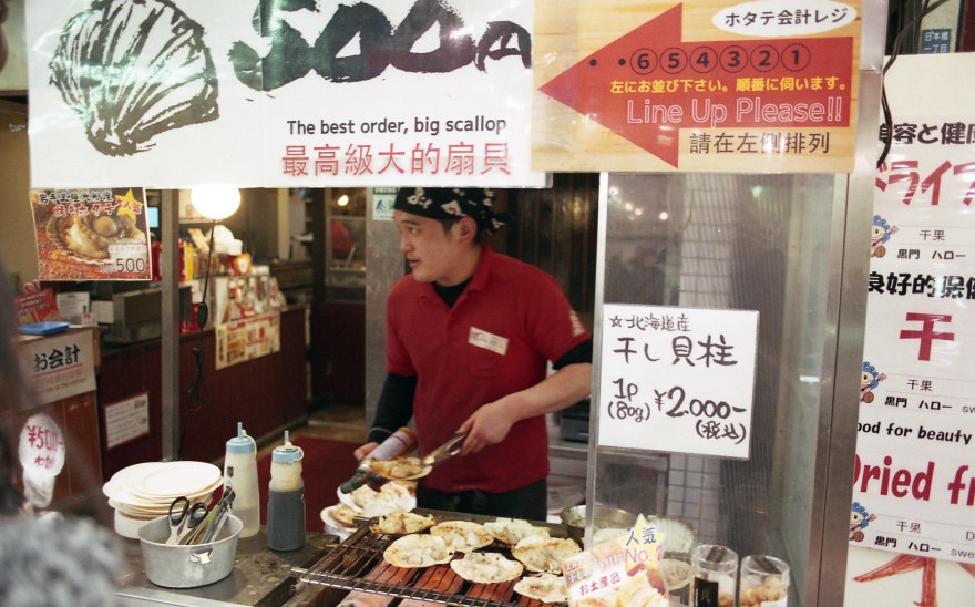
Film Never Die is a store based in Melbourne, Australia. They have a great selection of films, cameras (35mm, 120mm and Instant), laboratory with developing and scanning and also offer classes and workshops. Not only the physical store but an on-line store too. Film Never Die is really active in the film community and have a good amount of devoted customers and followers that interact frequently with their social media. Never visited the store myself, but If I travel to Australia, I’d definitely would arrange a visit to my itinerary and join one of their cool photo walks!
Through a Kickstarter campaign, they released IRO in 2017. They don’t have a constant stock, but rather work in batches. I got a few rolls in the second batch they produced during the pre-order, just had to wait a few weeks to get it.

IRO 200 色 is a day-balanced color negative film, C41 development with an ISO of 200. The name comes from the Japanese word “色” IRO, that literally means “Color”. There is not much technical information on the real manufacturer of the film or the technical conditions of the film, but that data is not relevant as long as we can see some real-life examples. Something cool about this film is that they had a designer (Rizki Wibisono) creating the packaging, something that many manufacturers neglect, but I think it makes your product way more appealing and shows that you care about it -independently of the product you are selling-. The design is simple but really cool:

| Name | FilmNeverDie IRO 200 |
| ISO | 200 |
| Developer | C-41 |
| Available formats | 35mm |
| Exposures | 36 Exposure
27 Exposures *First batch |
| DX coding | Yes (*First batch didn’t) |
| Availability | ★★☆☆☆
Orders through their website. |
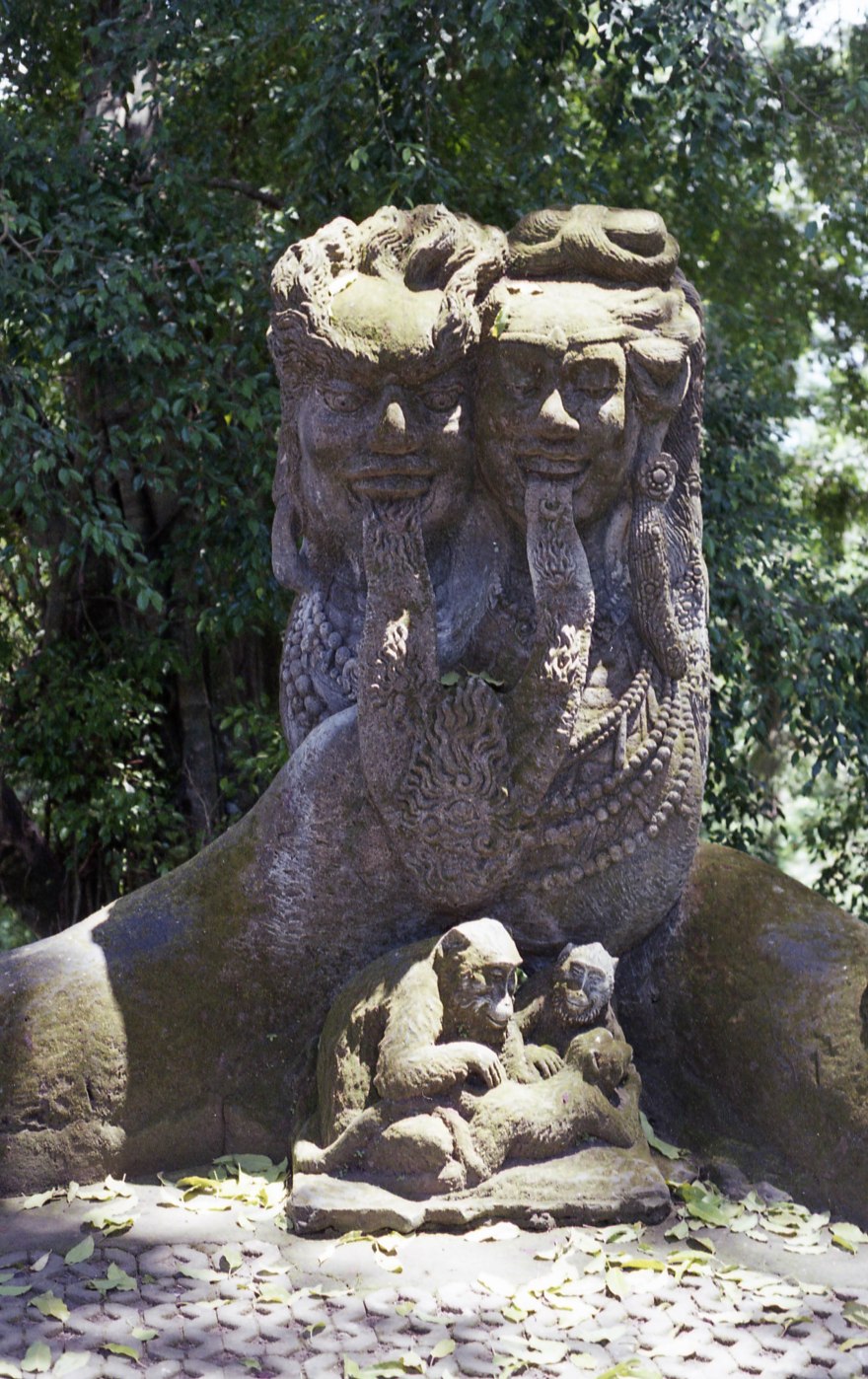
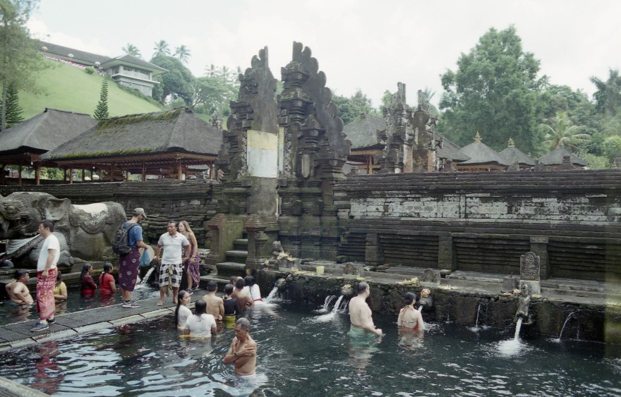
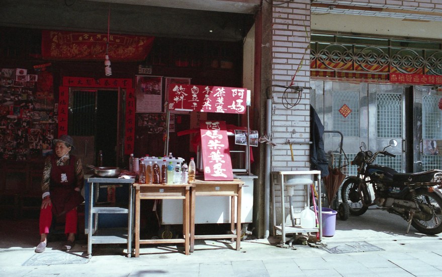
My rolls of film arrived right before a couple of big trips, Hawaii and Bali, perfect locations for a low ISO film. I shot both of them with my Nikon FM2n and my two favorite focal lenghts, 28mm and 50mm.

The first thing to notice, is that IRO200 is a colorful film. The colors are really vivid, especially yellows, blues and reds. It is a quite warm colored film, and shows a slight yellow cast over most images, you either love it or hate. I definitely love it!

Yellow colors are amazing, normally when reviewing other films like Superia X-TRA 400 or even Ultramax 400, I feel that yellow is the most “neglected” color being more muted than others. But in IRO, that is not the case, yellows are vivid and punchy.


Reds tend to become more “crimson” than just pure red, maybe they are not 100% true-to-color, however that different feeling is one of the reasons why we choose film over digital. These tones, definitely give a great and somehow vintage atmosphere to the scene.


Skies are great, this film has a really high latitude (like dynamic range in digital), so it captures a great range of blue tones. They tend to be slightly yellow, particularly when underexposed. In the second picture, I was trying to capture the rain from the distant cloud, underexposing the sky. I can feel it really tinted the scene more yellow. Overexposing the film a bit, this yellow tint disappears on the blue tones, not the case on greens.


Different days, tones and exposures, but greens always show a yellow cast all over it. Don’t get me wrong, I love the feeling of this film. However, if you are looking for a landscape film, you’d do better with a film like Ektar and use IRO in your day by day or on a trip to the beach.
I also shot a few portraits, with natural light and direct flash. Portraits of friends with different skin tones to see how IRO200 would react to different skin tones and flash.


Considering that IRO 200 is not a film oriented to portraits, the skin tones are surprisingly pleasant. I don’t mind the yellow tones as much as red ones that I see in other films (Every film in the Superia line or Ektar). Using flash it helps you to get rid of that cast and creates vivid and detailed images.
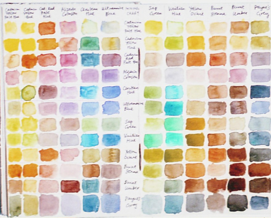
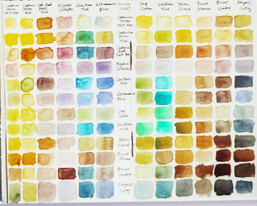
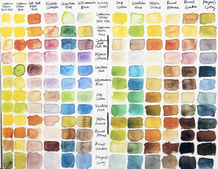
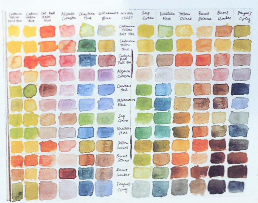
Color chart and measurement of the colors.

RED Average Colour R:209.0 G:142.0 B:84.0
YELLOW Average Colour R:229.0 G:210.0 B:52.0
BLUE Average Colour R:83.0 G:149.0 B:183.0
GREEN Average Colour R:190.0 G:205.0 B:117.0
You can take also a look on this article on How do I measure the colors?


I’m always excited to see people committed to the film industry. Honoring their name, they developed a new film. Something cool is, not just an old Fuji emulsion re-branded, this film has its own character. It has really warm colors, really punchy red and yellows. Controlled grain, slightly high for an ISO 200 film, but I always consider that nowadays grain is a matter of taste more than a decisive factor when choosing a film.
One of the troubles I find with this film is the price. If you are really on a budget, is not the cheapest film around. For example:
*Update: August 2018, the new batch of IRO 200 now comes with 36 exposures
A roll of 27 exposures costs: 7.35USD, that is 0.27USD per frame. As of today, a roll of Kodak Portra 400 or Kodak Ektar with 36 exposures each costs 7.49USD that is 0.21USD per frame.
The fact that this film can be only ordered online, also sums up. For Taiwan, when I ordered this film, the shipping costs were 8,50USD and it makes the total purchase more expensive, especially since I just bought a few rolls of IRO and a few of Hillvale’s Sunny 16. Definitely upgrading the exposures to 36 would help to solve this problem. The shipping cost is not much that can be done about it. Maybe instead of buying film every month, I should buy it every 6 months to make the shipping costs less of a deal.
Would I buy it again? DEFINITELY! I love the colors, the rich palette and the vintage feeling is amazing. Would I buy it often? If I was living in Australia, or I order something from them yes. For me, unfortunately, the high shipping costs and cost per frame make IRO 200 a rare treat. I can walk into a store in Taipei and buy professional film for cheaper, or three rolls of my beloved Colorplus 200.
YES ⇑
- Sunny days, warm colors, great results.
- Looking for a particular and different feeling in your pictures? this is your film.
- FilmNeverDie cares about the film community and this is a way to support them.
NO ⇓
- If you dislike warm colors or looking for a “cool” palette.
- Not the best value per shot.
- The irregular availability makes it difficult to become your day by day film, especially if you are looking for uniformity in your work.
Check out the gallery for more shots taken with this film!


![[Film] SPAIN TAIWAN - boat sanxia - AUG2016 -Nikon FM S - Fujifilm XTRA 400 -026](https://carlosgrphoto.com/wp-content/uploads/2018/07/film-spain-taiwan-boat-sanxia-aug2016-nikon-fm-s-fujifilm-xtra-400-026.jpg?w=880)

![[FILM] TAIWAN yuanshan street MAR2017 Nikon F4 Fujicolor X-TRA 400017](https://carlosgrphoto.com/wp-content/uploads/2018/07/film-taiwan-yuanshan-street-mar2017-nikon-f4-fujicolor-x-tra-400017.jpg?w=880)
![[FILM] IRELAND TAIWAN maria ireland taipei NIKON FM(S) Fujifilm XTRA400-004](https://carlosgrphoto.com/wp-content/uploads/2018/07/film-ireland-taiwan-maria-ireland-taipei-nikon-fms-fujifilm-xtra400-004.jpg?w=880)
![[FILM] TAIWAN yuanshan street MAR2017 Nikon F4 Fujicolor X-TRA 400015](https://carlosgrphoto.com/wp-content/uploads/2018/07/film-taiwan-yuanshan-street-mar2017-nikon-f4-fujicolor-x-tra-400015.jpg?w=880)
![[FILM] TAIWAN yuanshan street MAR2017 Nikon F4 Fujicolor X-TRA 400012](https://carlosgrphoto.com/wp-content/uploads/2018/07/film-taiwan-yuanshan-street-mar2017-nikon-f4-fujicolor-x-tra-400012.jpg?w=880)

![[Film] SPAIN TAIWAN - boat sanxia - AUG2016 -Nikon FM S - Fujifilm XTRA 400 -002](https://carlosgrphoto.com/wp-content/uploads/2018/07/film-spain-taiwan-boat-sanxia-aug2016-nikon-fm-s-fujifilm-xtra-400-002.jpg?w=880)
![[FILM] TAIWAN yuanshan street MAR2017 Nikon F4 Fujicolor X-TRA 400021](https://carlosgrphoto.com/wp-content/uploads/2018/07/film-taiwan-yuanshan-street-mar2017-nikon-f4-fujicolor-x-tra-400021.jpg?w=880)


![[FILM] TAIWAN Jorge Taipei center DEC2015 Nikon F3 Fujifilm X-TRA 400025](https://carlosgrphoto.com/wp-content/uploads/2018/07/film-taiwan-jorge-taipei-center-dec2015-nikon-f3-fujifilm-x-tra-400025.jpg?w=880)
![[FILM] TAIWAN Jorge Taipei center DEC2015 Nikon F3 Fujifilm X-TRA 400026](https://i0.wp.com/carlosgrphoto.com/wp-content/uploads/2018/07/film-taiwan-jorge-taipei-center-dec2015-nikon-f3-fujifilm-x-tra-400026.jpg?w=476&h=755&ssl=1 "[FILM] TAIWAN Jorge Taipei center DEC2015 Nikon F3 Fujifilm X-TRA 400026")
![[Film] SPAIN TAIWAN - boat sanxia - AUG2016 -Nikon FM S - Fujifilm XTRA 400 -008](https://i0.wp.com/carlosgrphoto.com/wp-content/uploads/2018/07/film-spain-taiwan-boat-sanxia-aug2016-nikon-fm-s-fujifilm-xtra-400-008.jpg?w=396&h=247&ssl=1 "[Film] SPAIN TAIWAN - boat sanxia - AUG2016 -Nikon FM S - Fujifilm XTRA 400 -008")
![[Film] SPAIN TAIWAN - boat sanxia - AUG2016 -Nikon FM S - Fujifilm XTRA 400 -007](https://i0.wp.com/carlosgrphoto.com/wp-content/uploads/2018/07/film-spain-taiwan-boat-sanxia-aug2016-nikon-fm-s-fujifilm-xtra-400-007.jpg?w=396&h=252&ssl=1 "[Film] SPAIN TAIWAN - boat sanxia - AUG2016 -Nikon FM S - Fujifilm XTRA 400 -007")


![[FILM] TAIWAN Jorge Taipei center DEC2015 Nikon F3 Fujifilm X-TRA 400006](https://carlosgrphoto.com/wp-content/uploads/2018/07/film-taiwan-jorge-taipei-center-dec2015-nikon-f3-fujifilm-x-tra-400006.jpg?w=880)


![[FILM] TAIWAN yuanshan street MAR2017 Nikon F4 Fujicolor X-TRA 400035](https://i0.wp.com/carlosgrphoto.com/wp-content/uploads/2018/07/film-taiwan-yuanshan-street-mar2017-nikon-f4-fujicolor-x-tra-400035.jpg?w=290&h=181&ssl=1 "[FILM] TAIWAN yuanshan street MAR2017 Nikon F4 Fujicolor X-TRA 400035")
![[FILM] TAIWAN yuanshan street MAR2017 Nikon F4 Fujicolor X-TRA 400032](https://i0.wp.com/carlosgrphoto.com/wp-content/uploads/2018/07/film-taiwan-yuanshan-street-mar2017-nikon-f4-fujicolor-x-tra-400032.jpg?w=290&h=181&ssl=1 "[FILM] TAIWAN yuanshan street MAR2017 Nikon F4 Fujicolor X-TRA 400032")
![[FILM] TAIWAN yuanshan street MAR2017 Nikon F4 Fujicolor X-TRA 400030](https://i0.wp.com/carlosgrphoto.com/wp-content/uploads/2018/07/film-taiwan-yuanshan-street-mar2017-nikon-f4-fujicolor-x-tra-400030.jpg?w=582&h=366&ssl=1 "[FILM] TAIWAN yuanshan street MAR2017 Nikon F4 Fujicolor X-TRA 400030")
![[FILM] TAIWAN yuanshan street MAR2017 Nikon F4 Fujicolor X-TRA 400029](https://i0.wp.com/carlosgrphoto.com/wp-content/uploads/2018/07/film-taiwan-yuanshan-street-mar2017-nikon-f4-fujicolor-x-tra-400029.jpg?w=436&h=273&ssl=1 "[FILM] TAIWAN yuanshan street MAR2017 Nikon F4 Fujicolor X-TRA 400029")
![[FILM] TAIWAN yuanshan street MAR2017 Nikon F4 Fujicolor X-TRA 400028](https://i0.wp.com/carlosgrphoto.com/wp-content/uploads/2018/07/film-taiwan-yuanshan-street-mar2017-nikon-f4-fujicolor-x-tra-400028.jpg?w=436&h=273&ssl=1 "[FILM] TAIWAN yuanshan street MAR2017 Nikon F4 Fujicolor X-TRA 400028")
![[FILM] TAIWAN yuanshan street MAR2017 Nikon F4 Fujicolor X-TRA 400027](https://i0.wp.com/carlosgrphoto.com/wp-content/uploads/2018/07/film-taiwan-yuanshan-street-mar2017-nikon-f4-fujicolor-x-tra-400027.jpg?w=475&h=756&ssl=1 "[FILM] TAIWAN yuanshan street MAR2017 Nikon F4 Fujicolor X-TRA 400027")

![[FILM] TAIWAN yuanshan street MAR2017 Nikon F4 Fujicolor X-TRA 400024](https://i0.wp.com/carlosgrphoto.com/wp-content/uploads/2018/07/film-taiwan-yuanshan-street-mar2017-nikon-f4-fujicolor-x-tra-400024.jpg?w=397&h=251&ssl=1 "[FILM] TAIWAN yuanshan street MAR2017 Nikon F4 Fujicolor X-TRA 400024")
![[FILM] TAIWAN yuanshan street MAR2017 Nikon F4 Fujicolor X-TRA 400023](https://i0.wp.com/carlosgrphoto.com/wp-content/uploads/2018/07/film-taiwan-yuanshan-street-mar2017-nikon-f4-fujicolor-x-tra-400023.jpg?w=397&h=247&ssl=1 "[FILM] TAIWAN yuanshan street MAR2017 Nikon F4 Fujicolor X-TRA 400023")
![[FILM] TAIWAN yuanshan street MAR2017 Nikon F4 Fujicolor X-TRA 400021](https://i0.wp.com/carlosgrphoto.com/wp-content/uploads/2018/07/film-taiwan-yuanshan-street-mar2017-nikon-f4-fujicolor-x-tra-400021.jpg?w=290&h=181&ssl=1 "[FILM] TAIWAN yuanshan street MAR2017 Nikon F4 Fujicolor X-TRA 400021")
![[FILM] TAIWAN yuanshan street MAR2017 Nikon F4 Fujicolor X-TRA 400020](https://i0.wp.com/carlosgrphoto.com/wp-content/uploads/2018/07/film-taiwan-yuanshan-street-mar2017-nikon-f4-fujicolor-x-tra-400020.jpg?w=288&h=181&ssl=1 "[FILM] TAIWAN yuanshan street MAR2017 Nikon F4 Fujicolor X-TRA 400020")
![[FILM] TAIWAN yuanshan street MAR2017 Nikon F4 Fujicolor X-TRA 400019](https://i0.wp.com/carlosgrphoto.com/wp-content/uploads/2018/07/film-taiwan-yuanshan-street-mar2017-nikon-f4-fujicolor-x-tra-400019.jpg?w=290&h=181&ssl=1 "[FILM] TAIWAN yuanshan street MAR2017 Nikon F4 Fujicolor X-TRA 400019")
![[FILM] TAIWAN yuanshan street MAR2017 Nikon F4 Fujicolor X-TRA 400018](https://i0.wp.com/carlosgrphoto.com/wp-content/uploads/2018/07/film-taiwan-yuanshan-street-mar2017-nikon-f4-fujicolor-x-tra-400018.jpg?w=582&h=368&ssl=1 "[FILM] TAIWAN yuanshan street MAR2017 Nikon F4 Fujicolor X-TRA 400018")
![[FILM] TAIWAN yuanshan street MAR2017 Nikon F4 Fujicolor X-TRA 400017](https://i0.wp.com/carlosgrphoto.com/wp-content/uploads/2018/07/film-taiwan-yuanshan-street-mar2017-nikon-f4-fujicolor-x-tra-400017.jpg?w=290&h=182&ssl=1 "[FILM] TAIWAN yuanshan street MAR2017 Nikon F4 Fujicolor X-TRA 400017")
![[FILM] TAIWAN yuanshan street MAR2017 Nikon F4 Fujicolor X-TRA 400016](https://i0.wp.com/carlosgrphoto.com/wp-content/uploads/2018/07/film-taiwan-yuanshan-street-mar2017-nikon-f4-fujicolor-x-tra-400016.jpg?w=290&h=182&ssl=1 "[FILM] TAIWAN yuanshan street MAR2017 Nikon F4 Fujicolor X-TRA 400016")
![[FILM] TAIWAN yuanshan street MAR2017 Nikon F4 Fujicolor X-TRA 400015](https://i0.wp.com/carlosgrphoto.com/wp-content/uploads/2018/07/film-taiwan-yuanshan-street-mar2017-nikon-f4-fujicolor-x-tra-400015.jpg?w=309&h=195&ssl=1 "[FILM] TAIWAN yuanshan street MAR2017 Nikon F4 Fujicolor X-TRA 400015")
![[FILM] TAIWAN yuanshan street MAR2017 Nikon F4 Fujicolor X-TRA 400012](https://i0.wp.com/carlosgrphoto.com/wp-content/uploads/2018/07/film-taiwan-yuanshan-street-mar2017-nikon-f4-fujicolor-x-tra-400012.jpg?w=309&h=196&ssl=1 "[FILM] TAIWAN yuanshan street MAR2017 Nikon F4 Fujicolor X-TRA 400012")
![[FILM] TAIWAN yuanshan street MAR2017 Nikon F4 Fujicolor X-TRA 400011](https://i0.wp.com/carlosgrphoto.com/wp-content/uploads/2018/07/film-taiwan-yuanshan-street-mar2017-nikon-f4-fujicolor-x-tra-400011.jpg?w=251&h=395&ssl=1 "[FILM] TAIWAN yuanshan street MAR2017 Nikon F4 Fujicolor X-TRA 400011")
![[FILM] TAIWAN yuanshan street MAR2017 Nikon F4 Fujicolor X-TRA 400010](https://i0.wp.com/carlosgrphoto.com/wp-content/uploads/2018/07/film-taiwan-yuanshan-street-mar2017-nikon-f4-fujicolor-x-tra-400010.jpg?w=308&h=196&ssl=1 "[FILM] TAIWAN yuanshan street MAR2017 Nikon F4 Fujicolor X-TRA 400010")
![[FILM] TAIWAN yuanshan street MAR2017 Nikon F4 Fujicolor X-TRA 400009](https://i0.wp.com/carlosgrphoto.com/wp-content/uploads/2018/07/film-taiwan-yuanshan-street-mar2017-nikon-f4-fujicolor-x-tra-400009.jpg?w=308&h=195&ssl=1 "[FILM] TAIWAN yuanshan street MAR2017 Nikon F4 Fujicolor X-TRA 400009")
![[FILM] TAIWAN yuanshan street MAR2017 Nikon F4 Fujicolor X-TRA 400007](https://i0.wp.com/carlosgrphoto.com/wp-content/uploads/2018/07/film-taiwan-yuanshan-street-mar2017-nikon-f4-fujicolor-x-tra-400007.jpg?w=253&h=392&ssl=1 "[FILM] TAIWAN yuanshan street MAR2017 Nikon F4 Fujicolor X-TRA 400007")
![[FILM] TAIWAN yuanshan street MAR2017 Nikon F4 Fujicolor X-TRA 400006](https://i0.wp.com/carlosgrphoto.com/wp-content/uploads/2018/07/film-taiwan-yuanshan-street-mar2017-nikon-f4-fujicolor-x-tra-400006.jpg?w=619&h=392&ssl=1 "[FILM] TAIWAN yuanshan street MAR2017 Nikon F4 Fujicolor X-TRA 400006")
![[FILM] TAIWAN yuanshan street MAR2017 Nikon F4 Fujicolor X-TRA 400002](https://i0.wp.com/carlosgrphoto.com/wp-content/uploads/2018/07/film-taiwan-yuanshan-street-mar2017-nikon-f4-fujicolor-x-tra-400002.jpg?w=481&h=758&ssl=1 "[FILM] TAIWAN yuanshan street MAR2017 Nikon F4 Fujicolor X-TRA 400002")
![[FILM] TAIWAN yuanshan street MAR2017 Nikon F4 Fujicolor X-TRA 400001](https://i0.wp.com/carlosgrphoto.com/wp-content/uploads/2018/07/film-taiwan-yuanshan-street-mar2017-nikon-f4-fujicolor-x-tra-400001.jpg?w=391&h=253&ssl=1 "[FILM] TAIWAN yuanshan street MAR2017 Nikon F4 Fujicolor X-TRA 400001")
![[FILM] TAIWAN Jorge Taipei center DEC2015 Nikon F3 Fujifilm X-TRA 400034](https://i0.wp.com/carlosgrphoto.com/wp-content/uploads/2018/07/film-taiwan-jorge-taipei-center-dec2015-nikon-f3-fujifilm-x-tra-400034.jpg?w=391&h=247&ssl=1 "[FILM] TAIWAN Jorge Taipei center DEC2015 Nikon F3 Fujifilm X-TRA 400034")
![[FILM] TAIWAN Jorge Taipei center DEC2015 Nikon F3 Fujifilm X-TRA 400030](https://i0.wp.com/carlosgrphoto.com/wp-content/uploads/2018/07/film-taiwan-jorge-taipei-center-dec2015-nikon-f3-fujifilm-x-tra-400030.jpg?w=391&h=250&ssl=1 "[FILM] TAIWAN Jorge Taipei center DEC2015 Nikon F3 Fujifilm X-TRA 400030")
![[FILM] TAIWAN Jorge Taipei center DEC2015 Nikon F3 Fujifilm X-TRA 400028](https://i0.wp.com/carlosgrphoto.com/wp-content/uploads/2018/07/film-taiwan-jorge-taipei-center-dec2015-nikon-f3-fujifilm-x-tra-400028.jpg?w=485&h=306&ssl=1 "[FILM] TAIWAN Jorge Taipei center DEC2015 Nikon F3 Fujifilm X-TRA 400028")
![[FILM] TAIWAN Jorge Taipei center DEC2015 Nikon F3 Fujifilm X-TRA 400027](https://i0.wp.com/carlosgrphoto.com/wp-content/uploads/2018/07/film-taiwan-jorge-taipei-center-dec2015-nikon-f3-fujifilm-x-tra-400027.jpg?w=485&h=305&ssl=1 "[FILM] TAIWAN Jorge Taipei center DEC2015 Nikon F3 Fujifilm X-TRA 400027")
![[FILM] TAIWAN Jorge Taipei center DEC2015 Nikon F3 Fujifilm X-TRA 400026](https://i0.wp.com/carlosgrphoto.com/wp-content/uploads/2018/07/film-taiwan-jorge-taipei-center-dec2015-nikon-f3-fujifilm-x-tra-400026.jpg?w=387&h=615&ssl=1 "[FILM] TAIWAN Jorge Taipei center DEC2015 Nikon F3 Fujifilm X-TRA 400026")
![[FILM] TAIWAN -Beach Drinking - APR2016 - Konica Z-UP70 - Fujifilm XTRA 400 -029](https://i0.wp.com/carlosgrphoto.com/wp-content/uploads/2018/07/film-taiwan-beach-drinking-apr2016-konica-z-up70-fujifilm-xtra-400-029.jpg?w=585&h=370&ssl=1 "[FILM] TAIWAN -Beach Drinking - APR2016 - Konica Z-UP70 - Fujifilm XTRA 400 -029")
![[FILM] TAIWAN -Beach Drinking - APR2016 - Konica Z-UP70 - Fujifilm XTRA 400 -035](https://i0.wp.com/carlosgrphoto.com/wp-content/uploads/2018/07/film-taiwan-beach-drinking-apr2016-konica-z-up70-fujifilm-xtra-400-035.jpg?w=287&h=182&ssl=1 "[FILM] TAIWAN -Beach Drinking - APR2016 - Konica Z-UP70 - Fujifilm XTRA 400 -035")
![[FILM] TAIWAN Jorge Taipei center DEC2015 Nikon F3 Fujifilm X-TRA 400001](https://i0.wp.com/carlosgrphoto.com/wp-content/uploads/2018/07/film-taiwan-jorge-taipei-center-dec2015-nikon-f3-fujifilm-x-tra-400001.jpg?w=287&h=184&ssl=1 "[FILM] TAIWAN Jorge Taipei center DEC2015 Nikon F3 Fujifilm X-TRA 400001")
![[FILM] TAIWAN Jorge Taipei center DEC2015 Nikon F3 Fujifilm X-TRA 400002](https://i0.wp.com/carlosgrphoto.com/wp-content/uploads/2018/07/film-taiwan-jorge-taipei-center-dec2015-nikon-f3-fujifilm-x-tra-400002.jpg?w=445&h=288&ssl=1 "[FILM] TAIWAN Jorge Taipei center DEC2015 Nikon F3 Fujifilm X-TRA 400002")
![[FILM] TAIWAN Jorge Taipei center DEC2015 Nikon F3 Fujifilm X-TRA 400006](https://i0.wp.com/carlosgrphoto.com/wp-content/uploads/2018/07/film-taiwan-jorge-taipei-center-dec2015-nikon-f3-fujifilm-x-tra-400006.jpg?w=427&h=288&ssl=1 "[FILM] TAIWAN Jorge Taipei center DEC2015 Nikon F3 Fujifilm X-TRA 400006")
![[FILM] TAIWAN Jorge Taipei center DEC2015 Nikon F3 Fujifilm X-TRA 400004](https://i0.wp.com/carlosgrphoto.com/wp-content/uploads/2018/07/film-taiwan-jorge-taipei-center-dec2015-nikon-f3-fujifilm-x-tra-400004.jpg?w=432&h=279&ssl=1 "[FILM] TAIWAN Jorge Taipei center DEC2015 Nikon F3 Fujifilm X-TRA 400004")
![[FILM] TAIWAN Jorge Taipei center DEC2015 Nikon F3 Fujifilm X-TRA 400013](https://i0.wp.com/carlosgrphoto.com/wp-content/uploads/2018/07/film-taiwan-jorge-taipei-center-dec2015-nikon-f3-fujifilm-x-tra-400013.jpg?w=440&h=279&ssl=1 "[FILM] TAIWAN Jorge Taipei center DEC2015 Nikon F3 Fujifilm X-TRA 400013")
![[FILM] TAIWAN Jorge Taipei center DEC2015 Nikon F3 Fujifilm X-TRA 400016](https://i0.wp.com/carlosgrphoto.com/wp-content/uploads/2018/07/film-taiwan-jorge-taipei-center-dec2015-nikon-f3-fujifilm-x-tra-400016.jpg?w=288&h=183&ssl=1 "[FILM] TAIWAN Jorge Taipei center DEC2015 Nikon F3 Fujifilm X-TRA 400016")
![[FILM] TAIWAN Jorge Taipei center DEC2015 Nikon F3 Fujifilm X-TRA 400021](https://i0.wp.com/carlosgrphoto.com/wp-content/uploads/2018/07/film-taiwan-jorge-taipei-center-dec2015-nikon-f3-fujifilm-x-tra-400021.jpg?w=288&h=182&ssl=1 "[FILM] TAIWAN Jorge Taipei center DEC2015 Nikon F3 Fujifilm X-TRA 400021")
![[FILM] TAIWAN Jorge Taipei center DEC2015 Nikon F3 Fujifilm X-TRA 400022](https://i0.wp.com/carlosgrphoto.com/wp-content/uploads/2018/07/film-taiwan-jorge-taipei-center-dec2015-nikon-f3-fujifilm-x-tra-400022.jpg?w=584&h=369&ssl=1 "[FILM] TAIWAN Jorge Taipei center DEC2015 Nikon F3 Fujifilm X-TRA 400022")
![[FILM] TAIWAN Jorge Taipei center DEC2015 Nikon F3 Fujifilm X-TRA 400023](https://i0.wp.com/carlosgrphoto.com/wp-content/uploads/2018/07/film-taiwan-jorge-taipei-center-dec2015-nikon-f3-fujifilm-x-tra-400023.jpg?w=583&h=369&ssl=1 "[FILM] TAIWAN Jorge Taipei center DEC2015 Nikon F3 Fujifilm X-TRA 400023")
![[FILM] TAIWAN Jorge Taipei center DEC2015 Nikon F3 Fujifilm X-TRA 400025](https://i0.wp.com/carlosgrphoto.com/wp-content/uploads/2018/07/film-taiwan-jorge-taipei-center-dec2015-nikon-f3-fujifilm-x-tra-400025.jpg?w=289&h=182&ssl=1 "[FILM] TAIWAN Jorge Taipei center DEC2015 Nikon F3 Fujifilm X-TRA 400025")
![[FILM] TAIWAN -Beach Drinking - APR2016 - Konica Z-UP70 - Fujifilm XTRA 400 -025](https://i0.wp.com/carlosgrphoto.com/wp-content/uploads/2018/07/film-taiwan-beach-drinking-apr2016-konica-z-up70-fujifilm-xtra-400-025.jpg?w=289&h=183&ssl=1 "[FILM] TAIWAN -Beach Drinking - APR2016 - Konica Z-UP70 - Fujifilm XTRA 400 -025")

![[FILM] TAIWAN -Beach Drinking - APR2016 - Konica Z-UP70 - Fujifilm XTRA 400 -012](https://i0.wp.com/carlosgrphoto.com/wp-content/uploads/2018/07/film-taiwan-beach-drinking-apr2016-konica-z-up70-fujifilm-xtra-400-012.jpg?w=435&h=278&ssl=1 "[FILM] TAIWAN -Beach Drinking - APR2016 - Konica Z-UP70 - Fujifilm XTRA 400 -012")
![[FILM] TAIWAN -Beach Drinking - APR2016 - Konica Z-UP70 - Fujifilm XTRA 400 -008](https://i0.wp.com/carlosgrphoto.com/wp-content/uploads/2018/07/film-taiwan-beach-drinking-apr2016-konica-z-up70-fujifilm-xtra-400-008.jpg?w=435&h=276&ssl=1 "[FILM] TAIWAN -Beach Drinking - APR2016 - Konica Z-UP70 - Fujifilm XTRA 400 -008")
![[Film] SPAIN TAIWAN - boat sanxia - AUG2016 -Nikon FM S - Fujifilm XTRA 400 -035](https://i0.wp.com/carlosgrphoto.com/wp-content/uploads/2018/07/film-spain-taiwan-boat-sanxia-aug2016-nikon-fm-s-fujifilm-xtra-400-035.jpg?w=437&h=276&ssl=1 "[Film] SPAIN TAIWAN - boat sanxia - AUG2016 -Nikon FM S - Fujifilm XTRA 400 -035")
![[Film] SPAIN TAIWAN - boat sanxia - AUG2016 -Nikon FM S - Fujifilm XTRA 400 -034](https://i0.wp.com/carlosgrphoto.com/wp-content/uploads/2018/07/film-spain-taiwan-boat-sanxia-aug2016-nikon-fm-s-fujifilm-xtra-400-034.jpg?w=287&h=184&ssl=1 "[Film] SPAIN TAIWAN - boat sanxia - AUG2016 -Nikon FM S - Fujifilm XTRA 400 -034")
![[Film] SPAIN TAIWAN - boat sanxia - AUG2016 -Nikon FM S - Fujifilm XTRA 400 -033](https://i0.wp.com/carlosgrphoto.com/wp-content/uploads/2018/07/film-spain-taiwan-boat-sanxia-aug2016-nikon-fm-s-fujifilm-xtra-400-033.jpg?w=287&h=182&ssl=1 "[Film] SPAIN TAIWAN - boat sanxia - AUG2016 -Nikon FM S - Fujifilm XTRA 400 -033")
![[Film] SPAIN TAIWAN - boat sanxia - AUG2016 -Nikon FM S - Fujifilm XTRA 400 -032](https://i0.wp.com/carlosgrphoto.com/wp-content/uploads/2018/07/film-spain-taiwan-boat-sanxia-aug2016-nikon-fm-s-fujifilm-xtra-400-032.jpg?w=585&h=370&ssl=1 "[Film] SPAIN TAIWAN - boat sanxia - AUG2016 -Nikon FM S - Fujifilm XTRA 400 -032")
![[Film] SPAIN TAIWAN - boat sanxia - AUG2016 -Nikon FM S - Fujifilm XTRA 400 -031](https://i0.wp.com/carlosgrphoto.com/wp-content/uploads/2018/07/film-spain-taiwan-boat-sanxia-aug2016-nikon-fm-s-fujifilm-xtra-400-031.jpg?w=583&h=365&ssl=1 "[Film] SPAIN TAIWAN - boat sanxia - AUG2016 -Nikon FM S - Fujifilm XTRA 400 -031")
![[Film] SPAIN TAIWAN - boat sanxia - AUG2016 -Nikon FM S - Fujifilm XTRA 400 -029](https://i0.wp.com/carlosgrphoto.com/wp-content/uploads/2018/07/film-spain-taiwan-boat-sanxia-aug2016-nikon-fm-s-fujifilm-xtra-400-029.jpg?w=289&h=181&ssl=1 "[Film] SPAIN TAIWAN - boat sanxia - AUG2016 -Nikon FM S - Fujifilm XTRA 400 -029")
![[Film] SPAIN TAIWAN - boat sanxia - AUG2016 -Nikon FM S - Fujifilm XTRA 400 -030](https://i0.wp.com/carlosgrphoto.com/wp-content/uploads/2018/07/film-spain-taiwan-boat-sanxia-aug2016-nikon-fm-s-fujifilm-xtra-400-030.jpg?w=289&h=180&ssl=1 "[Film] SPAIN TAIWAN - boat sanxia - AUG2016 -Nikon FM S - Fujifilm XTRA 400 -030")
![[Film] SPAIN TAIWAN - boat sanxia - AUG2016 -Nikon FM S - Fujifilm XTRA 400 -002](https://i0.wp.com/carlosgrphoto.com/wp-content/uploads/2018/07/film-spain-taiwan-boat-sanxia-aug2016-nikon-fm-s-fujifilm-xtra-400-002.jpg?w=437&h=277&ssl=1 "[Film] SPAIN TAIWAN - boat sanxia - AUG2016 -Nikon FM S - Fujifilm XTRA 400 -002")

![[Film] SPAIN TAIWAN - boat sanxia - AUG2016 -Nikon FM S - Fujifilm XTRA 400 -007](https://i0.wp.com/carlosgrphoto.com/wp-content/uploads/2018/07/film-spain-taiwan-boat-sanxia-aug2016-nikon-fm-s-fujifilm-xtra-400-007.jpg?w=432&h=275&ssl=1 "[Film] SPAIN TAIWAN - boat sanxia - AUG2016 -Nikon FM S - Fujifilm XTRA 400 -007")
![[Film] SPAIN TAIWAN - boat sanxia - AUG2016 -Nikon FM S - Fujifilm XTRA 400 -008](https://i0.wp.com/carlosgrphoto.com/wp-content/uploads/2018/07/film-spain-taiwan-boat-sanxia-aug2016-nikon-fm-s-fujifilm-xtra-400-008.jpg?w=440&h=275&ssl=1 "[Film] SPAIN TAIWAN - boat sanxia - AUG2016 -Nikon FM S - Fujifilm XTRA 400 -008")
![[Film] SPAIN TAIWAN - boat sanxia - AUG2016 -Nikon FM S - Fujifilm XTRA 400 -009](https://i0.wp.com/carlosgrphoto.com/wp-content/uploads/2018/07/film-spain-taiwan-boat-sanxia-aug2016-nikon-fm-s-fujifilm-xtra-400-009.jpg?w=311&h=195&ssl=1 "[Film] SPAIN TAIWAN - boat sanxia - AUG2016 -Nikon FM S - Fujifilm XTRA 400 -009")
![[Film] SPAIN TAIWAN - boat sanxia - AUG2016 -Nikon FM S - Fujifilm XTRA 400 -010](https://i0.wp.com/carlosgrphoto.com/wp-content/uploads/2018/07/film-spain-taiwan-boat-sanxia-aug2016-nikon-fm-s-fujifilm-xtra-400-010.jpg?w=311&h=194&ssl=1 "[Film] SPAIN TAIWAN - boat sanxia - AUG2016 -Nikon FM S - Fujifilm XTRA 400 -010")
![[Film] SPAIN TAIWAN - boat sanxia - AUG2016 -Nikon FM S - Fujifilm XTRA 400 -011](https://i0.wp.com/carlosgrphoto.com/wp-content/uploads/2018/07/film-spain-taiwan-boat-sanxia-aug2016-nikon-fm-s-fujifilm-xtra-400-011.jpg?w=246&h=393&ssl=1 "[Film] SPAIN TAIWAN - boat sanxia - AUG2016 -Nikon FM S - Fujifilm XTRA 400 -011")
![[Film] SPAIN TAIWAN - boat sanxia - AUG2016 -Nikon FM S - Fujifilm XTRA 400 -012](https://i0.wp.com/carlosgrphoto.com/wp-content/uploads/2018/07/film-spain-taiwan-boat-sanxia-aug2016-nikon-fm-s-fujifilm-xtra-400-012.jpg?w=311&h=195&ssl=1 "[Film] SPAIN TAIWAN - boat sanxia - AUG2016 -Nikon FM S - Fujifilm XTRA 400 -012")
![[Film] SPAIN TAIWAN - boat sanxia - AUG2016 -Nikon FM S - Fujifilm XTRA 400 -013](https://i0.wp.com/carlosgrphoto.com/wp-content/uploads/2018/07/film-spain-taiwan-boat-sanxia-aug2016-nikon-fm-s-fujifilm-xtra-400-013.jpg?w=311&h=194&ssl=1 "[Film] SPAIN TAIWAN - boat sanxia - AUG2016 -Nikon FM S - Fujifilm XTRA 400 -013")
![[Film] SPAIN TAIWAN - boat sanxia - AUG2016 -Nikon FM S - Fujifilm XTRA 400 -024](https://i0.wp.com/carlosgrphoto.com/wp-content/uploads/2018/07/film-spain-taiwan-boat-sanxia-aug2016-nikon-fm-s-fujifilm-xtra-400-024.jpg?w=583&h=377&ssl=1 "[Film] SPAIN TAIWAN - boat sanxia - AUG2016 -Nikon FM S - Fujifilm XTRA 400 -024")
![[Film] SPAIN TAIWAN - boat sanxia - AUG2016 -Nikon FM S - Fujifilm XTRA 400 -026](https://i0.wp.com/carlosgrphoto.com/wp-content/uploads/2018/07/film-spain-taiwan-boat-sanxia-aug2016-nikon-fm-s-fujifilm-xtra-400-026.jpg?w=289&h=186&ssl=1 "[Film] SPAIN TAIWAN - boat sanxia - AUG2016 -Nikon FM S - Fujifilm XTRA 400 -026")
![[Film] SPAIN TAIWAN - boat sanxia - AUG2016 -Nikon FM S - Fujifilm XTRA 400 -028](https://i0.wp.com/carlosgrphoto.com/wp-content/uploads/2018/07/film-spain-taiwan-boat-sanxia-aug2016-nikon-fm-s-fujifilm-xtra-400-028.jpg?w=289&h=187&ssl=1 "[Film] SPAIN TAIWAN - boat sanxia - AUG2016 -Nikon FM S - Fujifilm XTRA 400 -028")
![[FILM] IRELAND TAIWAN maria ireland taipei NIKON FM(S) Fujifilm XTRA400-032](https://i0.wp.com/carlosgrphoto.com/wp-content/uploads/2018/07/film-ireland-taiwan-maria-ireland-taipei-nikon-fms-fujifilm-xtra400-032.jpg?w=272&h=170&ssl=1 "[FILM] IRELAND TAIWAN maria ireland taipei NIKON FM(S) Fujifilm XTRA400-032")
![[FILM] IRELAND TAIWAN maria ireland taipei NIKON FM(S) Fujifilm XTRA400-031](https://i0.wp.com/carlosgrphoto.com/wp-content/uploads/2018/07/film-ireland-taiwan-maria-ireland-taipei-nikon-fms-fujifilm-xtra400-031.jpg?w=272&h=171&ssl=1 "[FILM] IRELAND TAIWAN maria ireland taipei NIKON FM(S) Fujifilm XTRA400-031")
![[FILM] IRELAND TAIWAN maria ireland taipei NIKON FM(S) Fujifilm XTRA400-029](https://i0.wp.com/carlosgrphoto.com/wp-content/uploads/2018/07/film-ireland-taiwan-maria-ireland-taipei-nikon-fms-fujifilm-xtra400-029.jpg?w=272&h=171&ssl=1 "[FILM] IRELAND TAIWAN maria ireland taipei NIKON FM(S) Fujifilm XTRA400-029")
![[FILM] IRELAND TAIWAN maria ireland taipei NIKON FM(S) Fujifilm XTRA400-028](https://i0.wp.com/carlosgrphoto.com/wp-content/uploads/2018/07/film-ireland-taiwan-maria-ireland-taipei-nikon-fms-fujifilm-xtra400-028.jpg?w=326&h=520&ssl=1 "[FILM] IRELAND TAIWAN maria ireland taipei NIKON FM(S) Fujifilm XTRA400-028")
![[FILM] IRELAND TAIWAN maria ireland taipei NIKON FM(S) Fujifilm XTRA400-027](https://i0.wp.com/carlosgrphoto.com/wp-content/uploads/2018/07/film-ireland-taiwan-maria-ireland-taipei-nikon-fms-fujifilm-xtra400-027.jpg?w=270&h=172&ssl=1 "[FILM] IRELAND TAIWAN maria ireland taipei NIKON FM(S) Fujifilm XTRA400-027")
![[FILM] IRELAND TAIWAN maria ireland taipei NIKON FM(S) Fujifilm XTRA400-023](https://i0.wp.com/carlosgrphoto.com/wp-content/uploads/2018/07/film-ireland-taiwan-maria-ireland-taipei-nikon-fms-fujifilm-xtra400-023.jpg?w=270&h=170&ssl=1 "[FILM] IRELAND TAIWAN maria ireland taipei NIKON FM(S) Fujifilm XTRA400-023")
![[FILM] IRELAND TAIWAN maria ireland taipei NIKON FM(S) Fujifilm XTRA400-022](https://i0.wp.com/carlosgrphoto.com/wp-content/uploads/2018/07/film-ireland-taiwan-maria-ireland-taipei-nikon-fms-fujifilm-xtra400-022.jpg?w=270&h=170&ssl=1 "[FILM] IRELAND TAIWAN maria ireland taipei NIKON FM(S) Fujifilm XTRA400-022")
![[FILM] IRELAND TAIWAN maria ireland taipei NIKON FM(S) Fujifilm XTRA400-021](https://i0.wp.com/carlosgrphoto.com/wp-content/uploads/2018/07/film-ireland-taiwan-maria-ireland-taipei-nikon-fms-fujifilm-xtra400-021.jpg?w=287&h=181&ssl=1 "[FILM] IRELAND TAIWAN maria ireland taipei NIKON FM(S) Fujifilm XTRA400-021")
![[FILM] IRELAND TAIWAN maria ireland taipei NIKON FM(S) Fujifilm XTRA400-019](https://i0.wp.com/carlosgrphoto.com/wp-content/uploads/2018/07/film-ireland-taiwan-maria-ireland-taipei-nikon-fms-fujifilm-xtra400-019.jpg?w=287&h=183&ssl=1 "[FILM] IRELAND TAIWAN maria ireland taipei NIKON FM(S) Fujifilm XTRA400-019")
![[FILM] IRELAND TAIWAN maria ireland taipei NIKON FM(S) Fujifilm XTRA400-017](https://i0.wp.com/carlosgrphoto.com/wp-content/uploads/2018/07/film-ireland-taiwan-maria-ireland-taipei-nikon-fms-fujifilm-xtra400-017.jpg?w=585&h=368&ssl=1 "[FILM] IRELAND TAIWAN maria ireland taipei NIKON FM(S) Fujifilm XTRA400-017")
![[FILM] IRELAND TAIWAN maria ireland taipei NIKON FM(S) Fujifilm XTRA400-016](https://i0.wp.com/carlosgrphoto.com/wp-content/uploads/2018/07/film-ireland-taiwan-maria-ireland-taipei-nikon-fms-fujifilm-xtra400-016.jpg?w=437&h=274&ssl=1 "[FILM] IRELAND TAIWAN maria ireland taipei NIKON FM(S) Fujifilm XTRA400-016")
![[FILM] IRELAND TAIWAN maria ireland taipei NIKON FM(S) Fujifilm XTRA400-015](https://i0.wp.com/carlosgrphoto.com/wp-content/uploads/2018/07/film-ireland-taiwan-maria-ireland-taipei-nikon-fms-fujifilm-xtra400-015.jpg?w=435&h=274&ssl=1 "[FILM] IRELAND TAIWAN maria ireland taipei NIKON FM(S) Fujifilm XTRA400-015")
![[FILM] IRELAND TAIWAN maria ireland taipei NIKON FM(S) Fujifilm XTRA400-014](https://i0.wp.com/carlosgrphoto.com/wp-content/uploads/2018/07/film-ireland-taiwan-maria-ireland-taipei-nikon-fms-fujifilm-xtra400-014.jpg?w=266&h=421&ssl=1 "[FILM] IRELAND TAIWAN maria ireland taipei NIKON FM(S) Fujifilm XTRA400-014")
![[FILM] IRELAND TAIWAN maria ireland taipei NIKON FM(S) Fujifilm XTRA400-013](https://i0.wp.com/carlosgrphoto.com/wp-content/uploads/2018/07/film-ireland-taiwan-maria-ireland-taipei-nikon-fms-fujifilm-xtra400-013.jpg?w=329&h=206&ssl=1 "[FILM] IRELAND TAIWAN maria ireland taipei NIKON FM(S) Fujifilm XTRA400-013")
![[FILM] IRELAND TAIWAN maria ireland taipei NIKON FM(S) Fujifilm XTRA400-012](https://i0.wp.com/carlosgrphoto.com/wp-content/uploads/2018/07/film-ireland-taiwan-maria-ireland-taipei-nikon-fms-fujifilm-xtra400-012.jpg?w=329&h=211&ssl=1 "[FILM] IRELAND TAIWAN maria ireland taipei NIKON FM(S) Fujifilm XTRA400-012")
![[FILM] IRELAND TAIWAN maria ireland taipei NIKON FM(S) Fujifilm XTRA400-011](https://i0.wp.com/carlosgrphoto.com/wp-content/uploads/2018/07/film-ireland-taiwan-maria-ireland-taipei-nikon-fms-fujifilm-xtra400-011.jpg?w=273&h=421&ssl=1 "[FILM] IRELAND TAIWAN maria ireland taipei NIKON FM(S) Fujifilm XTRA400-011")
![[FILM] IRELAND TAIWAN maria ireland taipei NIKON FM(S) Fujifilm XTRA400-009](https://i0.wp.com/carlosgrphoto.com/wp-content/uploads/2018/07/film-ireland-taiwan-maria-ireland-taipei-nikon-fms-fujifilm-xtra400-009.jpg?w=584&h=368&ssl=1 "[FILM] IRELAND TAIWAN maria ireland taipei NIKON FM(S) Fujifilm XTRA400-009")
![[FILM] IRELAND TAIWAN maria ireland taipei NIKON FM(S) Fujifilm XTRA400-007](https://i0.wp.com/carlosgrphoto.com/wp-content/uploads/2018/07/film-ireland-taiwan-maria-ireland-taipei-nikon-fms-fujifilm-xtra400-007.jpg?w=288&h=182&ssl=1 "[FILM] IRELAND TAIWAN maria ireland taipei NIKON FM(S) Fujifilm XTRA400-007")
![[FILM] IRELAND TAIWAN maria ireland taipei NIKON FM(S) Fujifilm XTRA400-006](https://i0.wp.com/carlosgrphoto.com/wp-content/uploads/2018/07/film-ireland-taiwan-maria-ireland-taipei-nikon-fms-fujifilm-xtra400-006.jpg?w=288&h=182&ssl=1 "[FILM] IRELAND TAIWAN maria ireland taipei NIKON FM(S) Fujifilm XTRA400-006")
![[FILM] IRELAND TAIWAN maria ireland taipei NIKON FM(S) Fujifilm XTRA400-004](https://i0.wp.com/carlosgrphoto.com/wp-content/uploads/2018/07/film-ireland-taiwan-maria-ireland-taipei-nikon-fms-fujifilm-xtra400-004.jpg?w=216&h=136&ssl=1 "[FILM] IRELAND TAIWAN maria ireland taipei NIKON FM(S) Fujifilm XTRA400-004")
![[FILM] IRELAND TAIWAN maria ireland taipei NIKON FM(S) Fujifilm XTRA400-003](https://i0.wp.com/carlosgrphoto.com/wp-content/uploads/2018/07/film-ireland-taiwan-maria-ireland-taipei-nikon-fms-fujifilm-xtra400-003.jpg?w=216&h=136&ssl=1 "[FILM] IRELAND TAIWAN maria ireland taipei NIKON FM(S) Fujifilm XTRA400-003")
![[FILM] IRELAND TAIWAN maria ireland taipei NIKON FM(S) Fujifilm XTRA400-002](https://i0.wp.com/carlosgrphoto.com/wp-content/uploads/2018/07/film-ireland-taiwan-maria-ireland-taipei-nikon-fms-fujifilm-xtra400-002.jpg?w=216&h=136&ssl=1 "[FILM] IRELAND TAIWAN maria ireland taipei NIKON FM(S) Fujifilm XTRA400-002")
![[FILM] IRELAND TAIWAN maria ireland taipei NIKON FM(S) Fujifilm XTRA400-001](https://i0.wp.com/carlosgrphoto.com/wp-content/uploads/2018/07/film-ireland-taiwan-maria-ireland-taipei-nikon-fms-fujifilm-xtra400-001.jpg?w=216&h=136&ssl=1 "[FILM] IRELAND TAIWAN maria ireland taipei NIKON FM(S) Fujifilm XTRA400-001")


-002")
-001")

-026")
-010")
-013")


-035")
-033")
-031")
-030")
-029")
-028")
-027")
-026")
-025")
-024")
-023")
-022")
-021")
-019")
-018")
-017")
-016")
-015")
-014")
-013")
-012")
-011")
-009")
-008")
-010")
-007")
-006")
-004")
-003")
-005")
-002")
-001")


![[FILM] SPAIN holidays summer AUG2016 Nikon FM(s) Fujicolor Superia 200028](https://carlosgrphoto.com/wp-content/uploads/2017/10/film-spain-holidays-summer-aug2016-nikon-fms-fujicolor-superia-200028.jpg?w=880)

![[FILM] SPAIN holidays summer AUG2016 Nikon FM(s) Fujicolor Superia 200023](https://carlosgrphoto.com/wp-content/uploads/2017/10/film-spain-holidays-summer-aug2016-nikon-fms-fujicolor-superia-200023.jpg?w=880)
![[FILM] SPAIN holidays summer AUG2016 Nikon FM(s) Fujicolor Superia 200027](https://carlosgrphoto.com/wp-content/uploads/2017/10/film-spain-holidays-summer-aug2016-nikon-fms-fujicolor-superia-200027.jpg?w=880)


![[FILM] SPAIN summer vacation with my parents - AUG2016 - Nikon FM (S) - Fujifilm Superia 200 -033](https://i0.wp.com/carlosgrphoto.com/wp-content/uploads/2017/10/film-spain-summer-vacation-with-my-parents-aug2016-nikon-fm-s-fujifilm-superia-200-033.jpg?w=395&h=248&ssl=1 "[FILM] SPAIN summer vacation with my parents - AUG2016 - Nikon FM (S) - Fujifilm Superia 200 -033")
![[FILM] SPAIN holidays summer AUG2016 Nikon FM(s) Fujicolor Superia 200019](https://i0.wp.com/carlosgrphoto.com/wp-content/uploads/2017/10/film-spain-holidays-summer-aug2016-nikon-fms-fujicolor-superia-200019.jpg?w=477&h=756&ssl=1 "[FILM] SPAIN holidays summer AUG2016 Nikon FM(s) Fujicolor Superia 200019")

 Fujicolor Superia 200014")
 Fujicolor Superia 200008")
 Fujicolor Superia 200034")
![[FILM] TAIWAN camping KTV MAR2017 Nikon F100 Fujicolor C200016](https://carlosgrphoto.com/wp-content/uploads/2017/10/film-taiwan-camping-ktv-mar2017-nikon-f100-fujicolor-c200016.jpg?w=880)

![[FILM] SPAIN summer vacation with my parents - AUG2016 - Nikon FM (S) - Fujifilm Superia 200 -018](https://carlosgrphoto.com/wp-content/uploads/2017/10/film-spain-summer-vacation-with-my-parents-aug2016-nikon-fm-s-fujifilm-superia-200-018.jpg?w=880)


![[FILM] SPAIN summer vacation with my parents - AUG2016 - Nikon FM (S) - Fujifilm Superia 200 -033](https://i0.wp.com/carlosgrphoto.com/wp-content/uploads/2017/10/film-spain-summer-vacation-with-my-parents-aug2016-nikon-fm-s-fujifilm-superia-200-033.jpg?w=288&h=181&ssl=1 "[FILM] SPAIN summer vacation with my parents - AUG2016 - Nikon FM (S) - Fujifilm Superia 200 -033")
![[FILM] SPAIN summer vacation with my parents - AUG2016 - Nikon FM (S) - Fujifilm Superia 200 -032](https://i0.wp.com/carlosgrphoto.com/wp-content/uploads/2017/10/film-spain-summer-vacation-with-my-parents-aug2016-nikon-fm-s-fujifilm-superia-200-032.jpg?w=288&h=180&ssl=1 "[FILM] SPAIN summer vacation with my parents - AUG2016 - Nikon FM (S) - Fujifilm Superia 200 -032")
![[FILM] SPAIN summer vacation with my parents - AUG2016 - Nikon FM (S) - Fujifilm Superia 200 -030](https://i0.wp.com/carlosgrphoto.com/wp-content/uploads/2017/10/film-spain-summer-vacation-with-my-parents-aug2016-nikon-fm-s-fujifilm-superia-200-030.jpg?w=395&h=247&ssl=1 "[FILM] SPAIN summer vacation with my parents - AUG2016 - Nikon FM (S) - Fujifilm Superia 200 -030")
![[FILM] SPAIN summer vacation with my parents - AUG2016 - Nikon FM (S) - Fujifilm Superia 200 -028](https://i0.wp.com/carlosgrphoto.com/wp-content/uploads/2017/10/film-spain-summer-vacation-with-my-parents-aug2016-nikon-fm-s-fujifilm-superia-200-028.jpg?w=157&h=247&ssl=1 "[FILM] SPAIN summer vacation with my parents - AUG2016 - Nikon FM (S) - Fujifilm Superia 200 -028")
![[FILM] SPAIN summer vacation with my parents - AUG2016 - Nikon FM (S) - Fujifilm Superia 200 -027](https://i0.wp.com/carlosgrphoto.com/wp-content/uploads/2017/10/film-spain-summer-vacation-with-my-parents-aug2016-nikon-fm-s-fujifilm-superia-200-027.jpg?w=156&h=247&ssl=1 "[FILM] SPAIN summer vacation with my parents - AUG2016 - Nikon FM (S) - Fujifilm Superia 200 -027")
![[FILM] SPAIN summer vacation with my parents - AUG2016 - Nikon FM (S) - Fujifilm Superia 200 -026](https://i0.wp.com/carlosgrphoto.com/wp-content/uploads/2017/10/film-spain-summer-vacation-with-my-parents-aug2016-nikon-fm-s-fujifilm-superia-200-026.jpg?w=156&h=247&ssl=1 "[FILM] SPAIN summer vacation with my parents - AUG2016 - Nikon FM (S) - Fujifilm Superia 200 -026")
![[FILM] SPAIN summer vacation with my parents - AUG2016 - Nikon FM (S) - Fujifilm Superia 200 -018](https://i0.wp.com/carlosgrphoto.com/wp-content/uploads/2017/10/film-spain-summer-vacation-with-my-parents-aug2016-nikon-fm-s-fujifilm-superia-200-018.jpg?w=616&h=399&ssl=1 "[FILM] SPAIN summer vacation with my parents - AUG2016 - Nikon FM (S) - Fujifilm Superia 200 -018")
![[FILM] SPAIN summer vacation with my parents - AUG2016 - Nikon FM (S) - Fujifilm Superia 200 -013](https://i0.wp.com/carlosgrphoto.com/wp-content/uploads/2017/10/film-spain-summer-vacation-with-my-parents-aug2016-nikon-fm-s-fujifilm-superia-200-013.jpg?w=256&h=399&ssl=1 "[FILM] SPAIN summer vacation with my parents - AUG2016 - Nikon FM (S) - Fujifilm Superia 200 -013")
![[FILM] SPAIN summer vacation with my parents - AUG2016 - Nikon FM (S) - Fujifilm Superia 200 -011](https://i0.wp.com/carlosgrphoto.com/wp-content/uploads/2017/10/film-spain-summer-vacation-with-my-parents-aug2016-nikon-fm-s-fujifilm-superia-200-011.jpg?w=311&h=194&ssl=1 "[FILM] SPAIN summer vacation with my parents - AUG2016 - Nikon FM (S) - Fujifilm Superia 200 -011")
![[FILM] SPAIN summer vacation with my parents - AUG2016 - Nikon FM (S) - Fujifilm Superia 200 -009](https://i0.wp.com/carlosgrphoto.com/wp-content/uploads/2017/10/film-spain-summer-vacation-with-my-parents-aug2016-nikon-fm-s-fujifilm-superia-200-009.jpg?w=311&h=195&ssl=1 "[FILM] SPAIN summer vacation with my parents - AUG2016 - Nikon FM (S) - Fujifilm Superia 200 -009")
![[FILM] SPAIN summer vacation with my parents - AUG2016 - Nikon FM (S) - Fujifilm Superia 200 -005](https://i0.wp.com/carlosgrphoto.com/wp-content/uploads/2017/10/film-spain-summer-vacation-with-my-parents-aug2016-nikon-fm-s-fujifilm-superia-200-005.jpg?w=250&h=393&ssl=1 "[FILM] SPAIN summer vacation with my parents - AUG2016 - Nikon FM (S) - Fujifilm Superia 200 -005")
![[FILM] SPAIN summer vacation with my parents - AUG2016 - Nikon FM (S) - Fujifilm Superia 200 -003](https://i0.wp.com/carlosgrphoto.com/wp-content/uploads/2017/10/film-spain-summer-vacation-with-my-parents-aug2016-nikon-fm-s-fujifilm-superia-200-003.jpg?w=307&h=194&ssl=1 "[FILM] SPAIN summer vacation with my parents - AUG2016 - Nikon FM (S) - Fujifilm Superia 200 -003")
![[FILM] SPAIN summer vacation with my parents - AUG2016 - Nikon FM (S) - Fujifilm Superia 200 -002](https://i0.wp.com/carlosgrphoto.com/wp-content/uploads/2017/10/film-spain-summer-vacation-with-my-parents-aug2016-nikon-fm-s-fujifilm-superia-200-002.jpg?w=307&h=195&ssl=1 "[FILM] SPAIN summer vacation with my parents - AUG2016 - Nikon FM (S) - Fujifilm Superia 200 -002")
![[FILM] Spain summer - AUG2016 - Nikon FM Fuji Superia 200 -067](https://i0.wp.com/carlosgrphoto.com/wp-content/uploads/2017/10/film-spain-summer-aug2016-nikon-fm-fuji-superia-200-067.jpg?w=576&h=375&ssl=1 "[FILM] Spain summer - AUG2016 - Nikon FM Fuji Superia 200 -067")
![[FILM] Spain summer - AUG2016 - Nikon FM Fuji Superia 200 -066](https://i0.wp.com/carlosgrphoto.com/wp-content/uploads/2017/10/film-spain-summer-aug2016-nikon-fm-fuji-superia-200-066.jpg?w=296&h=186&ssl=1 "[FILM] Spain summer - AUG2016 - Nikon FM Fuji Superia 200 -066")
![[FILM] Spain summer - AUG2016 - Nikon FM Fuji Superia 200 -063](https://i0.wp.com/carlosgrphoto.com/wp-content/uploads/2017/10/film-spain-summer-aug2016-nikon-fm-fuji-superia-200-063.jpg?w=296&h=185&ssl=1 "[FILM] Spain summer - AUG2016 - Nikon FM Fuji Superia 200 -063")
![[FILM] Spain summer - AUG2016 - Nikon FM Fuji Superia 200 -052](https://i0.wp.com/carlosgrphoto.com/wp-content/uploads/2017/10/film-spain-summer-aug2016-nikon-fm-fuji-superia-200-052.jpg?w=298&h=190&ssl=1 "[FILM] Spain summer - AUG2016 - Nikon FM Fuji Superia 200 -052")
![[FILM] Spain summer - AUG2016 - Nikon FM Fuji Superia 200 -049](https://i0.wp.com/carlosgrphoto.com/wp-content/uploads/2017/10/film-spain-summer-aug2016-nikon-fm-fuji-superia-200-049.jpg?w=298&h=181&ssl=1 "[FILM] Spain summer - AUG2016 - Nikon FM Fuji Superia 200 -049")
![[FILM] Spain summer - AUG2016 - Nikon FM Fuji Superia 200 -042](https://i0.wp.com/carlosgrphoto.com/wp-content/uploads/2017/10/film-spain-summer-aug2016-nikon-fm-fuji-superia-200-042.jpg?w=574&h=375&ssl=1 "[FILM] Spain summer - AUG2016 - Nikon FM Fuji Superia 200 -042")
![[FILM] Spain summer - AUG2016 - Nikon FM Fuji Superia 200 -040](https://i0.wp.com/carlosgrphoto.com/wp-content/uploads/2017/10/film-spain-summer-aug2016-nikon-fm-fuji-superia-200-040.jpg?w=623&h=395&ssl=1 "[FILM] Spain summer - AUG2016 - Nikon FM Fuji Superia 200 -040")
![[FILM] Spain summer - AUG2016 - Nikon FM Fuji Superia 200 -039](https://i0.wp.com/carlosgrphoto.com/wp-content/uploads/2017/10/film-spain-summer-aug2016-nikon-fm-fuji-superia-200-039.jpg?w=249&h=395&ssl=1 "[FILM] Spain summer - AUG2016 - Nikon FM Fuji Superia 200 -039")
![[FILM] Spain summer - AUG2016 - Nikon FM Fuji Superia 200 -037](https://i0.wp.com/carlosgrphoto.com/wp-content/uploads/2017/10/film-spain-summer-aug2016-nikon-fm-fuji-superia-200-037.jpg?w=436&h=279&ssl=1 "[FILM] Spain summer - AUG2016 - Nikon FM Fuji Superia 200 -037")
![[FILM] Spain summer - AUG2016 - Nikon FM Fuji Superia 200 -036](https://i0.wp.com/carlosgrphoto.com/wp-content/uploads/2017/10/film-spain-summer-aug2016-nikon-fm-fuji-superia-200-036.jpg?w=436&h=279&ssl=1 "[FILM] Spain summer - AUG2016 - Nikon FM Fuji Superia 200 -036")
 Fujicolor Superia 200034")
![[FILM] SPAIN holidays summer AUG2016 Nikon FM(s) Fujicolor Superia 200028](https://i0.wp.com/carlosgrphoto.com/wp-content/uploads/2017/10/film-spain-holidays-summer-aug2016-nikon-fms-fujicolor-superia-200028.jpg?w=385&h=242&ssl=1 "[FILM] SPAIN holidays summer AUG2016 Nikon FM(s) Fujicolor Superia 200028")
![[FILM] SPAIN holidays summer AUG2016 Nikon FM(s) Fujicolor Superia 200027](https://i0.wp.com/carlosgrphoto.com/wp-content/uploads/2017/10/film-spain-holidays-summer-aug2016-nikon-fms-fujicolor-superia-200027.jpg?w=385&h=241&ssl=1 "[FILM] SPAIN holidays summer AUG2016 Nikon FM(s) Fujicolor Superia 200027")
![[FILM] SPAIN holidays summer AUG2016 Nikon FM(s) Fujicolor Superia 200024](https://i0.wp.com/carlosgrphoto.com/wp-content/uploads/2017/10/film-spain-holidays-summer-aug2016-nikon-fms-fujicolor-superia-200024.jpg?w=487&h=737&ssl=1 "[FILM] SPAIN holidays summer AUG2016 Nikon FM(s) Fujicolor Superia 200024")
![[FILM] SPAIN holidays summer AUG2016 Nikon FM(s) Fujicolor Superia 200023](https://i0.wp.com/carlosgrphoto.com/wp-content/uploads/2017/10/film-spain-holidays-summer-aug2016-nikon-fms-fujicolor-superia-200023.jpg?w=584&h=366&ssl=1 "[FILM] SPAIN holidays summer AUG2016 Nikon FM(s) Fujicolor Superia 200023")
![[FILM] SPAIN holidays summer AUG2016 Nikon FM(s) Fujicolor Superia 200022](https://i0.wp.com/carlosgrphoto.com/wp-content/uploads/2017/10/film-spain-holidays-summer-aug2016-nikon-fms-fujicolor-superia-200022.jpg?w=288&h=181&ssl=1 "[FILM] SPAIN holidays summer AUG2016 Nikon FM(s) Fujicolor Superia 200022")
![[FILM] SPAIN holidays summer AUG2016 Nikon FM(s) Fujicolor Superia 200020](https://i0.wp.com/carlosgrphoto.com/wp-content/uploads/2017/10/film-spain-holidays-summer-aug2016-nikon-fms-fujicolor-superia-200020.jpg?w=288&h=181&ssl=1 "[FILM] SPAIN holidays summer AUG2016 Nikon FM(s) Fujicolor Superia 200020")
![[FILM] SPAIN holidays summer AUG2016 Nikon FM(s) Fujicolor Superia 200019](https://i0.wp.com/carlosgrphoto.com/wp-content/uploads/2017/10/film-spain-holidays-summer-aug2016-nikon-fms-fujicolor-superia-200019.jpg?w=265&h=421&ssl=1 "[FILM] SPAIN holidays summer AUG2016 Nikon FM(s) Fujicolor Superia 200019")
 Fujicolor Superia 200014")
 Fujicolor Superia 200008")
![[FILM] SPAIN holidays summer AUG2016 Nikon FM(s) Fujicolor Superia 200001](https://i0.wp.com/carlosgrphoto.com/wp-content/uploads/2017/10/film-spain-holidays-summer-aug2016-nikon-fms-fujicolor-superia-200001.jpg?w=270&h=421&ssl=1 "[FILM] SPAIN holidays summer AUG2016 Nikon FM(s) Fujicolor Superia 200001")


![[FILM] TAIWAN tamkang tamsui JUN2017 Olympus OM-30 Kodak Vision3 50D018](https://carlosgrphoto.com/wp-content/uploads/2017/07/film-taiwan-tamkang-tamsui-jun2017-olympus-om-30-kodak-vision3-50d018.jpg?w=880)
![[FILM] TAIWAN tamkang tamsui JUN2017 Olympus OM-30 Kodak Vision3 50D031](https://carlosgrphoto.com/wp-content/uploads/2017/07/film-taiwan-tamkang-tamsui-jun2017-olympus-om-30-kodak-vision3-50d031.jpg?w=880)
![[FILM] TAIWAN tamkang tamsui JUN2017 Olympus OM-30 Kodak Vision3 50D030](https://carlosgrphoto.com/wp-content/uploads/2017/07/film-taiwan-tamkang-tamsui-jun2017-olympus-om-30-kodak-vision3-50d030.jpg?w=880)
![[FILM] TAIWAN tamkang tamsui JUN2017 Olympus OM-30 Kodak Vision3 50D003](https://carlosgrphoto.com/wp-content/uploads/2017/07/film-taiwan-tamkang-tamsui-jun2017-olympus-om-30-kodak-vision3-50d003.jpg?w=880)
![[FILM] TAIWAN tamkang tamsui JUN2017 Olympus OM-30 Kodak Vision3 50D012](https://carlosgrphoto.com/wp-content/uploads/2017/07/film-taiwan-tamkang-tamsui-jun2017-olympus-om-30-kodak-vision3-50d012.jpg?w=880)
![[FILM] TAIWAN tamkang tamsui JUN2017 Olympus OM-30 Kodak Vision3 50D011](https://carlosgrphoto.com/wp-content/uploads/2017/07/film-taiwan-tamkang-tamsui-jun2017-olympus-om-30-kodak-vision3-50d011.jpg?w=880)
![[FILM] TAIWAN tamkang tamsui JUN2017 Olympus OM-30 Kodak Vision3 50D007](https://carlosgrphoto.com/wp-content/uploads/2017/07/film-taiwan-tamkang-tamsui-jun2017-olympus-om-30-kodak-vision3-50d007.jpg?w=880)
![[FILM] TAIWAN tamkang tamsui JUN2017 Olympus OM-30 Kodak Vision3 50D008](https://carlosgrphoto.com/wp-content/uploads/2017/07/film-taiwan-tamkang-tamsui-jun2017-olympus-om-30-kodak-vision3-50d008.jpg?w=880)
![[FILM] TAIWAN tamkang tamsui JUN2017 Olympus OM-30 Kodak Vision3 50D005](https://carlosgrphoto.com/wp-content/uploads/2017/07/film-taiwan-tamkang-tamsui-jun2017-olympus-om-30-kodak-vision3-50d005.jpg?w=880)
![[FILM] TAIWAN tamkang tamsui JUN2017 Olympus OM-30 Kodak Vision3 50D002](https://carlosgrphoto.com/wp-content/uploads/2017/07/film-taiwan-tamkang-tamsui-jun2017-olympus-om-30-kodak-vision3-50d002.jpg?w=880)
![[FILM] TAIWAN tamkang tamsui JUN2017 Olympus OM-30 Kodak Vision3 50D023](https://i0.wp.com/carlosgrphoto.com/wp-content/uploads/2017/07/film-taiwan-tamkang-tamsui-jun2017-olympus-om-30-kodak-vision3-50d023.jpg?w=436&h=436&crop=1&ssl=1 "[FILM] TAIWAN tamkang tamsui JUN2017 Olympus OM-30 Kodak Vision3 50D023")
![[FILM] TAIWAN tamkang tamsui JUN2017 Olympus OM-30 Kodak Vision3 50D021](https://i0.wp.com/carlosgrphoto.com/wp-content/uploads/2017/07/film-taiwan-tamkang-tamsui-jun2017-olympus-om-30-kodak-vision3-50d021.jpg?w=436&h=436&crop=1&ssl=1 "[FILM] TAIWAN tamkang tamsui JUN2017 Olympus OM-30 Kodak Vision3 50D021")


![[FILM] TAIWAN tamkang tamsui JUN2017 Olympus OM-30 Kodak Vision3 50D014](https://carlosgrphoto.com/wp-content/uploads/2017/07/film-taiwan-tamkang-tamsui-jun2017-olympus-om-30-kodak-vision3-50d014.jpg?w=880)
![[FILM] TAIWAN tamkang tamsui JUN2017 Olympus OM-30 Kodak Vision3 50D026](https://i0.wp.com/carlosgrphoto.com/wp-content/uploads/2017/07/film-taiwan-tamkang-tamsui-jun2017-olympus-om-30-kodak-vision3-50d026.jpg?w=393&h=249&ssl=1 "[FILM] TAIWAN tamkang tamsui JUN2017 Olympus OM-30 Kodak Vision3 50D026")
![[FILM] TAIWAN tamkang tamsui JUN2017 Olympus OM-30 Kodak Vision3 50D036](https://i0.wp.com/carlosgrphoto.com/wp-content/uploads/2017/07/film-taiwan-tamkang-tamsui-jun2017-olympus-om-30-kodak-vision3-50d036.jpg?w=393&h=246&ssl=1 "[FILM] TAIWAN tamkang tamsui JUN2017 Olympus OM-30 Kodak Vision3 50D036")
![[FILM] TAIWAN tamkang tamsui JUN2017 Olympus OM-30 Kodak Vision3 50D010](https://i0.wp.com/carlosgrphoto.com/wp-content/uploads/2017/07/film-taiwan-tamkang-tamsui-jun2017-olympus-om-30-kodak-vision3-50d010.jpg?w=393&h=249&ssl=1 "[FILM] TAIWAN tamkang tamsui JUN2017 Olympus OM-30 Kodak Vision3 50D010")
![[FILM] TAIWAN tamkang tamsui JUN2017 Olympus OM-30 Kodak Vision3 50D004](https://i0.wp.com/carlosgrphoto.com/wp-content/uploads/2017/07/film-taiwan-tamkang-tamsui-jun2017-olympus-om-30-kodak-vision3-50d004.jpg?w=479&h=752&ssl=1 "[FILM] TAIWAN tamkang tamsui JUN2017 Olympus OM-30 Kodak Vision3 50D004")


![[FILM] TAIWAN tamkang tamsui JUN2017 Olympus OM-30 Kodak Vision3 50D038](https://i0.wp.com/carlosgrphoto.com/wp-content/uploads/2017/07/film-taiwan-tamkang-tamsui-jun2017-olympus-om-30-kodak-vision3-50d038.jpg?w=623&h=393&ssl=1 "[FILM] TAIWAN tamkang tamsui JUN2017 Olympus OM-30 Kodak Vision3 50D038")
![[FILM] TAIWAN tamkang tamsui JUN2017 Olympus OM-30 Kodak Vision3 50D036](https://i0.wp.com/carlosgrphoto.com/wp-content/uploads/2017/07/film-taiwan-tamkang-tamsui-jun2017-olympus-om-30-kodak-vision3-50d036.jpg?w=585&h=367&ssl=1 "[FILM] TAIWAN tamkang tamsui JUN2017 Olympus OM-30 Kodak Vision3 50D036")
![[FILM] TAIWAN tamkang tamsui JUN2017 Olympus OM-30 Kodak Vision3 50D035](https://i0.wp.com/carlosgrphoto.com/wp-content/uploads/2017/07/film-taiwan-tamkang-tamsui-jun2017-olympus-om-30-kodak-vision3-50d035.jpg?w=287&h=182&ssl=1 "[FILM] TAIWAN tamkang tamsui JUN2017 Olympus OM-30 Kodak Vision3 50D035")
![[FILM] TAIWAN tamkang tamsui JUN2017 Olympus OM-30 Kodak Vision3 50D034](https://i0.wp.com/carlosgrphoto.com/wp-content/uploads/2017/07/film-taiwan-tamkang-tamsui-jun2017-olympus-om-30-kodak-vision3-50d034.jpg?w=287&h=181&ssl=1 "[FILM] TAIWAN tamkang tamsui JUN2017 Olympus OM-30 Kodak Vision3 50D034")
![[FILM] TAIWAN tamkang tamsui JUN2017 Olympus OM-30 Kodak Vision3 50D033](https://i0.wp.com/carlosgrphoto.com/wp-content/uploads/2017/07/film-taiwan-tamkang-tamsui-jun2017-olympus-om-30-kodak-vision3-50d033.jpg?w=440&h=278&ssl=1 "[FILM] TAIWAN tamkang tamsui JUN2017 Olympus OM-30 Kodak Vision3 50D033")
![[FILM] TAIWAN tamkang tamsui JUN2017 Olympus OM-30 Kodak Vision3 50D031](https://i0.wp.com/carlosgrphoto.com/wp-content/uploads/2017/07/film-taiwan-tamkang-tamsui-jun2017-olympus-om-30-kodak-vision3-50d031.jpg?w=432&h=278&ssl=1 "[FILM] TAIWAN tamkang tamsui JUN2017 Olympus OM-30 Kodak Vision3 50D031")
![[FILM] TAIWAN tamkang tamsui JUN2017 Olympus OM-30 Kodak Vision3 50D030](https://i0.wp.com/carlosgrphoto.com/wp-content/uploads/2017/07/film-taiwan-tamkang-tamsui-jun2017-olympus-om-30-kodak-vision3-50d030.jpg?w=432&h=279&ssl=1 "[FILM] TAIWAN tamkang tamsui JUN2017 Olympus OM-30 Kodak Vision3 50D030")
![[FILM] TAIWAN tamkang tamsui JUN2017 Olympus OM-30 Kodak Vision3 50D029](https://i0.wp.com/carlosgrphoto.com/wp-content/uploads/2017/07/film-taiwan-tamkang-tamsui-jun2017-olympus-om-30-kodak-vision3-50d029.jpg?w=440&h=279&ssl=1 "[FILM] TAIWAN tamkang tamsui JUN2017 Olympus OM-30 Kodak Vision3 50D029")
![[FILM] TAIWAN tamkang tamsui JUN2017 Olympus OM-30 Kodak Vision3 50D028](https://i0.wp.com/carlosgrphoto.com/wp-content/uploads/2017/07/film-taiwan-tamkang-tamsui-jun2017-olympus-om-30-kodak-vision3-50d028.jpg?w=288&h=182&ssl=1 "[FILM] TAIWAN tamkang tamsui JUN2017 Olympus OM-30 Kodak Vision3 50D028")
![[FILM] TAIWAN tamkang tamsui JUN2017 Olympus OM-30 Kodak Vision3 50D027](https://i0.wp.com/carlosgrphoto.com/wp-content/uploads/2017/07/film-taiwan-tamkang-tamsui-jun2017-olympus-om-30-kodak-vision3-50d027.jpg?w=288&h=182&ssl=1 "[FILM] TAIWAN tamkang tamsui JUN2017 Olympus OM-30 Kodak Vision3 50D027")
![[FILM] TAIWAN tamkang tamsui JUN2017 Olympus OM-30 Kodak Vision3 50D023](https://i0.wp.com/carlosgrphoto.com/wp-content/uploads/2017/07/film-taiwan-tamkang-tamsui-jun2017-olympus-om-30-kodak-vision3-50d023.jpg?w=584&h=368&ssl=1 "[FILM] TAIWAN tamkang tamsui JUN2017 Olympus OM-30 Kodak Vision3 50D023")
![[FILM] TAIWAN tamkang tamsui JUN2017 Olympus OM-30 Kodak Vision3 50D021](https://i0.wp.com/carlosgrphoto.com/wp-content/uploads/2017/07/film-taiwan-tamkang-tamsui-jun2017-olympus-om-30-kodak-vision3-50d021.jpg?w=624&h=391&ssl=1 "[FILM] TAIWAN tamkang tamsui JUN2017 Olympus OM-30 Kodak Vision3 50D021")
![[FILM] TAIWAN tamkang tamsui JUN2017 Olympus OM-30 Kodak Vision3 50D025](https://i0.wp.com/carlosgrphoto.com/wp-content/uploads/2017/07/film-taiwan-tamkang-tamsui-jun2017-olympus-om-30-kodak-vision3-50d025.jpg?w=248&h=391&ssl=1 "[FILM] TAIWAN tamkang tamsui JUN2017 Olympus OM-30 Kodak Vision3 50D025")
![[FILM] TAIWAN tamkang tamsui JUN2017 Olympus OM-30 Kodak Vision3 50D026](https://i0.wp.com/carlosgrphoto.com/wp-content/uploads/2017/07/film-taiwan-tamkang-tamsui-jun2017-olympus-om-30-kodak-vision3-50d026.jpg?w=615&h=389&ssl=1 "[FILM] TAIWAN tamkang tamsui JUN2017 Olympus OM-30 Kodak Vision3 50D026")
![[FILM] TAIWAN tamkang tamsui JUN2017 Olympus OM-30 Kodak Vision3 50D018](https://i0.wp.com/carlosgrphoto.com/wp-content/uploads/2017/07/film-taiwan-tamkang-tamsui-jun2017-olympus-om-30-kodak-vision3-50d018.jpg?w=257&h=389&ssl=1 "[FILM] TAIWAN tamkang tamsui JUN2017 Olympus OM-30 Kodak Vision3 50D018")
![[FILM] TAIWAN tamkang tamsui JUN2017 Olympus OM-30 Kodak Vision3 50D017](https://i0.wp.com/carlosgrphoto.com/wp-content/uploads/2017/07/film-taiwan-tamkang-tamsui-jun2017-olympus-om-30-kodak-vision3-50d017.jpg?w=601&h=389&ssl=1 "[FILM] TAIWAN tamkang tamsui JUN2017 Olympus OM-30 Kodak Vision3 50D017")
![[FILM] TAIWAN tamkang tamsui JUN2017 Olympus OM-30 Kodak Vision3 50D016](https://i0.wp.com/carlosgrphoto.com/wp-content/uploads/2017/07/film-taiwan-tamkang-tamsui-jun2017-olympus-om-30-kodak-vision3-50d016.jpg?w=271&h=175&ssl=1 "[FILM] TAIWAN tamkang tamsui JUN2017 Olympus OM-30 Kodak Vision3 50D016")
![[FILM] TAIWAN tamkang tamsui JUN2017 Olympus OM-30 Kodak Vision3 50D014](https://i0.wp.com/carlosgrphoto.com/wp-content/uploads/2017/07/film-taiwan-tamkang-tamsui-jun2017-olympus-om-30-kodak-vision3-50d014.jpg?w=271&h=210&ssl=1 "[FILM] TAIWAN tamkang tamsui JUN2017 Olympus OM-30 Kodak Vision3 50D014")
![[FILM] TAIWAN tamkang tamsui JUN2017 Olympus OM-30 Kodak Vision3 50D012](https://i0.wp.com/carlosgrphoto.com/wp-content/uploads/2017/07/film-taiwan-tamkang-tamsui-jun2017-olympus-om-30-kodak-vision3-50d012.jpg?w=286&h=185&ssl=1 "[FILM] TAIWAN tamkang tamsui JUN2017 Olympus OM-30 Kodak Vision3 50D012")
![[FILM] TAIWAN tamkang tamsui JUN2017 Olympus OM-30 Kodak Vision3 50D011](https://i0.wp.com/carlosgrphoto.com/wp-content/uploads/2017/07/film-taiwan-tamkang-tamsui-jun2017-olympus-om-30-kodak-vision3-50d011.jpg?w=286&h=181&ssl=1 "[FILM] TAIWAN tamkang tamsui JUN2017 Olympus OM-30 Kodak Vision3 50D011")
![[FILM] TAIWAN tamkang tamsui JUN2017 Olympus OM-30 Kodak Vision3 50D010](https://i0.wp.com/carlosgrphoto.com/wp-content/uploads/2017/07/film-taiwan-tamkang-tamsui-jun2017-olympus-om-30-kodak-vision3-50d010.jpg?w=586&h=370&ssl=1 "[FILM] TAIWAN tamkang tamsui JUN2017 Olympus OM-30 Kodak Vision3 50D010")
![[FILM] TAIWAN tamkang tamsui JUN2017 Olympus OM-30 Kodak Vision3 50D009](https://i0.wp.com/carlosgrphoto.com/wp-content/uploads/2017/07/film-taiwan-tamkang-tamsui-jun2017-olympus-om-30-kodak-vision3-50d009.jpg?w=290&h=183&ssl=1 "[FILM] TAIWAN tamkang tamsui JUN2017 Olympus OM-30 Kodak Vision3 50D009")
![[FILM] TAIWAN tamkang tamsui JUN2017 Olympus OM-30 Kodak Vision3 50D008](https://i0.wp.com/carlosgrphoto.com/wp-content/uploads/2017/07/film-taiwan-tamkang-tamsui-jun2017-olympus-om-30-kodak-vision3-50d008.jpg?w=289&h=183&ssl=1 "[FILM] TAIWAN tamkang tamsui JUN2017 Olympus OM-30 Kodak Vision3 50D008")
![[FILM] TAIWAN tamkang tamsui JUN2017 Olympus OM-30 Kodak Vision3 50D007](https://i0.wp.com/carlosgrphoto.com/wp-content/uploads/2017/07/film-taiwan-tamkang-tamsui-jun2017-olympus-om-30-kodak-vision3-50d007.jpg?w=289&h=183&ssl=1 "[FILM] TAIWAN tamkang tamsui JUN2017 Olympus OM-30 Kodak Vision3 50D007")
![[FILM] TAIWAN tamkang tamsui JUN2017 Olympus OM-30 Kodak Vision3 50D006](https://i0.wp.com/carlosgrphoto.com/wp-content/uploads/2017/07/film-taiwan-tamkang-tamsui-jun2017-olympus-om-30-kodak-vision3-50d006.jpg?w=436&h=277&ssl=1 "[FILM] TAIWAN tamkang tamsui JUN2017 Olympus OM-30 Kodak Vision3 50D006")
![[FILM] TAIWAN tamkang tamsui JUN2017 Olympus OM-30 Kodak Vision3 50D005](https://i0.wp.com/carlosgrphoto.com/wp-content/uploads/2017/07/film-taiwan-tamkang-tamsui-jun2017-olympus-om-30-kodak-vision3-50d005.jpg?w=436&h=277&ssl=1 "[FILM] TAIWAN tamkang tamsui JUN2017 Olympus OM-30 Kodak Vision3 50D005")
![[FILM] TAIWAN tamkang tamsui JUN2017 Olympus OM-30 Kodak Vision3 50D004](https://i0.wp.com/carlosgrphoto.com/wp-content/uploads/2017/07/film-taiwan-tamkang-tamsui-jun2017-olympus-om-30-kodak-vision3-50d004.jpg?w=482&h=756&ssl=1 "[FILM] TAIWAN tamkang tamsui JUN2017 Olympus OM-30 Kodak Vision3 50D004")
![[FILM] TAIWAN tamkang tamsui JUN2017 Olympus OM-30 Kodak Vision3 50D003](https://i0.wp.com/carlosgrphoto.com/wp-content/uploads/2017/07/film-taiwan-tamkang-tamsui-jun2017-olympus-om-30-kodak-vision3-50d003.jpg?w=390&h=248&ssl=1 "[FILM] TAIWAN tamkang tamsui JUN2017 Olympus OM-30 Kodak Vision3 50D003")
![[FILM] TAIWAN tamkang tamsui JUN2017 Olympus OM-30 Kodak Vision3 50D002](https://i0.wp.com/carlosgrphoto.com/wp-content/uploads/2017/07/film-taiwan-tamkang-tamsui-jun2017-olympus-om-30-kodak-vision3-50d002.jpg?w=390&h=249&ssl=1 "[FILM] TAIWAN tamkang tamsui JUN2017 Olympus OM-30 Kodak Vision3 50D002")
![[FILM] TAIWAN tamkang tamsui JUN2017 Olympus OM-30 Kodak Vision3 50D001](https://i0.wp.com/carlosgrphoto.com/wp-content/uploads/2017/07/film-taiwan-tamkang-tamsui-jun2017-olympus-om-30-kodak-vision3-50d001.jpg?w=390&h=251&ssl=1 "[FILM] TAIWAN tamkang tamsui JUN2017 Olympus OM-30 Kodak Vision3 50D001")


 The Cinestill 800T Tungsten is a re-treated
![[FILM] TAIWAN fisherman wharf ravioli JUL2016 Nikon FM Polypan F50 -031](https://carlosgrphoto.com/wp-content/uploads/2017/06/film-taiwan-fisherman-wharf-ravioli-jul2016-nikon-fm-polypan-f50-031.jpg?w=880)

![[FILM] TAIWAN tamsui emily ravioli JUN2016 Nikon FM(s) Kodak TMax400013](https://carlosgrphoto.com/wp-content/uploads/2017/06/film-taiwan-tamsui-emily-ravioli-jun2016-nikon-fms-kodak-tmax400013.jpg?w=880)


![[FILM] TAIWAN friends sakura APR2017 Nikon F100 Fujicolor ProviaF 100029-2](https://carlosgrphoto.com/wp-content/uploads/2017/05/film-taiwan-friends-sakura-apr2017-nikon-f100-fujicolor-proviaf-100029-2.jpg?w=880)
![[FILM] TAIWAN friends sakura APR2017 Nikon F100 Fujicolor ProviaF 100005](https://carlosgrphoto.com/wp-content/uploads/2017/05/film-taiwan-friends-sakura-apr2017-nikon-f100-fujicolor-proviaf-100005.jpg?w=880)
![[FILM] TAIWAN friends sakura APR2017 Nikon F100 Fujicolor ProviaF 100025](https://carlosgrphoto.com/wp-content/uploads/2017/05/film-taiwan-friends-sakura-apr2017-nikon-f100-fujicolor-proviaf-100025.jpg?w=880)
![[FILM] TAIWAN friends sakura APR2017 Nikon F100 Fujicolor ProviaF 100022](https://carlosgrphoto.com/wp-content/uploads/2017/05/film-taiwan-friends-sakura-apr2017-nikon-f100-fujicolor-proviaf-100022.jpg?w=880)
![[FILM] TAIWAN friends sakura APR2017 Nikon F100 Fujicolor ProviaF 100013](https://carlosgrphoto.com/wp-content/uploads/2017/05/film-taiwan-friends-sakura-apr2017-nikon-f100-fujicolor-proviaf-100013.jpg?w=880)

![[FILM] TAIWAN friends sakura APR2017 Nikon F100 Fujicolor ProviaF 100006](https://carlosgrphoto.com/wp-content/uploads/2017/05/film-taiwan-friends-sakura-apr2017-nikon-f100-fujicolor-proviaf-100006.jpg?w=880)


![[FILM] TAIWAN friends sakura APR2017 Nikon F100 Fujicolor ProviaF 100017](https://carlosgrphoto.com/wp-content/uploads/2017/05/film-taiwan-friends-sakura-apr2017-nikon-f100-fujicolor-proviaf-100017.jpg?w=880)
![[FILM] TAIWAN friends sakura APR2017 Nikon F100 Fujicolor ProviaF 100015](https://i0.wp.com/carlosgrphoto.com/wp-content/uploads/2017/05/film-taiwan-friends-sakura-apr2017-nikon-f100-fujicolor-proviaf-100015.jpg?w=490&h=303&ssl=1 "[FILM] TAIWAN friends sakura APR2017 Nikon F100 Fujicolor ProviaF 100015")
![[FILM] TAIWAN friends sakura APR2017 Nikon F100 Fujicolor ProviaF 100027](https://i0.wp.com/carlosgrphoto.com/wp-content/uploads/2017/05/film-taiwan-friends-sakura-apr2017-nikon-f100-fujicolor-proviaf-100027.jpg?w=490&h=320&ssl=1 "[FILM] TAIWAN friends sakura APR2017 Nikon F100 Fujicolor ProviaF 100027")
![[FILM] TAIWAN friends sakura APR2017 Nikon F100 Fujicolor ProviaF 100023](https://i0.wp.com/carlosgrphoto.com/wp-content/uploads/2017/05/film-taiwan-friends-sakura-apr2017-nikon-f100-fujicolor-proviaf-100023.jpg?w=382&h=627&ssl=1 "[FILM] TAIWAN friends sakura APR2017 Nikon F100 Fujicolor ProviaF 100023")
![[FILM] TAIWAN friends sakura APR2017 Nikon F100 Fujicolor ProviaF 100027](https://i0.wp.com/carlosgrphoto.com/wp-content/uploads/2017/05/film-taiwan-friends-sakura-apr2017-nikon-f100-fujicolor-proviaf-100027.jpg?w=621&h=406&ssl=1 "[FILM] TAIWAN friends sakura APR2017 Nikon F100 Fujicolor ProviaF 100027")
![[FILM] TAIWAN friends sakura APR2017 Nikon F100 Fujicolor ProviaF 100026](https://i0.wp.com/carlosgrphoto.com/wp-content/uploads/2017/05/film-taiwan-friends-sakura-apr2017-nikon-f100-fujicolor-proviaf-100026.jpg?w=251&h=406&ssl=1 "[FILM] TAIWAN friends sakura APR2017 Nikon F100 Fujicolor ProviaF 100026")
![[FILM] TAIWAN friends sakura APR2017 Nikon F100 Fujicolor ProviaF 100025](https://i0.wp.com/carlosgrphoto.com/wp-content/uploads/2017/05/film-taiwan-friends-sakura-apr2017-nikon-f100-fujicolor-proviaf-100025.jpg?w=633&h=389&ssl=1 "[FILM] TAIWAN friends sakura APR2017 Nikon F100 Fujicolor ProviaF 100025")
![[FILM] TAIWAN friends sakura APR2017 Nikon F100 Fujicolor ProviaF 100024](https://i0.wp.com/carlosgrphoto.com/wp-content/uploads/2017/05/film-taiwan-friends-sakura-apr2017-nikon-f100-fujicolor-proviaf-100024.jpg?w=239&h=389&ssl=1 "[FILM] TAIWAN friends sakura APR2017 Nikon F100 Fujicolor ProviaF 100024")
![[FILM] TAIWAN friends sakura APR2017 Nikon F100 Fujicolor ProviaF 100023](https://i0.wp.com/carlosgrphoto.com/wp-content/uploads/2017/05/film-taiwan-friends-sakura-apr2017-nikon-f100-fujicolor-proviaf-100023.jpg?w=239&h=392&ssl=1 "[FILM] TAIWAN friends sakura APR2017 Nikon F100 Fujicolor ProviaF 100023")
![[FILM] TAIWAN friends sakura APR2017 Nikon F100 Fujicolor ProviaF 100022](https://i0.wp.com/carlosgrphoto.com/wp-content/uploads/2017/05/film-taiwan-friends-sakura-apr2017-nikon-f100-fujicolor-proviaf-100022.jpg?w=633&h=392&ssl=1 "[FILM] TAIWAN friends sakura APR2017 Nikon F100 Fujicolor ProviaF 100022")
![[FILM] TAIWAN friends sakura APR2017 Nikon F100 Fujicolor ProviaF 100021](https://i0.wp.com/carlosgrphoto.com/wp-content/uploads/2017/05/film-taiwan-friends-sakura-apr2017-nikon-f100-fujicolor-proviaf-100021.jpg?w=468&h=756&ssl=1 "[FILM] TAIWAN friends sakura APR2017 Nikon F100 Fujicolor ProviaF 100021")
![[FILM] TAIWAN friends sakura APR2017 Nikon F100 Fujicolor ProviaF 100020](https://i0.wp.com/carlosgrphoto.com/wp-content/uploads/2017/05/film-taiwan-friends-sakura-apr2017-nikon-f100-fujicolor-proviaf-100020.jpg?w=404&h=251&ssl=1 "[FILM] TAIWAN friends sakura APR2017 Nikon F100 Fujicolor ProviaF 100020")


![[FILM] TAIWAN friends sakura APR2017 Nikon F100 Fujicolor ProviaF 100017](https://i0.wp.com/carlosgrphoto.com/wp-content/uploads/2017/05/film-taiwan-friends-sakura-apr2017-nikon-f100-fujicolor-proviaf-100017.jpg?w=330&h=255&ssl=1 "[FILM] TAIWAN friends sakura APR2017 Nikon F100 Fujicolor ProviaF 100017")
![[FILM] TAIWAN friends sakura APR2017 Nikon F100 Fujicolor ProviaF 100015](https://i0.wp.com/carlosgrphoto.com/wp-content/uploads/2017/05/film-taiwan-friends-sakura-apr2017-nikon-f100-fujicolor-proviaf-100015.jpg?w=330&h=204&ssl=1 "[FILM] TAIWAN friends sakura APR2017 Nikon F100 Fujicolor ProviaF 100015")
![[FILM] TAIWAN friends sakura APR2017 Nikon F100 Fujicolor ProviaF 100014](https://i0.wp.com/carlosgrphoto.com/wp-content/uploads/2017/05/film-taiwan-friends-sakura-apr2017-nikon-f100-fujicolor-proviaf-100014.jpg?w=330&h=207&ssl=1 "[FILM] TAIWAN friends sakura APR2017 Nikon F100 Fujicolor ProviaF 100014")
![[FILM] TAIWAN friends sakura APR2017 Nikon F100 Fujicolor ProviaF 100013](https://i0.wp.com/carlosgrphoto.com/wp-content/uploads/2017/05/film-taiwan-friends-sakura-apr2017-nikon-f100-fujicolor-proviaf-100013.jpg?w=542&h=674&ssl=1 "[FILM] TAIWAN friends sakura APR2017 Nikon F100 Fujicolor ProviaF 100013")
![[FILM] TAIWAN friends sakura APR2017 Nikon F100 Fujicolor ProviaF 100012](https://i0.wp.com/carlosgrphoto.com/wp-content/uploads/2017/05/film-taiwan-friends-sakura-apr2017-nikon-f100-fujicolor-proviaf-100012.jpg?w=583&h=364&ssl=1 "[FILM] TAIWAN friends sakura APR2017 Nikon F100 Fujicolor ProviaF 100012")
![[FILM] TAIWAN friends sakura APR2017 Nikon F100 Fujicolor ProviaF 100011](https://i0.wp.com/carlosgrphoto.com/wp-content/uploads/2017/05/film-taiwan-friends-sakura-apr2017-nikon-f100-fujicolor-proviaf-100011.jpg?w=289&h=179&ssl=1 "[FILM] TAIWAN friends sakura APR2017 Nikon F100 Fujicolor ProviaF 100011")
![[FILM] TAIWAN friends sakura APR2017 Nikon F100 Fujicolor ProviaF 100010](https://i0.wp.com/carlosgrphoto.com/wp-content/uploads/2017/05/film-taiwan-friends-sakura-apr2017-nikon-f100-fujicolor-proviaf-100010.jpg?w=289&h=181&ssl=1 "[FILM] TAIWAN friends sakura APR2017 Nikon F100 Fujicolor ProviaF 100010")
![[FILM] TAIWAN friends sakura APR2017 Nikon F100 Fujicolor ProviaF 100009](https://i0.wp.com/carlosgrphoto.com/wp-content/uploads/2017/05/film-taiwan-friends-sakura-apr2017-nikon-f100-fujicolor-proviaf-100009.jpg?w=630&h=393&ssl=1 "[FILM] TAIWAN friends sakura APR2017 Nikon F100 Fujicolor ProviaF 100009")

![[FILM] TAIWAN friends sakura APR2017 Nikon F100 Fujicolor ProviaF 100007](https://i0.wp.com/carlosgrphoto.com/wp-content/uploads/2017/05/film-taiwan-friends-sakura-apr2017-nikon-f100-fujicolor-proviaf-100007.jpg?w=629&h=391&ssl=1 "[FILM] TAIWAN friends sakura APR2017 Nikon F100 Fujicolor ProviaF 100007")
![[FILM] TAIWAN friends sakura APR2017 Nikon F100 Fujicolor ProviaF 100006](https://i0.wp.com/carlosgrphoto.com/wp-content/uploads/2017/05/film-taiwan-friends-sakura-apr2017-nikon-f100-fujicolor-proviaf-100006.jpg?w=243&h=391&ssl=1 "[FILM] TAIWAN friends sakura APR2017 Nikon F100 Fujicolor ProviaF 100006")
![[FILM] TAIWAN friends sakura APR2017 Nikon F100 Fujicolor ProviaF 100005](https://i0.wp.com/carlosgrphoto.com/wp-content/uploads/2017/05/film-taiwan-friends-sakura-apr2017-nikon-f100-fujicolor-proviaf-100005.jpg?w=489&h=306&ssl=1 "[FILM] TAIWAN friends sakura APR2017 Nikon F100 Fujicolor ProviaF 100005")
![[FILM] TAIWAN friends sakura APR2017 Nikon F100 Fujicolor ProviaF 100004](https://i0.wp.com/carlosgrphoto.com/wp-content/uploads/2017/05/film-taiwan-friends-sakura-apr2017-nikon-f100-fujicolor-proviaf-100004.jpg?w=489&h=303&ssl=1 "[FILM] TAIWAN friends sakura APR2017 Nikon F100 Fujicolor ProviaF 100004")


![[FILM] TAIWAN Beach Taipei APR2017 Nikon FM(B) Adox Color Implosion 100 @200034](https://carlosgrphoto.com/wp-content/uploads/2017/05/film-taiwan-beach-taipei-apr2017-nikon-fmb-adox-color-implosion-100-200034.jpg?w=880)
![[FILM] TAIWAN Beach Taipei APR2017 Nikon FM(B) Adox Color Implosion 100 @200020](https://carlosgrphoto.com/wp-content/uploads/2017/05/film-taiwan-beach-taipei-apr2017-nikon-fmb-adox-color-implosion-100-200020.jpg?w=880)

![[FILM] TAIWAN Beach Taipei APR2017 Nikon FM(B) Adox Color Implosion 100 @200016](https://carlosgrphoto.com/wp-content/uploads/2017/05/film-taiwan-beach-taipei-apr2017-nikon-fmb-adox-color-implosion-100-200016.jpg?w=880)
![[FILM] TAIWAN Beach Taipei APR2017 Nikon FM(B) Adox Color Implosion 100 @200031](https://carlosgrphoto.com/wp-content/uploads/2017/05/film-taiwan-beach-taipei-apr2017-nikon-fmb-adox-color-implosion-100-200031.jpg?w=880)
![[FILM] TAIWAN Beach Taipei APR2017 Nikon FM(B) Adox Color Implosion 100 @200011](https://carlosgrphoto.com/wp-content/uploads/2017/05/film-taiwan-beach-taipei-apr2017-nikon-fmb-adox-color-implosion-100-200011.jpg?w=880)
![[FILM] TAIWAN Beach Taipei APR2017 Nikon FM(B) Adox Color Implosion 100 @200024](https://carlosgrphoto.com/wp-content/uploads/2017/05/film-taiwan-beach-taipei-apr2017-nikon-fmb-adox-color-implosion-100-200024.jpg?w=880)
![[FILM] TAIWAN Beach Taipei APR2017 Nikon FM(B) Adox Color Implosion 100 @200025](https://carlosgrphoto.com/wp-content/uploads/2017/05/film-taiwan-beach-taipei-apr2017-nikon-fmb-adox-color-implosion-100-200025.jpg?w=880)
 Adox Color Implosion 100 @200015")
 Adox Color Implosion 100 @200014")
 Adox Color Implosion 100 @200012")
 Adox Color Implosion 100 @200001")
![[FILM] TAIWAN Beach Taipei APR2017 Nikon FM(B) Adox Color Implosion 100 @200010](https://carlosgrphoto.com/wp-content/uploads/2017/05/film-taiwan-beach-taipei-apr2017-nikon-fmb-adox-color-implosion-100-200010.jpg?w=880)
![[FILM] TAIWAN Beach Taipei APR2017 Nikon FM(B) Adox Color Implosion 100 @200030](https://carlosgrphoto.com/wp-content/uploads/2017/05/film-taiwan-beach-taipei-apr2017-nikon-fmb-adox-color-implosion-100-200030.jpg?w=880)
![[FILM] TAIWAN Beach Taipei APR2017 Nikon FM(B) Adox Color Implosion 100 @200029](https://carlosgrphoto.com/wp-content/uploads/2017/05/film-taiwan-beach-taipei-apr2017-nikon-fmb-adox-color-implosion-100-200029.jpg?w=880)
![[FILM] TAIWAN Beach Taipei APR2017 Nikon FM(B) Adox Color Implosion 100 @200028](https://carlosgrphoto.com/wp-content/uploads/2017/05/film-taiwan-beach-taipei-apr2017-nikon-fmb-adox-color-implosion-100-200028.jpg?w=880)
![[FILM] TAIWAN Beach Taipei APR2017 Nikon FM(B) Adox Color Implosion 100 @200030](https://i0.wp.com/carlosgrphoto.com/wp-content/uploads/2017/05/film-taiwan-beach-taipei-apr2017-nikon-fmb-adox-color-implosion-100-200030.jpg?w=289&h=289&crop=1&ssl=1 "[FILM] TAIWAN Beach Taipei APR2017 Nikon FM(B) Adox Color Implosion 100 @200030")
![[FILM] TAIWAN Beach Taipei APR2017 Nikon FM(B) Adox Color Implosion 100 @200029](https://i0.wp.com/carlosgrphoto.com/wp-content/uploads/2017/05/film-taiwan-beach-taipei-apr2017-nikon-fmb-adox-color-implosion-100-200029.jpg?w=289&h=289&crop=1&ssl=1 "[FILM] TAIWAN Beach Taipei APR2017 Nikon FM(B) Adox Color Implosion 100 @200029")
![[FILM] TAIWAN Beach Taipei APR2017 Nikon FM(B) Adox Color Implosion 100 @200028](https://i0.wp.com/carlosgrphoto.com/wp-content/uploads/2017/05/film-taiwan-beach-taipei-apr2017-nikon-fmb-adox-color-implosion-100-200028.jpg?w=289&h=289&crop=1&ssl=1 "[FILM] TAIWAN Beach Taipei APR2017 Nikon FM(B) Adox Color Implosion 100 @200028")
![[FILM] TAIWAN Beach Taipei APR2017 Nikon FM(B) Adox Color Implosion 100 @200002](https://carlosgrphoto.com/wp-content/uploads/2017/05/film-taiwan-beach-taipei-apr2017-nikon-fmb-adox-color-implosion-100-200002.jpg?w=880)
![[FILM] TAIWAN Beach Taipei APR2017 Nikon FM(B) Adox Color Implosion 100 @200006](https://i0.wp.com/carlosgrphoto.com/wp-content/uploads/2017/05/film-taiwan-beach-taipei-apr2017-nikon-fmb-adox-color-implosion-100-200006.jpg?w=449&h=674&ssl=1 "[FILM] TAIWAN Beach Taipei APR2017 Nikon FM(B) Adox Color Implosion 100 @200006")
![[FILM] TAIWAN Beach Taipei APR2017 Nikon FM(B) Adox Color Implosion 100 @200021](https://i0.wp.com/carlosgrphoto.com/wp-content/uploads/2017/05/film-taiwan-beach-taipei-apr2017-nikon-fmb-adox-color-implosion-100-200021.jpg?w=423&h=674&ssl=1 "[FILM] TAIWAN Beach Taipei APR2017 Nikon FM(B) Adox Color Implosion 100 @200021")
![[FILM] TAIWAN Beach Taipei APR2017 Nikon FM(B) Adox Color Implosion 100 @200004](https://i0.wp.com/carlosgrphoto.com/wp-content/uploads/2017/05/film-taiwan-beach-taipei-apr2017-nikon-fmb-adox-color-implosion-100-200004.jpg?w=876&h=562&ssl=1 "[FILM] TAIWAN Beach Taipei APR2017 Nikon FM(B) Adox Color Implosion 100 @200004")
![[FILM] TAIWAN Beach Taipei APR2017 Nikon FM(B) Adox Color Implosion 100 @200035](https://i0.wp.com/carlosgrphoto.com/wp-content/uploads/2017/05/film-taiwan-beach-taipei-apr2017-nikon-fmb-adox-color-implosion-100-200035.jpg?w=439&h=700&ssl=1 "[FILM] TAIWAN Beach Taipei APR2017 Nikon FM(B) Adox Color Implosion 100 @200035")
![[FILM] TAIWAN Beach Taipei APR2017 Nikon FM(B) Adox Color Implosion 100 @200034](https://i0.wp.com/carlosgrphoto.com/wp-content/uploads/2017/05/film-taiwan-beach-taipei-apr2017-nikon-fmb-adox-color-implosion-100-200034.jpg?w=433&h=700&ssl=1 "[FILM] TAIWAN Beach Taipei APR2017 Nikon FM(B) Adox Color Implosion 100 @200034")
![[FILM] TAIWAN Beach Taipei APR2017 Nikon FM(B) Adox Color Implosion 100 @200033](https://i0.wp.com/carlosgrphoto.com/wp-content/uploads/2017/05/film-taiwan-beach-taipei-apr2017-nikon-fmb-adox-color-implosion-100-200033.jpg?w=312&h=193&ssl=1 "[FILM] TAIWAN Beach Taipei APR2017 Nikon FM(B) Adox Color Implosion 100 @200033")
![[FILM] TAIWAN Beach Taipei APR2017 Nikon FM(B) Adox Color Implosion 100 @200032](https://i0.wp.com/carlosgrphoto.com/wp-content/uploads/2017/05/film-taiwan-beach-taipei-apr2017-nikon-fmb-adox-color-implosion-100-200032.jpg?w=312&h=194&ssl=1 "[FILM] TAIWAN Beach Taipei APR2017 Nikon FM(B) Adox Color Implosion 100 @200032")
![[FILM] TAIWAN Beach Taipei APR2017 Nikon FM(B) Adox Color Implosion 100 @200031](https://i0.wp.com/carlosgrphoto.com/wp-content/uploads/2017/05/film-taiwan-beach-taipei-apr2017-nikon-fmb-adox-color-implosion-100-200031.jpg?w=251&h=391&ssl=1 "[FILM] TAIWAN Beach Taipei APR2017 Nikon FM(B) Adox Color Implosion 100 @200031")
![[FILM] TAIWAN Beach Taipei APR2017 Nikon FM(B) Adox Color Implosion 100 @200030](https://i0.wp.com/carlosgrphoto.com/wp-content/uploads/2017/05/film-taiwan-beach-taipei-apr2017-nikon-fmb-adox-color-implosion-100-200030.jpg?w=305&h=194&ssl=1 "[FILM] TAIWAN Beach Taipei APR2017 Nikon FM(B) Adox Color Implosion 100 @200030")
![[FILM] TAIWAN Beach Taipei APR2017 Nikon FM(B) Adox Color Implosion 100 @200029](https://i0.wp.com/carlosgrphoto.com/wp-content/uploads/2017/05/film-taiwan-beach-taipei-apr2017-nikon-fmb-adox-color-implosion-100-200029.jpg?w=305&h=193&ssl=1 "[FILM] TAIWAN Beach Taipei APR2017 Nikon FM(B) Adox Color Implosion 100 @200029")
![[FILM] TAIWAN Beach Taipei APR2017 Nikon FM(B) Adox Color Implosion 100 @200028](https://i0.wp.com/carlosgrphoto.com/wp-content/uploads/2017/05/film-taiwan-beach-taipei-apr2017-nikon-fmb-adox-color-implosion-100-200028.jpg?w=623&h=396&ssl=1 "[FILM] TAIWAN Beach Taipei APR2017 Nikon FM(B) Adox Color Implosion 100 @200028")
![[FILM] TAIWAN Beach Taipei APR2017 Nikon FM(B) Adox Color Implosion 100 @200023](https://i0.wp.com/carlosgrphoto.com/wp-content/uploads/2017/05/film-taiwan-beach-taipei-apr2017-nikon-fmb-adox-color-implosion-100-200023.jpg?w=249&h=396&ssl=1 "[FILM] TAIWAN Beach Taipei APR2017 Nikon FM(B) Adox Color Implosion 100 @200023")
![[FILM] TAIWAN Beach Taipei APR2017 Nikon FM(B) Adox Color Implosion 100 @200024](https://i0.wp.com/carlosgrphoto.com/wp-content/uploads/2017/05/film-taiwan-beach-taipei-apr2017-nikon-fmb-adox-color-implosion-100-200024.jpg?w=395&h=248&ssl=1 "[FILM] TAIWAN Beach Taipei APR2017 Nikon FM(B) Adox Color Implosion 100 @200024")
![[FILM] TAIWAN Beach Taipei APR2017 Nikon FM(B) Adox Color Implosion 100 @200025](https://i0.wp.com/carlosgrphoto.com/wp-content/uploads/2017/05/film-taiwan-beach-taipei-apr2017-nikon-fmb-adox-color-implosion-100-200025.jpg?w=395&h=251&ssl=1 "[FILM] TAIWAN Beach Taipei APR2017 Nikon FM(B) Adox Color Implosion 100 @200025")
![[FILM] TAIWAN Beach Taipei APR2017 Nikon FM(B) Adox Color Implosion 100 @200027](https://i0.wp.com/carlosgrphoto.com/wp-content/uploads/2017/05/film-taiwan-beach-taipei-apr2017-nikon-fmb-adox-color-implosion-100-200027.jpg?w=395&h=252&ssl=1 "[FILM] TAIWAN Beach Taipei APR2017 Nikon FM(B) Adox Color Implosion 100 @200027")
![[FILM] TAIWAN Beach Taipei APR2017 Nikon FM(B) Adox Color Implosion 100 @200021](https://i0.wp.com/carlosgrphoto.com/wp-content/uploads/2017/05/film-taiwan-beach-taipei-apr2017-nikon-fmb-adox-color-implosion-100-200021.jpg?w=477&h=759&ssl=1 "[FILM] TAIWAN Beach Taipei APR2017 Nikon FM(B) Adox Color Implosion 100 @200021")
![[FILM] TAIWAN Beach Taipei APR2017 Nikon FM(B) Adox Color Implosion 100 @200020](https://i0.wp.com/carlosgrphoto.com/wp-content/uploads/2017/05/film-taiwan-beach-taipei-apr2017-nikon-fmb-adox-color-implosion-100-200020.jpg?w=433&h=684&ssl=1 "[FILM] TAIWAN Beach Taipei APR2017 Nikon FM(B) Adox Color Implosion 100 @200020")
![[FILM] TAIWAN Beach Taipei APR2017 Nikon FM(B) Adox Color Implosion 100 @200016](https://i0.wp.com/carlosgrphoto.com/wp-content/uploads/2017/05/film-taiwan-beach-taipei-apr2017-nikon-fmb-adox-color-implosion-100-200016.jpg?w=439&h=684&ssl=1 "[FILM] TAIWAN Beach Taipei APR2017 Nikon FM(B) Adox Color Implosion 100 @200016")
 Adox Color Implosion 100 @200015")
 Adox Color Implosion 100 @200014")
 Adox Color Implosion 100 @200012")
![[FILM] TAIWAN Beach Taipei APR2017 Nikon FM(B) Adox Color Implosion 100 @200011](https://i0.wp.com/carlosgrphoto.com/wp-content/uploads/2017/05/film-taiwan-beach-taipei-apr2017-nikon-fmb-adox-color-implosion-100-200011.jpg?w=623&h=394&ssl=1 "[FILM] TAIWAN Beach Taipei APR2017 Nikon FM(B) Adox Color Implosion 100 @200011")
![[FILM] TAIWAN Beach Taipei APR2017 Nikon FM(B) Adox Color Implosion 100 @200010](https://i0.wp.com/carlosgrphoto.com/wp-content/uploads/2017/05/film-taiwan-beach-taipei-apr2017-nikon-fmb-adox-color-implosion-100-200010.jpg?w=249&h=394&ssl=1 "[FILM] TAIWAN Beach Taipei APR2017 Nikon FM(B) Adox Color Implosion 100 @200010")
![[FILM] TAIWAN Beach Taipei APR2017 Nikon FM(B) Adox Color Implosion 100 @200009](https://i0.wp.com/carlosgrphoto.com/wp-content/uploads/2017/05/film-taiwan-beach-taipei-apr2017-nikon-fmb-adox-color-implosion-100-200009.jpg?w=471&h=299&ssl=1 "[FILM] TAIWAN Beach Taipei APR2017 Nikon FM(B) Adox Color Implosion 100 @200009")
![[FILM] TAIWAN Beach Taipei APR2017 Nikon FM(B) Adox Color Implosion 100 @200008](https://i0.wp.com/carlosgrphoto.com/wp-content/uploads/2017/05/film-taiwan-beach-taipei-apr2017-nikon-fmb-adox-color-implosion-100-200008.jpg?w=471&h=299&ssl=1 "[FILM] TAIWAN Beach Taipei APR2017 Nikon FM(B) Adox Color Implosion 100 @200008")
![[FILM] TAIWAN Beach Taipei APR2017 Nikon FM(B) Adox Color Implosion 100 @200006](https://i0.wp.com/carlosgrphoto.com/wp-content/uploads/2017/05/film-taiwan-beach-taipei-apr2017-nikon-fmb-adox-color-implosion-100-200006.jpg?w=401&h=602&ssl=1 "[FILM] TAIWAN Beach Taipei APR2017 Nikon FM(B) Adox Color Implosion 100 @200006")
![[FILM] TAIWAN Beach Taipei APR2017 Nikon FM(B) Adox Color Implosion 100 @200005](https://i0.wp.com/carlosgrphoto.com/wp-content/uploads/2017/05/film-taiwan-beach-taipei-apr2017-nikon-fmb-adox-color-implosion-100-200005.jpg?w=435&h=280&ssl=1 "[FILM] TAIWAN Beach Taipei APR2017 Nikon FM(B) Adox Color Implosion 100 @200005")
![[FILM] TAIWAN Beach Taipei APR2017 Nikon FM(B) Adox Color Implosion 100 @200004](https://i0.wp.com/carlosgrphoto.com/wp-content/uploads/2017/05/film-taiwan-beach-taipei-apr2017-nikon-fmb-adox-color-implosion-100-200004.jpg?w=437&h=280&ssl=1 "[FILM] TAIWAN Beach Taipei APR2017 Nikon FM(B) Adox Color Implosion 100 @200004")
![[FILM] TAIWAN Beach Taipei APR2017 Nikon FM(B) Adox Color Implosion 100 @200003](https://i0.wp.com/carlosgrphoto.com/wp-content/uploads/2017/05/film-taiwan-beach-taipei-apr2017-nikon-fmb-adox-color-implosion-100-200003.jpg?w=603&h=387&ssl=1 "[FILM] TAIWAN Beach Taipei APR2017 Nikon FM(B) Adox Color Implosion 100 @200003")
![[FILM] TAIWAN Beach Taipei APR2017 Nikon FM(B) Adox Color Implosion 100 @200002](https://i0.wp.com/carlosgrphoto.com/wp-content/uploads/2017/05/film-taiwan-beach-taipei-apr2017-nikon-fmb-adox-color-implosion-100-200002.jpg?w=269&h=211&ssl=1 "[FILM] TAIWAN Beach Taipei APR2017 Nikon FM(B) Adox Color Implosion 100 @200002")
 Adox Color Implosion 100 @200001")


![[FILM] US TAIWAN makiko iowa Nikon FM(B) Fujifilm Superia 800-020](https://carlosgrphoto.com/wp-content/uploads/2017/04/film-us-taiwan-makiko-iowa-nikon-fmb-fujifilm-superia-800-020.jpg?w=880)
![[FILM] US TAIWAN makiko iowa Nikon FM(B) Fujifilm Superia 800-023](https://carlosgrphoto.com/wp-content/uploads/2017/04/film-us-taiwan-makiko-iowa-nikon-fmb-fujifilm-superia-800-023.jpg?w=880)
![[FILM] US TAIWAN makiko iowa Nikon FM(B) Fujifilm Superia 800-022](https://carlosgrphoto.com/wp-content/uploads/2017/04/film-us-taiwan-makiko-iowa-nikon-fmb-fujifilm-superia-800-022.jpg?w=880)
![[FILM] US TAIWAN makiko iowa Nikon FM(B) Fujifilm Superia 800-014](https://carlosgrphoto.com/wp-content/uploads/2017/04/film-us-taiwan-makiko-iowa-nikon-fmb-fujifilm-superia-800-014.jpg?w=880)
![[FILM] US TAIWAN makiko iowa Nikon FM(B) Fujifilm Superia 800-015](https://carlosgrphoto.com/wp-content/uploads/2017/04/film-us-taiwan-makiko-iowa-nikon-fmb-fujifilm-superia-800-015.jpg?w=880)
![[FILM] US TAIWAN makiko iowa Nikon FM(B) Fujifilm Superia 800-010](https://carlosgrphoto.com/wp-content/uploads/2017/04/film-us-taiwan-makiko-iowa-nikon-fmb-fujifilm-superia-800-010.jpg?w=880)
![[FILM] US TAIWAN makiko iowa Nikon FM(B) Fujifilm Superia 800-021](https://carlosgrphoto.com/wp-content/uploads/2017/04/film-us-taiwan-makiko-iowa-nikon-fmb-fujifilm-superia-800-021.jpg?w=880)
 Fujifilm Superia 800-020")
 Fujifilm Superia 800-019")
 Fujifilm Superia 800-007")
 Fujifilm Superia 800-006")
![[FILM] TAIWAN US portraits makiko test Nikon FM(S) Kodak Gold 200 003-2](https://carlosgrphoto.com/wp-content/uploads/2017/03/film-taiwan-us-portraits-makiko-test-nikon-fms-kodak-gold-200-003-2.jpg?w=880)
![[FILM] US TAIWAN makiko iowa Nikon FM(B) Fujifilm Superia 800-007-2](https://carlosgrphoto.com/wp-content/uploads/2017/04/film-us-taiwan-makiko-iowa-nikon-fmb-fujifilm-superia-800-007-2.jpg?w=880)
![[FILM] US TAIWAN makiko iowa Nikon FM(B) Fujifilm Superia 800-018](https://carlosgrphoto.com/wp-content/uploads/2017/04/film-us-taiwan-makiko-iowa-nikon-fmb-fujifilm-superia-800-018.jpg?w=880)
![[FILM] US TAIWAN makiko iowa Nikon FM(B) Fujifilm Superia 800-009](https://carlosgrphoto.com/wp-content/uploads/2017/04/film-us-taiwan-makiko-iowa-nikon-fmb-fujifilm-superia-800-009.jpg?w=880)
![[FILM] US TAIWAN makiko iowa Nikon FM(B) Fujifilm Superia 800-001](https://carlosgrphoto.com/wp-content/uploads/2017/04/film-us-taiwan-makiko-iowa-nikon-fmb-fujifilm-superia-800-001.jpg?w=880)

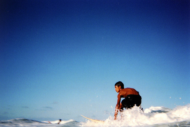
![[FILM] US TAIWAN makiko iowa Nikon FM(B) Fujifilm Superia 800-024](https://i0.wp.com/carlosgrphoto.com/wp-content/uploads/2017/04/film-us-taiwan-makiko-iowa-nikon-fmb-fujifilm-superia-800-024.jpg?w=617&h=390&ssl=1 "[FILM] US TAIWAN makiko iowa Nikon FM(B) Fujifilm Superia 800-024")
![[FILM] US TAIWAN makiko iowa Nikon FM(B) Fujifilm Superia 800-023](https://i0.wp.com/carlosgrphoto.com/wp-content/uploads/2017/04/film-us-taiwan-makiko-iowa-nikon-fmb-fujifilm-superia-800-023.jpg?w=255&h=390&ssl=1 "[FILM] US TAIWAN makiko iowa Nikon FM(B) Fujifilm Superia 800-023")
![[FILM] US TAIWAN makiko iowa Nikon FM(B) Fujifilm Superia 800-022](https://i0.wp.com/carlosgrphoto.com/wp-content/uploads/2017/04/film-us-taiwan-makiko-iowa-nikon-fmb-fujifilm-superia-800-022.jpg?w=583&h=366&ssl=1 "[FILM] US TAIWAN makiko iowa Nikon FM(B) Fujifilm Superia 800-022")
![[FILM] US TAIWAN makiko iowa Nikon FM(B) Fujifilm Superia 800-021](https://i0.wp.com/carlosgrphoto.com/wp-content/uploads/2017/04/film-us-taiwan-makiko-iowa-nikon-fmb-fujifilm-superia-800-021.jpg?w=289&h=182&ssl=1 "[FILM] US TAIWAN makiko iowa Nikon FM(B) Fujifilm Superia 800-021")
 Fujifilm Superia 800-020")
 Fujifilm Superia 800-019")
![[FILM] US TAIWAN makiko iowa Nikon FM(B) Fujifilm Superia 800-025](https://i0.wp.com/carlosgrphoto.com/wp-content/uploads/2017/04/film-us-taiwan-makiko-iowa-nikon-fmb-fujifilm-superia-800-025.jpg?w=329&h=210&ssl=1 "[FILM] US TAIWAN makiko iowa Nikon FM(B) Fujifilm Superia 800-025")
![[FILM] US TAIWAN makiko iowa Nikon FM(B) Fujifilm Superia 800-018](https://i0.wp.com/carlosgrphoto.com/wp-content/uploads/2017/04/film-us-taiwan-makiko-iowa-nikon-fmb-fujifilm-superia-800-018.jpg?w=543&h=419&ssl=1 "[FILM] US TAIWAN makiko iowa Nikon FM(B) Fujifilm Superia 800-018")
![[FILM] US TAIWAN makiko iowa Nikon FM(B) Fujifilm Superia 800-016](https://i0.wp.com/carlosgrphoto.com/wp-content/uploads/2017/04/film-us-taiwan-makiko-iowa-nikon-fmb-fujifilm-superia-800-016.jpg?w=438&h=273&ssl=1 "[FILM] US TAIWAN makiko iowa Nikon FM(B) Fujifilm Superia 800-016")
![[FILM] US TAIWAN makiko iowa Nikon FM(B) Fujifilm Superia 800-015](https://i0.wp.com/carlosgrphoto.com/wp-content/uploads/2017/04/film-us-taiwan-makiko-iowa-nikon-fmb-fujifilm-superia-800-015.jpg?w=434&h=273&ssl=1 "[FILM] US TAIWAN makiko iowa Nikon FM(B) Fujifilm Superia 800-015")
![[FILM] US TAIWAN makiko iowa Nikon FM(B) Fujifilm Superia 800-014](https://i0.wp.com/carlosgrphoto.com/wp-content/uploads/2017/04/film-us-taiwan-makiko-iowa-nikon-fmb-fujifilm-superia-800-014.jpg?w=392&h=250&ssl=1 "[FILM] US TAIWAN makiko iowa Nikon FM(B) Fujifilm Superia 800-014")
![[FILM] US TAIWAN makiko iowa Nikon FM(B) Fujifilm Superia 800-013](https://i0.wp.com/carlosgrphoto.com/wp-content/uploads/2017/04/film-us-taiwan-makiko-iowa-nikon-fmb-fujifilm-superia-800-013.jpg?w=392&h=251&ssl=1 "[FILM] US TAIWAN makiko iowa Nikon FM(B) Fujifilm Superia 800-013")
![[FILM] US TAIWAN makiko iowa Nikon FM(B) Fujifilm Superia 800-012](https://i0.wp.com/carlosgrphoto.com/wp-content/uploads/2017/04/film-us-taiwan-makiko-iowa-nikon-fmb-fujifilm-superia-800-012.jpg?w=392&h=254&ssl=1 "[FILM] US TAIWAN makiko iowa Nikon FM(B) Fujifilm Superia 800-012")
 Fujifilm Superia 800-007")
 Fujifilm Superia 800-006")
![[FILM] US TAIWAN makiko iowa Nikon FM(B) Fujifilm Superia 800-010](https://i0.wp.com/carlosgrphoto.com/wp-content/uploads/2017/04/film-us-taiwan-makiko-iowa-nikon-fmb-fujifilm-superia-800-010.jpg?w=293&h=183&ssl=1 "[FILM] US TAIWAN makiko iowa Nikon FM(B) Fujifilm Superia 800-010")
![[FILM] US TAIWAN makiko iowa Nikon FM(B) Fujifilm Superia 800-009](https://i0.wp.com/carlosgrphoto.com/wp-content/uploads/2017/04/film-us-taiwan-makiko-iowa-nikon-fmb-fujifilm-superia-800-009.jpg?w=293&h=184&ssl=1 "[FILM] US TAIWAN makiko iowa Nikon FM(B) Fujifilm Superia 800-009")
![[FILM] US TAIWAN makiko iowa Nikon FM(B) Fujifilm Superia 800-004](https://i0.wp.com/carlosgrphoto.com/wp-content/uploads/2017/04/film-us-taiwan-makiko-iowa-nikon-fmb-fujifilm-superia-800-004.jpg?w=484&h=308&ssl=1 "[FILM] US TAIWAN makiko iowa Nikon FM(B) Fujifilm Superia 800-004")
![[FILM] US TAIWAN makiko iowa Nikon FM(B) Fujifilm Superia 800-003](https://i0.wp.com/carlosgrphoto.com/wp-content/uploads/2017/04/film-us-taiwan-makiko-iowa-nikon-fmb-fujifilm-superia-800-003.jpg?w=484&h=305&ssl=1 "[FILM] US TAIWAN makiko iowa Nikon FM(B) Fujifilm Superia 800-003")
![[FILM] US TAIWAN makiko iowa Nikon FM(B) Fujifilm Superia 800-002](https://i0.wp.com/carlosgrphoto.com/wp-content/uploads/2017/04/film-us-taiwan-makiko-iowa-nikon-fmb-fujifilm-superia-800-002.jpg?w=388&h=617&ssl=1 "[FILM] US TAIWAN makiko iowa Nikon FM(B) Fujifilm Superia 800-002")
![[FILM] US TAIWAN makiko iowa Nikon FM(B) Fujifilm Superia 800-005](https://i0.wp.com/carlosgrphoto.com/wp-content/uploads/2017/04/film-us-taiwan-makiko-iowa-nikon-fmb-fujifilm-superia-800-005.jpg?w=224&h=141&ssl=1 "[FILM] US TAIWAN makiko iowa Nikon FM(B) Fujifilm Superia 800-005")
![[FILM] US TAIWAN makiko iowa Nikon FM(B) Fujifilm Superia 800-001](https://i0.wp.com/carlosgrphoto.com/wp-content/uploads/2017/04/film-us-taiwan-makiko-iowa-nikon-fmb-fujifilm-superia-800-001.jpg?w=224&h=141&ssl=1 "[FILM] US TAIWAN makiko iowa Nikon FM(B) Fujifilm Superia 800-001")

![[FILM] USA TAIWAN chritmas sanxia - Nikon FM(B) - Tudor 200001](https://i0.wp.com/carlosgrphoto.com/wp-content/uploads/2017/04/film-usa-taiwan-chritmas-sanxia-nikon-fmb-tudor-200001.jpg?w=141&h=141&crop=1&ssl=1 "[FILM] USA TAIWAN chritmas sanxia - Nikon FM(B) - Tudor 200001")
